
Workout Wednesday Redux (2017 Week 3)
I had started a “52 Vis” initiative back in 2016 to encourage folks to get practice making visualizations since that’s the only way to get better at virtually anything. Life got crazy, 52 Vis fell to the wayside and now there are more visible alternatives such as Makeover Mondayand Workout Wednesday. They’re geared towards the “T” crowd (I’m not giving a closed source and locked-in-data product any more marketing than two links) but that doesn’t mean R, Python or other open-tool/open-data communities can’t join in for the ride and learning experience.
This week’s workout is a challenge to reproduce or improve upon a chart by Matt Stiles. You should go to both (give them the clicks and eyeballs they both deserve since they did great work). They both chose a line chart, but the whole point of these exercises is to try out new things to help you learn how to communicate better. I chose to use geom_segment() to make mini-column charts since that:
- eliminates the giant rose-coloured rectangles that end up everywhere
- helps show the differences a bit better (IMO), and
- also helps highlight some of the states that have had more difficulties than others
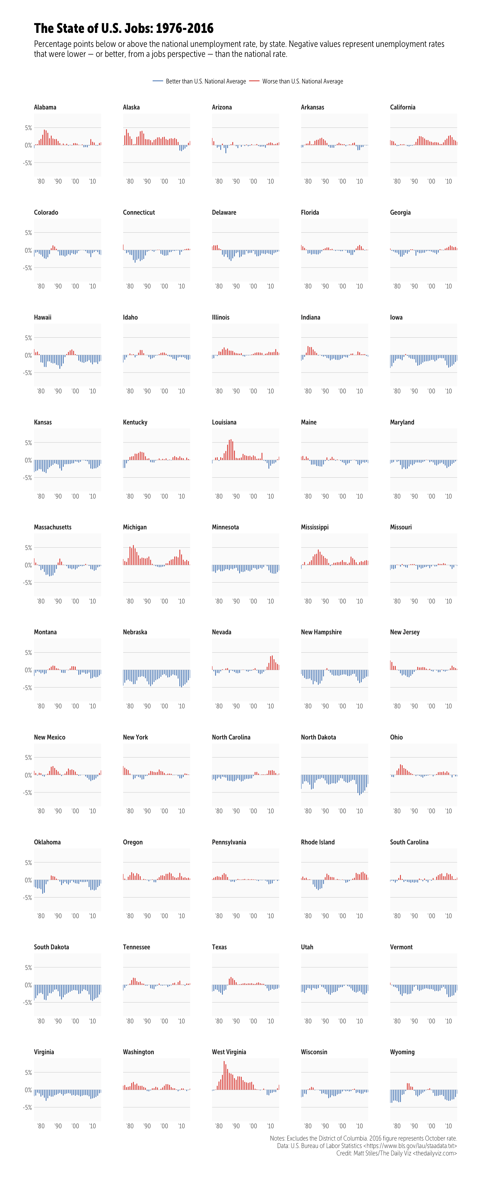
Click/tap to “embiggen”. I kept the same dimensions that Andy did but unlike Matt’s creation this is a plain ol’ PNG as I didn’t want to deal with web fonts (I’m on a Museo Sans Condensed kick at the moment but don’t have it in my TypeKit config yet). I went with official annual unemployment numbers as they may be calculated/adjusted differently (I didn’t check, but I knew that data source existed, so I used it).
One reason I’m doing this is a quote on the Workout Wednesday post:
This will be a very tedious exercise. To provide some context, this took me 2-3 hours to create. Don’t get discouraged and don’t feel like you have to do it all in one sitting. Basically, try to make yours look identical to mine.
This took me 10 minutes to create in R:
#' ---

#' output:

#'  html_document:

#'    keep_md: true

#' ---

#+ message=FALSE

library(ggplot2)

library(hrbrmisc)

library(readxl)

library(tidyverse)

# Use official BLS annual unemployment data vs manually calculating the average

# Source: https://data.bls.gov/timeseries/LNU04000000?years_option=all_years&periods_option=specific_periods&periods=Annual+Data

read_excel("~/Data/annual.xlsx", skip=10) %>%

  mutate(Year=as.character(as.integer(Year)), Annual=Annual/100) -> annual_rate

# The data source Andy Kriebel curated for you/us: https://1drv.ms/x/s!AhZVJtXF2-tD1UVEK7gYn2vN5Hxn #ty Andy!

read_excel("~/Data/staadata.xlsx") %>%

  left_join(annual_rate) %>%

  filter(State != "District of Columbia") %>%

  mutate(

    year = as.Date(sprintf("%s-01-01", Year)),

    pct = (Unemployed / `Civilian Labor Force Population`),

    us_diff = -(Annual-pct),

    col = ifelse(us_diff<0,

               "Better than U.S. National Average",

               "Worse than U.S. National Average")

  ) -> df

credits <- "Notes: Excludes the District of Columbia. 2016 figure represents October rate.\nData: U.S. Bureau of Labor Statistics <https://www.bls.gov/lau/staadata.txt>\nCredit: Matt Stiles/The Daily Viz <thedailyviz.com>"

#+ state_of_us, fig.height=21.5, fig.width=8.75, fig.retina=2

ggplot(df, aes(year, us_diff, group=State)) +

  geom_segment(aes(xend=year, yend=0, color=col), size=0.5) +

  scale_x_date(expand=c(0,0), date_labels="'%y") +

  scale_y_continuous(expand=c(0,0), label=scales::percent, limit=c(-0.09, 0.09)) +

  scale_color_manual(name=NULL, expand=c(0,0),

                     values=c(`Better than U.S. National Average`="#4575b4",

                              `Worse than U.S. National Average`="#d73027")) +

  facet_wrap(~State, ncol=5, scales="free_x") +

  labs(x=NULL, y=NULL, title="The State of U.S. Jobs: 1976-2016",

       subtitle="Percentage points below or above the national unemployment rate, by state. Negative values represent unemployment rates\nthat were lower — or better, from a jobs perspective — than the national rate.",

       caption=credits) +

  theme_hrbrmstr_msc(grid="Y", strip_text_size=9) +

  theme(panel.background=element_rect(color="#00000000", fill="#f0f0f055")) +

  theme(panel.spacing=unit(0.5, "lines")) +

  theme(plot.subtitle=element_text(family="MuseoSansCond-300")) +

  theme(legend.position="top")
Swap out ~/Data for where you stored the files.
The “weird” looking comments enable me to spin the script and is pretty much just the inverse markup for knitr R Markdown documents. As the comments say, you should really thank Andy for curating the BLS data for you/us.
If I really didn’t pine over aesthetics it would have taken me 5 minutes (most of that was waiting for re-rendering). Formatting the blog post took much longer. Plus, I can update the data source and re-run this in the future without clicking anything. This re-emphasizes a caution I tell my students: beware of dragon droppings (“drag-and-drop data science/visualization tools”).
Hopefully you presently follow or will start following Workout Wednesday and Makeover Monday and dedicate some time to hone your skills with those visualization katas.
转自:https://rud.is/b/2017/01/18/workout-wednesday-redux-2017-week-3/
Workout Wednesday Redux (2017 Week 3)的更多相关文章
- January 25 2017 Week 4 Wednesday
In every triumph, there's a lot of try. 每个胜利背后都有许多尝试. There's a lot of try behind every success, and ...
- November 15th, 2017 Week 46th Wednesday
Of all the tribulations in this world, boredom is the one most hard to bear. 所有的苦难中,无聊是最难以忍受的. When ...
- November 08th, 2017 Week 45th Wednesday
Keep your face to the sunshine and you cannot see the shadow. 始终面朝阳光,我们就不会看到黑暗. I love sunshine, but ...
- November 01st, 2017 Week 44th Wednesday
People always want to lead an active life, and is not it? 人们总要乐观生活,不是吗? Be active, and walk towards ...
- October 25th, 2017 Week 43rd Wednesday
Perseverance is not a long race; it is many short races one after another. 坚持不是一个长跑,她是很多一个接一个的短跑. To ...
- October 18th 2017 Week 42nd Wednesday
Only someone who is well-prepared has the opportunity to improvise. 只有准备充分的人才能够尽兴表演. From the first ...
- October 11th 2017 Week 41st Wednesday
If you don't know where you are going, you might not get there. 如果你不知道自己要去哪里,你可能永远到不了那里. The reward ...
- October 04th 2017 Week 40th Wednesday
We teach people how to remember, we never teach them how to grow. 我们教会人们如何记忆,却从来不教他们如何成长. Without pr ...
- September 27th 2017 Week 39th Wednesday
We both look up at the same stars, yet we see such different things. 我们仰望同一片星空,却看见了不同的事物. Looking up ...
随机推荐
- JavaEE开发使用Maven管理的SpringMVC工程
前几篇博客已经陆陆续续的聊了一些Spring的东西,今天博客我们就来聊一下SpringMVC.SpringMVC目前在JavaEE开发中可谓占据一席之地,用起来也是比较顺手的.低耦合,高内聚,利用一些 ...
- TDD 中关于mock一些理解
最近在写代码的UT时case注意到: 在写某个类的test suit时,如果这个类既有组合(Composition),又有聚合关系(Aggregation). 组合关系(Composition):部分 ...
- aos.js超赞页面滚动元素动画jQuery动画库
插件描述:aos.js 是一款效果超赞的页面滚动元素动画jQuery动画库插件.该动画库可以在页面滚动时提供28种不同的元素动画效果,以及多种easing效果.在页面往回滚动时,元素会恢复到原来的状态 ...
- Magento中URL路径的获取
//获得 media 带 http 的url 地址. Mage::getBaseUrl('media') //获得skin 和js 目录的地址: Mage::getBaseUrl('skin'); M ...
- Linux基础(7)
Linux 基础(7) 一.内存的监控(free) free -m 以单位为MB的方式查看内存的使用情况(free命令读取的文件是/proc/meminfo) total:是指计算机安装的内存总量 u ...
- 忘记了root密码,如何进入系统?
Issue 问题 忘记了root密码不能进入系统 如何进入系统? 环境 红帽企业版Linux所有版本 解决方法 可以进入单用户模式或者援救模式来改变root密码,如何进入单用户模式取决引导加载程序. ...
- web开发中,post与get的区别
区别: 1.Get是从服务器上获取数据,Post是向服务器传送数据. 2.Get是把参数数据队列加到提交表单的Action属性所指的URL中,值和表单内各个字段一一对应,在URL中可以看到.Post是 ...
- redis 主从配置实例、注意事项、及备份方式
这两天在配置线上使用的redis服务.总得看起来,redis服务的配置文件还是非常简洁.清楚,配置起来非常顺畅,赞一下作者. 下面是我使用的配置,使用主从模式,在master上关掉所有持久化,在sla ...
- 工具类总结---(六)---之http及https请求
下面使用的是HttpURLConnection进行的网络链接,并对https进行了忽略证书. 在这个utils里面,也使用到前面几个utils,比如下载文件的方法,就使用到了Fileutils pac ...
- 转:Maven项目编译后classes文件中没有dao的xml文件以及没有resources中的配置文件的问题解决
问题1:在做spring+mybatis时,自动扫描都配置正确了,却在运行时出现了如下错误.后来查看target/classes/.../dao/文件夹下,发现只有mapper的class文件,而没有 ...