css揭秘
一:渐变
- 线性渐变(Linear Gradients)- 向下/向上/向左/向右/对角方向 background: linear-gradient(direction, color-stop1, color-stop2, ...);
- 径向渐变(Radial Gradients)- 由它们的中心定义 background: radial-gradient(center, shape size, start-color, ..., last-color);
- 重复的径向渐变 background:repeating-radial-gradient(center, shape size, start-color, ..., last-color);
补充:
shape 参数定义了形状。它可以是值 circle 或 ellipse。其中,circle 表示圆形,ellipse 表示椭圆形。默认值是 ellipse。
size 参数定义了渐变的大小。它可以是以下四个值:
- closest-side
- farthest-side
- closest-corner
- farthest-corner
#grad {

  background: -webkit-radial-gradient(circle, red, yellow, green); /* Safari 5.1 - 6.0 */

  background: -o-radial-gradient(circle, red, yellow, green); /* Opera 11.6 - 12.0 */

  background: -moz-radial-gradient(circle, red, yellow, green); /* Firefox 3.6 - 15 */

  background: radial-gradient(circle, red, yellow, green); /* 标准的语法 */

}
二:currentcolor(css第一变量)
比图想要hr线的颜色和字体颜色保持一致,可以这样写:
hr{

        height:.5em;

        background: currentcolor;

   }
类似这些border-color outline-color text-shadow box-shadow都可以使用
三:border-radius(/”前面的值设置其水平半径,“/”后面值设置其垂直半径。)
border-radius:30px / 20px 40px;
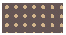
四:波点
<head>

        <meta charset="UTF-8">

        <title></title>

        <style>

            .one {

                width: 200px;

                height: 100px;

                background:#655;

                background-image: radial-gradient(tan 30%,transparent 0),radial-gradient(tan 30%,transparent 0);  //如果这里只有一项,没有background-position,效果图第二个图

                background-size: 30px 30px;

                background-position:0 0, 15px 15px;

            }

        </style>

    </head>

    <body>

        <div class="box">

            <div class="one"></div>

        </div>

    </body>
效果图:

五:色轮
.two{

        margin-top: 100px;

        width:200px;

        height: 200px;

        border-radius: 100px;

        background: conic-gradient(red,yellow,lime,aqua,blue,fuchsia,red);

}
效果图:

六:文字垂直居中
加载父元素中,
display: flex;

flex-direction: column;

justify-content: center;
css揭秘的更多相关文章
- [css 揭秘]-css coding tips
css 揭秘之css coding tips demo(1) html 代码: <body> <section> <div class="demo1" ...
- CSS揭秘读书笔记 (一)
CSS揭秘读书笔记 (一) 一.半透明边框 要想实现半透明边框可以使用border: border: 10px solid hsla(0,0%,100%,.5); background: ...
- 《css揭秘》
<css揭秘> 第一章:引言 引言 案例们 第二章:背景与边框 背景和边框 半透明边框(rgba/hsla.background-clip) 多重边框(box-shadow) 灵活的背景定 ...
- [css 揭秘]:CSS揭秘 技巧(三):背景定位
我的github地址:https://github.com/FannieGirl/ifannie 源码都在这上面哦! 喜欢的给我一个星吧 背景定位 问题:很多时候,我们想针对容器某个角对背景图片做便宜 ...
- CSS揭秘 技巧(五):条纹背景
条纹背景 https://github.com/FannieGirl/ifannie/问题:条纹背景 在设觉设计中无处不在,我们真的可以用css 创建图案吗? 这一章相对还是比较复杂的哦!一起get. ...
- [css 揭秘]:CSS揭秘 技巧(四):边框内圆角
我的github地址:https://github.com/FannieGirl/ifannie/ 源码都在这上面哦! 喜欢的给我一个星吧 边框内圆角 问题:有时候我们需要一个容器,只在内侧有圆角,而 ...
- [css 揭秘]:CSS揭秘 技巧(二):多重边框
我的github地址:https://github.com/FannieGirl/ifannie/ 源码都在这上面哦! 喜欢的给我一个星吧 多重边框 问题:我们通常希望在css代码层面以更灵活的方式来 ...
- [css 揭秘]:CSS揭秘 技巧(一):半透明边框
我的github地址:https://github.com/FannieGirl/ifannie/ 源码都在上面哦 喜欢的给我一个星吧 半透明边框 css 中的半透明颜色,比如用 rgba() 和 h ...
- [css 揭秘]:CSS编码技巧
CSS编码技巧 我的github地址:https://github.com/FannieGirl/ifannie 喜欢的给我一个星吧 尽量减少代码重复 尽量减少改动时需要编辑的地方 当某些值相互依赖时 ...
- CSS揭秘—透明边框(一)
前言: 所有实例均来自<CSS揭秘>,该书以平时遇到的疑难杂症为引,提供解决方法,只能说秒极了,再一次刷新了我对CSS的认知 该书只提供了关键CSS代码,虽然有在线示例代码链接,但访问速度 ...
随机推荐
- Bitcoin
看李笑来老师的2013演讲——Bitcoin is not virtual currency,it is a real world. 1.由于bitcoin的算法中进行有上限量的发布,所以这是不会出现 ...
- [ACM_数据结构] 线段树模板
#include<iostream> #include<cmath> using namespace std; #define maxn 200005 class Node{ ...
- 洛谷P3369 【模板】普通平衡树(Splay)
题面 传送门 题解 鉴于最近的码力实在是弱到了一个境界--回来重新打一下Splay的板子--竟然整整调了一个上午-- //minamoto #include<bits/stdc++.h> ...
- Reservoir Sampling-382. Linked List Random Node
Given a singly linked list, return a random node's value from the linked list. Each node must have t ...
- (1)Oracle基础--用户与登录
一.用户 · 系统用户 <1> sys,system sys和system是权限比较高的用户,且sys比system权限高.使用sys登录必须使用sysdba或者sysoper的权限,而 ...
- 【OpenCV3】cvRound()、cvFloor()、cvCeil()函数详解
函数cvRound().cvFloor().cvCeil()都是按照一种舍入方式将浮点型数据转换为整型数据. cvRound():返回跟参数最接近的整数值,即四舍五入: cvFloor() :返回不 ...
- OAuth 2.0 - Authorization Code授权方式详解
I:OAuth 2.0 开发前期准备 天上不会自然掉馅饼让你轻松地去访问到人家资源服务器里面的用户数据资源,所以你需要做的前期开发准备工作就是把AppKey, AppSecret取到手 新浪获取传送门 ...
- zookeeper知识点学习
单机模式配置: Zookeeper 的启动脚本在 bin 目录下,Linux 下的启动脚本是 zkServer.sh 在你执行启动脚本之前,还有几个基本的配置项需要配置一 下,Zookeeper 的配 ...
- (转)十分钟了结MySQL information_schema
十分钟了结MySQL information_schema 原文:http://www.cnblogs.com/shengdimaya/p/6920677.html information_sche ...
- php如何使用rabbitmq实现发布消息和消费消息(tp框架)(第一篇)
1,默认已经安装好了rabbitmq: 参考 http://www.cnblogs.com/spicy/p/7017603.html 2,安装rabbitmq客户端: 方法1: pecl 扩展安装 ...