移动端Retina屏边框线1px 显示为2px或3px问题解决方法
所有非视网膜屏幕的iphone在垂直的时候,宽度为320物理像素。当你使用<meta name="viewport" content="width=device-width">的时候,会设置视窗布局宽度(不同于视觉区域宽度,不放大显示情况下,两者大小一致,见下图)为320px, 于是,页面很自然地覆盖在屏幕上。这样,非视网膜屏幕的iphone上,屏幕物理像素320像素,独立像素也是320像素,因此,window.devicePixelRatio等于1.
<meta name="viewport" content="width=device-width">的时候,其视区宽度并不是640像素,而是320像素,这是为了有更好的阅读体验 – 更合适的文字大小。这样,在视网膜屏幕的iphone上,屏幕物理像素640像素,独立像素还是320像素,因此,
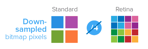
window.devicePixelRatio等于2.每个像素点实际上有4倍的普通像素点,如下示意(© smashingmagazine):
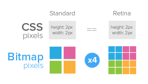
1个CSS像素点实际上有4个位图像素点,1个分成4个,显然不够分啊,只能颜色近似选取,于是,图片感觉就是模糊的(© smashingmagazine)!。这就是为什么使用两倍图。
- 所有非Retina的Mac
- 所有非Retina的iOS设备
- Acer Iconia A500
- Samsung Galaxy Tab 10.1
- Samsung Galaxy S
- Google Nexus 7
- Google Nexus S
- Samsung Galaxy S II
- HTC Desire
- HTC Desire HD
- HTC Incredible S
- HTC Velocity
- HTC Sensation
- iPhone 4
- iPhone 4S
- iPhone 5
- iPad (3rd generation)
- iPad 4
- 所有Retina displays 的MAC
- Google Galaxy Nexus
- Google Nexus 4
- Google Nexus 10
- Samsung Galaxy S III
- Samsung Galaxy Note II
- Sony Xperia S
- HTC One X
-webkit-min-device-pixel-ratio为3.0
- iPhone 6 plus
- iPhone 6s plus
alert(window.devicePixelRatio);
};
<!DOCTYPE html>

<html lang="en">

<head>

    <meta charset="UTF-8">

    <title>移动设备的1px边框(默认1px的线太粗,用背景模拟)</title>

    <style>

        .bordercase,.borderbottom,.borderright{

            border: 1px solid #000;

        }

        h1{font-size: 15px;}

        a.bt{display: inline-block;height:30px; red;color: #fff;}

        .borderbottom{#fff;font-size: 15px;}

        @media (-webkit-min-device-pixel-ratio: 2){

        .borderbottom {

        border: none;

        background-image: -webkit-gradient(linear,left top,left bottom,color-stop(50%,transparent),color-stop(50%,#000000),color-stop(100%,#000000));

        background-image: -webkit-linear-gradient(top,transparent 50%,#000000 50%,#000000 100%);

        background-image: linear-gradient(to bottom,transparent 50%,#000000 50%,#000000 100%);

        background-size: 100% 1px;

        background-repeat: no-repeat;

        background-position: bottom;

        }

        @media (-webkit-min-device-pixel-ratio: 2){

        .borderright {

        border: none;

        background-image: -webkit-gradient(linear,left top,right top,color-stop(50%,transparent),color-stop(50%,#000000),color-stop(100%,#000000));

        background-image: -webkit-linear-gradient(left,transparent 50%,#000000 50%,#000000 100%);

        background-image: linear-gradient(to right,transparent 50%,#000000 50%,#000000 100%);

        background-size: 1px 100%;

        background-repeat: no-repeat;

        background-position: right;

        }

        @media (-webkit-min-device-pixel-ratio: 3){

        .borderbottom {

        border: none;

        background-image: -webkit-gradient(linear,left top,left bottom,color-stop(65%,transparent),color-stop(65%,#000000),color-stop(100%,#000000));

        background-image: -webkit-linear-gradient(top,transparent 65%,#000000 65%,#000000 100%);

        background-image: linear-gradient(to bottom,transparent 65%,#000000 65%,#000000 100%);

        background-size: 100% 1px;

        background-repeat: no-repeat;

        background-position: bottom;

        }

    }

    </style>

</head>

<body>

    <ul>

        <li>

            <h1>问题:border:1px,在手机设备上是2px或是3px,Why???

            </h1>

            <div class="bordercase">为什么我的边框那么大? 说好的1像素呢???  瞬间各种不爱了。。。。。。

            .bordercase{border: 1px solid #000;}</div>

        </li>

        <li><h1>1、何为“设备像素比devicePixelRatio”</h1>

            <p>设备上物理像素和设备独立像素(device-independent pixels (dips))的比例。公式表示就是:window.devicePixelRatio = 物理像素 / dips   dip或dp,(device independent pixels,设备独立像素)与屏幕密度有关。dip可以用来辅助区分视网膜设备还是非视网膜设备。</p>

        </li>

        <li>

            <h1>2、“Retina”屏呈像原理</h1>

            <img src="page1.png" height="284" width="500" />

            <img src="page2.png" height="168" width="500"/>

        </li>

        <li><h1>3、获取设备的devicePixelRatio(开启Chrome浏览器可以看到各种类型设备的像素比)</h1>

                    <a class="bt" id="bt" onclick="alert(window.devicePixelRatio);">点击我查看设备的devicePixelRatio</a>

        </li><li><h1>4、解决方法(通过背景模拟边框线,把1px一分为二)</h1>

            <a class="bt" href='https://jsfiddle.net/starrycheng/6ndbw6ax/1/'" target="_blank">jsfiddle地址</a>

            <div class="borderbottom">看我下边框(在手机上才能看到我,在模拟器里有时候是看不到的。)</div>

              <br/>

              <br/>

              <br/>

            <div class="borderright">看我右边框(在手机上才能看到我,在模拟器里有时候是看不到的。)</div>

            <br/>

            <br/>

            <br/>

            <br/>

            <div>

            <br/>

            我的代码样式代码  <br/>

            @media (-webkit-min-device-pixel-ratio: 2){

            <br/>

            .borderbottom {

        border: none;(定义元素无边框)

        <br/>

        background-image: -webkit-gradient(linear,left top,left bottom,color-stop(50%,transparent),color-stop(50%,#000000),color-stop(100%,#000000));(//-webkit老式语法书写规则:线性渐变,从中间到下,颜色逐渐加深。50%从中间开始。从透明效果开始。)

        <br/>

        background-image: -webkit-linear-gradient(top,transparent 50%,#000000 50%,#000000 100%);(//-webkit最新发布书写语法:线性渐变,从中间到下,颜色逐渐加深。50%从中间开始。从透明效果开始。)

        <br/>

        background-image: linear-gradient(to bottom,transparent 50%,#000000 50%,#000000 100%);(//HTML5标准写法:线性渐变,从中间到下,颜色逐渐加深。50%从中间开始。从透明效果开始。)

        <br/>

        background-size: 100% 1px;(背景大小1像素,100%的宽度)

        <br/>

        background-repeat: no-repeat;(不重复)

        <br/>

        background-position: bottom;(背景出现位置)

        }}</div>

        </li>

    </ul>

</body>

</html>
各位大神还有什么其它的解决方案欢迎讨论,谢谢。
移动端Retina屏边框线1px 显示为2px或3px问题解决方法的更多相关文章
- 移动端Retina屏boder 1px显示为2px或3px的解决方法
我们在开发移动端web项目时经常遇到设置border:1px,但是显示的边框却为2px或是3px粗细,这是因为设备像素比devicePixelRatio为2或3引起的. 何为“设备像素比deviceP ...
- 移动端 Retina屏 各大主流网站1px的解决方案
Retina屏的移动设备如何实现真正1px的线? 在retina屏下面,如果你写了这样的meta <meta name="viewport" content="in ...
- Retina 屏移动设备 1px解决方案
做移动端H5页面开发时都会遇到这样的问题,用 CSS 定义 1px 的实线边框,在 window.devicePixelRatio=2 的屏幕上会显示成 2px,在 window.devicePix ...
- 移动端 Retina屏border实现0.5px
首先来看一下造成Retina边框变粗的原因 其实这个原因很简单,因为css中的1px并不等于移动设备的1px,这些由于不同的手机有不同的像素密度.在window对象中有一个devicePixelRat ...
- xp系统重绘边框线不显示(首次加载没有触发paint事件)
同样是,重绘边框事件,win7系统显示正常,而xp系统却不显示,这是什么原因造成的呢? 于是,小编开始百度,不停的查找原因,通过一番查找,小编也意外的收获了一些内容: 例如:窗口的拖动,放大,缩小,等 ...
- 移动端下网页border:1px显示
解决这个问题之前首先要了解移动前端开发viewport的概念,自己写了一篇很粗糙viewport详解的文章对它有了一个很简单的理解.这里推荐一篇很详细的博文<<移动前端开发之viewpor ...
- 7种方法解决移动端Retina屏幕1px边框问题
在Reina(视网膜)屏幕的手机上,使用CSS设置的1px的边框实际会比视觉稿粗很多.在之前的项目中,UI告诉我说我们移动项目中的边框全部都变粗了,UI把他的设计稿跟我的屏幕截图跟我看,居然真的不一样 ...
- 7种方法实现移动端Retina屏幕1px边框效果
在Reina(视网膜)屏幕的手机上,使用CSS设置的1px的边框实际会比视觉稿粗很多.在之前的项目中,UI告诉我说我们移动项目中的边框全部都变粗了,UI把他的设计稿跟我的屏幕截图跟我看,居然真的不一样 ...
- Retina屏的移动设备如何实现真正1px的线
前些日子总被人问起 iOS Retina 屏,设置 1px 边框,实际显示 2px,如何解决?原来一直没在意,源于自己根本不是像素眼……今天仔细瞅了瞅原生实现的边框和CSS设置的边框,确实差距不小…… ...
随机推荐
- Maven(Eclipse版)
前言: 由于最近工作学习,总是能碰到Maven的源码.虽然平时工作并不使用Maven,但是为了学习一些源码,还是必须要了解下.这篇文章不是一个全面的Maven解析,而是一个简单的介绍,包括Eclips ...
- HTML的标签简介
1.标签的简介: <html>与</html>之间的文本描述网页<head>与</head>之间的标签用于定义文档的头部,他是所有的头部的文件<b ...
- Ajax的get方式传值 避免& 与= 号
js代码 例如: var name = $("#name”).value;//为a&b=7 name=encodeURLComponent(name); 可以将a&b=7转化 ...
- Easyui-datagrid显示时间的格式化代码
{field: 'Time', title: '时间', formatter: function (value, row, index) { var date = new Date(value); v ...
- LuoguP1126 机器人搬重物(BFS)
题目链接:https://www.luogu.org/problemnew/show/P1126 思路:很不错的搜索题,用BFS,虐了我1天多才A掉 QAQ,细节很多. 1.每个状态包含行.列.方向. ...
- np.eye()
今天在完成深度学习的相关编程作业的时候,发现代码中出现了一个关于np.eye()的函数,这个函数的用法非常的简单,但是在预制的代码中,这个函数的用法并非单单制造一个对角矩阵,而是通过其来将一个labe ...
- 97. Interleaving String (String; DP)
Given s1, s2, s3, find whether s3 is formed by the interleaving of s1 and s2. For example,Given:s1 = ...
- 配置Maven从私服下载构件
--------------------siwuxie095 配置 Maven 从私服下载构件 从 Nexus ...
- JAVA 框架 Spring Cache For Redis.
一.概述 缓存(Caching)可以存储经常会用到的信息,这样每次需要的时候,这些信息都是立即可用的. 常用的缓存数据库: Redis 使用内存存储(in-memory)的非关系数据库,字符串.列 ...
- JAVA知识积累 JSP第一篇【JSP介绍、工作原理、生命周期、语法、指令、行为】
什么是JSP JSP全名为Java Server Pages,java服务器页面.JSP是一种基于文本的程序,其特点就是HTML和Java代码共同存在! 为什么需要JSP JSP是为了简化Servle ...