如何基于 React 封装一个组件
如何基于 React 封装一个组件
前言
很多小伙伴在第一次尝试封装组件时会和我一样碰到许多问题,比如人家的组件会有 color 属性,我们在使用组件时传入组件文档中说明的属性值如 primary ,那么这个组件的字体颜色会变为 primary 对应的颜色,这是如何做到的?还有别人封装的组件类名都有自己独特的前缀,这是如何处理的呢,难道是 css 类名全部加上前缀吗,这也太麻烦了!
如果你正在困惑这些问题,你可以看看这篇文章。
我会参照 antd的divider组件 来讲述如何基于React封装一个组件,以及解答上述的一些问题,请耐心看完!
antd 是如何封装组件的
仓库地址
- antd 仓库地址:https://github.com/ant-design/ant-design
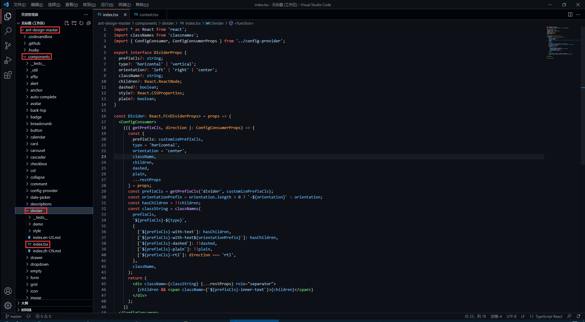
- divider 组件在下图对应目录下 (代码我会拷贝过来,感兴趣的还是可以去克隆一下仓库)
divider 组件源代码
antd 的源码使用了 TypeScript 语法,因此不了解语法的同学要及时了解哦!
import * as React from 'react';

import classNames from 'classnames';

import { ConfigConsumer, ConfigConsumerProps } from '../config-provider';

export interface DividerProps {

    prefixCls?: string;

    type?: 'horizontal' | 'vertical';

    orientation?: 'left' | 'right' | 'center';

    className?: string;

    children?: React.ReactNode;

    dashed?: boolean;

    style?: React.CSSProperties;

    plain?: boolean;

}

const Divider: React.FC<DividerProps> = props => (

    <ConfigConsumer>

        {({ getPrefixCls, direction }: ConfigConsumerProps) => {

            const {

                prefixCls: customizePrefixCls,

                type = 'horizontal',

                orientation = 'center',

                className,

                children,

                dashed,

                plain,

                ...restProps

            } = props;

            const prefixCls = getPrefixCls('divider', customizePrefixCls);

            const orientationPrefix = orientation.length > 0 ? `-${orientation}` : orientation;

            const hasChildren = !!children;

            const classString = classNames(

                prefixCls,

                `${prefixCls}-${type}`,

                {

                    [`${prefixCls}-with-text`]: hasChildren,

                    [`${prefixCls}-with-text${orientationPrefix}`]: hasChildren,

                    [`${prefixCls}-dashed`]: !!dashed,

                    [`${prefixCls}-plain`]: !!plain,

                    [`${prefixCls}-rtl`]: direction === 'rtl',

                },

                className,

            );

            return (

                <div className={classString} {...restProps} role="separator">

                    {children && <span className={`${prefixCls}-inner-text`}>{children}</span>}

                </div>

            );

        }}

    </ConfigConsumer>

);

export default Divider;
如何暴露组件属性
在源码中,最先看到的是以下内容,这些属性也就是divider组件所暴露的属性,我们可以 <Divider type='vertical' /> 这样来传入 type 属性,那么 divider 分割线样式就会渲染为垂直分割线,是不是很熟悉!
export interface DividerProps { // interface 是 TypeScript 的语法

    prefixCls?: string;

    type?: 'horizontal' | 'vertical'; // 限定 type 只能传入两个值中的一个

    orientation?: 'left' | 'right' | 'center';

    className?: string;

    children?: React.ReactNode;

    dashed?: boolean;

    style?: React.CSSProperties;

    plain?: boolean;

}
在上面的属性中,我们还发现 className 和 style是比较常见的属性,这代表我们可以 <Divider type='vertical' className='myClassName' style={{width: '1em'}} /> 这样使用这些属性。
如何设置统一类名前缀
我们知道,antd 的组件类名会有他们独特的前缀 ant-,这是如何处理的呢?继续看源码。
<ConfigConsumer>

    {({ getPrefixCls, direction }: ConfigConsumerProps) => {

        const {

            prefixCls: customizePrefixCls,

            type = 'horizontal',

            orientation = 'center',

            className,

            children,

            dashed,

            plain,

            ...restProps

        } = props;

        const prefixCls = getPrefixCls('divider', customizePrefixCls);
从源码中,我们发现 prefixCls ,这里是通过 getPrefixCls 方法生成,再看看 getPrefixCls 方法的源码,如下。
export interface ConfigConsumerProps {

  ...

  getPrefixCls: (suffixCls?: string, customizePrefixCls?: string) => string;

  ...

}

const defaultGetPrefixCls = (suffixCls?: string, customizePrefixCls?: string) => {

  if (customizePrefixCls) return customizePrefixCls;

  return suffixCls ? `ant-${suffixCls}` : 'ant';

};
不难发现此时会生成的类名前缀为 ant-divider 。
如何处理样式与类名
我们封装的组件肯定是有预设的样式,又因为样式要通过类名来定义,而我们传入的属性值则会决定组件上要添加哪个类名,这又是如何实现的呢?下面看源码。
import classNames from 'classnames';

const classString = classNames(

    prefixCls,

    `${prefixCls}-${type}`,

    {

        [`${prefixCls}-with-text`]: hasChildren,

        [`${prefixCls}-with-text${orientationPrefix}`]: hasChildren,

        [`${prefixCls}-dashed`]: !!dashed,

        [`${prefixCls}-plain`]: !!plain,

        [`${prefixCls}-rtl`]: direction === 'rtl',

    },

    className,

);

return (

    <div className={classString} {...restProps} role="separator">

        {children && <span className={`${prefixCls}-inner-text`}>{children}</span>}

    </div>

);
我们发现,它通过 classNames 方法(classNames是React处理多类名的组件)定义了一个所有类名的常量,然后传给了 div 中的 className 属性。
其实生成的类名也就是 ant-divider-horizontal 这个样子,那么css中以此类名定义的样式也就自然会生效了。而 className 和 style 属性则是通过 {...restProps} 来传入。
最后我们再看看它的css样式代码是怎么写的!
divider 组件样式源代码
antd 组件的样式使用 Less 书写,不了解 Less 语法的同学一定要了解一下。
@import '../../style/themes/index';

@import '../../style/mixins/index';

@divider-prefix-cls: ~'@{ant-prefix}-divider'; // 可以看到这里对应的也就是之前说到的类名前缀

.@{divider-prefix-cls} {

  .reset-component();

  border-top: @border-width-base solid @divider-color;

  &-vertical { // 这里的完整类名其实就是 ant-divider-vertical, 也就是 divider 组件的 type 属性值为 vertical 时对应的样式

    position: relative;

    top: -0.06em;

    display: inline-block;

    height: 0.9em;

    margin: 0 8px;

    vertical-align: middle;

    border-top: 0;

    border-left: @border-width-base solid @divider-color;

  }

  &-horizontal {

    display: flex;

    clear: both;

    width: 100%;

    min-width: 100%;

    margin: 24px 0;

  }

  &-horizontal&-with-text {

    display: flex;

    margin: 16px 0;

    color: @heading-color;

    font-weight: 500;

    font-size: @font-size-lg;

    white-space: nowrap;

    text-align: center;

    border-top: 0;

    border-top-color: @divider-color;

    &::before,

    &::after {

      position: relative;

      top: 50%;

      width: 50%;

      border-top: @border-width-base solid transparent;

      // Chrome not accept `inherit` in `border-top`

      border-top-color: inherit;

      border-bottom: 0;

      transform: translateY(50%);

      content: '';

    }

  }

  &-horizontal&-with-text-left {

    &::before {

      top: 50%;

      width: @divider-orientation-margin;

    }

    &::after {

      top: 50%;

      width: 100% - @divider-orientation-margin;

    }

  }

  &-horizontal&-with-text-right {

    &::before {

      top: 50%;

      width: 100% - @divider-orientation-margin;

    }

    &::after {

      top: 50%;

      width: @divider-orientation-margin;

    }

  }

  &-inner-text {

    display: inline-block;

    padding: 0 @divider-text-padding;

  }

  &-dashed {

    background: none;

    border-color: @divider-color;

    border-style: dashed;

    border-width: @border-width-base 0 0;

  }

  &-horizontal&-with-text&-dashed {

    border-top: 0;

    &::before,

    &::after {

      border-style: dashed none none;

    }

  }

  &-vertical&-dashed {

    border-width: 0 0 0 @border-width-base;

  }

  &-plain&-with-text {

    color: @text-color;

    font-weight: normal;

    font-size: @font-size-base;

  }

}

@import './rtl';
这样一来,我相信同学们也大概了解如何去封装一个组件以及关键点了,在源码中还有很多地方值得我们学习,比如这里的 ConfigConsumer 的定义与使用,感兴趣的同学欢迎一起交流。
笔记下载
此文章系原创,转载请附上链接,抱拳。
此文档提供 markdown 源文件下载,请去我的码云仓库进行下载。 下载文档
若本文对你有用,请不要忘记给我的点个 Star 哦!
如何基于 React 封装一个组件的更多相关文章
- 基于 React 封装的高德地图组件,帮助你轻松的接入地图到 React 项目中。
react-amap 这是一个基于 React 封装的高德地图组件,帮助你轻松的接入地图到 React 项目中. 文档实例预览: Github Web | Gitee Web 特性 ️ 自动加载高德地 ...
- 基于 React 实现一个 Transition 过渡动画组件
过渡动画使 UI 更富有表现力并且易于使用.如何使用 React 快速的实现一个 Transition 过渡动画组件? 基本实现 实现一个基础的 CSS 过渡动画组件,通过切换 CSS 样式实现简单的 ...
- 基于 element-plus 封装一个依赖 json 动态渲染的查询控件
前情回顾 基于 el-form 封装一个依赖 json 动态渲染的表单控件 Vue3 封装第三方组件(一)做一个合格的传声筒 功能 使用 vue3 + element-plus 封装了一个查询控件,专 ...
- Vue.use源码分析(转)+如何封装一个组件
封装一个组件:https://www.jianshu.com/p/89a05706917a 我想有过vue开发经验的,对于vue.use并不陌生.当使用vue-resource或vue-router等 ...
- 基于iview 封装一个vue 表格分页组件
iview 是一个支持中大型项目的后台管理系统ui组件库,相对于一个后台管理系统的表格来说分页十分常见的 iview是一个基于vue的ui组件库,其中的iview-admin是一个已经为我们搭好的后天 ...
- 基于better-scroll封装一个上拉加载下拉刷新组件
1.起因 上拉加载和下拉刷新在移动端项目中是很常见的需求,遂自己便基于better-scroll封装了一个下拉刷新上拉加载组件. 2.过程 better-scroll是目前比较好用的开源滚动库,提供很 ...
- 基于react hooks,zarm组件库配置开发h5表单页面
最近使用React Hooks结合zarm组件库,基于js对象配置方式开发了大量的h5表单页面.大家都知道h5表单功能无非就是表单数据的收集,验证,提交,回显编辑,通常排列方式也是自上向下一行一列的方 ...
- 基于highcharts封装的组件-demo&源码
前段时间做的项目中需要用到highcharts绘制各种图表,其实绘制图表本身代码很简单,但是由于需求很多,有大量的图形需要绘制,所以就不得不复制粘贴大量重复(默认配置等等)的代码,所以,后来抽空自己基 ...
- 基于 el-form 封装一个依赖 json 动态渲染的表单控件
nf-form 表单控件的功能 基于 el-form 封装了一个表单控件,包括表单的子控件. 既然要封装,那么就要完善一些,把能想到的功能都要实现出来,不想留遗憾. 毕竟UI库提供的功能都很强大了,不 ...
随机推荐
- js--typeof 和 instanceof 判断数据类型的区别及开发中的使用
前言 日常的开发中,我们经常会遇到判断一个变量的数据类型或者该变量是否为空值的情况,你是如何去选择判断类型的操作符的?本文来总结记录一下我们开发人员必须掌握的关于 typeof 和 instanceo ...
- 使用tinypng对需要上传Gitee图床的图片进行压缩
目录 背景 Tinypng简介 Tinypng使用 手动上传图片 使用API 调用API自动上传超过1MB图片 安装tinyfy 自动上传脚本 其他 背景 在使用Gitee作为图床时(使用Typora ...
- javascript-jquery-文档处理
一.移动元素 1.append():向每个匹配元素的内部追加内容.例如:$("选择器1").qppend("选择器2"):将会匹配选择器2的元素,移动到匹配选择 ...
- 【UE4 C++】UKismetSystemLibrary 源代码
// Copyright Epic Games, Inc. All Rights Reserved. #pragma once #include "CoreMinimal.h" # ...
- 【Azure 应用服务】App Service For Linux 如何在 Web 应用实例上住抓取网络日志
问题描述 在App Service For Windows的环境中,我们可以通过ArmClient 工具发送POST请求在Web应用的实例中抓取网络日志,但是在App Service For Linu ...
- 在 ASP.NET Core Web API中使用 Polly 构建弹性容错的微服务
在 ASP.NET Core Web API中使用 Polly 构建弹性容错的微服务 https://procodeguide.com/programming/polly-in-aspnet-core ...
- 记一次 .NET 某资讯论坛 CPU爆高分析
大概有11天没发文了,真的不是因为懒,本想前几天抽空写,不知道为啥最近求助的朋友比较多,一天都能拿到2-3个求助dump,晚上回来就是一顿分析,有点意思的是大多朋友自己都分析了几遍或者公司多年的牛皮藓 ...
- UltraSoft - Alpha - 发布声明
DDL_Killer Alpha版本发布声明 1. Alpha 阶段功能描述与版本实现 功能描述 设计原型 Alpha实现 登陆界面 注册界面 首页 日历视图 事项详情页 新建事项 列表视图 课程视图 ...
- DP接口中AUX
背景技术: DP接口(DisplayPort)是一种图像显示接口,它不仅可以支持全高清显示分辨率(1920×1080),还能支持4k分辨率(3840×2160),以及最新的8k分辨率(7680×432 ...
- stm32f103中断学习总结
一.NVIC 介绍 NVIC 英文全称是 Nested Vectored Interrupt Controller,中文意思就是嵌套向量中断控制器,它属于 M3 内核的一个外设,控制着芯片的中断相关功 ...