
CSS3布局之多列布局columns详解
columns语法:columns:[ column-width ] || [ column-count ]
设置或检索对象的列数和每列的宽度
其中:[ column-width ]:设置或检索对象每列的宽度;[ column-count ]:设置或检索对象的列数。
css代码:
body{font:14px/1.5 georgia,serif,sans-serif;}

p{margin:;padding:5px 10px;background:#eee;}

h1{margin:10px 0;font-size:16px;}

.test{

    width:628px;

    border:10px solid #000;

    -moz-columns:200px 3;

    -webkit-columns:200px 3;

    columns:200px 3;

}

.test2{

    border:10px solid #000;

    -moz-columns:200px;

    -webkit-columns:200px;

    columns:200px;

}
html代码:
<h1>列数及列宽固定:</h1>

<div class="test">

    <p>This module describes multi-column layout in CSS. By using functionality described in this document, style sheets can declare that the content of an element is to be laid out in multiple columns. </p>

    <p>On the Web, tables have also been used to describe multi-column layouts. The main benefit of using CSS-based columns is flexibility; content can flow from one column to another, and the number of columns can vary depending on the size of the viewport. Removing presentation table markup from documents allows them to more easily be presented on various output devices including speech synthesizers and small mobile devices.</p>

</div>

<h1>列宽固定,根据容器宽度液态分布列数:</h1>

<div class="test2">

    <p>This module describes multi-column layout in CSS. By using functionality described in this document, style sheets can declare that the content of an element is to be laid out in multiple columns. </p>

    <p>On the Web, tables have also been used to describe multi-column layouts. The main benefit of using CSS-based columns is flexibility; content can flow from one column to another, and the number of columns can vary depending on the size of the viewport. Removing presentation table markup from documents allows them to more easily be presented on various output devices including speech synthesizers and small mobile devices.</p>

</div>
结果如图所示: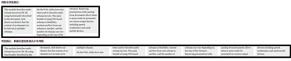
以下列出column运用的相关属性
1.column-width:<length> | auto 设置或检索对象每列的宽度
如:-moz-column-width:200px;
2.column-count:<integer> | auto 设置或检索对象的列数
如:-webkit-column-count:3;
3.column-gap:<length> | normal 设置或检索对象的列与列之间的间隙
如:column-gap:normal;column-gap:40px;
4.column-rule:[ column-rule-width ] || [ column-rule-style ] || [ column-rule-color ]设置或检索对象的列与列之间的边框。复合属性。相当于border属性
如:column-rule:10px solid #090;
5.column-span:none | all 设置或检索对象元素是否横跨所有列。
如:column-span:all;
6.column-fill:auto | balance 设置或检索对象所有列的高度是否统一。
auto:列高度自适应内容
balance:所有列的高度以其中最高的一列统一
如:column-fill:balance;
7.column-break-before:auto | always | avoid | left | right | page | column | avoid-page | avoid-column 设置或检索对象之前是否断行。
auto:既不强迫也不禁止在元素之前断行并产生新列
always:总是在元素之前断行并产生新列
avoid:避免在元素之前断行并产生新列
8.column-break-after:auto | always | avoid | left | right | page | column | avoid-page | avoid-column 设置或检索对象之后是否断行。
auto:既不强迫也不禁止在元素之后断行并产生新列
always:总是在元素之后断行并产生新列
avoid:避免在元素之后断行并产生新列
9.column-break-inside:auto | avoid | avoid-page | avoid-column 设置或检索对象内部是否断行。
auto:既不强迫也不禁止在元素内部断行并产生新列
avoid:避免在元素内部断行并产生新列
其实常用的也就前面5条。
CSS3布局之多列布局columns详解的更多相关文章
- CSS3之多列布局columns详解
CSS3之多列布局columns详解 CSS3提供了个新属性columns用于多列布局.基本属性如下: 1. columns: <'column-width'> || <'colum ...
- css常见的各种布局下----三列布局
css 三列布局,左右固定宽度右边自适应 1不使用定位,只使用浮动可以实现左右固定,中间宽度自适应布局 1.1.1 自适应部分一定要放第一个位子,使用浮动,并且设置宽度为100%,不设置浮动元素内容不 ...
- CSS布局之脱离文档流详解——浮动、绝对定位脱离文档流的区别
1.代码 (1)示例代码1 <!DOCTYPE html> <html lang="zh"> <head> <meta charset=& ...
- 160427、CSS3实战笔记--多列布局
通过阅读和学习书籍<CSS3实战>总结 <CSS3实战>/成林著.—北京机械工业出版社2011.5 多列布局适合纯文字版式设计,如报纸内和杂志类网页布局,不适合做网页结构布 ...
- bootstrap的栅格布局与两列布局结合使用
在工作中我们常常需要实现响应式布局,这个可以使用bootstrap的栅格系统来实现,我们在列里也需要实现一部分的响应式.比如下面的效果图,需要实现左边图标固定,右边的自适应 : 左边固定宽度,右边自适 ...
- css布局之两列布局
我们见过两列布局的网站也很多,不过这种两列布局的分为两种:自适应和固定宽度 1.自适应两列布局 <!DOCTYPE html> <html lang="en"&g ...
- CSS布局——横向两列布局
1.固定两栏布局,使用float,注意对紧邻元素清除浮动影响.IE6在使用float布局同时设置横行margin的情况下会有双边距BUG,解决方案是加入_display:inline 代码如下: &l ...
- ExtJS布局方式(layout)图文详解
Auto默认布局 不给下级组件指定大小和位置 Absolute绝对布局 可使用坐标(x.y)进行布局 Accordion手风琴布局 实现Accordion效果的布局,也可叫可折叠布局.也就是说使用该布 ...
- jqm的多列布局demo,html5的多列布局demo,多列布局的具体解说,html5开发实例具体解释
因为移动设备屏幕宽度较小,所以一般不建议使用多列布局.但有时你可能须要并排放置一些元素(如button之类的). jQuery Mobile通过约定的类名ui-grid来提供了一种基于css的多列布局 ...
- 慕课笔记利用css进行布局【三列布局】
三个div中间自适应,两侧固定大小 <html> <head> <title>三列布局</title> <style type="tex ...
随机推荐
- PHP判断访问系统的用户设备类型
当今的电子设备越来越多,我们在开发过程中往往也需要分析用户使用的电子设备类型.下面是采用PHP代码来获取用户使用的哪些类型的电子设备来访问自己的平台. /** * 用户设备类型 * @return s ...
- Linux 总是提示You have new mail in /var/spool/mail/root
解决办法: echo “unset MAILCHECK” >> /etc/profile source /etc/profile 这样就可以了!!!!!!!!!!
- python基础-字典(8)
一.字典介绍 字典和列表一样,也是存储多个数据的容器,只不过存储和读取的方式不同 字典的语法格式: 字典名 = {key1 : value1,key2:value2,key3:value3,……} 说 ...
- tensorflow 1.0 学习:卷积层
在tf1.0中,对卷积层重新进行了封装,比原来版本的卷积层有了很大的简化. 一.旧版本(1.0以下)的卷积函数:tf.nn.conv2d conv2d( input, filter, strides, ...
- 原生端与服务器通过sessionid实现session共享以及登录验证
注:原生端与服务器建立连接时产生的sessionid会变,跟上一次的不一样,为了保证sessionid一样,所以第一次服务器需要把sessionid返回给原生端,下一次与服务端会话时,原生端需要把这个 ...
- mysql 开发基础系列5 运算符
1. 算术运算符 2.比较运算符 注意NULL值不能用= 运算符 SELECT * FROM t WHERE c =NULL; -- 需要改成 SELECT * FROM t WHERE c IS N ...
- Vagrant Ansible Playbook 安装一群虚拟机
https://docs.ansible.com/ https://favoorr.github.io/2017/01/06/vagrant-virtualbox-vagrantfile-config ...
- 【Python开发】Python中数据分析环境的搭建
注:无论是任何一门语言,刚开始入门的时候,语言运行环境的搭建都是一件不轻松的事情. Python的运行环境 要运行或写Python代码,就需要Python的运行环境,主要的Python有以下三类: 原 ...
- Map<String, Object>转Object,Object转 Map<String, Object>
Map转Object import com.alibaba.fastjson.JSON; Map<String, Object> boneAgeOrderMap=boneAgeOrderS ...
- 里氏替换原则(LSP)
替换原则由MIT计算机科学实验室的Liskov女士在1987年的OOPSLA大会上的一篇文章中提出,主要阐述有关继承的一些原则,故称里氏替换原则. 2002年,Robert C.Martin出版了一本 ...