纯 CSS 画 iphone
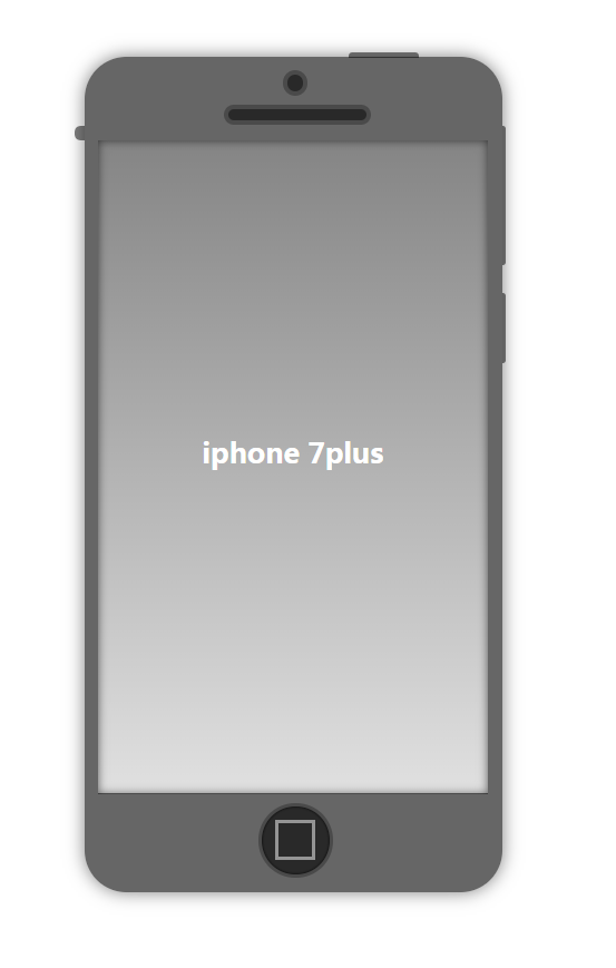
好几天没有更新了,直接上效果吧,哈哈!(我想这个应该大部分都会!哈哈哈!)
代码如下:
html:
<div class="container">

    <div class="round"></div>

    <div class="longround"></div>

    <div class="screen">iphone 7plus</div>

     <div class="home"></div>

</div>
css:
<style type="text/css">

        .container {

            width: 300px;

            height: 600px;

            background-color: rgba(0, 0, 0, .6);

            margin: 50px auto;

            border-radius: 30px;

            box-shadow: 0 0 20px rgba(0, 0, 0, .5);

            position: relative;

            z-index:;

        }

        .container::before {

            content: "";

            width: 3px;

            height: 50px;

            background: rgba(0, 0, 0, .5);

            position: absolute;

            top: 170px;

            left: 300px;

            border-radius: 0 4px 4px 0;

        }

        .container::after {

            content: "";

            width: 3px;

            height: 100px;

            background: rgba(0, 0, 0, .5);

            position: absolute;

            top: 50px;

            left: 300px;

            border-radius: 0 4px 4px 0;

        }

        .container .round {

            width: 12px;

            height: 12px;

            border: 3px solid #4a4a4a;

            background-color: rgba(0, 0, 0, .6);

            border-radius: 50%;

            position: absolute;

            left: 50%;

            top: 10px;

            margin-left: -7.5px;

        }

        .container .longround {

            position: absolute;

            width: 100px;

            height: 8px;

            border: 3px solid #4a4a4a;

            background-color: rgba(0, 0, 0, .6);

            border-radius: 30px;

            position: absolute;

            left: 50%;

            margin-left: -50px;

            top: 35px;

        }

        .container .screen {

            width: 280px;

            height: 470px;

            background: linear-gradient(to bottom, rgba(255, 255, 255, .2), rgba(255, 255, 255, .8));

            position: absolute;

            top: 60px;

            left: 50%;

            margin-left: -140px;

            color: #fff;

            text-align: center;

            font-weight: bold;

            font-size: 20px;

            line-height: 450px;

            box-shadow: 0 0 10px rgba(0, 0, 0, .6) inset;

        }

        .container .screen::before {

            content: "";

            width: 50px;

            height: 4px;

            background: rgba(0, 0, 0, .5);

            border-radius: 3px 3px 0 0;

            position: absolute;

            top: -63px;

            left: 180px;

        }

        .container .screen::after {

            content: "";

            width: 7px;

            height: 10px;

            background: rgba(0, 0, 0, .5);

            border-radius: 5px 0 0 5px;

            position: absolute;

            top: -10px;

            left: -17px;

        }

        .container .home {

            width: 50px;

            height: 50px;

            border-radius: 50%;

            background-color: rgba(0, 0, 0, .6);

            border: 2px solid #4a4a4a;

            position: absolute;

            bottom: 10px;

            left: 50%;

            margin-left: -25px;

            box-shadow: 0 0 2px black inset;

        }

        .container .home::before {

            content: "";

            width: 25px;

            height: 25px;

            background-color: transparent;

            border: 2px solid rgba(255, 255, 255, .5);

            position: absolute;

            left: 10px;

            top: 10px;

        }

</style>
大家一起努力吧!!
纯 CSS 画 iphone的更多相关文章
- 用纯css画个三角形
用纯css画个三角形以下是源代码: <!DOCTYPE html PUBLIC "-//W3C//DTD XHTML 1.0 Transitional//EN" " ...
- 纯css画三角形
纯css画三角形与border元素相关 设置border的属性 width: 100px; height: 100px; border-style: solid; border-width: 100p ...
- CSS之纯CSS画的基本图形(矩形、圆形、三角形、多边形、爱心、八卦等)
图形包括基本的矩形.圆形.椭圆.三角形.多边形,也包括稍微复杂一点的爱心.钻石.阴阳八卦等.当然有一些需要用到CSS3的属性,所以在你打开这篇文章的时候,我希望你用的是firefox或者chrome, ...
- 【原创】纯CSS画黄金梅丽号!
代码如下 <!DOCTYPE html> <!-- saved from url=(0055)http://jadyoap.bj.bcebos.com/ife%2FcssCatAni ...
- 纯CSS画的基本图形
图形包括基本的矩形.圆形.椭圆.三角形.多边形,也包括稍微复杂一点的爱心.钻石.阴阳八卦等.当然有一些需要用到CSS3的属性,所以在你打开这篇文章的时候,我希望你用的是firefox或者chrome, ...
- 用纯CSS画大白
纯CSS打造网页大白知识点: 首先要把大白分割,整体baymax中包含header(eye1,eye2,mouth),torso(heart),belly(cover),l-bigfinge ...
- 理解纯CSS画三角形
pure css draw a triangle code { display: inline-block; width: 300px; background-color: #E0E0E0 } .te ...
- 8.17 纯css画一个着重号图标
今天看到一个同事写的着重号图标,我以为是图片,仔细一看,是span标签!哇!!学习一下哈哈 图标长这样: CSS代码: .hint{ display: inline-block; width: 20p ...
- 纯css 画气泡
我们知道运用css可以绘画出各式各样的形状:三角形,圆形,正方形,椭圆形,平行四边形等等,而通过他们之间进行两两组合可以变换出各种意想不到的效果图,气泡框就是其中一个.最简单的气泡框就是一个矩形框+一 ...
随机推荐
- Ubuntu系统之Hadoop搭建
作业来源:https://edu.cnblogs.com/campus/gzcc/GZCC-16SE1/homework/3223 一.在Window中安装Oracle VM VirtualBox 二 ...
- vooya --- a YUV player and a generic raw data player
vooya是一个raw数据播放器,可播放yuv数据,兼容win.linex以及mac平台. 下载地址:https://www.offminor.de/(见最下面) ubuntu需要安装依赖: apt ...
- bash 重启后台程序脚本
kill -9 `cat pid` nohup python3 -u webserver.py & echo $! > pid
- 007 webpack基本的用法
1.安装node.js 因为webpack是基于node.js的 2.新建目录 3.需求 列表的隔行变色 4.初始化 在终端中使用npm init命令可以自动创建这个package.json文件 n ...
- [转]vue项目中 指令 v-html 中使用过滤器filters功能
转载于简书 链接:http://www.jianshu.com/p/29b7eaabd1ba 问题 2.0 filters only work in mustache tags and v-bind. ...
- Android 解读Event和Main Log
1 Android P EventLogTags文件 Android P 9.0.0 所有EventLogTags文件List: system/bt/EventLogTags.logtags syst ...
- Windows上python2和python3共存
1.找到python2安装目录 2.将应用程序中的python重命名为python2,或自行定义. 3.为python2设置系统变量中的path变量.注意,记得加上英文的分号. 验证:输入python ...
- jdk1.7 64位官方下载
平时要新装一个系统环境,或者下载最新的jdk,就需要到oracle官网去下载一个jdk,而目前生产环境都是1.7的环境下开发完成的,需要下载1.7版本的jdk,oracle官方网站的默认下载页面是1. ...
- VS2019/VS2017怎么更改visual studio新建项目的默认路径
1.点击“工具” 2.选择“选项” 3.点击左边的“项目和解决方案”展开选择“常规” 4.在右边- ”项目位置“来自定义默认路径 5.“确定”保存后下次新建项目就是此默认路径
- SpringBoot 的拦截器
首先注册我们要有完整的一个可以开始的开发环境 先自己创建一个配置类 InterceptorConfig, 实现springboot自带的拦截器接口 WebMvcConfigurer. package ...