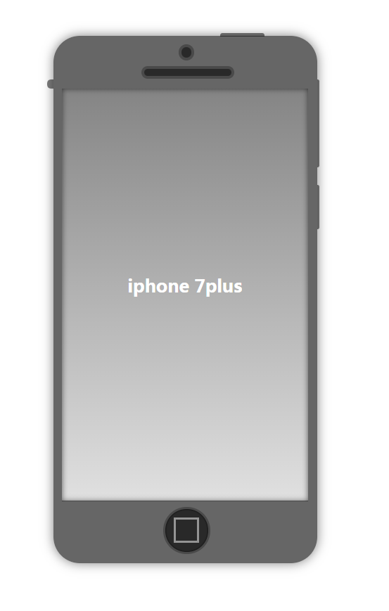
纯 CSS 画 iphone
好几天没有更新了,直接上效果吧,哈哈!(我想这个应该大部分都会!哈哈哈!)
代码如下:
html:
<div class="container">

    <div class="round"></div>

    <div class="longround"></div>

    <div class="screen">iphone 7plus</div>

     <div class="home"></div>

</div>
css:
<style type="text/css">

        .container {

            width: 300px;

            height: 600px;

            background-color: rgba(0, 0, 0, .6);

            margin: 50px auto;

            border-radius: 30px;

            box-shadow: 0 0 20px rgba(0, 0, 0, .5);

            position: relative;

            z-index:;

        }

        .container::before {

            content: "";

            width: 3px;

            height: 50px;

            background: rgba(0, 0, 0, .5);

            position: absolute;

            top: 170px;

            left: 300px;

            border-radius: 0 4px 4px 0;

        }

        .container::after {

            content: "";

            width: 3px;

            height: 100px;

            background: rgba(0, 0, 0, .5);

            position: absolute;

            top: 50px;

            left: 300px;

            border-radius: 0 4px 4px 0;

        }

        .container .round {

            width: 12px;

            height: 12px;

            border: 3px solid #4a4a4a;

            background-color: rgba(0, 0, 0, .6);

            border-radius: 50%;

            position: absolute;

            left: 50%;

            top: 10px;

            margin-left: -7.5px;

        }

        .container .longround {

            position: absolute;

            width: 100px;

            height: 8px;

            border: 3px solid #4a4a4a;

            background-color: rgba(0, 0, 0, .6);

            border-radius: 30px;

            position: absolute;

            left: 50%;

            margin-left: -50px;

            top: 35px;

        }

        .container .screen {

            width: 280px;

            height: 470px;

            background: linear-gradient(to bottom, rgba(255, 255, 255, .2), rgba(255, 255, 255, .8));

            position: absolute;

            top: 60px;

            left: 50%;

            margin-left: -140px;

            color: #fff;

            text-align: center;

            font-weight: bold;

            font-size: 20px;

            line-height: 450px;

            box-shadow: 0 0 10px rgba(0, 0, 0, .6) inset;

        }

        .container .screen::before {

            content: "";

            width: 50px;

            height: 4px;

            background: rgba(0, 0, 0, .5);

            border-radius: 3px 3px 0 0;

            position: absolute;

            top: -63px;

            left: 180px;

        }

        .container .screen::after {

            content: "";

            width: 7px;

            height: 10px;

            background: rgba(0, 0, 0, .5);

            border-radius: 5px 0 0 5px;

            position: absolute;

            top: -10px;

            left: -17px;

        }

        .container .home {

            width: 50px;

            height: 50px;

            border-radius: 50%;

            background-color: rgba(0, 0, 0, .6);

            border: 2px solid #4a4a4a;

            position: absolute;

            bottom: 10px;

            left: 50%;

            margin-left: -25px;

            box-shadow: 0 0 2px black inset;

        }

        .container .home::before {

            content: "";

            width: 25px;

            height: 25px;

            background-color: transparent;

            border: 2px solid rgba(255, 255, 255, .5);

            position: absolute;

            left: 10px;

            top: 10px;

        }

</style>
大家一起努力吧!!
纯 CSS 画 iphone的更多相关文章
- 用纯css画个三角形
用纯css画个三角形以下是源代码: <!DOCTYPE html PUBLIC "-//W3C//DTD XHTML 1.0 Transitional//EN" " ...
- 纯css画三角形
纯css画三角形与border元素相关 设置border的属性 width: 100px; height: 100px; border-style: solid; border-width: 100p ...
- CSS之纯CSS画的基本图形(矩形、圆形、三角形、多边形、爱心、八卦等)
图形包括基本的矩形.圆形.椭圆.三角形.多边形,也包括稍微复杂一点的爱心.钻石.阴阳八卦等.当然有一些需要用到CSS3的属性,所以在你打开这篇文章的时候,我希望你用的是firefox或者chrome, ...
- 【原创】纯CSS画黄金梅丽号!
代码如下 <!DOCTYPE html> <!-- saved from url=(0055)http://jadyoap.bj.bcebos.com/ife%2FcssCatAni ...
- 纯CSS画的基本图形
图形包括基本的矩形.圆形.椭圆.三角形.多边形,也包括稍微复杂一点的爱心.钻石.阴阳八卦等.当然有一些需要用到CSS3的属性,所以在你打开这篇文章的时候,我希望你用的是firefox或者chrome, ...
- 用纯CSS画大白
纯CSS打造网页大白知识点: 首先要把大白分割,整体baymax中包含header(eye1,eye2,mouth),torso(heart),belly(cover),l-bigfinge ...
- 理解纯CSS画三角形
pure css draw a triangle code { display: inline-block; width: 300px; background-color: #E0E0E0 } .te ...
- 8.17 纯css画一个着重号图标
今天看到一个同事写的着重号图标,我以为是图片,仔细一看,是span标签!哇!!学习一下哈哈 图标长这样: CSS代码: .hint{ display: inline-block; width: 20p ...
- 纯css 画气泡
我们知道运用css可以绘画出各式各样的形状:三角形,圆形,正方形,椭圆形,平行四边形等等,而通过他们之间进行两两组合可以变换出各种意想不到的效果图,气泡框就是其中一个.最简单的气泡框就是一个矩形框+一 ...
随机推荐
- 剑指offer:数组中的逆序对
题目描述: 在数组中的两个数字,如果前面一个数字大于后面的数字,则这两个数字组成一个逆序对.输入一个数组,求出这个数组中的逆序对的总数P.并将P对1000000007取模的结果输出. 即输出P%100 ...
- flowable表简要说明
1. Flowable数据库表命名规则 ACT_RE_* ’RE’表示repository(存储).RepositoryService接口操作的表.带此前缀的表包含的是静态信息,如,流程定义,流程的资 ...
- SQLSERVER教师学生成绩课程四表联合各种SQL考题
--CREATE DATABASE EXAM_1 --GO USE EXAM_1 --判断并删除表 IF OBJECT_ID('Scores') IS NOT NULL DROP TABLE Scor ...
- Python绘制3D图形
来自:https://www.jb51.net/article/139349.htm 3D图形在数据分析.数据建模.图形和图像处理等领域中都有着广泛的应用,下面将给大家介绍一下如何使用python进行 ...
- 创建批处理文件.bat文件(删除指定文件夹下的文件及文件夹并循环)
1.针对仅仅是删除文件夹下的文件的操作:使用del命令,单纯的删除文件操作,如下:del /f /s /q C:\Users\dell\AppData\Local\Temp\*.* 2.删除文件夹操作 ...
- beyond compare解决特殊字符无法输出、多sheet页无法对比以及文件太大超出系统内存问题的Excel转txt脚本
beyond compare解决特殊字符无法输出.多sheet页无法对比以及文件太大超出系统内存问题的Excel转txt脚本 ' XLS_to_CSV.vbs ' ' Converts an Exce ...
- ERROR: source database "template1" is being accessed by other users
一开始,开发童鞋说他在测试环境没有创建数据库的权限.心想,不对呀,开发环境没有怎么做权限管控,明明给予授权了.上来一看: postgres=# CREATE DATABASE "abce&q ...
- pytorch torch.backends.cudnn设置作用
cuDNN使用非确定性算法,并且可以使用torch.backends.cudnn.enabled = False来进行禁用 如果设置为torch.backends.cudnn.enabled =Tru ...
- python操作excel——openpyxl
一.概述 python操作excel各个库对比:https://www.cnblogs.com/paul-liang/p/9187503.html 官方文档:https://openpyxl.read ...
- 【翻译】Flink Table Api & SQL —— Table API
本文翻译自官网:Table API https://ci.apache.org/projects/flink/flink-docs-release-1.9/dev/table/tableApi.ht ...