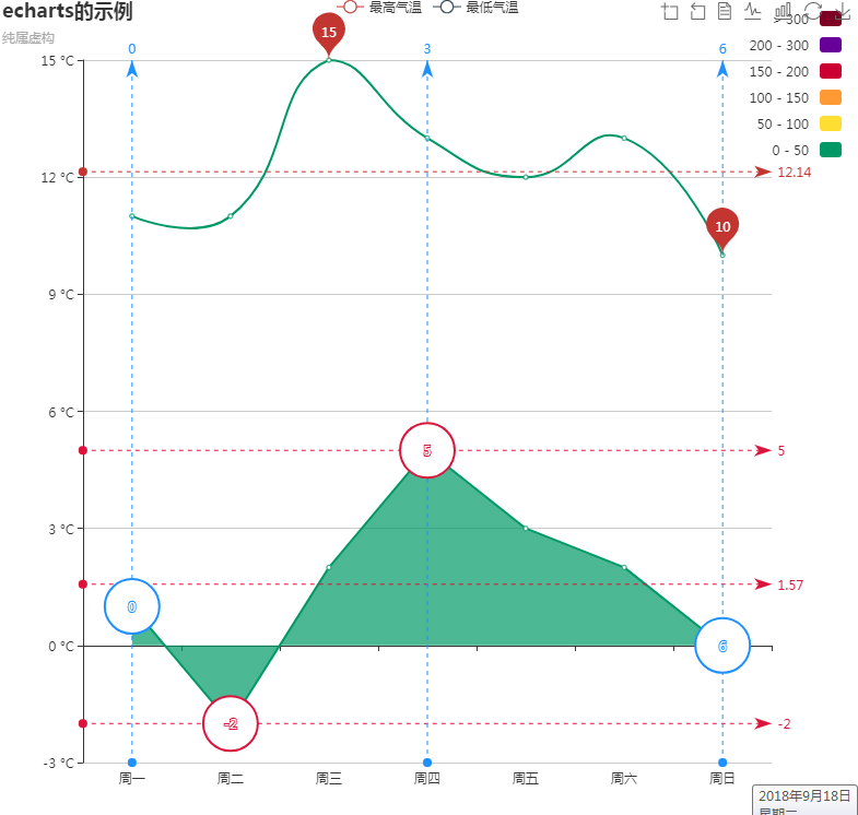
移动端写一个图表引用echarts,highcharts插件,本次要找一个能够显示最新数据的折线图,最后只找到显示最大值;
找到echarts的实例;记一下个各功能。
<!DOCTYPE html>
<html style="height: 100%">
<head>
<meta charset="utf-8">
<script type="text/javascript" src="echarts/echarts.min.js"></script>
<script type="text/javascript" src="echarts/echarts-gl.min.js"></script>
<script type="text/javascript" src="echarts/ecStat.min.js"></script>
<script type="text/javascript" src="echarts/dataTool.min.js"></script>
<script type="text/javascript" src="echarts/china.js"></script>
<script type="text/javascript" src="echarts/world.js"></script>
<!-- <script type="text/javascript" src="echarts/api.js"></script> -->
<script type="text/javascript" src="echarts/bmap.min.js"></script>
<script type="text/javascript" src="echarts/simplex.js"></script>
</head>
<body style="height: 100%; margin: 0">
<div id="container" style="height: 100%"></div>
<script type="text/javascript">
var dom = document.getElementById("container");
var myChart = echarts.init(dom);
var app = {};
option = null;
option = {
title: {
text: 'echarts的示例',//标题
subtext: '纯属虚构',//标题2
},
tooltip: {
trigger: 'axis',
},
legend: {
data: ['最高气温', '最低气温']
},
toolbox: {//控制上的小按钮
show: true,
feature: {
dataZoom: {
yAxisIndex: 'none'
},
dataView: { readOnly: false },
magicType: { type: ['line', 'bar'] },
restore: {},
saveAsImage: {}
}
},
xAxis: {
type: 'category',
boundaryGap: true,//控制是否靠边
data: ['周一', '周二', '周三', '周四', '周五', '周六', '周日']
},
yAxis: {
type: 'value',
axisLabel: {
formatter: '{value} °C'//y轴的单位
}
},
dataZoom: [{//滚动条
startValue: '2014-06-01',
show: false,//显示,隐藏滚动条;
}, {
type: 'inside'
}],
visualMap: {//控制折线曲线颜色
top: 10,
right: 10,
pieces: [{
gt: 0,
lte: 50,
color: '#096'
}, {
gt: 50,
lte: 100,
color: '#ffde33'
}, {
gt: 100,
lte: 150,
color: '#ff9933'
}, {
gt: 150,
lte: 200,
color: '#cc0033'
}, {
gt: 200,
lte: 300,
color: '#660099'
}, {
gt: 300,
color: '#7e0023'
}],
outOfRange: {
color: '#999'
}
},
series: [
{//第一条线
name: '最高气温',
type: 'line',
smooth: true,//尖锐、圆弧
data: [11, 11, 15, 13, 12, 13, 10],
markPoint: {//最大、小值汽泡
data: [
{ type: 'max', name: '最大值' },
{ type: 'min', name: '最小值' }
]
},
markLine: {
data: [
{ type: 'average', name: '平均值' }
]
}
},
{//第2条线
name: '最低气温',
type: 'line',
areaStyle: {},
data: [1, -2, 2, 5, 3, 2, 0],
markPoint: {
data: [
{ name: '周最低', value: -2, xAxis: 1, yAxis: -1.5 }
]
},
markPoint: {
data: [
// 纵轴,默认
{ type: 'max', name: '最大值',
symbol: 'emptyCircle',
itemStyle: {
normal: {
color: '#dc143c',
label: {
position: 'top'
}
}
}
},
{ type: 'min', name: '最小值',
symbol: 'emptyCircle',
itemStyle: {
normal: {
color: '#dc143c',
label: {
position: 'bottom'
}
}
}
},
// 横轴
{ type: 'max',
name: '最大值',
valueIndex: 0,
symbol: 'emptyCircle',
itemStyle: {
normal: {
color: '#1e90ff',
label: {
position: 'right'
}
}
}
},
{ type: 'min',
name: '最小值',
valueIndex: 0,
symbol: 'emptyCircle',
itemStyle: {
normal: {
color: '#1e90ff',
label: {
position: 'left'
}
}
}
}
]
},
markLine: {
data: [
// 纵轴,默认
{ type: 'max', name: '最大值', itemStyle: { normal: { color: '#dc143c' } } },
{ type: 'min', name: '最小值', itemStyle: { normal: { color: '#dc143c' } } },
{ type: 'average', name: '平均值', itemStyle: { normal: { color: '#dc143c' } } },
// 横轴
{ type: 'max', name: '最大值', valueIndex: 0, itemStyle: { normal: { color: '#1e90ff' } } },
{ type: 'min', name: '最小值', valueIndex: 0, itemStyle: { normal: { color: '#1e90ff' } } },
{ type: 'average', name: '平均值', valueIndex: 0, itemStyle: { normal: { color: '#1e90ff' } } }
]
}
},
],
markLine: {
data: [
{ type: 'average', name: '平均值' },
[{
symbol: 'none',
x: '90%',
yAxis: 'max'
}, {
symbol: 'circle',
label: {
normal: {
position: 'start',
formatter: '最大值'
}
},
type: 'max',
name: '最高点'
}]
]
},
}
;
if (option && typeof option === "object") {
myChart.setOption(option, true);
}
</script>
</body>
</html>
- echarts版本折线图
1.效果如下: 绘制折线图,应该算是说echarts中使用最简单也算使用频率最高的一种功能了吧.根据官网列子能找出规律,只是有些属性对于初接触者来说,会有点陌生,不过仔细阅读一下还是不 ...
- Echarts line折线图使用(vue)
实现 首先引入echarts工具 // vue文件中引入echarts工具 let echarts = require('echarts/lib/echarts') require('echarts/ ...
- ECharts使用—折线图动态加载
最近需求中用到折线图,单线条,多线交错,之前是散点图,用的是另一个 amcharts.js,这个文档也能找的到,回归早本次重点:ECharts 一.首先引入echarts.common.min.js文 ...
- echarts实现折线图
前端框架使用的angular,折线图使用echarts实现. 这里实现的折线图只是简单是折线图,折线图显示在table中,不需要xy轴的数据说明. 1. item.component.html < ...
- Echarts案例-折线图
一:先在官网下载 https://www.echartsjs.com/zh/download.html 然后再建立工程,导入这两个包: 写代码: <!DOCTYPE html> <h ...
- echarts自定义折线图横坐标时间间隔踩坑总结
折线图需求:横坐标为时间,要求按一定间隔展示,鼠标移至折线上间隔时间内的数据也可展示 其实很简单的一个配置就可搞定,但在不熟悉echarts配置的情况下,就很懵逼 xAxis: { boundaryG ...
- echarts之折线图介绍及使用
<!DOCTYPE html> <html lang="en"> <head> <meta charset="UTF-8&quo ...
- 使用Echarts实现折线图的一点总结
使用Echarts的一点总结 1.安装,我使用得vue cnpm install echarts --save 2.在入口文件main.js中注册,并使用 // 引入折线图 echarts impor ...
- ECharts绘制折线图
首先看实现好的页面 实现 首先引入echarts工具 // vue文件中引入echarts工具 let echarts = require('echarts/lib/echarts') require ...
随机推荐
- Linux下卸载安装jdk
1.检查一下系统中的jdk版本 [root@localhost software]# java -version 显示: openjdk version "1.8.0_102" O ...
- 什么时候删除指针后,要给指针赋NULL
删除后需要赋NULL: 1.当在一个类里的时候,删除类的某个成员对象,需要给它赋NULL,以防其他地方使用这个成员的时候,不知道这个成员是否存在 eg: ref1::ref1() { tPint = ...
- tomcat和eclipse-wtp的一些配置
TOMCAT配置UTF-8 server.xml配置文件: <Connector port="8080" protocol="HTTP/1.1" conn ...
- iOS源文件工程打包
第一步:添加开发者账号 第二步:刷新 第三步:设置证书名 第四步:Export
- UINavigationController 返回到各级目录
[self.navigationController popViewControllerAnimated:YES]; UINavigationController返回总结: 1.弹出当前视图控制器(弹 ...
- aptana studio 使用技巧整理
aptana studio 使用技巧整理 https://192.168.1.16/web/punica/adaptana studio 使用技巧整理http://uedfans.cn/ 推荐一个网站 ...
- 简单ATM机功能实现及感想
感想: 在那一天下午气喘吁吁的上了六楼 在建民的课上 都要带电脑 第一次上这样的课,每一次都是个段子 ,这一次考试是学前考试,什么也不知道 ,但是通过百度, 发现JAVA有很多还都和C语言相似的地方 ...
- leetcode986
class Solution: def judgeIntersection(self,a:'Interval',b:'Interval'): #返回值1,bool类型,是否有交集:True-有交集,F ...
- golang 操作redis 错误:failed redigo: unexpected type for String, got type int64
报错的代码: isExist,err := redis.String(conn.Do("EXISTS", key)) 这个操作返回的应该是bool类型,所有改成 isExist,e ...
- 基于Redis的Spring cache 缓存介绍
目录 Cache API及默认提供的实现 demo 依赖包安装 定义实体类.服务类和相关配置文件 Cache注解 启用Cache注解 @CachePut @CacheEvict @Cacheable ...