Android----Material Design之(FloatActionButton,CoordinatorLayout,CollapsingToolbarLayout,AppBarLayout,TabLayout等)
Material Design 的一些UI 平常开发还是用的比较多的,以前没写,最近总结一下,写一篇博客,要求版本在5.0以上。
主要介绍了FloatActionButton,CoordinatorLayout,CollapsingToolbarLayout,AppBarLayout,Toolbar,TabLayout,RecyclerView,CardView
案例中包含了这些的使用;
使用前在build.gradle 添加
    compile 'com.android.support:appcompat-v7:24.2.1'

    compile 'com.jaeger.statusbaruitl:library:1.1.1'

    compile 'com.android.support:design:24.2.+'

    compile 'com.android.support:cardview-v7:24.2.1'
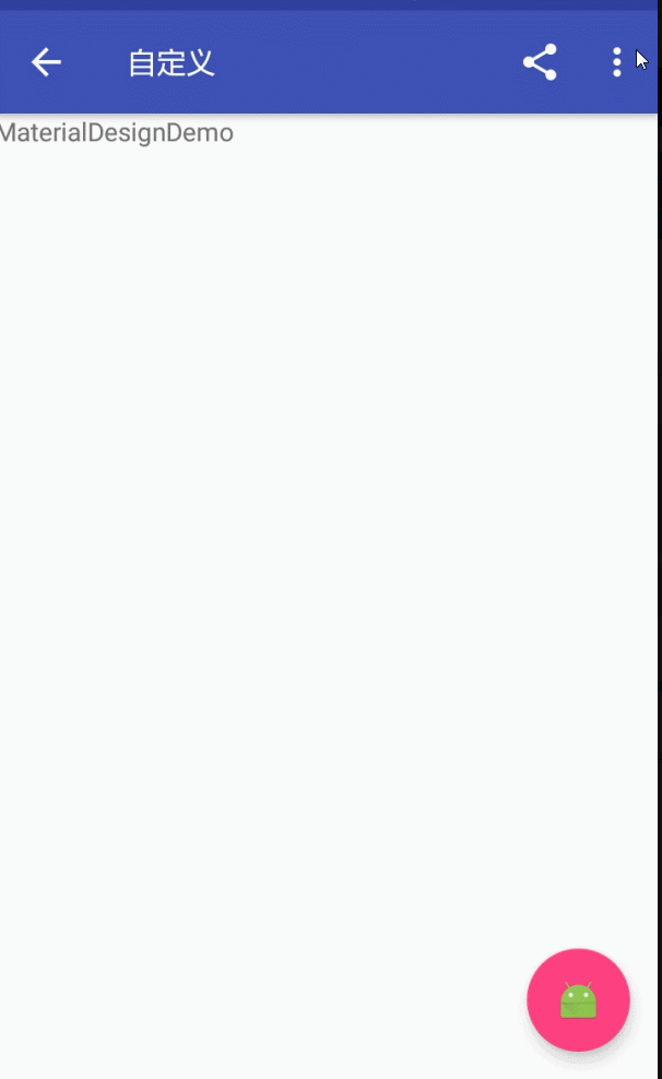
1:FloatActionButton(悬浮按钮)
FloatActionButton是ImageButton的继承类,其用法跟普通的Button基本类似,悬浮的效果,故其使用的重点其实是在布局上。
效果如图:
 <android.support.design.widget.FloatingActionButton

        android:id="@+id/fab"

        android:layout_width="wrap_content"

        android:layout_height="wrap_content"

        android:layout_margin="15dp"

        android:layout_gravity="bottom|right"

        app:fabSize="normal"

        app:elevation="6dp"

        android:src="@mipmap/ic_launcher"

        app:pressedTranslationZ="25dp"

        />
结合Snackbar使用
属性介绍:
1、app:borderWidth=""------------------边框宽度,通常设置为0 ,用于解决Android 5.X设备上阴影无法正常显示的问题
2、app:backgroundTint=""---------------按钮的背景颜色,不设置,默认使用theme中colorAccent的颜色
3、app:rippleColor=""--------------------点击的边缘阴影颜色
4、app:elevation=""----------------------边缘阴影的宽度
5、app:pressedTranslationZ="16dp"-----点击按钮时,按钮边缘阴影的宽度,通常设置比elevation的数值大
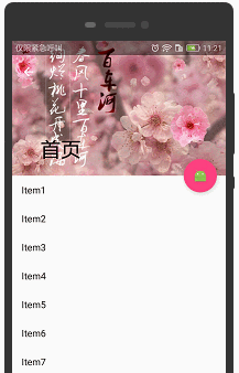
2:CoordinatorLayout+AppBarLayout+CollapsingToolbarLayout(工具栏伸缩折叠)
实现Material Design里折叠工具栏,它继承至FrameLayout,给它设置layout_scrollFlags,
它可以控制包含在CollapsingToolbarLayout中的控件(如:ImageView、Toolbar)在响应layout_behavior事件时作出相应的scrollFlags滚动事件(移除屏幕或固定在屏幕顶端)。
效果如图:
实现效果图的代码:
<?xml version="1.0" encoding="utf-8"?>

<android.support.design.widget.CoordinatorLayout xmlns:android="http://schemas.android.com/apk/res/android"

    xmlns:app="http://schemas.android.com/apk/res-auto"

    android:id="@+id/main_content"

    android:layout_width="match_parent"

    android:layout_height="match_parent"

    android:fitsSystemWindows="true">

    <android.support.design.widget.AppBarLayout

        android:id="@+id/appbar"

        android:layout_width="match_parent"

        android:layout_height="226dp"

        android:theme="@style/ThemeOverlay.AppCompat.Dark.ActionBar"

        android:fitsSystemWindows="true">

        <android.support.design.widget.CollapsingToolbarLayout

            android:id="@+id/collapsing_toolbar"

            android:layout_width="match_parent"

            android:layout_height="match_parent"

            app:layout_scrollFlags="scroll|exitUntilCollapsed"

            android:fitsSystemWindows="true"

            app:contentScrim="?attr/colorPrimary"

            app:expandedTitleMarginStart="48dp"

            app:expandedTitleMarginEnd="64dp">

            <ImageView

                app:layout_scrollFlags="scroll|enterAlways|enterAlwaysCollapsed"

                android:id="@+id/backdrop"

                android:layout_width="match_parent"

                android:layout_height="match_parent"

                android:scaleType="centerCrop"

                android:fitsSystemWindows="true"

                android:src="@mipmap/zhangwo_hometop1"

                app:layout_collapseMode="parallax"

                />

            <android.support.v7.widget.Toolbar

                android:id="@+id/toolbar"

                android:layout_width="match_parent"

                android:layout_height="?attr/actionBarSize"

                app:popupTheme="@style/ThemeOverlay.AppCompat.Light"

                app:layout_collapseMode="pin" />

        </android.support.design.widget.CollapsingToolbarLayout>

    </android.support.design.widget.AppBarLayout>

    <android.support.v4.widget.NestedScrollView

        android:layout_width="match_parent"

        android:layout_height="match_parent"

        app:layout_behavior="@string/appbar_scrolling_view_behavior">

        <android.support.v7.widget.RecyclerView

            android:id="@+id/recyclerView"

            android:layout_width="match_parent"

            android:layout_height="match_parent"

            android:scrollbars="none" />

    </android.support.v4.widget.NestedScrollView>

    <android.support.design.widget.FloatingActionButton

        android:id="@+id/fab"

        android:layout_height="wrap_content"

        android:layout_width="wrap_content"

        app:layout_anchor="@id/appbar"

        app:layout_anchorGravity="bottom|right|end"

        android:src="@mipmap/ic_launcher"

        android:layout_margin="15dp"

        android:clickable="true"/>

</android.support.design.widget.CoordinatorLayout>
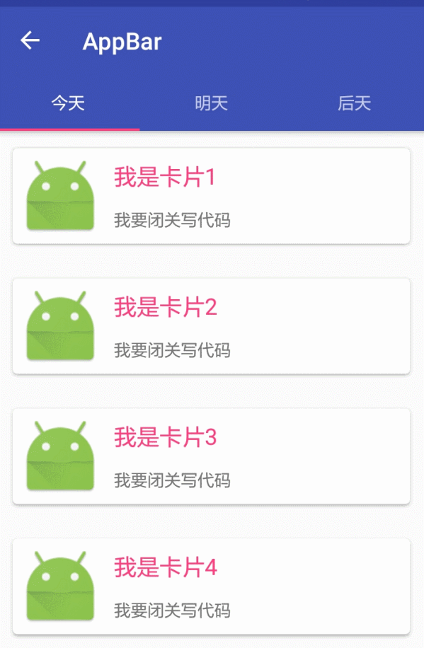
3:CoordinatorLayout+AppBarLayout+TabLayout(工具栏伸缩折叠)
CoordinatorLayout是support.design包中的控件,它可以说是Design库中最重要的控件,
CoordinatorLayout 实现了多种Material Design中提到的滚动效果。
效果图:
效果图布局
<?xml version="1.0" encoding="utf-8"?>

<android.support.design.widget.CoordinatorLayout xmlns:android="http://schemas.android.com/apk/res/android"

    xmlns:app="http://schemas.android.com/apk/res-auto"

    android:layout_width="match_parent"

    android:layout_height="match_parent"

    android:orientation="vertical">

    <android.support.design.widget.AppBarLayout

        android:layout_width="match_parent"

        android:layout_height="wrap_content"

        android:theme="@style/ThemeOverlay.AppCompat.Dark.ActionBar">

        <!--app:layout_scrollFlags

        1、scroll: 所有想滚动出屏幕的view都需要设置这个flag,

        没有设置这个flag的view将被固定在屏幕顶部。

        例如,TabLayout 没有设置这个值,将会停留在屏幕顶部。

        2、enterAlways: 设置这个flag时,向下的滚动都会导致该view变为可见,启用快速“返回模式”。

        3、enterAlwaysCollapsed: 当你的视图已经设置minHeight属性又使用此标志时,

        你的视图只能已最小高度进入,只有当滚动视图到达顶部时才扩大到完整高度。

        4、exitUntilCollapsed: 滚动退出屏幕,最后折叠在顶端。-->

        <android.support.v7.widget.Toolbar

            android:id="@+id/appbar_toolbar"

            app:layout_scrollFlags="scroll|enterAlways"

            app:popupTheme="@style/Theme.AppCompat.Light"

            android:layout_width="match_parent"

            android:layout_height="?attr/actionBarSize"

            android:background="?attr/colorPrimary" />

        <android.support.design.widget.TabLayout

            android:id="@+id/tabs"

            app:tabGravity="fill"

            app:tabMode="fixed"

            android:layout_width="match_parent"

            android:layout_height="wrap_content" />

    </android.support.design.widget.AppBarLayout>

    <android.support.v4.view.ViewPager

        android:id="@+id/viewpager"

        android:layout_width="match_parent"

        android:layout_height="match_parent"

        app:layout_behavior="@string/appbar_scrolling_view_behavior" />

    <!--三:滑动组件的动画,满一屏才有效果。

    app:layout_behavior=”@string/appbar_scrolling_view_behavior”

    -->

</android.support.design.widget.CoordinatorLayout>
其他相关请看博客:
Android之ToolBar和自定义ToolBar实现沉浸式状态栏
Android之新闻客服端顶部导航栏Tab点击和左右滑动实现切换界面
Android之侧滑菜单DrawerLayout的使用
Android之SwipeRefreshLayout下拉刷新组件
Android之 RecyclerView,CardView 详解和相对应的上拉刷新下拉加载
由于代码太多,就不一一贴出来了,源码直接下载即可
Android----Material Design之(FloatActionButton,CoordinatorLayout,CollapsingToolbarLayout,AppBarLayout,TabLayout等)的更多相关文章
- 【转】Material Design 折叠效果 Toolbar CollapsingToolbarLayout AppBarLayout
我非常喜欢Material Design里折叠工具栏的效果,bilibili Android客户端视频详情页就是采用的这种设计.这篇文章的第二部分我们就通过简单的模仿bilibili视频详情页的实现来 ...
- Android Material Design的FloatingActionButton,Snackbar和CoordinatorLayout
如果是为了兼容低版本的Android系统,则需要引用Android Material Design的扩展支持库,我在之前的一篇文章张,较为详细的说明了如何导入Android Material Desi ...
- Android Material Design 兼容库的使用
Android Material Design 兼容库的使用 mecury 前言:近来学习了Android Material Design 兼容库,为了把这个弄懂,才有了这篇博客,这里先推荐两篇博客: ...
- Android Material Design Ripple Effect在Android5.0(SDK=21)以下Android版本崩溃问题解决
Android Material Design Ripple Effect在Android5.0(SDK=21)以下Android版本崩溃问题解决 附录1的Android Ripple Effect水 ...
- Android Material Design : Ripple Effect水波波纹荡漾的视觉交互设计
Android Material Design : Ripple Effect水波波纹荡漾的视觉交互设计 Android Ripple Effect波纹荡漾效果,是Android Materia ...
- MaterialEditText——Android Material Design EditText控件
MaterialEditText是Android Material Design EditText控件.可以定制浮动标签.主要颜色.默认的错误颜色等. 随着 Material Design 的到来, ...
- Android Material Design控件学习(三)——使用TextInputLayout实现酷市场登录效果
前言 前两次,我们学习了 Android Material Design控件学习(一)--TabLayout的用法 Android Material Design控件学习(二)--Navigation ...
- Android material design support library -- CollapsingToolbarLayout简介
本文是codetrick上material design support library教程的第三篇,主要讲的是CollapsingToolbarLayout的概念和应用方法. 原文链接:Materi ...
- Android Material Design之CollapsingToolbarLayout使用
CollapsingToolbarLayout作用是提供了一个可以折叠的Toolbar,它继承至FrameLayout,给它设置layout_scrollFlags,它可以控制包含在Collapsin ...
- Android Material Design:基于CoordinatorLayout实现向上滚动导航条ToolBar滚出、向下滚动导航条滚出
activity_main.xml: <android.support.design.widget.CoordinatorLayout xmlns:android="http://sc ...
随机推荐
- lnmp1.4环境下thinkphp3.2配置pathinfo模式
1.打开php.ini 通常该文件在 /usr/local/php/etc/php.ini vi /usr/local/php/etc/php.ini 找到 cgi.fix_pathinfo,默认为0 ...
- PAT 1038 Recover the Smallest Number[dp][难]
1038 Recover the Smallest Number (30 分) Given a collection of number segments, you are supposed to r ...
- PageObject模式的层次结构
做过UI自动化的都晓得,在做UI自动化时定位特别依赖页面,一旦页面发生变更就不得不跟着去修改页面定位. 在webdriver中,假设你想对一个元素定位操作,那么你可能会编写下面的代码: driver. ...
- XDU 1037 倍流畅序列(字符串匹配+贪心)
题目描述 对于一个0,1串s, 从左端开始读取它的0获得序列s0,从右端开始读取它的1获得s1,如果s0与s1同构,则称s为倍流畅序列.例如:011001是一个倍流畅序列, 因为:s0 = 0__00 ...
- webpack.dev.conf.js详解
转载自:https://www.cnblogs.com/ye-hcj/p/7087205.html webpack.dev.conf.js详解 //引入当前目录下的utils.js文件模块var ut ...
- dp的简单递推笔记1
(1)转自rockZ的博文 UVa 10328 - Coin Toss (递推) 题意:给你一个硬币,抛掷n次,问出现连续至少k个正面向上的情况有多少种. 原题中问出现连续至少k个H的情况,很难下手. ...
- spark-sql做ETL时遇到的两个问题
项目中使用spark-sql来作ETL,遇到两个问题,记录一下. 问题1: spark-sql –master yarn –hiveconf load_date=`date –d ..` -e 'i ...
- git 移除某个文件的版本管理
1:最简单的,在项目刚创建的时候,在根目录的.gitignore,加入该文件的相对路径 2:已经被纳入到了版本控制,使用在当前目录下,打开cmd窗口 输入rm命令,加上文件的绝对路径(相对路径没试过) ...
- linux下创建用户,给用户设置密码,给用户授权
1.linux下的用户是属于组的,所以需要创建一个组,划分给用户.创建命令: 在root下执行 groupadd ver 创建一个组ver 2.创建用户 useradd ...
- java 与C# 时间格式 交互
方法一 C#端代码 IsoDateTimeConverter convert = new IsoDateTimeConverter(); string ret = JsonConvert.Serial ...