css3学习笔记(一)
1. IE下的渐变: filter:progid:DXImageTransform.Microsoft.gradient(startColorstr='#ffffff',endColorstr='#ff0000',GradientType='0');
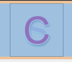
2.多背景:background:url(Images/c.png) no-repeat 0 0,url(Images/s-1.png) no-repeat 0 0;
<!DOCTYPE html>

<html xmlns="http://www.w3.org/1999/xhtml">

<head>

<meta http-equiv="Content-Type" content="text/html; charset=utf-8"/>

    <title></title>

    <style>

        .box

        {

            width:170px; height:170px; margin:0 auto; border:1px solid #000; background:url(Images/c.png) no-repeat 0 0,url(Images/s-1.png) no-repeat 0 0; -webkit-transition:1s all ease; /*后一个背景又叠加在前一个的下边*/

        }

            .box:hover

            {

                background-position:-170px -170px,0 0;

            }

    </style>

</head>

<body>

    <div class="box"></div>

</body>

</html>

<!DOCTYPE html>

<html xmlns="http://www.w3.org/1999/xhtml">

<head>

<meta http-equiv="Content-Type" content="text/html; charset=utf-8"/>

    <title></title>

    <style>

        body

        {

            background:#000;

        }

        .box

        {

           width:738px; text-align:center; font-weight:bold; margin:0 auto; font-size:100px; font-family:'Microsoft YaHei'; color:rgba(255,255,255,0.2);

           background:-webkit-linear-gradient(-30deg,rgba(255,255,255,0.1) 10%,rgba(255,255,255,1) 20%,rgba(255,255,255,0) 30%); -webkit-background-clip:text; -webkit-transition:1s linear all;

        }

        .box:hover

        {

                background-position:500px 0;

        }

    </style>

</head>

<body>

    <div class="box">人气不过肥皂泡</div>

</body>

</html>
3.rgba:
background:rgba(0,0,0,0.4);
4.背景图裁切 background-clip

<!DOCTYPE html>

<html xmlns="http://www.w3.org/1999/xhtml">

<head>

<meta http-equiv="Content-Type" content="text/html; charset=utf-8"/>

    <title></title>

    <style>

        .box

        {

            width:500px; height:200px; background:url(Images/a4.jpg); border:20px solid rgba(0,0,0,0.3); padding:20px;margin:0 auto; font-size:80px; font-family:"Microsoft YaHei";font-weight:bold; color:rgba(0,0,0,0.1); -webkit-background-clip:text; -webkit-transition:1s background-position linear;

        }

            .box:hover

            {

                background-position:0 1000px;

            }

    </style>

</head>

<body>

    <div class="box">

        我们都没错,只是不适合!

    </div>

</body>

</html>
5.背景图大小设置 background-size:20px 20px;
<!DOCTYPE html>

<html xmlns="http://www.w3.org/1999/xhtml">

<head>

<meta http-equiv="Content-Type" content="text/html; charset=utf-8"/>

    <title></title>

    <style>

        .box

        {

            width:800px;height:300px; margin:0 auto; background:url(Images/new_bg.png) no-repeat center; border:1px solid #000; background-size:20px 20px; -webkit-transition:1s all linear;

        }

        .box:hover

        {background-size:200px 200px;

        }

    </style>

</head>

<body>

    <div class="box"></div>

</body>

</html>
例:背景全屏固定显示: body{margin:0;height:1000px;background:url(miaov.png) no-repeat fixed; background-size:100% 100%;}
6.背景图原点设置
background-origin:content-box;
7.盒模型阴影 box-shadow:10px 10px 10px 4px rgba(0,0,0,0.8);
<!DOCTYPE html>
<html xmlns="http://www.w3.org/1999/xhtml">
<head>
<meta http-equiv="Content-Type" content="text/html; charset=utf-8"/>
<title></title>
<style>
.box
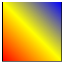
{
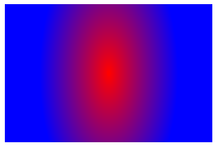
width:200px; height:200px; border:1px solid #000; background:-webkit-linear-gradient(45deg,red 0%,yellow 50%,blue 100%);/*角度是逆时针的*/
}
</style>
</head>
<body>
<div class="box"></div>
</body>
</html>
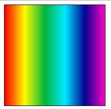
例2:-webkit-repeating-linear-gradient()
<!DOCTYPE html>

<html xmlns="http://www.w3.org/1999/xhtml">

<head>

<meta http-equiv="Content-Type" content="text/html; charset=utf-8"/>

    <title></title>

    <style>

        .box

        {

            width:200px; height:200px; border:1px solid #000; background:-webkit-repeating-linear-gradient(left,#f00,#fffc00,#01b439,#00eaff,#000390,#ff00c6),

        }

    </style>

</head>

<body>

    <div class="box"></div>

</body>

</html>
9.渐变配合背景 background:-webkit-linear-gradient(left top,#fff 0%,rgba(255,255,255,0) 40%,rgba(255,255,255,0) 50%,rgba(255,255,255,1) 50%,rgba(255,255,255,1) 60%,rgba(255,255,255,0) 60%,rgba(255,255,255,0) 70%,rgba(255,255,255,1) 70%),url(Images/new_bg.png) no-repeat;

<!DOCTYPE html>

<html xmlns="http://www.w3.org/1999/xhtml">

<head>

<meta http-equiv="Content-Type" content="text/html; charset=utf-8"/>

    <title></title>

    <style>

        .box

        {

            width:440px; height:300px; background:-webkit-linear-gradient(left top,#fff 0%,rgba(255,255,255,0) 40%,rgba(255,255,255,0) 50%,rgba(255,255,255,1) 50%,rgba(255,255,255,1) 60%,rgba(255,255,255,0) 60%,rgba(255,255,255,0) 70%,rgba(255,255,255,1) 70%),url(Images/new_bg.png) no-repeat;

        }

    </style>

</head>

<body>

    <div class="box"></div>

</body>

</html>
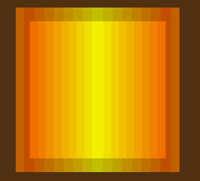
10.渐变旋转 background:-webkit-linear-gradient(0deg,#ff6e02 0%,#fffc00 50%,#ff6e02 100%);
<!DOCTYPE html>

<html xmlns="http://www.w3.org/1999/xhtml">

<head>

<meta http-equiv="Content-Type" content="text/html; charset=utf-8"/>

    <title></title>

    <style>

        body{background:#5e3612;}

        #box

        {

            width:200px; height:200px;margin:30px auto; border:20px solid rgba(0,0,0,0.2); background:-webkit-linear-gradient(0deg,#ff6e02 0%,#fffc00 50%,#ff6e02 100%);

        }

    </style>

    <script>

        window.onload = function () {

            var oBox = document.getElementById("box");

            oBox.iDeg = 0;

            oBox.onmouseover = function () {

                move(oBox, 360);

            }

            oBox.onmouseout = function () {

                move(oBox, 0);

            }

        }

        function move(obj, iTarget) {

            if (obj.timer) {

                clearInterval(obj.timer);

            }

            if (iTarget > obj.iDeg) {

                var iSpeed = 5;

            }

            else {

                var iSpeed = -5;

            }

            obj.timer = setInterval(function () {

                if (obj.iDeg == iTarget) {

                    clearInterval(obj.timer);

                }

                else {

                    obj.iDeg += iSpeed;

                    obj.style.background = "-webkit-linear-gradient(" + obj.iDeg + "deg,#ff6e02 0%,#fffc00 50%,#ff6e02 100%)";

                }

            }, 14);

        }

    </script>

</head>

<body>

    <div id="box"></div>

</body>

</html>


css3学习笔记(一)的更多相关文章
- CSS3学习笔记(3)-CSS3边框
p{ font-size: 15px; } .alexrootdiv>div{ background: #eeeeee; border: 1px solid #aaa; width: 99%; ...
- CSS3学习笔记之linear-gradient
我觉得CSS3很不错,自己也稍微看过,并且尝试过一些属性.对我自己而言,我没有勇气说我学过CSS3,我觉得任何自己看来很小的事情,也只是站在自己的角度来评判.就算的是"简单的"HT ...
- CSS3学习笔记1-选择器和新增属性
前言:之前自学了一些关于CSS3的知识,在学习过程中也遇到过坑,不过总算磕磕绊绊的学习完了关于CSS3的相关知识,于是最近把之前的笔记和代码整理了一下,也算是一个对CSS3知识的回顾复习吧,也希望能够 ...
- 十天精通CSS3学习笔记 part4
CSS3中的变形与动画(下) CSS3 Keyframes介绍 Keyframes 被称为关键帧,其类似于Flash中的关键帧.在CSS3中其主要以"@keyframes"开头,后 ...
- HTML5+CSS3学习笔记(二) 页面布局:HTML5新元素及其特性
HTML5的语义化标签以及属性,可以让开发者非常方便地实现清晰的web页面布局,加上CSS3的效果渲染,快速建立丰富灵活的web页面显得非常简单. 本次学习HTML5的新标签元素有: <head ...
- HTML5+CSS3学习笔记(一)
HTML5+CSS3概述 HTML5和CSS3不仅仅是两项新的Web技术标准,更代表了下一代HTML和CSS技术.虽然HTML5的标准规范还没有正式发布,但是未来的发展前景已经可以预见,那就是HTML ...
- CSS3学习笔记——伪类hover
最近看到一篇文章:“Transition.Transform和Animation使用简介及应用展示” ,想看看里面 “不同缓动类效果demo”例子的效果,发现了一个问题如下: .Trans_Bo ...
- css3学习笔记三
css3有些特殊的元素选择器这和jquery相似.效果图如下
- 我的CSS3学习笔记
1.元字符使用: []: 全部可选项 ||:并列 |:多选一 ?: 0个或者一个 *:0个或者多个 {}: 范围 2.CSS3属性选择器: E[attr]:存在attr属性即可: E[attr=val ...
- HTML5+CSS3学习笔记(一) 概述
HTML5+CSS3概述 HTML5和CSS3不仅仅是两项新的Web技术标准,更代表了下一代HTML和CSS技术.虽然HTML5的标准规范还没有正式发布,但是未来的发展前景已经可以预见,那就 ...
随机推荐
- HttpServletRequest和HttpServletResponse详解
请求与响应相关的类和接口非常多,下表是主要的与请求和接口相关的类以及接口. 主要的与请求和接口相关的类及接口 方 法 说 明 ServletInputStream Servlet的输入流 ...
- SVG路径字符串格式
命令 名称 参数 M 移动到(moveTo) (x y)+ Z 闭合路径(closepath) (none) L 直线(lineTo) (x y)+ H 水平直线 x+ V 垂直直线 y+ C 曲线( ...
- Python工作日类库Busines Holiday介绍
引言: 在日常工作中.常常会碰到相似的场景.须要计算在某个时间段内的工作日以及确定某天是否为工作日,这里的介绍的工具包将很好的解决问题. 1. 工具包Business Holiday介绍 其提供了很e ...
- Apple 远程推送APNS 服务
APP注册APNS流程 http://mobiforge.com/design-development/programming-apple-push-notification-services 服务器 ...
- EditText输入为空button不可点击搜索
一丶任务详情 二丶改动后演示效果 三丶改动过程 分析:非常明显这里是须要监听EditText,推断输入字符串长度是否不为0来改变Button样式 首先的屡清楚代码逻辑在适当的位子加监听推断是最好的处理 ...
- Reading assignments in science
First, get a perspective: Review the assignment in the syllabus and any handouts (1-2 minutes)Maybe ...
- ubuntu 改动 ls 下的文件夹颜色
ubuntu 下, ls 显示的文件夹的颜色,怎么说呢,看起来太费劲了. 于是想着改动成easy识别的颜色. 于是搜索了一下. 这里列举三个搜到的教程吧. 简单说我按这上面的方法做了,然后都失败了. ...
- java String->float,float->int
类型转换代码 : String sourceStr = "0.0"; String类型 float sourceF = Float.valueOf(sourceStr); floa ...
- hibernate 关系映射之 双向外键关联一对一
在上一篇博客内容的基础上做了以下修改,即可实现. 注解方式: package com.bjsxt.hibernate; import javax.persistence.Entity; imp ...
- 安装Drupal7.12升级至7.22
怀揣着为中小企业量身定做一整套开源软件解决方案的梦想开始了一个网站的搭建.http://osssme.org/ [2013-08-11] 资料更新,Drupal 7.22升级至7.23 访问自己的Dr ...