
炫酷实用的CSS3代码垂直手风琴菜单
今天在微博上看到别人分享的代码,自己拿来自己保存着。
代码效果如下:
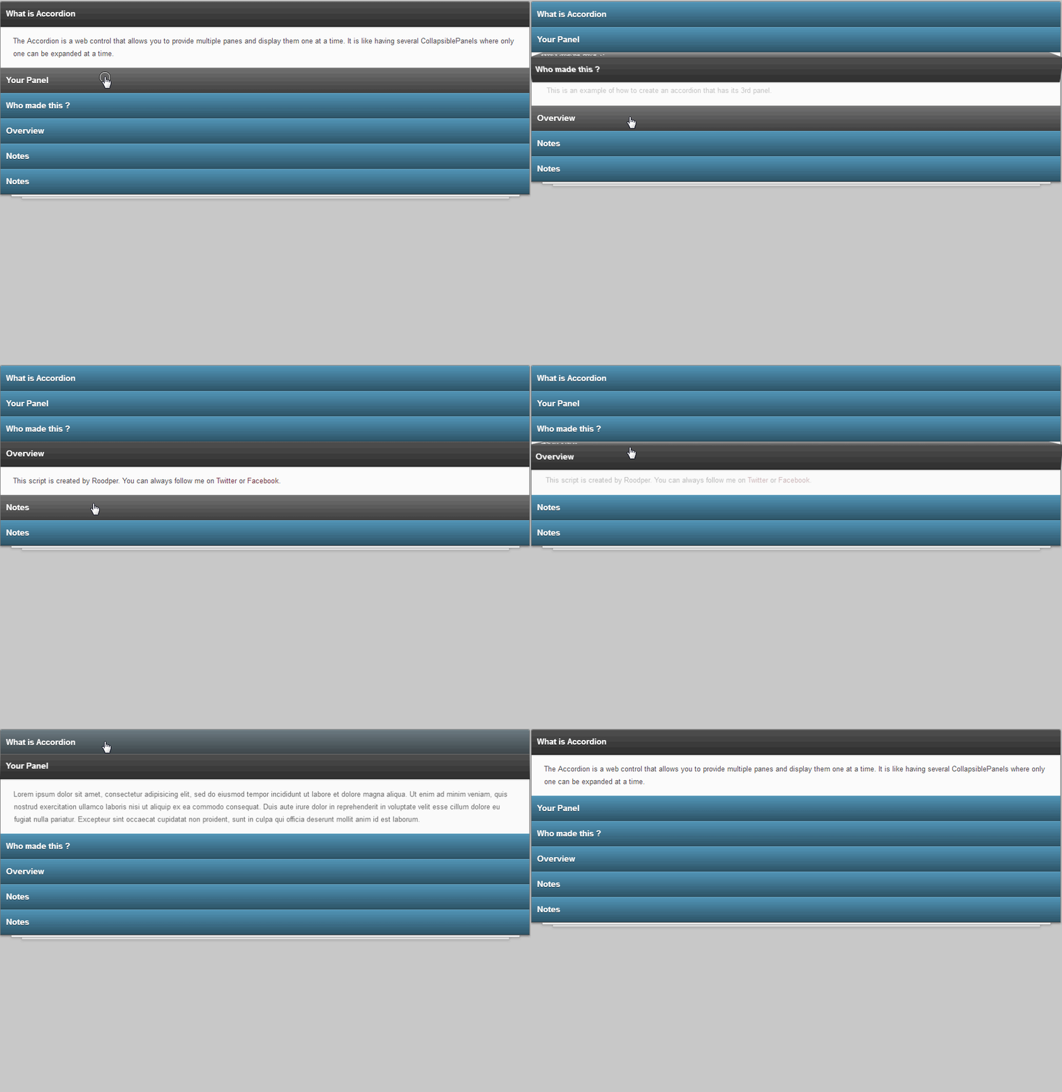
下面是源码:
index.html
<!DOCTYPE html>

<html >

<head>

  <meta charset="UTF-8">

  <title>炫酷实用的CSS3 3D垂直手风琴菜单DEMO演示</title>

  <link rel="stylesheet" href="css/style.css">

</head>

<body>

<div class="content">

<div style="text-align:center;clear:both">

</div>

<section>

    <ul class="container anim-label-4 anim-art ">

        <li><input type="radio" id="ac-1" name="ac-3D" checked="checked"/><label for="ac-1" onclick="" title="What is Accordion">What is Accordion</label><article><p>The Accordion is a web control that allows you to provide multiple panes and display them one at a time. It is like having several CollapsiblePanels where only one can be expanded at a time.</p></article></li>

        <li><input type="radio" id="ac-2" name="ac-3D" /><label for="ac-2" onclick="" title="Your Panel">Your Panel</label><article><p>Lorem ipsum dolor sit amet, consectetur adipisicing elit, sed do eiusmod tempor incididunt ut labore et dolore magna aliqua. Ut enim ad minim veniam, quis nostrud exercitation ullamco laboris nisi ut aliquip ex ea commodo consequat. Duis aute irure dolor in reprehenderit in voluptate velit esse cillum dolore eu fugiat nulla pariatur. Excepteur sint occaecat cupidatat non proident, sunt in culpa qui officia deserunt mollit anim id est laborum.</p></article></li>

        <li><input type="radio" id="ac-3" name="ac-3D" /><label for="ac-3" onclick="" title="Who made this ?">Who made this ?</label><article><p>This is an example of how to create an accordion that has its 3rd panel.</p></article></li>

        <li><input type="radio" id="ac-4" name="ac-3D" /><label for="ac-4" onclick="" title="Overview">Overview</label><article><p>This script is created by Roodper. You can always follow me on <a href="https://twitter.com/#!/roodper">Twitter</a> or <a href="https://www.facebook.com/Roodper">Facebook</a>.</p></article></li>

        <li><input type="radio" id="ac-5" name="ac-3D" /><label for="ac-5" onclick="" title="Notes">Notes</label><article><p>Remember this is just an example. There are more option and features are available in full version.</p><p>Check out video embedding inside accordion panel.</p><p><iframe width="100%" height="315" src="https://www.youtube.com/embed/k3L7pwrE-tw" frameborder="0" allowfullscreen></iframe></p></article></li>

        <li><input type="radio" id="ac-6" name="ac-3D" /><label for="ac-6" onclick="" title="Notes">Notes</label><article><p>Remember this is just an example. There are more option and features are available in full version.</p><p>Check out video embedding inside accordion panel.</p><p><iframe width="100%" height="315" src="https://www.youtube.com/embed/k3L7pwrE-tw" frameborder="0" allowfullscreen></iframe></p></article></li>

    </ul>

</section>

</div>

</body>

</html>
下面是样式文件:
style.css
html,body,div,span,applet,object,iframe,h1,h2,h3,h4,h5,h6,p,blockquote,pre,a,abbr,acronym,address,big,cite,code,del,dfn,em,img,ins,kbd,q,s,samp,small,strike,strong,sub,sup,tt,var,b,u,i,center,dl,dt,dd,ol,ul,li,fieldset,form,label,legend,table,caption,tbody,tfoot,thead,tr,th,td,article,aside,canvas,details,embed,figure,figcaption,footer,header,hgroup,menu,nav,output,ruby,section,summary,time,mark,audio,video{margin:;padding:;border:;font-size:100%;font:inherit;vertical-align:baseline}article,aside,details,figcaption,figure,footer,header,hgroup,menu,nav,section{display:block}

body{line-height:}

ol,ul{list-style:none}html{}body{background-image:url(data:image/png;);font:14px/21px "HelveticaNeue","Helvetica Neue",Helvetica,Arial,sans-serif;color:#444;-webkit-font-smoothing:antialiased;-webkit-text-size-adjust:100%}.content{background-image:-webkit-gradient(radial,50% 100%,100,50% -50%,100,from(rgba(200,200,200,1.00)),to(rgba(209,209,209,0.00)));background-image:-webkit-radial-gradient(50% 0,rgba(209,209,209,0.00),rgba(200,200,200,1.00));background-image:-moz-radial-gradient(50% 0,rgba(209,209,209,0.00),rgba(200,200,200,1.00));background-image:-ms-radial-gradient(50% 0,rgba(209,209,209,0.00),rgba(200,200,200,1.00));background-image:radial-gradient(50% 0,rgba(209,209,209,0.00),rgba(200,200,200,1.00));height:100%;width:100%;position:absolute;overflow:auto}footer{width:100%;height:30px;top:100px;position:relative;text-align:center;color:#797979}

ul.container{top:20px;margin:0 auto;width:50%;position:relative;padding:;background:#fbfbfb;border:1px solid #7d7d7d;border-bottom:;list-style:none;z-index:;display:block;border-radius:3px 3px 0 0;-webkit-border-radius:3px 3px 0 0;-moz-border-radius:3px 3px 0 0;-o-border-radius:3px 3px 0 0;-ms-border-radius:3px 3px 0 0;-khtml-border-radius:3px 3px 0 0;box-shadow:0 2px 5px rgba(0,0,0,0.28);-webkit-box-shadow:0 2px 5px rgba(0,0,0,0.28);-moz-box-shadow:0 2px 5px rgba(0,0,0,0.28);-o-box-shadow:0 2px 5px rgba(0,0,0,0.28);-ms-box-shadow:0 2px 5px rgba(0,0,0,0.28);-khtml-box-shadow:0 2px 5px rgba(0,0,0,0.28)}ul.container:after,ul.container:before{content:'';width:96%;height:96%;position:absolute;left:2%;z-index:-1;bottom:-4px;background:#f2f2f2;border:1px solid #a1a1a1;box-shadow:0 2px 4px rgba(0,0,0,0.13);-webkit-box-shadow:0 2px 4px rgba(0,0,0,0.13);-moz-box-shadow:0 2px 4px rgba(0,0,0,0.13);-o-box-shadow:0 2px 4px rgba(0,0,0,0.13);-ms-box-shadow:0 2px 4px rgba(0,0,0,0.13);-khtml-box-shadow:0 2px 4px rgba(0,0,0,0.13)}ul.container:before{width:92%;bottom:-8px;left:4%;background:#f2f2f2;border:1px solid #b9b9b9}ul.container li{background:#fbfbfb}.container li label{display:block;color:white;padding:10px;cursor:pointer;font-family:Arial,Helvetica,sans-serif;font-size:15px;font-weight:bold;position:relative;z-index:;line-height:26px;text-shadow:0 1px 0 rgba(0,0,0,0.6);background-color:#5ba6cc;-webkit-touch-callout:none;-webkit-user-select:none;-khtml-user-select:none;-moz-user-select:none;-ms-user-select:none;user-select:none;transition:background-color .17s ease;-webkit-transition:background-color .17s ease;-moz-transition:background-color .17s ease;-o-transition:background-color .17s ease;-ms-transition:background-color .17s ease}.container li label,.container.anim-label-4 li label:before{background-image:-webkit-gradient(linear,left top,left bottom,from(rgba(0,0,0,0.10)),to(rgba(0,0,0,0.50)));background-image:-webkit-linear-gradient(top,rgba(0,0,0,0.10),rgba(0,0,0,0.50));background-image:-moz-linear-gradient(top,rgba(0,0,0,0.10),rgba(0,0,0,0.50));background-image:-o-linear-gradient(top,rgba(0,0,0,0.10),rgba(0,0,0,0.50));background-image:-ms-linear-gradient(top,rgba(0,0,0,0.10),rgba(0,0,0,0.50));background-image:linear-gradient(top,rgba(0,0,0,0.10),rgba(0,0,0,0.50));filter:progid:DXImageTransform.Microsoft.gradient(GradientType=0,StartColorStr='#000000',EndColorStr='#000000');box-shadow:inset 0 1px 0 rgba(255,255,255,0.16),inset 0 -1px 0 rgba(0,0,0,0.25),0 2px 0 rgba(0,0,0,0.1);-webkit-box-shadow:inset 0 1px 0 rgba(255,255,255,0.16),inset 0 -1px 0 rgba(0,0,0,0.25),0 2px 0 rgba(0,0,0,0.1);-moz-box-shadow:inset 0 1px 0 rgba(255,255,255,0.16),inset 0 -1px 0 rgba(0,0,0,0.25),0 2px 0 rgba(0,0,0,0.1);-o-box-shadow:inset 0 1px 0 rgba(255,255,255,0.16),inset 0 -1px 0 rgba(0,0,0,0.25),0 2px 0 rgba(0,0,0,0.1);-ms-box-shadow:inset 0 1px 0 rgba(255,255,255,0.16),inset 0 -1px 0 rgba(0,0,0,0.25),0 2px 0 rgba(0,0,0,0.1);-khtml-box-shadow:inset 0 1px 0 rgba(255,255,255,0.16),inset 0 -1px 0 rgba(0,0,0,0.25),0 2px 0 rgba(0,0,0,0.1)}ul.container li:first-child,ul.container li:first-child label,ul.container li:first-child label:before{border-radius:2px 2px 0 0;-webkit-border-radius:2px 2px 0 0;-moz-border-radius:2px 2px 0 0;-o-border-radius:2px 2px 0 0;-ms-border-radius:2px 2px 0 0;-khtml-border-radius:2px 2px 0 0}ul.container li input{display:none}ul.container li label:hover{background-color:grey}.container li input:checked ~ label{background-color:#5a5a5a}ul.container li article{height:;overflow:hidden;display: block;-webkit-transition:max-height 1s ease;-moz-transition:max-height 1s ease;-o-transition:max-height 1s ease;-ms-transition:max-height 1s ease;-khtml-transition:max-height 1s ease}ul.container li article p{padding:10px;margin:4px 13px;font-family:Helvetica;word-wrap:break-word;color:#444;font-size:13px;line-height:23px}ul.container li article a{text-decoration:none;color:#6f2a31}ul.container li:last-child article{border-bottom:1px solid #7d7d7d}ul.container li article iframe{border:1px solid #7d7d7d;box-shadow:0 0 10px rgba(0,0,0,0.2);-webkit-box-shadow:0 0 10px rgba(0,0,0,0.2);-moz-box-shadow:0 0 10px rgba(0,0,0,0.2);-o-box-shadow:0 0 10px rgba(0,0,0,0.2);-ms-box-shadow:0 0 10px rgba(0,0,0,0.2);-khtml-box-shadow:0 0 10px rgba(0,0,0,0.2)}ul.container li input:checked ~ article{height:auto;max-height:800px}.anim-art li input:checked ~ article p{transform-origin:top;-webkit-transform-origin:top;-moz-transform-origin:top;-khtml-transform-origin:top;animation:fade-bounce .7s ease normal;-webkit-animation:fade-bounce .7s ease normal;-moz-animation:fade-bounce .7s ease normal;-khtml-animation:fade-bounce .7s ease normal}@keyframes fade-bounce{0%{transform:perspective(800px) translateY(-10px) translateZ(-40px) rotateX(-90deg);opacity:}40%{transform:perspective(800px) translateZ(0px) rotateX(10deg)}70%{transform:perspective(800px) translateZ(0px) rotateX(-5deg)}100%{transform:perspective(800px) translateZ(0px) rotateX(0deg);opacity:}}@-webkit-keyframes fade-bounce{0%{-webkit-transform:perspective(800px) translateY(-10px) translateZ(-40px) rotateX(-90deg);opacity:}40%{-webkit-transform:perspective(800px) translateZ(0px) rotateX(10deg)}70%{-webkit-transform:perspective(800px) translateZ(0px) rotateX(-5deg)}100%{-webkit-transform:perspective(800px) translateZ(0px) rotateX(0deg);opacity:}}@-moz-keyframes fade-bounce{0%{-moz-transform:perspective(800px) translateY(-10px) translateZ(-40px) rotateX(-90deg);opacity:}40%{-moz-transform:perspective(800px) translateZ(0px) rotateX(10deg)}70%{-moz-transform:perspective(800px) translateZ(0px) rotateX(-5deg)}100%{-moz-transform:perspective(800px) translateZ(0px) rotateX(0deg);opacity:}}@-khtml-keyframes fade-bounce{0%{-khtml-transform:perspective(800px) translateY(-10px) translateZ(-40px) rotateX(-90deg);opacity:}40%{-khtml-transform:perspective(800px) translateZ(0px) rotateX(10deg)}70%{-khtml-transform:perspective(800px) translateZ(0px) rotateX(-5deg)}100%{-khtml-transform:perspective(800px) translateZ(0px) rotateX(0deg);opacity:}}.anim-label-4 li label{transform:perspective(0px) translateZ(0px) translateY(0px) rotateX(0deg);-webkit-transform:perspective(0px) translateZ(0px) translateY(0px) rotateX(0deg);-moz-transform:perspective(0px) translateZ(0px) translateY(0px) rotateX(0deg);-khtml-transform:perspective(0px) translateZ(0px) translateY(0px) rotateX(0deg);transform-style:preserve-3d;-webkit-transform-style:preserve-3d;-moz-transform-style:preserve-3d;transform-origin:top;-webkit-transform-origin:top;-moz-transform-origin:top}.anim-label-4 li label:before{content:attr(title);line-height:45px;text-indent:10px;position:absolute;height:100%;width:100%;color:white;left:;top:20px;background-color:#5a5a5a;transform:translateZ(-23px) rotateX(-90deg);-webkit-transform:translateZ(-23px) rotateX(-90deg);-moz-transform:translateZ(-23px) rotateX(-90deg);-o-transform:matrix(1,0,0,0,0,0);-ms-transform:matrix(1,0,0,0,0,0);-khtml-transform:translateZ(-23px) rotateX(-90deg)}.container.anim-label-4 input:checked ~ label{background-color:#adadad;animation:flipup .8s forwards normal ease;-webkit-animation:flipup .8s forwards normal ease;-moz-animation:flipup .8s forwards normal ease;-khtml-animation:flipup .8s forwards normal ease}.container.anim-label-4 input:checked ~ label:hover{-moz-transform:none}@keyframes flipup{0%{transform:perspective(600px) translateZ(0px) rotateX(0deg)}40%{transform:perspective(800px) translateZ(-43px) rotateX(100deg)}70%{transform:perspective(1000px) translateZ(-43px) rotateX(87deg)}100%{transform:perspective(1000px) translateZ(-43px) rotateX(90deg)}}@-webkit-keyframes flipup{0%{-webkit-transform:perspective(600px) translateZ(0px) rotateX(0deg)}40%{-webkit-transform:perspective(800px) translateZ(-43px) rotateX(100deg)}70%{-webkit-transform:perspective(1000px) translateZ(-43px) rotateX(87deg)}100%{-webkit-transform:perspective(1000px) translateZ(-43px) rotateX(90deg)}}@-moz-keyframes flipup{0%{-moz-transform:perspective(600px) translateZ(0px) rotateX(0deg)}40%{-moz-transform:perspective(800px) translateZ(-43px) rotateX(100deg)}70%{-moz-transform:perspective(1000px) translateZ(-43px) rotateX(87deg)}100%{-moz-transform:perspective(1000px) translateZ(-43px) rotateX(90deg)}}@-khtml-keyframes flipup{0%{-khtml-transform:perspective(600px) translateZ(0px) rotateX(0deg)}40%{-khtml-transform:perspective(800px) translateZ(-40px) rotateX(100deg)}70%{-khtml-transform:perspective(1000px) translateZ(-43px) rotateX(87deg)}100%{-khtml-transform:perspective(1000px) translateZ(-43px) rotateX(90deg)}}.buy{transition:all .2s ease;-webkit-transition:all .2s ease;-moz-transition:all .2s ease;-ms-transition:all .2s ease;-o-transition:all .2s ease;-khtml-transition:all .2s ease;height:25px;border:1px #093c49 solid;width:60px;background:#145869;color:white!important;padding:10px 20px;font-size:20px;font-weight:bold;box-shadow:inset 0 0 0 white,0 0 5px rgba(0,0,0,0.4);-webkit-box-shadow:inset 0 0 0 white,0 0 5px rgba(0,0,0,0.4);-moz-box-shadow:inset 0 0 0 white,0 0 5px rgba(0,0,0,0.4);-o-box-shadow:inset 0 0 0 white,0 0 5px rgba(0,0,0,0.4);-ms-box-shadow:inset 0 0 0 white,0 0 5px rgba(0,0,0,0.4);-khtml-box-shadow:inset 0 0 0 white,0 0 5px rgba(0,0,0,0.4)}.buy:hover{color:#145869!important;background:white!important}.buy:active{box-shadow:inset 0 0 5px rgba(0,0,0,0.4),0 0 0 white;-webkit-box-shadow:inset 0 0 5px rgba(0,0,0,0.4),0 0 0 white;-moz-box-shadow:inset 0 0 5px rgba(0,0,0,0.4),0 0 0 white;-o-box-shadow:inset 0 0 5px rgba(0,0,0,0.4),0 0 0 white;-ms-box-shadow:inset 0 0 5px rgba(0,0,0,0.4),0 0 0 white;-khtml-box-shadow:inset 0 0 5px rgba(0,0,0,0.4),0 0 0 white}
具体为什么是这个效果,我也不知道,以后有空再分析吧。
炫酷实用的CSS3代码垂直手风琴菜单的更多相关文章
- 8个超炫酷的纯CSS3动画及源码分享
在现代网页中,我们已经越来越习惯使用大量的CSS3元素,而现在的浏览器也基本都支持CSS3,所以很多时候我们不妨思考一下是否可以用纯CSS3制作一些有趣或者实用的网页.本文要分享8个超炫酷的纯CSS3 ...
- jQuery&HTML&CSS3实现垂直手风琴折叠菜单方法讲解
在网页制作中我们常常需要折叠式的菜单,在折叠菜单中,手风琴特效的菜单是非常受欢迎,下面就讲解使用jQuery+HTML+CSS3实现垂直手风琴折叠菜单的方法. jQuery实现垂直手风琴折叠菜单示例代 ...
- web前端炫酷实用的HTML5应用和jQuery插件
又开始了新的一天,我们也将继续为大家分享许多优秀的HTML5应用和jQuery插件,作为前端开发者来说,这些资源可以帮助你在项目开发上派上用场.下面一起来看看这些炫酷而实用的HTML5应用和jQuer ...
- 8款超酷实用的CSS3 Tab菜单集合
1.CSS3华丽的Tab菜单 带小图标动画 之前我们分享过一款非常出色的CSS3 Tab菜单HTML5 SVG Tab滑块菜单,结合SVG,Tab菜单实现非常灵活.今天我们要再来分享一款基于CSS3的 ...
- 炫酷实用的jQuery插件 涵盖菜单、按钮、图片
新的一周开始了,今天我们要为大家分享一些全新的jQuery插件和HTML5/CSS3应用,这些jQuery插件不仅非常炫酷,而且还挺实用,这次的分享包含jQuery菜单.CSS3按钮已经多种图片特效, ...
- 炫酷:一句代码实现标题栏、导航栏滑动隐藏。ByeBurger库的使用和实现
本文已授权微信公众号:鸿洋(hongyangAndroid)原创首发. 其实上周五的时候已经发过一篇文章.基本实现了底部导航栏隐藏的效果.但是使用起来可能不是很实用.因为之前我实现的方式是继承了系统的 ...
- (转载)android炫酷实用的开源框架(UI框架)
可以实现一些场常用炫酷效果,包含android-lockpattern(图案密码解锁).Titanic(可以显示水位上升下降的TextView).Pull-to-Refresh.Rentals-And ...
- jQuery垂直手风琴菜单 菜单项带小图标
在线演示 本地下载
- jQuery多层级垂直手风琴菜单
在线演示 本地下载
随机推荐
- 使用kaptcha验证码组件操作演示
1.创建一个Maven项目 2.在pom.xml中引入相关依赖 <project xmlns="http://maven.apache.org/POM/4.0.0" xmln ...
- LeetCode Maximum Average Subarray I
原题链接在这里:https://leetcode.com/problems/maximum-average-subarray-i/description/ 题目: Given an array con ...
- js相关命令
echo "<script>alert('您尚未关注,关注成功后方可下单!');location.href='http://www.baidu.com';</script& ...
- unity 联机调试(android ios)
http://blog.csdn.net/OnafioO/article/details/44903491 (这种没用,只是在手机看到画面而已) 手机安装unityRemote并运行,unity中设置 ...
- BZOJ2527:[POI2011]Meteors
浅谈离线分治算法:https://www.cnblogs.com/AKMer/p/10415556.html 题目传送门:https://lydsy.com/JudgeOnline/problem.p ...
- laravel 判断上传文件的类型和后缀
学习源头: https://blog.csdn.net/ddjjll8877/article/details/52249965 class FileUpdateController extends B ...
- 转载:trap 的用法 /etc/init.d/rcS trap :1 2 3 24
在有些情况下,我们不希望自己的shell脚本在运行时刻被中断,比如说我们写得shell脚 本设为某一用户的默认shell,使这一用户进入系统后只能作某一项工作,如数据库备份, 我 们可不希望用户使用c ...
- 关于jsp和html页面中的三种弹出框
代码: <!-- 引入jquery 由于在下面使用jquery选择器,与弹出框无关 --> <script type="text/javascript" src= ...
- 并发编程之五--ThreadLocal
ThreadLocal是什么 早在JDK 1.2的版本中就提供java.lang.ThreadLocal,ThreadLocal为解决多线程程序的并发问题提供了一种新的思路.使用这个工具类可以很简洁地 ...
- 转:InnoDB Page Structure(InnoDB页面结构详解)
InnoDB Page Structure(InnoDB页面结构详解) 此转载自登博的博客,给大家分享.