matplotlib 画图
matplotlib 画图
1. 画曲线图
- Tompson = np.array([0, 0, 0, 0, 0.011, 0.051, 0.15, 0.251, 0.35, 0.44, 0.51, 0.59, 0.65, 0.68, 0.725, 0.752, 0.8])
- ours = np.array([0.00000000e+00, 1.21182744e-04, 4.26563257e-02,
- 1.76078526e-01, 3.51187591e-01, 5.02666020e-01,
- 6.18274358e-01, 7.03102278e-01, 7.61754726e-01,
- 8.12893844e-01, 8.63427048e-01, 9.02205526e-01,
- 9.30198740e-01, 9.51284537e-01, 9.61706253e-01,
- 9.74066893e-01, 9.79641299e-01])
- Deep_prior = np.array([0, 0, 0.03, 0.09, 0.15, 0.251, 0.34, 0.415, 0.49, 0.55, 0.62, 0.69, 0.74, 0.79, 0.83, 0.86, 0.9])
- Zhou = np.array([0, 0, 0.023, 0.1, 0.21, 0.325, 0.415, 0.52, 0.59, 0.661, 0.73, 0.78, 0.85, 0.885, 0.91, 0.94, 0.95])
- Feedback_loop = np.array(
- [0, 0, 0.022, 0.09, 0.20, 0.32, 0.415, 0.53, 0.642, 0.72, 0.79, 0.85, 0.88, 0.91, 0.951, 0.96, 0.965])
- Crossing_net = np.array(
- [0, 0, 0.07, 0.17, 0.25, 0.36, 0.485, 0.62, 0.715, 0.79, 0.865, 0.906, 0.92, 0.95, 0.952, 0.970, 0.97])
- qinghua = np.array([ 0. , 0.00121183, 0.06386331, 0.17886573, 0.3427048 ,
- 0.4655841 , 0.57828405, 0.67716917, 0.76223946, 0.82222492,
- 0.87433349, 0.91250606, 0.94122637, 0.96122152, 0.9726127 ,
- 0.9831556 , 0.98679108])
- def draw_map(errs1, errs2, errs3, errs4, errs5, errs6, errs7):
- # err_flat = errs.ravel() # Return a flattened array, 相同功能的函数为np.flat
- thresholds = np.arange(0, 85, 5) # 不包含85
- fig=plt.figure(figsize=(10, 8)) # 设置figsize的大小
- ax = fig.add_subplot(111)
- ax.plot(thresholds, errs1, '-.', thresholds, errs2, '-_',
- thresholds, errs3, '--', thresholds, errs4, '--*', thresholds, errs5, ':*',
- thresholds, errs6, ':x', linewidth=2)
- ax.plot(thresholds, errs7, '-', linewidth=2.25, color='b')
- ax.set_xlabel('Maximum joint error threshold (mm)', fontsize=15)
- ax.set_ylabel('Fraction of frames within threshold', fontsize=15)
- ax.tick_params(axis='x', labelsize=15)
- ax.tick_params(axis='y', labelsize=15)
- # 设置x, y轴的数字字号
- # plt.rcParams['xtick.labelsize']=15
- # plt.rcParams['ytick.labelsize']=15
- # 或者
- # plt.set_xticks(fontsize=15) # 设置坐标轴刻度字体大小
- # plt.set_yticks(fontsize=15)
- ax.legend(['Tompson et al.', 'Prior', 'Zhou et al.', 'Feedback', 'REN', 'Crossing Nets','ours'], loc='lower right',
- prop={'size': 15})
- ax.grid(True)
- fig=draw_map(Tompson, Deep_prior, Zhou, Feedback_loop, qinghua, Crossing_net, ours)
- <span style="font-size:18px">
- plt.savefig('D:\\filename.svg',format='svg') #保持为eps格式或者svg格式
- plt.show()</span>

前面依然使用plt句柄,只是最后获取当前图像
- # plt调用gcf函数取得当前绘制的figure并调用savefig函数
- foo_fig = plt.gcf() # 'get current figure'
- foo_fig.savefig('foo.eps', format='eps', dpi=1000)
- plt.show()
2. 画柱状图
- def draw_error(errs1, errs2, errs3, errs4, errs5, errs6, dataset='nyu'):
- bar_width = 0.23
- opacity = 0.4
- # 将总体的mean计算出来也放进去!!
- if dataset == 'icvl':
- joint_idx = [0, 1, 3, 4, 6, 7, 9, 10, 12, 13, 15, 16]
- names = ['Palm', 'Thumb.R', 'Thumb.T', 'Index.R', 'Index.T', 'Mid.R', 'Mid.T', 'Ring.R', 'Ring.T', 'Pinky.R',
- 'Pinky.T', 'Mean']
- elif dataset == 'nyu':
- joint_idx = [0, 1, 2, 3, 4, 5, 6, 7, 13, 11, 12, 8, 9, 10, 14]
- names = ['P1', 'P2', 'R1', 'R2', 'M1', 'M2', 'I1', 'I2', 'C', 'W1', 'W2', 'T1', 'T2', 'T3', 'AVG']
- x = np.arange(len(joint_idx))
- plt.figure(figsize=(12, 8))
- # plt.bar(x, errs1[joint_idx]) # 选中indx为joint_idx的元素
- # plt.title('error')
- plt.xticks(x + 0.5, names, fontsize=15) # set the locations and labels of the xticks , rotation='vertical'
- plt.yticks(fontsize=15) # 设置坐标轴刻度字体大小
- plt.ylabel('Mean Error (mm)', fontsize=15)
- # plt.grid(True)
- rects1 = plt.bar(x, errs1, bar_width / 2, alpha=opacity, color='y', label='Tompson et al.')
- rects2 = plt.bar(x + bar_width / 2, errs2, bar_width / 2, alpha=opacity, color='k', label='Prior')
- rects3 = plt.bar(x + bar_width, errs3, bar_width / 2, alpha=opacity, color='c', label='Zhou et al.')
- rects4 = plt.bar(x + 1.5 * bar_width, errs4, bar_width / 2, alpha=opacity, color='m', label='Feedback')
- rects5 = plt.bar(x + 2 * bar_width, errs5[joint_idx], bar_width / 2, alpha=opacity, color='g', label='REN')
- rects6 = plt.bar(x + 2.5 * bar_width, errs6[joint_idx], bar_width / 2, alpha=opacity, color='b', label='ours')
- plt.legend(loc='upper left', prop={'size': 12})
- plt.tight_layout()
- foo_fig = plt.gcf() # 'get current figure'
- foo_fig.savefig('柱状图.eps', format='eps', dpi=1000)
- plt.show()

3. 转载的一个教程: 点击打开链接
官网介绍:
一个很详细的博客:
基础知识:
首先一幅Matplotlib的图像组成部分介绍。
在matplotlib中,整个图像为一个Figure对象。在Figure对象中可以包含一个或者多个Axes对象。每个Axes(ax)对象都是一个拥有自己坐标系统的绘图区域。所属关系如下:

下面以一个直线图来详解图像内部各个组件内容:

其中:title为图像标题,Axis为坐标轴, Label为坐标轴标注,Tick为刻度线,Tick Label为刻度注释。各个对象关系可以梳理成以下内容:

图像中所有对象均来自于Artist的基类。
上面基本介绍清楚了图像中各个部分的基本关系,下面着重讲一下几个部分的详细的设置。
一个"Figure"意味着用户交互的整个窗口。在这个figure中容纳着"subplots"。
当我们调用plot时,matplotlib会调用gca()获取当前的axes绘图区域,而且gca反过来调用gcf()来获得当前的figure。如果figure为空,它会自动调用figure()生成一个figure, 严格的讲,是生成subplots(111)。
Figures

Subplots
注意:其中各个参数也可以用逗号,分隔开。第一个参数代表子图的行数;第二个参数代表该行图像的列数; 第三个参数代表每行的第几个图像。

另外:fig, ax = plt.subplots(2,2),其中参数分别代表子图的行数和列数,一共有 2x2 个图像。函数返回一个figure图像和一个子图ax的array列表。
补充:gridspec命令可以对子图区域划分提供更灵活的配置。
中文显示方框问题
这是由于matplotlib文件夹内没有中文字体包导致的,实际上函数包本身是支持中文的,常见解决方案是拷贝字体文件到matplotlib中,不过我感觉太麻烦,找到了另外的方式,
|
1
2
3
4
|
from pylab import mplmpl.rcParams['font.sans-serif'] = ['FangSong'] # 指定默认字体mpl.rcParams['axes.unicode_minus'] = False # 解决保存图像是负号'-'显示为方块的问题 |
加上这三行代码指定一下字体就行了(实际上最后一行可以不加)
常用绘制流程
1.axes列表中包含各个子图句柄
|
1
2
3
4
5
6
7
|
# 3x3子图fig, axes = plt.subplots(3, 3)# 子图间距设定fig.subplots_adjust(hspace=0.3, wspace=0.3)# 在分别绘制各个子图for i, ax in enumerate(axes.flat): pass |
2.每个子图句柄需要单独生成
|
1
2
3
4
5
6
7
8
|
# 画布fig = plt.figure()# 添加子图ax = fig.add_subplot(211)pass# 添加子图ax2 = fig.add_subplot(212)pass |
3.使用plt包命名空间代指多个子图句柄
【注】这种方法的句柄含在plt中,与上面的ax的方法属性并不相同,下面会详解
|
1
2
3
4
5
6
7
8
9
|
# 添加子图plt.subplot(311)pass# 添加子图plt.subplot(312)pass# 添加子图plt.subplot(313)pass |
绘图功能
【注】使用ax代指子图方法1、2的句柄,plt代指方法3中的命名空间。坐标生成:
|
1
2
3
4
5
6
|
# 一维坐标生成x = np.linspace(0,10,100)# 二维网格生成u = np.linspace(-1,1,100)x,y = np.meshgrid(u,u) |
坐标轴标签:
|
1
2
3
4
5
6
7
8
|
xlabel = "True: {0}, Pred: {1}".format(cls_true[i], cls_pred[i])xlabel = "y"ax.set_xlabel(xlabel)ax.set_ylabel(ylabel)plt.xlabel('x')plt.ylabel('y') |
坐标轴刻度:
|
1
2
3
4
5
|
ax.set_xticks([])ax.set_yticks([])plt.xticks(range(len(x)), ['a', 'b', 'c', 'd', 'e', 'f'])plt.yticks(range(1, 8, 2)) |
坐标网格:
|
1
2
3
4
5
6
7
|
# 横纵坐标单位长度统一plt.axis('equal')# 网格plt.grid(True)# 网格ax.grid(True) |
图表标题:
|
1
|
plt.title('Second Derivative') |
对数坐标:
|
1
2
3
4
5
|
'''对数坐标'''plt.semilogx(x,y) # 对x取对数plt.semilogy(x,y) # 对y取对数plt.loglog(x,y) # 同时取对数 |
绘图:
|
1
2
3
4
5
6
7
8
9
10
|
# 色彩填充ax.fill(x,y1,facecolor='g',alpha=0.3)ax.fill_between(x,y,y1,facecolor='b')# 等高线ax.contourf(x,y,z)# 显示数组,因为是数组所以才会有vmin和vmax的关键字ax.imshow()# 线性绘图plt.plot(x,y1,c='b',linestyle='',marker='^') |
经典实现
饼状图
|
1
2
3
4
5
6
7
8
9
10
11
12
13
14
15
16
17
18
19
20
21
22
23
24
25
26
27
|
import matplotlib.pyplot as pltplt.figure(figsize=(12,9))labels = ['part1', 'part2', 'part3']# 各个饼的比例sizes = [30, 20, 50]colors = ['yellowgreen', 'gold', 'lightskyblue']# 各个模块离圆心的距离,参数为距离explode = (0.05, 0.0, 0.0) # 图 label的text 比例的textpatches, l_texts, p_texts = plt.pie(sizes, explode=explode, labels=labels, colors=colors, labeldistance=0.8, autopct='%3.1f%%', shadow=True, startangle=90, pctdistance=0.6)# 设置x,y轴刻度一致,这样饼图才能是圆的plt.axis('equal')plt.legend()# 设置label的字体大小for t in l_texts: t.set_size(20)# 设置比例数字的字体大小for t in p_texts: t.set_size(20)plt.show() |

柱状图
|
1
2
3
4
5
6
7
8
9
10
11
12
13
14
15
16
17
18
19
20
21
22
23
24
25
26
|
import numpy as npfrom matplotlib import pyplot as pltplt.figure(figsize=(9,6))n = 12X = np.arange(n)+1# numpy.random.uniform(low=0.0, high=1.0, size=None), normalY1 = (1-X/float(n+1)) * np.random.uniform(0.5,1.0,n)Y2 = (1-X/float(n+1)) * np.random.uniform(0.5,1.0,n)# bar and barhwidth = 0.35plt.bar(X, Y1, width=width, facecolor='#9999ff', edgecolor='white')plt.bar(X+width, Y2, width=width, facecolor='#ff9999', edgecolor='white')plt.bar(X, -Y2, width=width, facecolor='#ff9999', edgecolor='white')# 柱状图添加说明文字for x,y in zip(X,Y1): plt.text(x, y+0.05, '%.2f' % y, ha='center', va= 'bottom') for x,y in zip(X,-Y2): plt.text(x+0.4, y-0.15, '%.2f' % y, ha='center', va= 'bottom')#plt.ylim(-1.25,+1.25)plt.show() |

|
1
2
3
4
5
6
7
8
9
10
11
12
13
14
15
16
17
|
import numpy as npfrom matplotlib import pyplot as pltplt.figure(figsize=(9,6))n = 12X = np.arange(n)+1# numpy.random.uniform(low=0.0, high=1.0, size=None), normalY1 = (1-X/float(n+1)) * np.random.uniform(0.5,1.0,n)Y2 = (1-X/float(n+1)) * np.random.uniform(0.5,1.0,n)# bar and barhwidth = 0.35# 方法barh和参数height可以实现横向的柱状图plt.barh(X, Y1, height=width, facecolor='#9999ff', edgecolor='white')plt.show() |

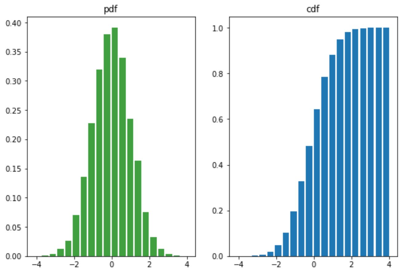
概率分布图
|
1
2
3
4
5
6
7
8
9
10
11
12
13
14
15
16
|
from matplotlib import pyplot as pltimport numpy as npmu = 0sigma = 1x = mu + sigma*np.random.randn(10000)fig,(ax0,ax1)=plt.subplots(ncols=2, figsize=(9,6))ax0.hist(x, 20, normed=1, histtype='bar', facecolor='g', rwidth=0.8, alpha=0.75)ax0.set_title('pdf')# 累积概率密度分布ax1.hist(x, 20, normed=1, histtype='bar', rwidth=0.8, cumulative=True)ax1.set_title('cdf')plt.show() |
散点图
atan2(a,b)是4象限反正切,它的取值不仅取决于正切值a/b,还取决于点 (b, a) 落入哪个象限: 当点(b, a) 落入第一象限时,atan2(a,b)的范围是 0 ~ pi/2; 当点(b, a) 落入第二象限时,atan2(a,b)的范围是 pi/2 ~ pi; 当点(b, a) 落入第三象限时,atan2(a,b)的范围是 -pi~-pi/2; 当点(b, a) 落入第四象限时,atan2(a,b)的范围是 -pi/2~0
而 atan(a/b) 仅仅根据正切值为a/b求出对应的角度 (可以看作仅仅是2象限反正切): 当 a/b > 0 时,atan(a/b)取值范围是 0 ~ pi/2; 当 a/b < 0 时,atan(a/b)取值范围是 -pi/2~0
故 atan2(a,b) = atan(a/b) 仅仅发生在 点 (b, a) 落入第一象限 (b>0, a>0)或 第四象限(b>0, a0 , 故 atan(a/b) 取值范围是 0 ~ pi/2,2atan(a/b) 的取值范围是 0 ~ pi,而此时atan2(a,b)的范围是 -pi~-pi/2,很显然,atan2(a,b) = 2atan(a/b)
举个最简单的例子,a = 1, b = -1,则 atan(a/b) = atan(-1) = -pi/4, 而 atan2(a,b) = 3*pi/4
|
1
2
3
4
5
6
7
8
9
10
11
12
13
14
15
16
17
18
19
20
21
|
from matplotlib import pyplot as pltimport numpy as npplt.figure(figsize=(9,6))n = 1024# 均匀分布 高斯分布# rand 和 randnX = np.random.rand(1,n)Y = np.random.rand(1,n)# 设定颜色T = np.arctan2(Y,X)plt.scatter(X,Y, s=75, c=T, alpha=.4, marker='o')#plt.xlim(-1.5,1.5), plt.xticks([])#plt.ylim(-1.5,1.5), plt.yticks([])plt.show() |

不规则组合图
# 定义子图区域
left, width = 0.1, 0.65
bottom, height = 0.1, 0.65
bottom_h = left_h = left + width + 0.02rect_scatter = [left, bottom, width, height]
rect_histx = [left, bottom_h, width, 0.2]
rect_histy = [left_h, bottom, 0.2, height]plt.figure(1, figsize=(6, 6))
# 需要传入[左边起始位置,下边起始位置,宽,高]
# 根据子图区域来生成子图
axScatter = plt.axes(rect_scatter)
axHistx = plt.axes(rect_histx)
axHisty = plt.axes(rect_histy)
|
1
2
3
4
5
6
7
8
9
10
11
12
13
14
15
16
17
18
19
20
21
22
23
24
25
26
27
28
29
30
31
32
33
34
35
36
37
38
39
40
41
42
43
44
45
46
47
48
49
50
|
# ref : http://matplotlib.org/examples/pylab_examples/scatter_hist.htmlimport numpy as npimport matplotlib.pyplot as plt# the random datax = np.random.randn(1000)y = np.random.randn(1000)# 定义子图区域left, width = 0.1, 0.65bottom, height = 0.1, 0.65bottom_h = left_h = left + width + 0.02rect_scatter = [left, bottom, width, height]rect_histx = [left, bottom_h, width, 0.2]rect_histy = [left_h, bottom, 0.2, height]plt.figure(1, figsize=(6, 6))# 根据子图区域来生成子图axScatter = plt.axes(rect_scatter)axHistx = plt.axes(rect_histx)axHisty = plt.axes(rect_histy)# no labels#axHistx.xaxis.set_ticks([])#axHisty.yaxis.set_ticks([])# now determine nice limits by hand:N_bins=20xymax = np.max([np.max(np.fabs(x)), np.max(np.fabs(y))])binwidth = xymax/N_binslim = (int(xymax/binwidth) + 1) * binwidthnlim = -lim# 画散点图,概率分布图axScatter.scatter(x, y)axScatter.set_xlim((nlim, lim))axScatter.set_ylim((nlim, lim))bins = np.arange(nlim, lim + binwidth, binwidth)axHistx.hist(x, bins=bins)axHisty.hist(y, bins=bins, orientation='horizontal')# 共享刻度axHistx.set_xlim(axScatter.get_xlim())axHisty.set_ylim(axScatter.get_ylim())plt.show() |

三维数据图
使用散点图的点大小、颜色、透明度表示高维数据:
|
1
2
3
4
5
6
7
8
9
10
11
12
13
14
15
16
17
18
19
20
21
22
23
24
25
26
27
28
29
|
import numpy as npimport matplotlib.pyplot as pltfig = plt.figure(figsize=(9,6),facecolor='white')# Number of ringn = 50size_min = 50size_max = 50*50# Ring positionP = np.random.rand(n,2)# Ring colors R,G,B,AC = np.ones((n,4)) * (0.5,0.5,0,1)# Alpha color channel goes from 0 (transparent) to 1 (opaque),很厉害的实现C[:,3] = np.linspace(0,1,n)# Ring sizesS = np.linspace(size_min, size_max, n)# Scatter plotplt.scatter(P[:,0], P[:,1], s=S, lw = 0.5, edgecolors = C, facecolors=C)plt.xlim(0,1), plt.xticks([])plt.ylim(0,1), plt.yticks([])plt.show() |

美化
|
1
2
3
4
5
6
7
8
|
# 美化matplotlib绘出的图,导入后自动美化import seaborn as sns# matplotlib自带美化风格# 打印可选风格print(plt.style.available #ggplot, bmh, dark_background, fivethirtyeight, grayscale)# 激活风格plt.style.use('bmh') |
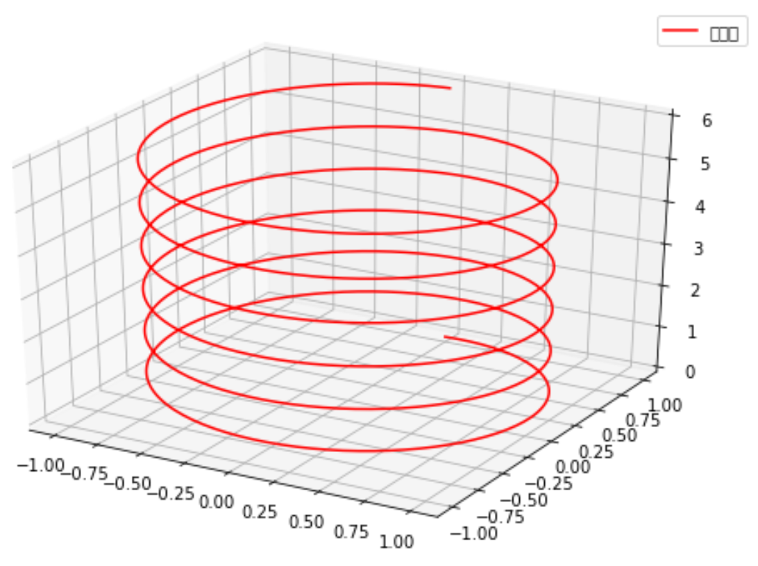
一维颜色填充 & 三维绘图 & 三维等高线图
『Python』Numpy学习指南第九章_使用Matplotlib绘图
from mpl_toolkits.mplot3d import Axes3D
ax = fig.add_subplot(111,projection='3d')
ax.plot() 绘制3维线
ax.plot_surface绘制三维网格(面)
|
1
2
3
4
5
6
7
8
9
10
11
12
13
14
15
16
17
18
|
from mpl_toolkits.mplot3d import Axes3D #<-----导入3D包import numpy as npimport matplotlib.pyplot as pltfig = plt.figure(figsize=(9,6))ax = fig.add_subplot(111,projection='3d') #<-----设置3D模式子图<br># 新思路,之前都是生成x和y绘制z=f(x,y)的函数,这次绘制x=f1(z),y=f2(z)z = np.linspace(0, 6, 1000)r = 1x = r * np.sin(np.pi*2*z)y = r * np.cos(np.pi*2*z)ax.plot(x, y, z, label=u'螺旋线', c='r')ax.legend()# dpi每英寸长度的点数plt.savefig('3d_fig.png',dpi=200)plt.show() |
# ax.plot 绘制的是3维线,ax.plot_surface绘制的是三维网格(也就是面)
|
1
2
3
4
5
6
7
8
9
10
11
12
13
14
15
16
17
18
19
20
21
22
23
|
from mpl_toolkits.mplot3d import axes3dimport matplotlib.pyplot as pltfrom matplotlib import cmfig = plt.figure()ax = fig.add_subplot(111,projection='3d')X, Y, Z = axes3d.get_test_data(0.05)print(X,Y,Z)# ax.plot 绘制的是3维线,ax.plot_surface绘制的是三维网格(也就是面)ax.plot_surface(X, Y, Z, rstride=5, cstride=5, alpha=0.3)# 三维图投影制作,zdir选择投影方向坐标轴cset = ax.contour(X, Y, Z, 10, zdir='z', offset=-100, cmap=cm.coolwarm)cset = ax.contour(X, Y, Z, zdir='x', offset=-40, cmap=cm.coolwarm)cset = ax.contour(X, Y, Z, zdir='y', offset=40, cmap=cm.coolwarm)ax.set_xlabel('X')ax.set_xlim(-40, 40)ax.set_ylabel('Y')ax.set_ylim(-40, 40)ax.set_zlabel('Z')ax.set_zlim(-100, 100)plt.show() |
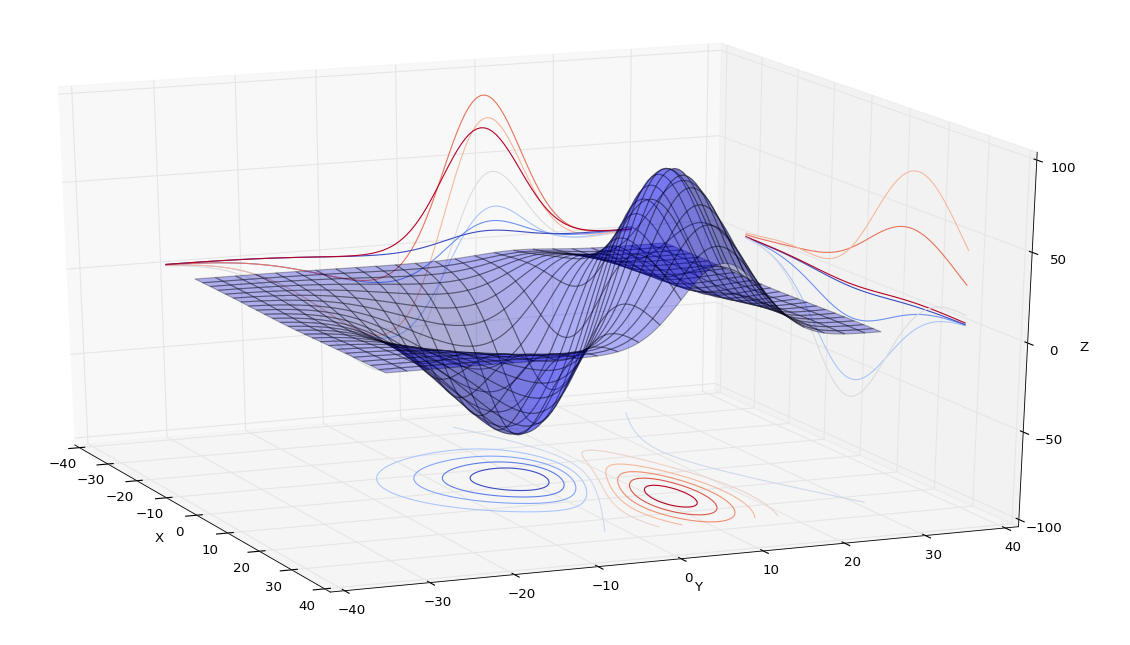
# 为等高线图添加标注
|
1
2
|
cs = ax2.contour(X,Y,Z)ax2.clabel(cs, inline=1, fontsize=5) |
配置Colorbar
|
1
2
3
4
5
6
7
8
9
10
11
12
13
14
15
16
17
18
19
20
21
22
23
24
25
26
27
28
29
30
31
32
33
34
35
36
37
38
39
40
41
42
43
44
45
46
47
48
49
50
51
52
53
54
55
56
57
58
59
60
61
62
63
64
65
66
67
68
69
70
71
72
73
74
75
76
77
78
79
80
81
82
83
|
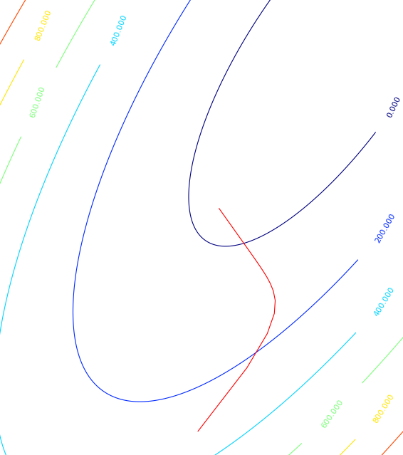
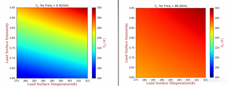
# -*- coding: utf-8 -*- #********************************************************** import os import numpy as np import wlab #pip install wlab import matplotlib import matplotlib.cm as cm import matplotlib.pyplot as plt from matplotlib.ticker import MultipleLocator from scipy.interpolate import griddata matplotlib.rcParams['xtick.direction'] = 'out' matplotlib.rcParams['ytick.direction'] = 'out' #********************************************************** FreqPLUS=['F06925','F10650','F23800','F18700','F36500','F89000'] # FindPath='/d3/MWRT/R20130805/' #********************************************************** fig = plt.figure(figsize=(8,6), dpi=72, facecolor="white") axes = plt.subplot(111) axes.cla()#清空坐标轴内的所有内容 #指定图形的字体 font = {'family' : 'serif', 'color' : 'darkred', 'weight' : 'normal', 'size' : 16, } #********************************************************** # 查找目录总文件名中保护F06925,EMS和txt字符的文件 for fp in FreqPLUS: FlagStr=[fp,'EMS','txt'] FileList=wlab.GetFileList(FindPath,FlagStr) # LST=[]#地表温度 EMS=[]#地表发射率 TBH=[]#水平极化亮温 TBV=[]#垂直极化亮温 # findex=0 for fn in FileList: findex=findex+1 if (os.path.isfile(fn)): print(str(findex)+'-->'+fn) #fn='/d3/MWRT/R20130805/F06925_EMS60.txt' data=wlab.dlmread(fn) EMS=EMS+list(data[:,1])#地表发射率 LST=LST+list(data[:,2])#温度 TBH=TBH+list(data[:,8])#水平亮温 TBV=TBV+list(data[:,9])#垂直亮温 #----------------------------------------------------------- #生成格点数据,利用griddata插值 grid_x, grid_y = np.mgrid[275:315:1, 0.60:0.95:0.01] grid_z = griddata((LST,EMS), TBH, (grid_x, grid_y), method='cubic') #将横纵坐标都映射到(0,1)的范围内 extent=(0,1,0,1) #指定colormap cmap = matplotlib.cm.jet #设定每个图的colormap和colorbar所表示范围是一样的,即归一化 norm = matplotlib.colors.Normalize(vmin=160, vmax=300) #显示图形,此处没有使用contourf #>>>ctf=plt.contourf(grid_x,grid_y,grid_z) gci=plt.imshow(grid_z.T, extent=extent, origin='lower',cmap=cmap, norm=norm) #配置一下坐标刻度等 ax=plt.gca() ax.set_xticks(np.linspace(0,1,9)) ax.set_xticklabels( ('275', '280', '285', '290', '295', '300', '305', '310', '315')) ax.set_yticks(np.linspace(0,1,8)) ax.set_yticklabels( ('0.60', '0.65', '0.70', '0.75', '0.80','0.85','0.90','0.95')) #显示colorbar cbar = plt.colorbar(gci) cbar.set_label('$T_B(K)$',fontdict=font) cbar.set_ticks(np.linspace(160,300,8)) cbar.set_ticklabels( ('160', '180', '200', '220', '240', '260', '280', '300')) #设置label ax.set_ylabel('Land Surface Emissivity',fontdict=font) ax.set_xlabel('Land Surface Temperature(K)',fontdict=font) #陆地地表温度LST #设置title titleStr='$T_B$ for Freq = '+str(float(fp[1:-1])*0.01)+'GHz' plt.title(titleStr) figname=fp+'.png' plt.savefig(figname) plt.clf()#清除图形 #plt.show() print('ALL -> Finished OK') |
上面的例子中,每个保存的图,都是用同样的colormap,并且每个图的颜色映射值都是一样的,也就是说第一个图中如果200表示蓝色,那么其他图中的200也表示蓝色。
示例的图形如下:
4. 样式美化(matplotlib.pyplot.style.use) 点击打开链接
使用matplotlib自带的几种美化样式,就可以很轻松的对生成的图形进行美化。
可以使用matplotlib.pyplot.style.available获取所有的美化样式
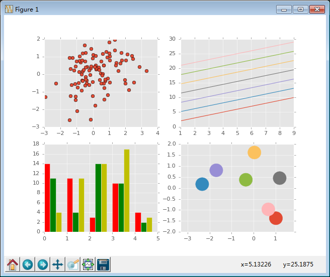
- #!/usr/bin/python
- #coding: utf-8
- import numpy as np
- import matplotlib.pyplot as plt
- # 获取所有的自带样式
- print plt.style.available
- # 使用自带的样式进行美化
- plt.style.use("ggplot")
- fig, axes = plt.subplots(ncols = 2, nrows = 2)
- # 四个子图的坐标轴赋予四个对象
- ax1, ax2, ax3, ax4 = axes.ravel()
- x, y = np.random.normal(size = (2, 100))
- ax1.plot(x, y, "o")
- x = np.arange(1, 10)
- y = np.arange(1, 10)
- # plt.rcParams['axes.prop_cycle']获取颜色的字典
- # 会在这个范围内依次循环
- ncolors = len(plt.rcParams['axes.prop_cycle'])
- # print ncolors
- # print plt.rcParams['axes.prop_cycle']
- shift = np.linspace(1, 20, ncolors)
- for s in shift:
- # print s
- ax2.plot(x, y + s, "-")
- x = np.arange(5)
- y1, y2, y3 = np.random.randint(1, 25, size = (3, 5))
- width = 0.25
- # 柱状图中要显式的指定颜色
- ax3.bar(x, y1, width, color = "r")
- ax3.bar(x + width, y2, width, color = "g")
- ax3.bar(x + 2 * width, y3, width, color = "y")
- for i, color in enumerate(plt.rcParams['axes.prop_cycle']):
- xy = np.random.normal(size= 2)
- for c in color.values():
- ax4.add_patch(plt.Circle(xy, radius = 0.3, color= c))
- ax4.axis("equal")
- plt.show()
使用ggplot进行美化后的结果
matplotlib 画图的更多相关文章
- python matplotlib画图产生的Type 3 fonts字体没有嵌入问题
ScholarOne's 对python matplotlib画图产生的Type 3 fonts字体不兼容,更改措施: 在程序中添加如下语句 import matplotlib matplotlib. ...
- 使用python中的matplotlib 画图,show后关闭窗口,继续运行命令
使用python中的matplotlib 画图,show后关闭窗口,继续运行命令 在用python中的matplotlib 画图时,show()函数总是要放在最后,且它阻止命令继续往下运行,直到1.0 ...
- matplotlib画图
matplotlib画图 import numpy as np import matplotlib.pyplot as plt x1=[20,33,51,79,101,121,132,145,162, ...
- python3 使用matplotlib画图出现中文乱码的情况
python3使用matplotlib画图,因python3默认使用中unicode编码,所以在写代码时不再需要写 plt.xlabel(u’人数’),而是直接写plt.xlabel(‘人数’). 注 ...
- matplotlib画图实例:pyplot、pylab模块及作图參数
http://blog.csdn.net/pipisorry/article/details/40005163 Matplotlib.pyplot画图实例 {使用pyplot模块} matplotli ...
- python使用matplotlib画图
python使用matplotlib画图 matplotlib库是python最著名的画图库.它提供了一整套和matlab类似的命令API.十分适合交互式地进行制图. 先介绍了怎样使用matplotl ...
- matplotlib画图报错This figure includes Axes that are not compatible with tight_layout, so results might be incorrect.
之前用以下代码将实验结果用matplotlib show出来 plt.plot(np.arange(len(aver_reward_list)), aver_reward_list) plt.ylab ...
- matplotlib画图出现乱码情况
python3使用matplotlib画图,因python3默认使用中unicode编码,所以在写代码时不再需要写 plt.xlabel(u’人数’),而是直接写plt.xlabel(‘人数’). 注 ...
- python使用matplotlib画图,jieba分词、词云、selenuium、图片、音频、视频、文字识别、人脸识别
一.使用matplotlib画图 关注公众号"轻松学编程"了解更多. 使用matplotlib画柱形图 import matplotlib from matplotlib impo ...
随机推荐
- 【刷题】BZOJ 2407 探险
Description 探险家小T好高兴!X国要举办一次溶洞探险比赛,获奖者将得到丰厚奖品哦!小T虽然对奖品不感兴趣,但是这个大振名声的机会当然不能错过! 比赛即将开始,工作人员说明了这次比赛的规则: ...
- CDQ分治总结(CDQ,树状数组,归并排序)
闲话 CDQ是什么? 是一个巨佬,和莫队.HJT(不是我这个蒟蒻)一样,都发明出了在OI中越来越流行的算法/数据结构. CDQ分治思想 分治就是分治,"分而治之"的思想. 那为什么 ...
- 【转】位置式、增量式PID算法C语言实现
位置式.增量式PID算法C语言实现 芯片:STM32F107VC 编译器:KEIL4 作者:SY 日期:2017-9-21 15:29:19 概述 PID 算法是一种工控领域常见的控制算法,用于闭环反 ...
- 洛谷 P10P1343 地震逃生 改错
P1343 地震逃生 题目描述 汶川地震发生时,四川**中学正在上课,一看地震发生,老师们立刻带领x名学生逃跑,整个学校可以抽象地看成一个有向图,图中有\(n\)个点,\(m\)条边.1号点为教室,\ ...
- 暑期OI大电影——不看后悔整个OI生涯!
惊爆~!! 2018暑期OI大电影要开始放送啦~!! 各位OI骨灰级大咖登场荧幕~!! 近四十部大电影纷至沓来~!! 著名特级导演CCF.著名特级编剧刘汝佳等纷纷给予高度评价~!! 观众朋友们,OI的 ...
- 洛谷P2446 大陆争霸
这是一道dijkstra拓展......不知道为什么被评成了紫题. 有一个很朴素的想法就是每次松弛的时候判断一下那个点是否被保护.如果被保护就不入队. 然后发现写起来要改的地方巨多无比...... 改 ...
- display position 和float的作用和关系
1.传统布局由这三者构成. 2.position设为absolute,那么display一定是block,因此对于span来说,就可以设置高和宽了. 3.position为relative ,那么fl ...
- python(五)——运算符
1.成员运算符,判断某个东西是否在某个东西里包含:in,not in name = "abcd" if "ac" in name: print("ok ...
- zTree重命名节点时,操作的那个dom(类似input框那个)怎么写
<script type="text/javascript"> //tree的编辑节点的方法 ztree.editName(nodeNew[0]); /// $(&qu ...
- EOJ2018.10 月赛(A 数学+思维题)
传送门:Problem A https://www.cnblogs.com/violet-acmer/p/9739115.html 题意: 能否通过横着排或竖着排将 1x p 的小姐姐填满 n x m ...