
bootstrap的折叠组件1
官网的例子:
http://v3.bootcss.com/javascript/#collapse
<div class="panel-group" id="accordion" role="tablist" aria-multiselectable="true">

  <div class="panel panel-default">

    <div class="panel-heading" role="tab" id="headingOne">

      <h4 class="panel-title">

        <a role="button" data-toggle="collapse" data-parent="#accordion" href="#collapseOne" aria-expanded="true" aria-controls="collapseOne">

          Collapsible Group Item #1

        </a>

      </h4>

    </div>

    <div id="collapseOne" class="panel-collapse collapse in" role="tabpanel" aria-labelledby="headingOne">

      <div class="panel-body">

        Anim pariatur cliche reprehenderit, enim eiusmod high life accusamus terry richardson ad squid. 3 wolf moon officia aute, non cupidatat skateboard dolor brunch. Food truck quinoa nesciunt laborum eiusmod. Brunch 3 wolf moon tempor, sunt aliqua put a bird on it squid single-origin coffee nulla assumenda shoreditch et. Nihil anim keffiyeh helvetica, craft beer labore wes anderson cred nesciunt sapiente ea proident. Ad vegan excepteur butcher vice lomo. Leggings occaecat craft beer farm-to-table, raw denim aesthetic synth nesciunt you probably haven't heard of them accusamus labore sustainable VHS.

      </div>

    </div>

  </div>

  <div class="panel panel-default">

    <div class="panel-heading" role="tab" id="headingTwo">

      <h4 class="panel-title">

        <a class="collapsed" role="button" data-toggle="collapse" data-parent="#accordion" href="#collapseTwo" aria-expanded="false" aria-controls="collapseTwo">

          Collapsible Group Item #2

        </a>

      </h4>

    </div>

    <div id="collapseTwo" class="panel-collapse collapse" role="tabpanel" aria-labelledby="headingTwo">

      <div class="panel-body">

        Anim pariatur cliche reprehenderit, enim eiusmod high life accusamus terry richardson ad squid. 3 wolf moon officia aute, non cupidatat skateboard dolor brunch. Food truck quinoa nesciunt laborum eiusmod. Brunch 3 wolf moon tempor, sunt aliqua put a bird on it squid single-origin coffee nulla assumenda shoreditch et. Nihil anim keffiyeh helvetica, craft beer labore wes anderson cred nesciunt sapiente ea proident. Ad vegan excepteur butcher vice lomo. Leggings occaecat craft beer farm-to-table, raw denim aesthetic synth nesciunt you probably haven't heard of them accusamus labore sustainable VHS.

      </div>

    </div>

  </div>

  <div class="panel panel-default">

    <div class="panel-heading" role="tab" id="headingThree">

      <h4 class="panel-title">

        <a class="collapsed" role="button" data-toggle="collapse" data-parent="#accordion" href="#collapseThree" aria-expanded="false" aria-controls="collapseThree">

          Collapsible Group Item #3

        </a>

      </h4>

    </div>

    <div id="collapseThree" class="panel-collapse collapse" role="tabpanel" aria-labelledby="headingThree">

      <div class="panel-body">

        Anim pariatur cliche reprehenderit, enim eiusmod high life accusamus terry richardson ad squid. 3 wolf moon officia aute, non cupidatat skateboard dolor brunch. Food truck quinoa nesciunt laborum eiusmod. Brunch 3 wolf moon tempor, sunt aliqua put a bird on it squid single-origin coffee nulla assumenda shoreditch et. Nihil anim keffiyeh helvetica, craft beer labore wes anderson cred nesciunt sapiente ea proident. Ad vegan excepteur butcher vice lomo. Leggings occaecat craft beer farm-to-table, raw denim aesthetic synth nesciunt you probably haven't heard of them accusamus labore sustainable VHS.

      </div>

    </div>

  </div>

</div>
官网的效果:
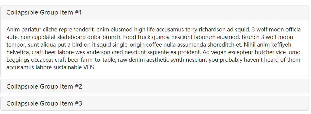
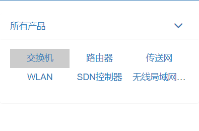
自己根据这个折叠组件写的:--看折叠组件部分的代码就好了。
<!doctype html>

<html>

<head>

<meta charset="utf-8">

<title>导航测试</title>

<link rel="stylesheet" type="text/css" href="bootstrap/bootstrap.min.css">

<style type="text/css">

.navbar-inverse .navbar-header .active{

     background-color: #31708f;

}

.navbar-inverse .navbar-brand {

    color: #fff;

    cursor: pointer;

    padding: 15px 25px;

    font-size: 14px;

}

.navbar-inverse {

    background-color: #337ab7;

    border-color: #337ab7;

}

.navbar-inverse .navbar-nav>li>a {

    color: #fff;

}

.navbar-inverse .navbar-nav>.active>a, .navbar-inverse .navbar-nav>.active>a:focus, .navbar-inverse .navbar-nav>.active>a:hover{

    color: #fff;

    background-color: #31708f;

}

.navbar-inverse .navbar-nav>.open>a, .navbar-inverse .navbar-nav>.open>a:focus, .navbar-inverse .navbar-nav>.open>a:hover{

    color: #fff;

    background-color: #337ab7;

}

input#sw{

    font-style: italic;

    color: #aaa;

}

.navbar-inverse .navbar-collapse, .navbar-inverse .navbar-form{

    border-color: #337ab7;

}

@media (max-width: 767px){

    .navbar-inverse .navbar-nav .open .dropdown-menu .divider{

        background-color: rgba(0,0,0,.075);

    }

}

/* 产品分类 */

ul.product_category li {

    float: left;

    list-style: none;

}

ul.product_category {

    padding: 0;

}

.product_category >li{

    padding: 5px 25px;

}

.product_category >li.active{

    background: #ccc;

}

/* 手机版产品分类导航 */

ul.product_category_mobile>li {

    padding: 5px 0;

    width: 33.3%;

    text-align: center;

    overflow: hidden;

    text-overflow: ellipsis;

    white-space: nowrap;

}

.product_category_mobile{

    padding: 0;

}

#accordion .category_arrow{

    float: right;

    padding: 0 10px;

}

.panel-heading>li{

    float: left;

    list-style: none;

}

@media (max-width: 767px){

    .pc{

        display: none;

    }

    .mobile{

        display: block;

    }

}

@media(min-width: 768px){

    .pc{

        display: block;

    }

    .mobile{

        display: none;

    }

}

</style>

</head>

<body>

<div class="container">

    <div class="row">

        <nav class="navbar navbar-inverse">

            <div class="navbar-header">

              <button type="button" class="navbar-toggle collapsed" data-toggle="collapse" data-target="#bs-example-navbar-collapse-1" aria-expanded="false">

                <span class="sr-only">Toggle navigation</span>

                <span class="icon-bar"></span>

                <span class="icon-bar"></span>

                <span class="icon-bar"></span>

              </button>

              <a class="navbar-brand active" onclick="alert('all')">全部</a>

            </div>

            <div class="collapse navbar-collapse" id="bs-example-navbar-collapse-1">

              <ul class="nav navbar-nav">

                <li class="dropdown">

                  <a href="#" class="dropdown-toggle" data-toggle="dropdown" role="button" aria-haspopup="true" aria-expanded="false">按场景选择 <span class="caret"></span></a>

                  <ul class="dropdown-menu">

                    <li><a href="#">全部</a></li>

                    <li role="separator" class="divider"></li>

                    <li><a href="#">规划</a></li>

                    <li><a href="#">实施</a></li>

                    <li><a href="#">维护</a></li>

                  </ul>

                </li>

                <li class="active"><a href="#">我的收藏</a></li>

                <li><a href="#">最近浏览</a></li>

              </ul>

              <form class="navbar-form navbar-right">

                  <div class="input-group">

                  <input id="sw" type="text" class="form-control" value="请输入关键字(名称/描述)">

                  <span class="input-group-btn">

                    <button class="btn btn-default" type="button">搜索</button>

                  </span>

                </div>

                <!--

                <div class="form-group">

                  <input id="sw" type="text" class="form-control" value="请输入关键字(名称/描述)">

                </div>

                <input type="button" class="btn btn-default" value="搜索"/>

                -->

              </form>

            </div>

        </nav>

    </div>

    <!-- 产品分类 -->

    <div class="row pc">

        <ul class="product_category clearfix">

            <li><a href="#">所有产品</a></li>

            <li class="active"><a href="#">交换机</a></li>

            <li><a href="#">路由器</a></li>

            <li><a href="#">传送网</a></li>

            <li><a href="#">WLAN</a></li>

            <li><a href="#">SDN控制器</a></li>

            <li><a href="#">无线局域网</a></li>

        </ul>

    </div>

    <!-- 手机端产品分类展示 -->

    <div class="row mobile">

        <div class="panel-group" id="accordion" role="tablist" aria-multiselectable="true">

          <div class="panel">

            <div class="panel-heading clearfix" role="tab">

                <li><a href="#">所有产品</a></li>

                <a class="category_arrow" role="button" data-toggle="collapse" data-parent="#accordion" href="#collapseOne" aria-expanded="true">

                    <span class="glyphicon glyphicon-menu-down"></span>

                </a>

            </div>

            <div id="collapseOne" class="panel-collapse collapse" role="tabpanel">

              <div class="panel-body">

                    <ul class="product_category product_category_mobile clearfix">

                        <li class="active"><a href="#">交换机</a></li>

                        <li><a href="#">路由器</a></li>

                        <li><a href="#">传送网</a></li>

                        <li><a href="#">WLAN</a></li>

                        <li><a href="#">SDN控制器</a></li>

                        <li><a href="#">无线局域网无线局域网无线局域网</a></li>

                    </ul>

              </div>

            </div>

          </div>

        </div>

    </div>

</div>

</body>

<script src="jquery/jquery.min.js"></script>

<script src="bootstrap/bootstrap.min.js"></script>

<script type="text/javascript">

</script>

</html>
bootstrap的折叠组件1的更多相关文章
- bootstrap导航条组件
一.导航条模板(官方文档) <nav class="navbar navbar-default"> <div class="container-flui ...
- 利用bootstrap的modal组件自定义alert,confirm和modal对话框
由于浏览器提供的alert和confirm框体验不好,而且浏览器没有提供一个标准的以对话框的形式显示自定义HTML的弹框函数,所以很多项目都会自定义对话框组件.本篇文章介绍自己在项目中基于bootst ...
- bootstrap轮播组件,大屏幕图片居中效果
在慕课网学习bootstrap轮播组件的时候,了解到轮播的图片都放在了类名为item下的img中 视频中老师对图片自适应采用给图片img设置width=100%完成,然而这样自适应处理图片在不同屏幕中 ...
- bootstrap 之 列表组件使用
列表是几乎所有网站都会用到的一个组件,正好bootstrap也给我们提供了这个组件的样式,下面我给大家简单介绍一下bootstrap中的列表组件的用法! 首先,重提一下引用bootstrap的核心文件 ...
- bootstrap轮播组件之“如何关闭自动轮播”
在一个页面里使用多个bootstrap轮播组件的时候,如果还让所有轮播图都自动轮播的话,整个画面都在动,会给用户一种很不好的体验感受.所以,需要关闭轮播图的自动轮播. 关闭方法:去除如下属性即可: d ...
- bootstrap课程5 bootstrap中的组件使用的注意事项是什么
bootstrap课程5 bootstrap中的组件使用的注意事项是什么 一.总结 一句话总结: 1.img-responsive的作用是什么(其实还是要多看手册)? 看起来像width=100%的效 ...
- Bootstrap Blazor Table 组件(二)
原文链接:https://www.cnblogs.com/ysmc/p/16128206.html 很多小伙伴在使用 Bootstrap Blazor Table组件的时候,都会有这样的一个需求: 我 ...
- 【BootStrap】 布局组件 I
BootStrap布局组件 I 除了在原生的HTML基础上进行了外观和类别上的改进,BS还包装了很多组件进库中,设计网页时我们可以方便地调用这些组件.下面来简略地介绍一下各种各样的组件 ■ 字体图标 ...
- bootStrap树形目录组件
需求描述 产品添加页面,需要选择车型.在bootStrap的modal上弹出子modal来使用.车型一共有4级目录.要使用目录树.然后分活动和商品两种,需要能够通过不通参数来调用该组件.车型品牌要使用 ...
随机推荐
- poj 1182 食物链(高级的带权并查集)
食物链 Time Limit: 1000MS Memory Limit: 10000K Total Submissions: 76486 Accepted: 22742 Description ...
- MySQL pt-table-checksum及pt-table-sync校验及修复主从一致性
[pt-table-checksum]pt-table-checksum是percona-toolkit系列工具中的一个, 可以用来检测主. 从数据库中数据的一致性.其原理是在主库上运行, 对同步的表 ...
- log4cpp之Layout布局
body, table{font-family: 微软雅黑; font-size: 10pt} table{border-collapse: collapse; border: solid gray; ...
- Error:Cause: org/gradle/api/publication/maven/internal/DefaultMavenFactory 解决办法
当你使用的Gradle版本是2.4以上,Android插件版本是1.3.0以上的时候就会出现这个问题,这时候你只需将android-maven-gradle-plugin插件版本改为classpath ...
- 使用jQuery操作DOM(2)
1.获取设置属性值 attr({属性名1:属性值1,属性名2:属性值2}); //设置属性值 removeAttr(“属性名”); //删除属性 注意:如果元素没有此属性,会不起作用 2.获取同辈元素 ...
- Android程序员学WEB前端(6)-CSS(1)-选择器-Sublime
转载请注明出处:http://blog.csdn.net/iwanghang/article/details/76576469 觉得博文有用,请点赞,请评论,请关注,谢谢!~ CSS外部文档链接: & ...
- [Scala]Scala学习笔记六 文件
1. 读取行 读取文件,可以使用scala.io.Source对象的fromFile方法.如果读取所有行可以使用getLines方法: val source = Source.fromFile(&qu ...
- OPEN(SAP) UI5 学习入门系列之一:扫盲与热身(上)
什么是SAP Fiori? 了解SAP UI5必须要从SAP Fiori开始,两者概念经常被混淆,而两者也确实有着非常紧密的关系. 用过SAP的同学们都对SAP的传统的界面(SAP GUI)表示“呵呵 ...
- CA数字加密解密Demo
package aisin.text; import com.google.common.collect.Maps; import sun.misc.BASE64Decoder; impor ...
- IIS项目发布完整流程
第一步: 发布项目 使在IIS上发布是防止源码泄露 第二步: 打开IIS(如果没有就自己安装一个)打开IIS步骤 控制面板>系统安全>管理工具>IIS管理器 填写网站的名称和之前发布 ...