CSS3实现加载数据动画2
<!DOCTYPE html>
<html lang="en">
<head>
<meta charset="UTF-8">
<title>CSS3实现加载数据动画</title>
<style type="text/css">
.box{
width: 100%;
padding: 3%;
-webkit-box-sizing: border-box;
-moz-box-sizing: border-box;
box-sizing: border-box;
overflow: hidden;
}
.box .loader{
width: 30%;
height: 200px;
float: left;
margin-right: 3%;
border: 1px #cccccc solid;
-webkit-box-sizing: border-box;
-moz-box-sizing: border-box;
box-sizing: border-box;
display: flex;
align-items: center;
justify-content: center;
}
.loading-1{
width: 60px;
height: 60px;
position: relative;
}
.loading-1 i{
display: block;
width: 60px;
height: 60px;
border-radius: 50%;
background-color: #333333;
position: absolute;
left:;
top:;
opacity:;
}
.loading-1 i:nth-child(1){
-webkit-animation: loading-1 1s linear 0s infinite;
-moz-animation: loading-1 1s linear 0s infinite;
-o-animation: loading-1 1s linear 0s infinite;
animation: loading-1 1s linear 0s infinite;
}
.loading-1 i:nth-child(2){
-webkit-animation: loading-1 1s linear 0.2s infinite;
-moz-animation: loading-1 1s linear 0.2s infinite;
-o-animation: loading-1 1s linear 0.2s infinite;
animation: loading-1 1s linear 0.2s infinite;
}
.loading-1 i:nth-child(2){
-webkit-animation: loading-1 1s linear 0.4s infinite;
-moz-animation: loading-1 1s linear 0.4s infinite;
-o-animation: loading-1 1s linear 0.4s infinite;
animation: loading-1 1s linear 0.4s infinite;
}
@-webkit-keyframes loading-1 {
0%{
-webkit-transform: scale(0);
-moz-transform: scale(0);
-ms-transform: scale(0);
-o-transform: scale(0);
transform: scale(0);
opacity:;
}
50%{
opacity:;
}
100%{
-webkit-transform: scale(1);
-moz-transform: scale(1);
-ms-transform: scale(1);
-o-transform: scale(1);
transform: scale(1);
opacity:;
}
}
@-moz-keyframes loading-1 {
0%{
-webkit-transform: scale(0);
-moz-transform: scale(0);
-ms-transform: scale(0);
-o-transform: scale(0);
transform: scale(0);
opacity:;
}
50%{
opacity:;
}
100%{
-webkit-transform: scale(1);
-moz-transform: scale(1);
-ms-transform: scale(1);
-o-transform: scale(1);
transform: scale(1);
opacity:;
}
}
@-o-keyframes loading-1 {
0%{
-webkit-transform: scale(0);
-moz-transform: scale(0);
-ms-transform: scale(0);
-o-transform: scale(0);
transform: scale(0);
opacity:;
}
50%{
opacity:;
}
100%{
-webkit-transform: scale(1);
-moz-transform: scale(1);
-ms-transform: scale(1);
-o-transform: scale(1);
transform: scale(1);
opacity:;
}
}
@keyframes loading-1 {
0%{
-webkit-transform: scale(0);
-moz-transform: scale(0);
-ms-transform: scale(0);
-o-transform: scale(0);
transform: scale(0);
opacity:;
}
50%{
opacity:;
}
100%{
-webkit-transform: scale(1);
-moz-transform: scale(1);
-ms-transform: scale(1);
-o-transform: scale(1);
transform: scale(1);
opacity:;
}
} .loading-2{
width: 40px;
height: 40px;
position: relative;
}
.loading-2 i{
display: block;
border: 2px solid;
border-color: transparent #333333;
-webkit-border-radius: 50%;
-moz-border-radius: 50%;
border-radius: 50%;
position: absolute;
}
.loading-2 i:first-child{
width: 35px;
height: 35px;
top:;
left:;
-webkit-animation: loading-2 1s ease 0s infinite;
-moz-animation: loading-2 1s ease 0s infinite;
-o-animation: loading-2 1s ease 0s infinite;
animation: loading-2 1s ease 0s infinite;
}
.loading-2 i:last-child{
width: 15px;
height: 15px;
top: 10px;
left: 10px;
-webkit-animation: loading-2 1s ease -0.25s infinite reverse;
-moz-animation: loading-2 1s ease -0.25s infinite reverse;
-o-animation: loading-2 1s ease -0.25s infinite reverse;
animation: loading-2 1s ease -0.25s infinite reverse;
}
@-webkit-keyframes loading-2 {
0%{
-webkit-transform: rotate(0deg) scale(1);
-moz-transform: rotate(0deg) scale(1);
-ms-transform: rotate(0deg) scale(1);
-o-transform: rotate(0deg) scale(1);
transform: rotate(0deg) scale(1);
}
50%{
-webkit-transform: rotate(180deg) scale(.6);
-moz-transform: rotate(180deg) scale(.6);
-ms-transform: rotate(180deg) scale(.6);
-o-transform: rotate(180deg) scale(.6);
transform: rotate(180deg) scale(.6);
}
100%{
-webkit-transform: rotate(360deg) scale(1);
-moz-transform: rotate(360deg) scale(1);
-ms-transform: rotate(360deg) scale(1);
-o-transform: rotate(360deg) scale(1);
transform: rotate(360deg) scale(1);
}
}
@-moz-keyframes loading-2 {
0%{
-webkit-transform: rotate(0deg) scale(1);
-moz-transform: rotate(0deg) scale(1);
-ms-transform: rotate(0deg) scale(1);
-o-transform: rotate(0deg) scale(1);
transform: rotate(0deg) scale(1);
}
50%{
-webkit-transform: rotate(180deg) scale(.6);
-moz-transform: rotate(180deg) scale(.6);
-ms-transform: rotate(180deg) scale(.6);
-o-transform: rotate(180deg) scale(.6);
transform: rotate(180deg) scale(.6);
}
100%{
-webkit-transform: rotate(360deg) scale(1);
-moz-transform: rotate(360deg) scale(1);
-ms-transform: rotate(360deg) scale(1);
-o-transform: rotate(360deg) scale(1);
transform: rotate(360deg) scale(1);
}
}
@-o-keyframes loading-2 {
0%{
-webkit-transform: rotate(0deg) scale(1);
-moz-transform: rotate(0deg) scale(1);
-ms-transform: rotate(0deg) scale(1);
-o-transform: rotate(0deg) scale(1);
transform: rotate(0deg) scale(1);
}
50%{
-webkit-transform: rotate(180deg) scale(.6);
-moz-transform: rotate(180deg) scale(.6);
-ms-transform: rotate(180deg) scale(.6);
-o-transform: rotate(180deg) scale(.6);
transform: rotate(180deg) scale(.6);
}
100%{
-webkit-transform: rotate(360deg) scale(1);
-moz-transform: rotate(360deg) scale(1);
-ms-transform: rotate(360deg) scale(1);
-o-transform: rotate(360deg) scale(1);
transform: rotate(360deg) scale(1);
}
}
@keyframes loading-2 {
0%{
-webkit-transform: rotate(0deg) scale(1);
-moz-transform: rotate(0deg) scale(1);
-ms-transform: rotate(0deg) scale(1);
-o-transform: rotate(0deg) scale(1);
transform: rotate(0deg) scale(1);
}
50%{
-webkit-transform: rotate(180deg) scale(.6);
-moz-transform: rotate(180deg) scale(.6);
-ms-transform: rotate(180deg) scale(.6);
-o-transform: rotate(180deg) scale(.6);
transform: rotate(180deg) scale(.6);
}
100%{
-webkit-transform: rotate(360deg) scale(1);
-moz-transform: rotate(360deg) scale(1);
-ms-transform: rotate(360deg) scale(1);
-o-transform: rotate(360deg) scale(1);
transform: rotate(360deg) scale(1);
}
} .loading-3{
width: 80px;
height: 20px;
position: relative;
}
.loading-3 i{
display: block;
width: 20px;
height: 20px;
-webkit-border-radius: 50%;
-moz-border-radius: 50%;
border-radius: 50%;
background: #333333;
margin-right: 10px;
position: absolute;
}
.loading-3 i:nth-child(1){
-webkit-animation: loading-3 2s linear 0s infinite;
-moz-animation: loading-3 2s linear 0s infinite;
-o-animation: loading-3 2s linear 0s infinite;
animation: loading-3 2s linear 0s infinite;
}
.loading-3 i:nth-child(2){
-webkit-animation: loading-3 2s linear -0.4s infinite;
-moz-animation: loading-3 2s linear -0.4s infinite;
-o-animation: loading-3 2s linear -0.4s infinite;
animation: loading-3 2s linear -0.4s infinite;
}
.loading-3 i:nth-child(3){
-webkit-animation: loading-3 2s linear -0.8s infinite;
-moz-animation: loading-3 2s linear -0.8s infinite;
-o-animation: loading-3 2s linear -0.8s infinite;
animation: loading-3 2s linear -0.8s infinite;
}
.loading-3 i:nth-child(4){
-webkit-animation: loading-3 2s linear -1.2s infinite;
-moz-animation: loading-3 2s linear -1.2s infinite;
-o-animation: loading-3 2s linear -1.2s infinite;
animation: loading-3 2s linear -1.2s infinite;
}
.loading-3 i:nth-child(5){
-webkit-animation: loading-3 2s linear -1.6s infinite;
-moz-animation: loading-3 2s linear -1.6s infinite;
-o-animation: loading-3 2s linear -1.6s infinite;
animation: loading-3 2s linear -1.6s infinite;
}
@-moz-keyframes loading-3 {
0%{
left: 100px;
top:;
}
80%{
left:;
top:;
}
85%{
width: 20px;
height: 20px;
left:;
top: -25px;
}
90%{
width: 40px;
height: 20px;
}
95%{
left: 100px;
top: -20px;
width: 20px;
height: 20px;
}
100%{
left: 100px;
top:;
}
}
@-webkit-keyframes loading-3 {
0%{
left: 100px;
top:;
}
80%{
left:;
top:;
}
85%{
width: 20px;
height: 20px;
left:;
top: -25px;
}
90%{
width: 40px;
height: 20px;
}
95%{
left: 100px;
top: -20px;
width: 20px;
height: 20px;
}
100%{
left: 100px;
top:;
}
}
@-o-keyframes loading-3 {
0%{
left: 100px;
top:;
}
80%{
left:;
top:;
}
85%{
width: 20px;
height: 20px;
left:;
top: -25px;
}
90%{
width: 40px;
height: 20px;
}
95%{
left: 100px;
top: -20px;
width: 20px;
height: 20px;
}
100%{
left: 100px;
top:;
}
}
@keyframes loading-3 {
0%{
left: 100px;
top:;
}
80%{
left:;
top:;
}
85%{
width: 20px;
height: 20px;
left:;
top: -25px;
}
90%{
width: 40px;
height: 20px;
}
95%{
left: 100px;
top: -20px;
width: 20px;
height: 20px;
}
100%{
left: 100px;
top:;
}
}
</style>
</head>
<body>
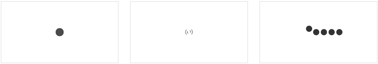
<div class="box">
<div class="loader">
<div class="loading-1">
<i></i>
<i></i>
<i></i>
</div>
</div>
<div class="loader">
<div class="loading-2">
<i></i>
<i></i>
</div>
</div>
<div class="loader">
<div class="loading-3">
<i></i>
<i></i>
<i></i>
<i></i>
<i></i>
</div>
</div>
</div>
</body>
</html>
CSS3实现加载数据动画2的更多相关文章
- CSS3实现加载数据动画1
<!DOCTYPE html> <html lang="en"> <head> <meta charset="UTF-8&quo ...
- css3加载ing动画
项目中ajax交互成功前总会需要给用户提醒,比如请稍候.正在加载中等等,那个等待的动图以前项目中用的是gif,在移动端画质很渣,有毛边,于是在新项目中用css3展示加载中的动画效果. function ...
- 纯css3 加载loading动画特效
最近项目中要实现当页面还没有加载完给用户提示正在加载的loading,本来是想做个图片提示的,但是图片如果放大电脑的分辨率就会感觉到很虚,体验效果很不好.于是就采用css3+js实现这个loading ...
- 2款不同样式的CSS3 Loading加载动画 附源码
原文:2款不同样式的CSS3 Loading加载动画 附源码 我们经常看到的Loading加载很多都是转圈圈的那种,今天我们来换一种有创意的CSS3 Loading加载动画,一种是声波形状的动画,另一 ...
- 10个样式各异的CSS3 Loading加载动画
前几天我在园子里分享过2款很酷的CSS3 Loading加载动画,今天又有10个最新的Loading动画分享给大家,这些动画的样式都不一样,实现起来也并不难,你很容易把它们应用在项目中,先来看看效果图 ...
- 30款基于 jQuery & CSS3 的加载动画和进度条插件
我们所生活每一天看到的新技术或新设计潮流的兴起,Web 开发正处在上升的时代.HTML5 & CSS3 技术的发展让 Web 端可以实现的功能越来越强大. 加载动画和进度条使网站更具吸引力.该 ...
- Android动画之仿美团加载数据等待时,小人奔跑进度动画对话框(附顺丰快递员奔跑效果)
Android动画之仿美团加载数据等待时,小人奔跑进度动画对话框(附顺丰快递员奔跑效果) 首句依然是那句老话,你懂得! finddreams :(http://blog.csdn.net/finddr ...
- echarts在.Net中使用实例(二) 使用ajax动态加载数据
通过上一篇文章可以知道和echarts参考手册可知,series字段就是用来存储我们显示的数据,所以我们只需要用ajax来获取series的值就可以. option 名称 描述 {color}back ...
- iscroll5 上拉,下拉 加载数据
我这里的思路是上拉时候只是加载第一页的内容,可根据实际情况修改其中的代码.请勿照搬.样式没怎么调,可以加载gif动画.1.没有数据时候,下拉可以加载数据.2.没有数据时候,点击也可以加载数据.3.其余 ...
随机推荐
- 一点一点学写Makefile-1
相信很多Linux开发者 都得自己来写Makefile,刚开始学习学写这个的时候都会碰到很多困难,我之前没有自己独立完成过Makefile,都是在公司已有的模板上添加.现在突然有一个很大的想法就是从零 ...
- 小故事学设计模式之Command : (一) 在永和豆浆店
IT的事就是过场多,过场多了就容易忘,所以我们不妨看一个记一个,这也是一个办法,顺便跟同行们学习交流一下)前几天出去拍照,饿到腿软, 回城附近有一家永和豆浆店, 我们决定去那边解决午餐.豆浆店里面还不 ...
- Objective-C(装箱和拆箱)
概述 从前面的博文我们也可以看到,数组和字典中只能存储对象类型,其他基本类型和结构体是没有办法放到数组和字典中的,当然你也是无法给它们发送消息的也就是说有些NSObject的方法是无法调用的,这个时候 ...
- linux 安装redis和集群
一.安装redis单机 1.安装编译环境 Redis是c语言开发的. 安装redis需要c语言的编译环境.如果没有gcc需要在线安装.yum install gcc-c++ 2.安装步骤: 第一步:r ...
- idea原生ajax数据处理(增删改查)
项目名称:Bookstore UI界面 项目文件 操作: jsp代码 <%@ page import="dao.BookDAO" %> <%@ page impo ...
- Android学习笔记_30_常用控件使用
一.状态栏通知(Notification): 如果需要查看消息,可以拖动状态栏到屏幕下方即可查看消息.发送消息的代码如下: public void sendNotice(View v){ int ic ...
- java递归菜单树转换成pojo对象
package com.cjonline.foundation.authority.pojo; import java.util.ArrayList; import java.util.Collect ...
- code First 四
先从现有数据库获取代码: 我们创建模型的时候选择Code First就可以了 public ModelStudent() : base("name=ModelStudent") ...
- <body> 中的 JavaScript 函数
<!DOCTYPE html><html><head><meta http-equiv="Content-Type" content=&q ...
- 自定义AngularJS中的services服务
<!DOCTYPE html><html><head><meta http-equiv="Content-Type" content=&q ...