CSS3实现加载数据动画2
<!DOCTYPE html>
<html lang="en">
<head>
<meta charset="UTF-8">
<title>CSS3实现加载数据动画</title>
<style type="text/css">
.box{
width: 100%;
padding: 3%;
-webkit-box-sizing: border-box;
-moz-box-sizing: border-box;
box-sizing: border-box;
overflow: hidden;
}
.box .loader{
width: 30%;
height: 200px;
float: left;
margin-right: 3%;
border: 1px #cccccc solid;
-webkit-box-sizing: border-box;
-moz-box-sizing: border-box;
box-sizing: border-box;
display: flex;
align-items: center;
justify-content: center;
}
.loading-1{
width: 60px;
height: 60px;
position: relative;
}
.loading-1 i{
display: block;
width: 60px;
height: 60px;
border-radius: 50%;
background-color: #333333;
position: absolute;
left:;
top:;
opacity:;
}
.loading-1 i:nth-child(1){
-webkit-animation: loading-1 1s linear 0s infinite;
-moz-animation: loading-1 1s linear 0s infinite;
-o-animation: loading-1 1s linear 0s infinite;
animation: loading-1 1s linear 0s infinite;
}
.loading-1 i:nth-child(2){
-webkit-animation: loading-1 1s linear 0.2s infinite;
-moz-animation: loading-1 1s linear 0.2s infinite;
-o-animation: loading-1 1s linear 0.2s infinite;
animation: loading-1 1s linear 0.2s infinite;
}
.loading-1 i:nth-child(2){
-webkit-animation: loading-1 1s linear 0.4s infinite;
-moz-animation: loading-1 1s linear 0.4s infinite;
-o-animation: loading-1 1s linear 0.4s infinite;
animation: loading-1 1s linear 0.4s infinite;
}
@-webkit-keyframes loading-1 {
0%{
-webkit-transform: scale(0);
-moz-transform: scale(0);
-ms-transform: scale(0);
-o-transform: scale(0);
transform: scale(0);
opacity:;
}
50%{
opacity:;
}
100%{
-webkit-transform: scale(1);
-moz-transform: scale(1);
-ms-transform: scale(1);
-o-transform: scale(1);
transform: scale(1);
opacity:;
}
}
@-moz-keyframes loading-1 {
0%{
-webkit-transform: scale(0);
-moz-transform: scale(0);
-ms-transform: scale(0);
-o-transform: scale(0);
transform: scale(0);
opacity:;
}
50%{
opacity:;
}
100%{
-webkit-transform: scale(1);
-moz-transform: scale(1);
-ms-transform: scale(1);
-o-transform: scale(1);
transform: scale(1);
opacity:;
}
}
@-o-keyframes loading-1 {
0%{
-webkit-transform: scale(0);
-moz-transform: scale(0);
-ms-transform: scale(0);
-o-transform: scale(0);
transform: scale(0);
opacity:;
}
50%{
opacity:;
}
100%{
-webkit-transform: scale(1);
-moz-transform: scale(1);
-ms-transform: scale(1);
-o-transform: scale(1);
transform: scale(1);
opacity:;
}
}
@keyframes loading-1 {
0%{
-webkit-transform: scale(0);
-moz-transform: scale(0);
-ms-transform: scale(0);
-o-transform: scale(0);
transform: scale(0);
opacity:;
}
50%{
opacity:;
}
100%{
-webkit-transform: scale(1);
-moz-transform: scale(1);
-ms-transform: scale(1);
-o-transform: scale(1);
transform: scale(1);
opacity:;
}
} .loading-2{
width: 40px;
height: 40px;
position: relative;
}
.loading-2 i{
display: block;
border: 2px solid;
border-color: transparent #333333;
-webkit-border-radius: 50%;
-moz-border-radius: 50%;
border-radius: 50%;
position: absolute;
}
.loading-2 i:first-child{
width: 35px;
height: 35px;
top:;
left:;
-webkit-animation: loading-2 1s ease 0s infinite;
-moz-animation: loading-2 1s ease 0s infinite;
-o-animation: loading-2 1s ease 0s infinite;
animation: loading-2 1s ease 0s infinite;
}
.loading-2 i:last-child{
width: 15px;
height: 15px;
top: 10px;
left: 10px;
-webkit-animation: loading-2 1s ease -0.25s infinite reverse;
-moz-animation: loading-2 1s ease -0.25s infinite reverse;
-o-animation: loading-2 1s ease -0.25s infinite reverse;
animation: loading-2 1s ease -0.25s infinite reverse;
}
@-webkit-keyframes loading-2 {
0%{
-webkit-transform: rotate(0deg) scale(1);
-moz-transform: rotate(0deg) scale(1);
-ms-transform: rotate(0deg) scale(1);
-o-transform: rotate(0deg) scale(1);
transform: rotate(0deg) scale(1);
}
50%{
-webkit-transform: rotate(180deg) scale(.6);
-moz-transform: rotate(180deg) scale(.6);
-ms-transform: rotate(180deg) scale(.6);
-o-transform: rotate(180deg) scale(.6);
transform: rotate(180deg) scale(.6);
}
100%{
-webkit-transform: rotate(360deg) scale(1);
-moz-transform: rotate(360deg) scale(1);
-ms-transform: rotate(360deg) scale(1);
-o-transform: rotate(360deg) scale(1);
transform: rotate(360deg) scale(1);
}
}
@-moz-keyframes loading-2 {
0%{
-webkit-transform: rotate(0deg) scale(1);
-moz-transform: rotate(0deg) scale(1);
-ms-transform: rotate(0deg) scale(1);
-o-transform: rotate(0deg) scale(1);
transform: rotate(0deg) scale(1);
}
50%{
-webkit-transform: rotate(180deg) scale(.6);
-moz-transform: rotate(180deg) scale(.6);
-ms-transform: rotate(180deg) scale(.6);
-o-transform: rotate(180deg) scale(.6);
transform: rotate(180deg) scale(.6);
}
100%{
-webkit-transform: rotate(360deg) scale(1);
-moz-transform: rotate(360deg) scale(1);
-ms-transform: rotate(360deg) scale(1);
-o-transform: rotate(360deg) scale(1);
transform: rotate(360deg) scale(1);
}
}
@-o-keyframes loading-2 {
0%{
-webkit-transform: rotate(0deg) scale(1);
-moz-transform: rotate(0deg) scale(1);
-ms-transform: rotate(0deg) scale(1);
-o-transform: rotate(0deg) scale(1);
transform: rotate(0deg) scale(1);
}
50%{
-webkit-transform: rotate(180deg) scale(.6);
-moz-transform: rotate(180deg) scale(.6);
-ms-transform: rotate(180deg) scale(.6);
-o-transform: rotate(180deg) scale(.6);
transform: rotate(180deg) scale(.6);
}
100%{
-webkit-transform: rotate(360deg) scale(1);
-moz-transform: rotate(360deg) scale(1);
-ms-transform: rotate(360deg) scale(1);
-o-transform: rotate(360deg) scale(1);
transform: rotate(360deg) scale(1);
}
}
@keyframes loading-2 {
0%{
-webkit-transform: rotate(0deg) scale(1);
-moz-transform: rotate(0deg) scale(1);
-ms-transform: rotate(0deg) scale(1);
-o-transform: rotate(0deg) scale(1);
transform: rotate(0deg) scale(1);
}
50%{
-webkit-transform: rotate(180deg) scale(.6);
-moz-transform: rotate(180deg) scale(.6);
-ms-transform: rotate(180deg) scale(.6);
-o-transform: rotate(180deg) scale(.6);
transform: rotate(180deg) scale(.6);
}
100%{
-webkit-transform: rotate(360deg) scale(1);
-moz-transform: rotate(360deg) scale(1);
-ms-transform: rotate(360deg) scale(1);
-o-transform: rotate(360deg) scale(1);
transform: rotate(360deg) scale(1);
}
} .loading-3{
width: 80px;
height: 20px;
position: relative;
}
.loading-3 i{
display: block;
width: 20px;
height: 20px;
-webkit-border-radius: 50%;
-moz-border-radius: 50%;
border-radius: 50%;
background: #333333;
margin-right: 10px;
position: absolute;
}
.loading-3 i:nth-child(1){
-webkit-animation: loading-3 2s linear 0s infinite;
-moz-animation: loading-3 2s linear 0s infinite;
-o-animation: loading-3 2s linear 0s infinite;
animation: loading-3 2s linear 0s infinite;
}
.loading-3 i:nth-child(2){
-webkit-animation: loading-3 2s linear -0.4s infinite;
-moz-animation: loading-3 2s linear -0.4s infinite;
-o-animation: loading-3 2s linear -0.4s infinite;
animation: loading-3 2s linear -0.4s infinite;
}
.loading-3 i:nth-child(3){
-webkit-animation: loading-3 2s linear -0.8s infinite;
-moz-animation: loading-3 2s linear -0.8s infinite;
-o-animation: loading-3 2s linear -0.8s infinite;
animation: loading-3 2s linear -0.8s infinite;
}
.loading-3 i:nth-child(4){
-webkit-animation: loading-3 2s linear -1.2s infinite;
-moz-animation: loading-3 2s linear -1.2s infinite;
-o-animation: loading-3 2s linear -1.2s infinite;
animation: loading-3 2s linear -1.2s infinite;
}
.loading-3 i:nth-child(5){
-webkit-animation: loading-3 2s linear -1.6s infinite;
-moz-animation: loading-3 2s linear -1.6s infinite;
-o-animation: loading-3 2s linear -1.6s infinite;
animation: loading-3 2s linear -1.6s infinite;
}
@-moz-keyframes loading-3 {
0%{
left: 100px;
top:;
}
80%{
left:;
top:;
}
85%{
width: 20px;
height: 20px;
left:;
top: -25px;
}
90%{
width: 40px;
height: 20px;
}
95%{
left: 100px;
top: -20px;
width: 20px;
height: 20px;
}
100%{
left: 100px;
top:;
}
}
@-webkit-keyframes loading-3 {
0%{
left: 100px;
top:;
}
80%{
left:;
top:;
}
85%{
width: 20px;
height: 20px;
left:;
top: -25px;
}
90%{
width: 40px;
height: 20px;
}
95%{
left: 100px;
top: -20px;
width: 20px;
height: 20px;
}
100%{
left: 100px;
top:;
}
}
@-o-keyframes loading-3 {
0%{
left: 100px;
top:;
}
80%{
left:;
top:;
}
85%{
width: 20px;
height: 20px;
left:;
top: -25px;
}
90%{
width: 40px;
height: 20px;
}
95%{
left: 100px;
top: -20px;
width: 20px;
height: 20px;
}
100%{
left: 100px;
top:;
}
}
@keyframes loading-3 {
0%{
left: 100px;
top:;
}
80%{
left:;
top:;
}
85%{
width: 20px;
height: 20px;
left:;
top: -25px;
}
90%{
width: 40px;
height: 20px;
}
95%{
left: 100px;
top: -20px;
width: 20px;
height: 20px;
}
100%{
left: 100px;
top:;
}
}
</style>
</head>
<body>
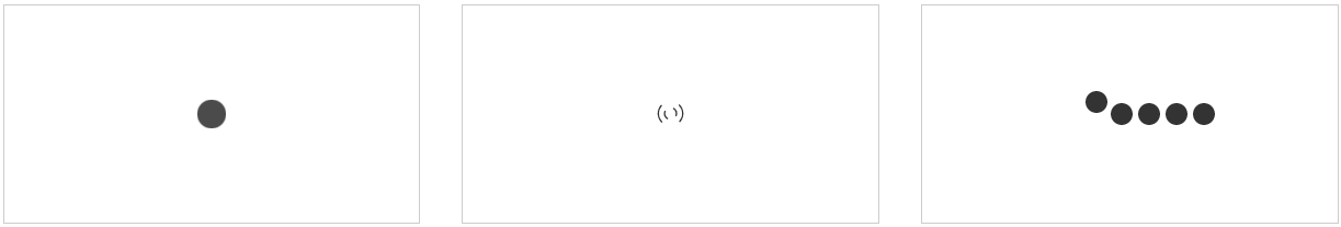
<div class="box">
<div class="loader">
<div class="loading-1">
<i></i>
<i></i>
<i></i>
</div>
</div>
<div class="loader">
<div class="loading-2">
<i></i>
<i></i>
</div>
</div>
<div class="loader">
<div class="loading-3">
<i></i>
<i></i>
<i></i>
<i></i>
<i></i>
</div>
</div>
</div>
</body>
</html>
CSS3实现加载数据动画2的更多相关文章
- CSS3实现加载数据动画1
<!DOCTYPE html> <html lang="en"> <head> <meta charset="UTF-8&quo ...
- css3加载ing动画
项目中ajax交互成功前总会需要给用户提醒,比如请稍候.正在加载中等等,那个等待的动图以前项目中用的是gif,在移动端画质很渣,有毛边,于是在新项目中用css3展示加载中的动画效果. function ...
- 纯css3 加载loading动画特效
最近项目中要实现当页面还没有加载完给用户提示正在加载的loading,本来是想做个图片提示的,但是图片如果放大电脑的分辨率就会感觉到很虚,体验效果很不好.于是就采用css3+js实现这个loading ...
- 2款不同样式的CSS3 Loading加载动画 附源码
原文:2款不同样式的CSS3 Loading加载动画 附源码 我们经常看到的Loading加载很多都是转圈圈的那种,今天我们来换一种有创意的CSS3 Loading加载动画,一种是声波形状的动画,另一 ...
- 10个样式各异的CSS3 Loading加载动画
前几天我在园子里分享过2款很酷的CSS3 Loading加载动画,今天又有10个最新的Loading动画分享给大家,这些动画的样式都不一样,实现起来也并不难,你很容易把它们应用在项目中,先来看看效果图 ...
- 30款基于 jQuery & CSS3 的加载动画和进度条插件
我们所生活每一天看到的新技术或新设计潮流的兴起,Web 开发正处在上升的时代.HTML5 & CSS3 技术的发展让 Web 端可以实现的功能越来越强大. 加载动画和进度条使网站更具吸引力.该 ...
- Android动画之仿美团加载数据等待时,小人奔跑进度动画对话框(附顺丰快递员奔跑效果)
Android动画之仿美团加载数据等待时,小人奔跑进度动画对话框(附顺丰快递员奔跑效果) 首句依然是那句老话,你懂得! finddreams :(http://blog.csdn.net/finddr ...
- echarts在.Net中使用实例(二) 使用ajax动态加载数据
通过上一篇文章可以知道和echarts参考手册可知,series字段就是用来存储我们显示的数据,所以我们只需要用ajax来获取series的值就可以. option 名称 描述 {color}back ...
- iscroll5 上拉,下拉 加载数据
我这里的思路是上拉时候只是加载第一页的内容,可根据实际情况修改其中的代码.请勿照搬.样式没怎么调,可以加载gif动画.1.没有数据时候,下拉可以加载数据.2.没有数据时候,点击也可以加载数据.3.其余 ...
随机推荐
- 一个查看UI5控件所有公有方法的小技巧
一个很小的tip:比如我想把UI5表格控件里的每列设置成宽度根据显示的内容自适应,需要知道应该调用控件的哪个方法来实现. 一种办法当然是查SAP帮助文档,得知需要调用控件的公有方法setAutoSiz ...
- python 提取字符串中的数字组成新的字符串
方法一 # 有一个字符串text = "aAsmr3idd4bgs7Dlsf9eAF" # 请将text字符串中的数字取出,并输出成一个新的字符串 import re text = ...
- IOS 蓝牙(GameKit、Core Bluetooth)
GameKit的蓝牙开发注意 ● 只能用于iOS设备之间的连接 ● 只能用于同一个应用程序之间的连接 ● 最好别利用蓝牙发送比较大的数据 /* 关于蓝牙的数据传输 1. 一次性传送,没有中间方法,所 ...
- ExtJS4 ajax请求同步异步问题
今天在写代码过程中遇到一个奇怪的问题.事情是这种,我写了一个简单的页面用来删除选中的用户,请看以下: 由于后台的servlet的代码实现了依据用户名来删除一条记录.所以我在前台的ExtJS代码里面用了 ...
- 【[SDOI2013]随机数生成器】
题目 来画柿子吧 我们要求的是 \[f(x)\equiv t(mod\ \ p)\] 其中\(f(1)=x_0,f(x)=af(x-1)+b\) 我们来写几项柿子看看 \[f(1)=x_0\] \[f ...
- 2018.11.8 Error contacting service. It is probably not running.
安装zookeeper-3.4.6的时候,启动正常没报错,但zkServer.sh status查看状态的时候却出现错误,如下: JMX enabled by default Using config ...
- 【转】不错的linux下通用的java程序启动脚本
虽然写起动shell的频率非常不高...但是每次要写都要对付一大堆的jar文件路径,新加jar包也必须要修改起动shell. 在网上找到一个挺好的通用shell脚本. 只需要修改一些配置变量,就可以用 ...
- Spring Boot 推荐的基础 POM 文件
名称 说明 spring-boot-starter 核心 POM,包含自动配置支持.日志库和对 YAML 配置文件的支持. spring-boot-starter-amqp 通过 spring-rab ...
- 手机移动端 web整合
meta基础知识 <!DOCTYPE html> <html> <head> <meta charset="utf-8"> < ...
- Entity Framework 二
本篇主要介绍:创建了实体数据模型,生成了那些文件以及其代表意义 创建实体数据模型 上一篇的最后,我们创建了数据库,现在我们利用数据库来生成我们的实体数据模型,这种形式我们称为数据库优先,后面会介绍代码 ...