
Android表单UI及相应控件的事件处理
<!--布局-->

<?xml version="1.0" encoding="utf-8"?>

<RelativeLayout xmlns:android="http://schemas.android.com/apk/res/android"

    android:layout_width="match_parent"

    android:layout_height="match_parent"

    xmlns:app="http://schemas.android.com/apk/res-auto">

    <TextView

        android:id="@+id/textviewtitle"

        android:layout_width="wrap_content"

        android:layout_height="wrap_content"

        android:layout_marginTop="30dp"

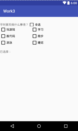
        android:text="平时喜欢做什么事情?" />

    <CheckBox

        android:id="@+id/checkboxall"

        android:layout_width="wrap_content"

        android:layout_height="wrap_content"

        android:layout_alignBottom="@id/textviewtitle"

        android:layout_alignTop="@id/textviewtitle"

        android:layout_toRightOf="@id/textviewtitle"

        android:text="全选" />

    <!--内容的CheckBox-->

    <CheckBox

        android:id="@+id/checkbox1"

        android:layout_width="wrap_content"

        android:layout_height="wrap_content"

        android:layout_below="@id/textviewtitle"

        android:layout_marginRight="80dp"

        android:text="玩游戏" />

    <CheckBox

        android:id="@+id/checkbox2"

        android:layout_width="wrap_content"

        android:layout_height="wrap_content"

        android:layout_below="@id/textviewtitle"

        android:layout_toRightOf="@+id/checkbox1"

        android:text="学习" />

    <CheckBox

        android:id="@+id/checkbox3"

        android:layout_width="wrap_content"

        android:layout_height="wrap_content"

        android:layout_below="@id/checkbox1"

        android:text="敲代码" />

    <CheckBox

        android:id="@+id/checkbox4"

        android:layout_width="wrap_content"

        android:layout_height="wrap_content"

        android:layout_below="@id/checkbox2"

        android:layout_toRightOf="@+id/checkbox1"

        android:text="跑步" />

    <CheckBox

        android:id="@+id/checkbox5"

        android:layout_width="wrap_content"

        android:layout_height="wrap_content"

        android:layout_below="@id/checkbox3"

        android:text="游泳" />

    <CheckBox

        android:id="@+id/checkbox6"

        android:layout_width="wrap_content"

        android:layout_height="wrap_content"

        android:layout_below="@id/checkbox4"

        android:layout_toRightOf="@+id/checkbox1"

        android:text="睡觉" />

    <TextView

        android:id="@+id/textviewinfo"

        android:layout_width="match_parent"

        android:layout_height="wrap_content"

        android:layout_below="@id/checkbox5"

        android:layout_marginTop="20dp"

        android:text="已选择:"/>

</RelativeLayout>

<!--java代码-->

package com.dc.work3;

import android.os.Bundle;

import android.support.v7.app.AppCompatActivity;

import android.util.Log;

import android.widget.CheckBox;

import android.widget.CompoundButton;

import android.widget.TextView;

import android.widget.Toast;

import java.util.LinkedList;

import java.util.List;

/**

 * Created by 怪蜀黍 on 2016/11/4.

 */

public class MainActivity2s extends AppCompatActivity {

    private CheckBox checkboxall;

    private CheckBox checkBox1;

    private CheckBox checkBox2;

    private CheckBox checkBox3;

    private CheckBox checkBox4;

    private CheckBox checkBox5;

    private CheckBox checkBox6;

    private TextView textviewinfo;

    private List<String> checkedStr;

    //操作取消一个时,全选取消,这个变量是是否是用户点击

    private boolean checkFoUser=true;

    protected void onCreate(Bundle savedInstanceState) {

        super.onCreate(savedInstanceState);

        setContentView(R.layout.activity_main_2);

        checkboxall = (CheckBox) findViewById(R.id.checkboxall);

        checkBox1 = (CheckBox) findViewById(R.id.checkbox1);

        checkBox2 = (CheckBox) findViewById(R.id.checkbox2);

        checkBox3 = (CheckBox) findViewById(R.id.checkbox3);

        checkBox4 = (CheckBox) findViewById(R.id.checkbox4);

        checkBox5 = (CheckBox) findViewById(R.id.checkbox5);

        checkBox6 = (CheckBox) findViewById(R.id.checkbox6);

        textviewinfo = (TextView) findViewById(R.id.textviewinfo);

        checkBox1.setOnCheckedChangeListener(changeListener);

        checkBox2.setOnCheckedChangeListener(changeListener);

        checkBox3.setOnCheckedChangeListener(changeListener);

        checkBox4.setOnCheckedChangeListener(changeListener);

        checkBox5.setOnCheckedChangeListener(changeListener);

        checkBox6.setOnCheckedChangeListener(changeListener);

        checkboxall.setOnCheckedChangeListener(changeListener);

        checkedStr=new LinkedList<>();

    }

    public CompoundButton.OnCheckedChangeListener changeListener = new CompoundButton.OnCheckedChangeListener() {

        @Override

        public void onCheckedChanged(CompoundButton buttonView, boolean isChecked) {

            switch (buttonView.getId()){

                case R.id.checkbox1:

                case R.id.checkbox2:

                case R.id.checkbox3:

                case R.id.checkbox4:

                case R.id.checkbox5:

                case R.id.checkbox6:

                    String str=buttonView.getText().toString();

                    if(isChecked){

                        checkedStr.add(str);

                    }else {

                        checkedStr.remove(str);

                    }

                     checkboxall.setOnCheckedChangeListener(null);

                    if(checkBox1.isChecked()&&checkBox2.isChecked()&&checkBox3.isChecked()&&checkBox4.isChecked()&&checkBox5.isChecked()&&checkBox6.isChecked()){

                        //表示如果都选中时,把全选按钮也选中

                        checkboxall.setChecked(true);

                    }else {

                        //否则就全选按钮去不选中,但是这样会触发checkboxall的监听,会把所有的都取消掉

                        checkboxall.setChecked(false);

                    }

                     checkboxall.setOnCheckedChangeListener(changeListener);

                    break;

                case R.id.checkboxall:

                    if(checkFoUser) {

                        checkBox1.setChecked(isChecked);

                        checkBox2.setChecked(isChecked);

                        checkBox3.setChecked(isChecked);

                        checkBox4.setChecked(isChecked);

                        checkBox5.setChecked(isChecked);

                        checkBox6.setChecked(isChecked);

                        break;

                    }

            }

            StringBuffer sb=new StringBuffer();

            for(String str:checkedStr){

                sb.append(str+",");

            }

            if(sb.length()>0){

                //设置长度为长度-1,去除最后的“,”

                sb.setLength(sb.length()-1);

            }

            textviewinfo.setText("已选择:"+sb.toString());

        }

    };

}
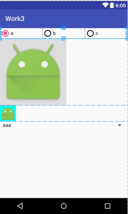
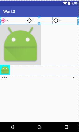
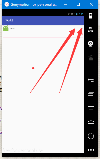
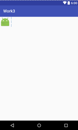
<!--布局-->

<?xml version="1.0" encoding="utf-8"?>

<!--虽然高度是充满,但是他是包裹的-->

<!--android:scrollbars="none"无滚动条-->

<!--android:overScrollMode="never" 滚动条到头的提示模式-->

<ScrollView xmlns:android="http://schemas.android.com/apk/res/android"

    android:layout_width="match_parent"

    android:layout_height="match_parent"

    android:scrollbars="none"

    android:overScrollMode="never">

    <!--注意,ScrolView只能有一个子控件,要想有多个空间,使用Linear Layout包裹-->

    <LinearLayout

        android:layout_width="match_parent"

        android:layout_height="match_parent"

        android:orientation="vertical">

        <!--横向滚动条-->

        <!--因为是横向滚动条,所以不管你宽度设置多少,他始终是充满的-->

        <HorizontalScrollView

            android:layout_width="match_parent"

            android:layout_height="wrap_content"></HorizontalScrollView>

        <!--进度条-->

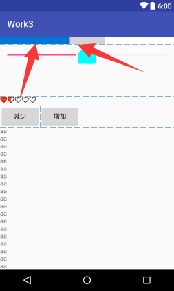
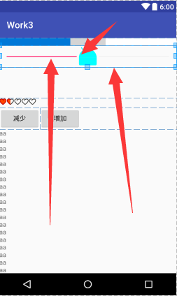
        <!--android:indeterminate="true" 设置进度条不确定值的进度条-->

        <!--android:progressDrawable="@drawable/progress_bar_drawable"我们自定义的进度条-->

        <!--高度

        android:maxHeight="2dp"

            android:minHeight="2dp"-->

        <ProgressBar

            android:id="@+id/progress_bar"

            style="?android:attr/progressBarStyleHorizontal"

            android:layout_width="match_parent"

            android:layout_height="wrap_content"

            android:max="10"

            android:progress="4"

            android:secondaryProgress="6"

            android:progressDrawable="@drawable/progress_bar_drawable"

            />

        <!--可以拖拽的进度条-->

        <!-- android:thumb="@mipmap/ic_launcher"自定义图片-->

        <!-- android:thumbOffset="100dp" 偏移量,一般不会用到-->

        <!--android:thumbTint="#0ff"  着色,不管什么图片还是默认,颜色都改变-->

        <!--鼠标悬浮上边这句话时,他的意思是,21版本才可以使用,当前版本是16-->

        <SeekBar

            android:id="@+id/seek_bar"

            android:layout_width="match_parent"

            android:layout_height="wrap_content"

            android:thumb="@mipmap/ic_launcher"

            android:thumbTint="#0ff"

            android:progress="50"/>

        <!-- android:visibility="invisible" 默认隐藏-->

        <!--调整文本框的大小尽量使用边来改变-->

        <TextView

            android:id="@+id/progress"

            android:layout_width="wrap_content"

            android:layout_height="wrap_content"

            android:paddingLeft="50dp"

            android:paddingRight="50dp"

            android:paddingTop="20dp"

            android:paddingBottom="20dp"

            android:background="#cdcdcd"

            android:text="0%"

            android:textSize="22sp"

            android:visibility="invisible"

            android:layout_gravity="center_horizontal"/>

        <!--注意使用时,宽度和高度都使用包裹-->

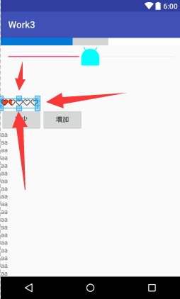
        <!--android:stepSize="1"每次增长1-->

        <!--android:isIndicator="true" 是否作为指示器,比如QQ等级-->

        <!--style="?android:attr/ratingBarStyleSmall"-->

        <!--hdpi是mdpi的1.5倍,xmdpi是m的2倍-->

        <RatingBar

            android:layout_width="wrap_content"

            android:layout_height="wrap_content"

            android:numStars="5"

            android:rating="1.5"

            android:stepSize="0.5"

            android:progressDrawable="@drawable/rating_bar_drawable"

            android:minHeight="21dp"

            android:maxHeight="21dp"/>

        <LinearLayout

            android:layout_width="match_parent"

            android:layout_height="wrap_content">

            <Button

                android:id="@+id/bt1"

                android:layout_width="wrap_content"

                android:layout_height="wrap_content"

                android:text="减少"/>

            <Button

                android:id="@+id/bt2"

                android:layout_width="wrap_content"

                android:layout_height="wrap_content"

                android:text="增加"/>

        </LinearLayout>

        <!--为了看清楚效果,这里我们把高度设为20dp,text设置多点字符,这样就超出了屏幕-->

        <TextView

            android:layout_width="20dp"

            android:layout_height="wrap_content"

            android:text="aaaaaaaaaaaaaaaaaaaaaaaaaaaaaaaaaaaaaaaaaaaaaaaaaaaaaaaaaaaaaaaaaaaaaaaaaaaaaaaaaaaaaaaaaaaaaaaaaaaaaaaaaaaaaaaaaaaaaaaaaaaaaaaaaaaaaaa"/>

        <Button

            android:layout_width="wrap_content"

            android:layout_height="wrap_content" />

    </LinearLayout>

</ScrollView>

具体功能实现的java代码

package com.dc.work3;

import android.os.Bundle;

import android.support.annotation.Nullable;

import android.support.v7.app.AppCompatActivity;

import android.util.Log;

import android.view.View;

import android.widget.AdapterView;

import android.widget.ImageView;

import android.widget.RadioGroup;

import android.widget.Spinner;

/**

 * Created by 怪蜀黍 on 2016/11/4.

 */

public class MainActivity_radiobutton extends AppCompatActivity {

    private RadioGroup rg;

    private Spinner spinner;

    //重写一个参数的处事方法

    @Override

    protected void onCreate(Bundle savedInstanceState) {

        super.onCreate(savedInstanceState);

        setContentView(R.layout.activity_main_radiobutton);

        rg= (RadioGroup) findViewById(R.id.rg1);

        rg.setOnCheckedChangeListener(changeLis);

        //如果没有任何选中项,返回-1

      //  rg.getCheckedRadioButtonId();

        //选中指定项

       // rg.check(R.id.rb1);

        //清除选中项

       // rg.clearCheck();

        ImageView img=(ImageView) findViewById(R.id.iv);

//        设置图片

        img.setImageResource(R.mipmap.ic_launcher);

        //设置缩放类型

        img.setScaleType(ImageView.ScaleType.CENTER);

        spinner=(Spinner)findViewById(R.id.spinner);

        spinner.setOnItemSelectedListener(itemSelectedListener);

    }

    private AdapterView.OnItemSelectedListener itemSelectedListener =new AdapterView.OnItemSelectedListener() {

        @Override//当项选中时  参数1:触发事件的控件 2:选中的视图 3:选中视图的id

        public void onItemSelected(AdapterView<?> parent, View view, int position, long id) {

        }

        @Override//当没有项选中时

        public void onNothingSelected(AdapterView<?> parent) {

        }

    };

    private RadioGroup.OnCheckedChangeListener changeLis=new RadioGroup.OnCheckedChangeListener() {

        @Override //参数2:选中者的id

        public void onCheckedChanged(RadioGroup group, int checkedId) {

            //获取选中项的数据

            String str=spinner.getSelectedItem().toString();

            //获取选中项的下标

            int position=spinner.getSelectedItemPosition();

            //获取选中项的id

            long id= spinner.getSelectedItemId();

            Log.e("aaaa",str+"========="+position+"========="+id);

        }

    };

}
Android表单UI及相应控件的事件处理的更多相关文章
- Bootstrap3 表单-被支持的控件:文本域
支持多行文本的表单控件.可根据需要改变 rows 属性. <textarea class="form-control" rows="3"></ ...
- Bootstrap3 表单-被支持的控件:输入框
输入框包括大部分表单控件.文本输入域控件,还支持所有 HTML5 类型的输入控件: text.password.datetime.datetime-local.date.month.time.week ...
- html表单的各种输入控件
表单的输入控件主要是input和select.其中input可以是多种类型,通过type属性来进行定义,type可以取值是text,radio,checkbox,password,submit,res ...
- BarTender 2016表单中的“秤显示”控件
BarTender 2016中的表单是一个非常实用的工具,它可以实现数据输出提示,查询提示和同一表单的记录选择.这些都离开可供添加的控件,“秤显示”控件也是我们打印尝尝需要涉及的,今天我们就来看看什么 ...
- Appium Android Bootstrap源码分析之控件AndroidElement
通过上一篇文章<Appium Android Bootstrap源码分析之简介>我们对bootstrap的定义以及其在appium和uiautomator处于一个什么样的位置有了一个初步的 ...
- iOS开发UI篇—UIScrollView控件介绍
iOS开发UI篇—UIScrollView控件介绍 一.知识点简单介绍 1.UIScrollView控件是什么? (1)移动设备的屏幕⼤大⼩小是极其有限的,因此直接展⽰示在⽤用户眼前的内容也相当有限 ...
- Android support library支持包常用控件介绍(二)
谷歌官方推出Material Design 设计理念已经有段时间了,为支持更方便的实现 Material Design设计效果,官方给出了Android support design library ...
- Android开发技巧——自定义控件之组合控件
Android开发技巧--自定义控件之组合控件 我准备在接下来一段时间,写一系列有关Android自定义控件的博客,包括如何进行各种自定义,并分享一下我所知道的其中的技巧,注意点等. 还是那句老话,尽 ...
- (转载) Android 带清除功能的输入框控件ClearEditText,仿IOS的输入框
Android 带清除功能的输入框控件ClearEditText,仿IOS的输入框 标签: Android清除功能EditText仿IOS的输入框 2013-09-04 17:33 70865人阅读 ...
随机推荐
- 检索 COM 类工厂中 CLSID 为 {13C28AD0-F195-4319-B7D7-A1BDAA329FB8} 的组件时失败,原因是出现以下错误: 80040154
异常类型:COMException 异常消息:检索 COM 类工厂中 CLSID 为 {13C28AD0-F195-4319-B7D7-A1BDAA329FB8} 的组件时失败,原因是出现以下错误: ...
- js 获取时间比较全,留备用(zhuan)
var myDate = new Date(); myDate.getYear(); //获取当前年份(2位) myDate.getFullYear(); //获取完整的年份(4位 ...
- 内存调试的东西D/dalvikvm( 809 ): GC_CONCURRENT freed
一般Java虚拟机要求支持verbosegc选项,输出详细的垃圾收集调试信息.dalvik虚拟机很安静的接受verbosegc选项,然后什么都不做.dalvik虚拟机使用自己的一套LOG机制来输出调试 ...
- [引用]SQLServer占CPU100%
程序猿是如何解决SQLServer占CPU100%的 文章目录 遇到的问题 使用SQLServer Profiler监控数据库 SQL1:查找最新的30条告警事件 SQL2:获取当前的总报警记录数 ...
- spring源码分析之spring-web remoting模块概况及基本概念
spring-web总体分为三部分:caucho.httpinvoker.jaxws,其总体构造图如下: uml结构: 先看看网上搜索到的上述实现的原理吧:Spring RMI,Hessian/Bur ...
- jQuery--捕获键盘敲击
功能 当页面加载完成后,用户键盘按下某个键后,jQuery能够捕获到一个数字,从而执行一系列动作. 格式 1 2 3 4 5 6 7 8 9 10 11 12 $(function(){ $ ...
- IIS相关问题整理
1.报错:请求的内容似乎是脚本,因而将无法由静态文件处理程序来处理 解决方案地址:http://blog.csdn.net/canielau/article/details/7609613 2.报错: ...
- 【Android进阶系列教程】前言
起因 因为初学Android的时候还没有写博客的意识,现在Android的门是入了,正在进阶的道路上行走,但是就这一路也走了不少的弯路.我想,总得来说Android入门还是比较容易的,网络资源比较丰富 ...
- TreeBuilder科学的树创建器
public static class TreeBuilder { public static List<dynamic> Build(IEnumerable<dynamic> ...
- Unity中启动VS时出现"Visual Studio 2010 Shell 无效的许可证数据"的解决办法
(感觉还是cnblog好一点,刚注册成功赶紧把baidu hi的一篇文章搬过来试试) 一直用着Visual Studio 2013给Unity写代码,安装了SQL Server 2014后,在Unit ...