【CSS3】loading动画
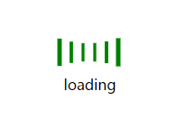
HTML:
<!DOCTYPE html>

<html lang="en">

<head>

    <meta charset="UTF-8">

    <title>loading</title>

</head>

<body>

    <div>

        <ul>

            <li></li>

            <li></li>

            <li></li>

            <li></li>

            <li></li>

            <li></li>

        </ul>

        <p>loading</p>

    </div>

</body>

</html>
CSS:
    <style>

        * { margin:; padding:; list-style: none; }

        div { width: 85px; height: 70px; margin: 50px auto; }

        ul { width: 85px; height: 50px; }

        li { width: 8px; height: 50px; background-color: green; float: left; margin-left: 5px; animation: loading 1.2s ease-in-out infinite; }

        p { text-align: center; vertical-align: middle; }

        li:nth-of-type(1) {

            animation-delay: -1.1s;

        }

        li:nth-of-type(2) {

            animation-delay: -1s;

        }

        li:nth-of-type(3) {

            animation-delay: -0.9s;

        }

        li:nth-of-type(4) {

            animation-delay: -0.8s;

        }

        li:nth-of-type(5) {

            animation-delay: -0.7s;

        }

        li:nth-of-type(6) {

            animation-delay: -0.6s;

        }

        @keyframes loading {

            0%,100% { transform: scaleY(1); }

            50% { transform: scale(.4); }

        }

    </style>

HTML:
<!DOCTYPE html>

<html>

    <head>

        <meta charset="UTF-8">

        <title></title>

    </head>

    <body>

        <div>

            <div></div>

            <img src="img/bg.jpg" alt="">

        </div>

    </body>

</html>
css:
        <style type="text/css">

            div { width: 200px; height: 200px; border-radius: 50%; position: relative; margin: 100px auto; background-color: black; }

            div > * { top:; right:; bottom:; left:; margin: auto; }

            div > div { width: 95%; height: 95%; border: 5px #333     solid; border-radius: 50%; border-top-color: #eee; background-size: 100%; transform: rotateZ(0deg); position: absolute; }

            img { width: 95%; height: 95%; border-radius: 50%; position: absolute; opacity:; }

            div:hover div { animation: rotate 1s linear infinite; }

            div:hover img { opacity: .6; }

            @keyframes rotate {

                0% { transform: rotateZ(0deg); }

                25% { transform: rotateZ(90deg); }

                50% { transform: rotateZ(180deg); }

                75% { transform: rotateZ(270deg); }

                100% { transform: rotateZ(360deg); }

            }

        </style>
【CSS3】loading动画的更多相关文章
- 简单的CSS3 Loading动画
最终效果如图一,gif图片稍微有点卡顿,事实上代码在浏览器里执行得很流畅.这里面用到的css3技术非常简单,分别是border-radius.伪元素.css3关键帧以及animation动画. 首先整 ...
- css3 loading动画 三个省略号
<!DOCTYPE html><html lang="en"><head> <meta charset="UTF-8" ...
- 分享web前端七款HTML5 Loading动画特效集锦
以前我们大部分的Loading动画都是利用gif图片实现的,这种图片实现Loading动画的方法虽然也很不错,但是作为HTML5开发者来说,如果能利用HTML5和CSS3实现这些超酷的Loading动 ...
- 7 款华丽的 HTML5 Loading 动画特效
我们在进行大数据的传输或者复杂操作的等待时,最好能有一个Loading等待的小动画提示用户.本文将为大家分享一些超华丽的基于HTML5的Loading加载动画特效,希望你会喜欢. 1.HTML5 Ca ...
- 纯css3 加载loading动画特效
最近项目中要实现当页面还没有加载完给用户提示正在加载的loading,本来是想做个图片提示的,但是图片如果放大电脑的分辨率就会感觉到很虚,体验效果很不好.于是就采用css3+js实现这个loading ...
- 2款不同样式的CSS3 Loading加载动画 附源码
原文:2款不同样式的CSS3 Loading加载动画 附源码 我们经常看到的Loading加载很多都是转圈圈的那种,今天我们来换一种有创意的CSS3 Loading加载动画,一种是声波形状的动画,另一 ...
- CSS3效果:animate实现点点点loading动画效果(二)
box-shadow实现的打点效果 简介 box-shadow理论上可以生成任意的图形效果,当然也就可以实现点点点的loading效果了. 实现原理 html代码,首先需要写如下html代码以及cla ...
- 10个样式各异的CSS3 Loading加载动画
前几天我在园子里分享过2款很酷的CSS3 Loading加载动画,今天又有10个最新的Loading动画分享给大家,这些动画的样式都不一样,实现起来也并不难,你很容易把它们应用在项目中,先来看看效果图 ...
- 纯CSS3文字Loading动画特效
纯CSS3文字Loading动画特效是一款个性的loading文字加载动画. 在线演示本地下载
- 10种CSS3实现的loading动画,挑一个走吧?
这篇文章主要介绍了10种CSS3实现的loading动画,帮助大家更好的美化自身网页,完成需求,感兴趣的朋友可以了解下. HTML: 1 <body> 2 <div class=&q ...
随机推荐
- Phpstrom学习笔记
1.用*标识编辑过的文件 File - Editor – General - Editor Tabs 选中Mark modifyied tabs with asterisk
- toString方法和valueof()方法的区别
JavaScript引用类型之Array数组的toString()和valueof()方法的区别 一.转换方法 1.在JavaScript中几乎所有对象都具有toLocaleString().to ...
- 2017年浙工大迎新赛热身赛 L cayun日常之赏月【易错特判】
题目描述(https://www.nowcoder.com/acm/contest/51#question) 在cayun星球月亮大小都有一个规律,月亮为每30天一个周期,在这30天的周期里,月亮的大 ...
- jQuery ajax请求struts action实现异步刷新
第一步:导入相关jar包,本样例需导入struts相关jar包,json-lib.jar,gson-2.1.jar可以任意选择,但是这里需要都导入,因为为了做测试,两种jar包的转换方式都用到了. 第 ...
- 类似淘宝五星点评 ,Jquery实现代码
<!--默认五星,根据鼠标点击判断--> <!DOCTYPE html><html lang="en"><head> <met ...
- 模板内置函数(HTML)
模板内置函数 注意:1.html书写避免多余的空格,否则可能无法被识别 2.模板是用来渲染的不要用来处理逻辑 后台ctime=datetime.datatime.now() {{ctime|date: ...
- poj2125 最小点权覆盖集
题意:有一张图,对于每个点,有出边和入边,现在目的是删除改图的所有边,对于每个点,删除出边的花费Wi-,删除入边的花费Wi+,现在的目的求删去所有边后的花费最小. 建图方法:对于每个点i,拆点为i,i ...
- 将Gradle项目发布到Maven Central库中
本文主要介绍如何一个由gradle构建的项目部署到Maven Central. 网上大部分都是介绍如何将由maven构建的项目部署到Maven Central.与Gradle相关的比较少. 申请账号 ...
- 洛谷 P2486 [SDOI2011]染色 树链剖分
目录 题面 题目链接 题目描述 输入输出格式 输入格式 输出格式 输入输出样例 输入样例: 输出样例: 说明 思路 PushDown与Update Q AC代码 总结与拓展 题面 题目链接 P2486 ...
- Xici drop flower
var xici_user_api = "http://www.xici.net/apps/wedding/?method=wedding.user.getusername&from ...