LaTeX绘图宏包 Pgfplots package
Pgfplots package
The pgfplots package is a powerful tool, based on tikz, dedicated to create scientific graphs.
Contents |
Introduction
Pgfplots is a visualization tool to make simpler the inclusion of plots in your documents. The basic idea is that you provide the input data/formula and pgfplots does the rest.
\begin{tikzpicture}

\begin{axis}

\addplot[color=red]{exp(x)};

\end{axis}

\end{tikzpicture}

%Here ends the furst plot

\hskip 5pt

%Here begins the 3d plot

\begin{tikzpicture}

\begin{axis}

\addplot3[

    surf,

]

{exp(-x^2-y^2)*x};

\end{axis}

\end{tikzpicture}
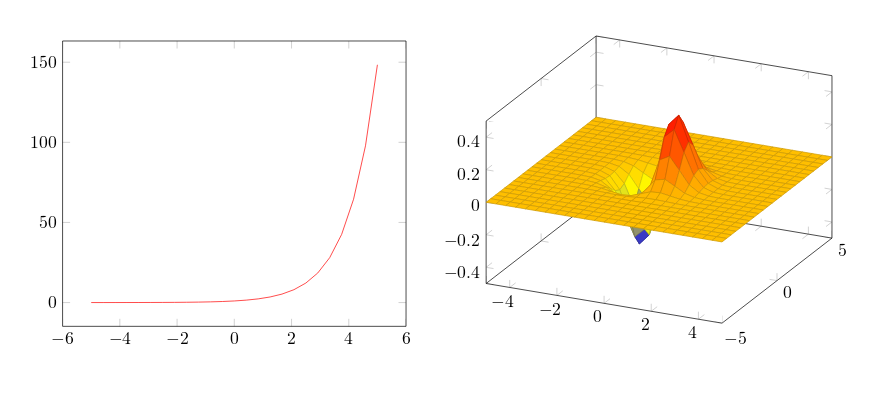
Since pgfplot is based on tikz the plot must be inside a tikzpicture environment. Then the environment declaration \begin{axis}, \end{axis} will set the right scaling for the plot, check the Reference guide for other axis environments.
To add an actual plot, the command \addplot[color=red]{log(x)}; is used. Inside the squared brackets some options can be passed, in this case we set the colour of the plot to red; the squared brackets are mandatory, if no options are passed leave a blank space between them. Inside the curly brackets you put the function to plot. Is important to remember that this command must end with a semicolon ;.
To put a second plot next to the first one declare a new tikzpicture environment. Do not insert a new line, but a small blank gap, in this case hskip 10pt will insert a 10pt-wide blank space.
The rest of the syntax is the same, except for the \addplot3 [surf,]{exp(-x^2-y^2)*x};. This will add a 3dplot, and the option surf inside squared brackets declares that it's a surface plot. The function to plot must be placed inside curly brackets. Again, don't forget to put a semicolon ; at the end of the command.
Note: It's recommended as a good practice to indent the code - see the second plot in the example above - and to add a comma , at the end of each option passed to \addplot. This way the code is more readable and is easier to add further options if needed.
Open an example of the pgfplots package in ShareLaTeX
The document preamble
To include pgfplots in your document is very easy, add the next line to your preamble and that's it:
\usepackage{pgfplots}
Some additional tweaking for this package can be made in the preamble. To change the size of each plot and also guarantee compatibility backwards (recommended) add the next line:
\pgfplotsset{width=10cm,compat=1.9}
This changes the size of each pgfplot figure to 10 cementers, which is huge; you may use different units (pt, mm, in). The compat parameter is for the code to work on the package version 1.9 or latter.
Since LaTeX was not initially conceived with plotting capabilities in mind, when there are several pgfplotfigures in your document or they are very complex, it takes a considerable amount of time to render them. To improve the compiling time you can configure the package to export the figures to separate PDF files and then import them into the document, just add the code shown below to the preamble:
\usepgfplotslibrary{external}
\tikzexternalize
By now this functionality is not implemented in ShareLaTeX, but you can try it in your local LaTeX installation.
Open an example of the pgfplots package in ShareLaTeX
2D plots
Pgfplots 2D plotting functionalities are vast, you can personalize your plots to look exactly what you want. Nevertheless, the default options usually give very good result, so all you have to do is feed the data and LaTeX will do the rest:
Plotting mathematical expressions
To plot mathematical expressions is really easy:
\begin{tikzpicture}

\begin{axis}[

    axis lines = left,

    xlabel = $x$,

    ylabel = {$f(x)$},

]

%Below the red parabola is defined

\addplot [

    domain=-10:10,

    samples=100,

    color=red,

]

{x^2 - 2*x - 1};

\addlegendentry{$x^2 - 2x - 1$}

%Here the blue parabloa is defined

\addplot [

    domain=-10:10,

    samples=100,

    color=blue,

    ]

    {x^2 + 2*x + 1};

\addlegendentry{$x^2 + 2x + 1$}


\end{axis}

\end{tikzpicture}
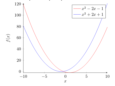
Let's analyse the new commands line by line:
axis lines = left.- This will set the axis only on the left and bottom sides of the plot, instead of the default box. Further customisation options at the reference guide.
xlabel = $x$andylabel = {$f(x)$}.- Self-explanatory parameter names, these will let you put a label on the horizontal and vertical axis. Notice the ylabel value in between curly brackets, this brackets tell pgfplots how to group the text. The xlabelcould have had brackets too. This is useful for complicated labels that may confuse pgfplot.
\addplot.- This will add a plot to the axis, general usage was described at the introduction. There are two new parameters in this example.
domain=-10:10.- This establishes the range of values of
 .
.
samples=100.- Determines the number of points in the interval defined by domain. The greater the value of samples the sharper the graph you get, but it will take longer to render.
\addlegendentry{$x^2 - 2x - 1$}.- This adds the legend to identify the function
 .
.
To add another graph to the plot just write a new \addplot entry.
Open an example of the pgfplots package in ShareLaTeX
Plotting from data
Scientific research often yields data that has to be analysed. The next example shows how to plot data withpgfplots:
\begin{tikzpicture}

\begin{axis}[

    title={Temperature dependence of CuSO$_4\cdot$5H$_2$O solubility},

    xlabel={Temperature [\textcelsius]},

    ylabel={Solubility [g per 100 g water]},

    xmin=0, xmax=100,

    ymin=0, ymax=120,

    xtick={0,20,40,60,80,100},

    ytick={0,20,40,60,80,100,120},

    legend pos=north west,

    ymajorgrids=true,

    grid style=dashed,

]


\addplot[

    color=blue,

    mark=square,

    ]

    coordinates {

    (0,23.1)(10,27.5)(20,32)(30,37.8)(40,44.6)(60,61.8)(80,83.8)(100,114)

    };

    \legend{CuSO$_4\cdot$5H$_2$O}


\end{axis}

\end{tikzpicture}
There are some new commands and parameters here:
title={Temperature dependence of CuSO$_4\cdot$5H$_2$O solubility}.- As you might expect, assigns a title to the figure. The title will be displayed above the plot.
xmin=0, xmax=100, ymin=0, ymax=120.- Minimum and maximum bounds of the x and y axes.
xtick={0,20,40,60,80,100}, ytick={0,20,40,60,80,100,120}.- Points where the marks are placed. If empty the ticks are set automatically.
legend pos=north west.- Position of the legend box. Check the reference guide for more options.
ymajorgrids=true.- This Enables/disables grid lines at the tick positions on the y axis. Use
xmajorgridsto enable grid lines on the x axis.
grid style=dashed.- Self-explanatory. To display dashed grid lines.
mark=square.- This draws a squared mark at each point in the cordinates array. Each mark will be connected with the next one by a straight line.
coordinates {(0,23.1)(10,27.5)(20,32)...}- Coordinates of the points to be plotted. This is the data you want analyse graphically.
If the data is in a file, which is the case most of the time; instead of the commands \addplot andcoordinates you should use \addplot table {file_with_the_data.dat}, the rest of the options are valid in this environment.
Open an example of the pgfplots package in ShareLaTeX
Scatter plots
Scatter plots are used to represent information by using some kind of marks, these are common, for example, when computing statistical regression. Lets start with some data, the sample below is to show the structure of the data file we are going to plot (see the end of this section for a link to the LaTeX source and the data file):
GPA ma ve co un
3.45 643 589 3.76 3.52
2.78 558 512 2.87 2.91
2.52 583 503 2.54 2.4
3.67 685 602 3.83 3.47
3.24 592 538 3.29 3.47
2.1 562 486 2.64 2.37
The next example is a scatter plot of the first two columns in this table:
\begin{tikzpicture}

\begin{axis}[

    enlargelimits=false,

]

\addplot+[

    only marks,

    scatter,

    mark=halfcircle*,

    mark size=2.9pt]

table[meta=ma]

{scattered_example.dat};

\end{axis}

\end{tikzpicture}
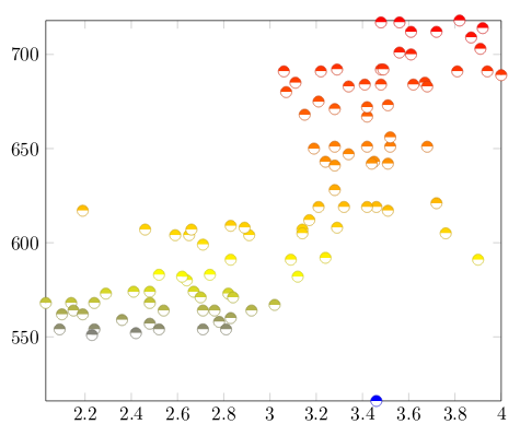
The parameters passed to the axis and addplot environments can also be used in a data plot, except forscatter. Below the description of the code:
enlarge limits=false- This will shrink the axes so the point with maximum and minimum values lay on the edge of the plot.
only marks- Really explicit, will put a mark on each point.
scatter- When scatter is used the points are coloured depending on a value, the colour is given by the
metaparameter explained below.
mark=halfcircle*- The kind of mark to use on each point, check the reference guide for a list of possible values.
mark size=2.9pt- The size of each mark, different units can be used.
table[meta=ma]{scattered_example.dat};- Here the table command tells latex that the data to be plotted is in a file. The meta=ma parameter is passed to choose the column that determines the colour of each point. Inside curly brackets is the name of the data file.
Open an example of the pgfplots package in ShareLaTeX
Bar graphs
Bar graphs (also known as bar charts and bar plots) are used to display gathered data, mainly statistical data about a population of some sort. Bar plots in pgfplots are highly customisable, but here we are going to show an example that 'just works':
\begin{tikzpicture}

\begin{axis}[

	x tick label style={

		/pgf/number format/1000 sep=},

	ylabel=Year,

	enlargelimits=0.05,

	legend style={at={(0.5,-0.1)},

	anchor=north,legend columns=-1},

	ybar interval=0.7,

]

\addplot

	coordinates {(2012,408184) (2011,408348)

		 (2010,414870) (2009,412156) (2008,415 838)};

\addplot

	coordinates {(2012,388950) (2011,393007)

		(2010,398449) (2009,395972) (2008,398866)};

\legend{Men,Women}

\end{axis}

\end{tikzpicture}
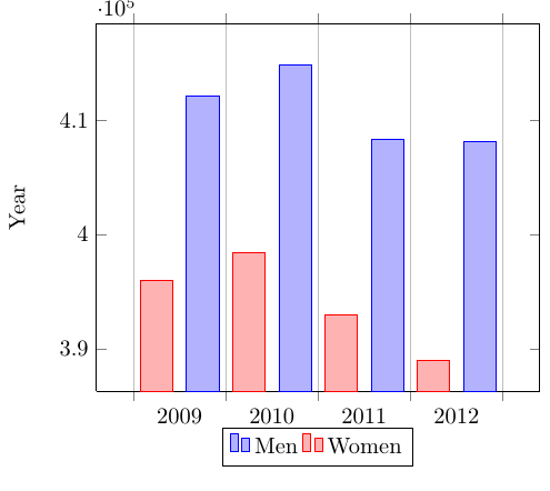
The figure starts with the already explained declaration of the tikzpicture and axis environments, but theaxis declaration has a number of new parameters:
x tick label style={/pgf/number format/1000 sep=}- This piece of code defines a complete style for the plot. With this style you may include several
\addplotcommands within this axis environment, they will fit and look nice together with no further tweaks (theybarparameter described below is mandatory for this to work).
enlargelimits=0.05.- Enlarging the limits in a bar plot is necessary because these kind of plots often require some extra space above the bar to look better and/or add a label. Then number 0.05 is relative to the total height of of the plot.
legend style={at={(0.5,-0.2)}, anchor=north,legend columns=-1}- Again, this will work just fine most of the time. If anything, change the value of -0.2 to locate the legend closer/farther from the x-axis.
ybar interval=0.7,- Thickness of each bar. 1 meaning the bars will be one next to the other with no gaps and 0 meaning there will be no bars, but only vertical lines.
The coordinates in this kind of plot determine the base point of the bar and its height.
The labels on the y-axis will show up to 4 digits. If in the numbers you are working with are greater than 9999 pgfplot will use the same notation as in the example.
Open an example of the pgfplots package in ShareLaTeX
3D Plots
pgfplots has the 3d Plotting capabilities that you may expect in a plotting software.
Plotting mathematical expressions
There's a simple example about this at the introduction, let's work on something slightly more complex:
\begin{tikzpicture}

\begin{axis}[

    title=Exmple using the mesh parameter,

    hide axis,

    colormap/cool,

]

\addplot3[

    mesh,

    samples=50,

    domain=-8:8,

]

{sin(deg(sqrt(x^2+y^2)))/sqrt(x^2+y^2)};

\addlegendentry{$\frac{sin(r)}{r}$}

\end{axis}

\end{tikzpicture}
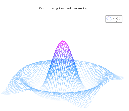
Most of the commands here have already been explained, but there are 3 new things:
hide axis- This option in the axis environment is self descriptive, the axis won't be shown.
colormap/cool- Is the colour scheme to be used in the plot. Check the reference guide for more colour schemes.
mesh- This option is self-descriptive too, check also the surf parameter in the introductory example.
Note: When working with trigonometric functions pgfplots uses degrees as default units, if the angle is in radians (as in this example) you have to use de deg function to convert to degrees.
Open an example of the pgfplots package in ShareLaTeX
Contour plots
In pgfplots is possible to plot contour plots, but the data has have to be pre calculated by an external program. Let's see:
\begin{tikzpicture}

\begin{axis}

[

    title={Contour plot, view from top},

    view={0}{90}

]

\addplot3[

    contour gnuplot={levels={0.8, 0.4, 0.2, -0.2}}

]

{sin(deg(sqrt(x^2+y^2)))/sqrt(x^2+y^2)};

\end{axis}

\end{tikzpicture}

This is a plot of some contour lines for the same equation used in the previous section. The value of thetitle parameter is inside curly brackets because it contains a comma, so we use the grouping brackets to avoid any confusion with the other parameters passed to the \begin{axis} declaration. There are two new commands:
view={0}{90}- This changes the view of the plot. The parameter is passed to the axis environment, which means this can be used in any other type of 3d plot. The first value is a rotation, in degrees, around the z-axis; the second value is to rotate the view around the x-axis. In this example when we combine a 0° rotation around the z-axis and a 90° rotation around the x-axis we end up with a view of the plot from top.
contour gnuplot={levels={0.8, 0.4, 0.2, -0.2}}- This line of code does two things: First, tells LaTeX to use the external software gnuplot to compute the contour lines; this works fine in ShareLaTeX but if you want to use this command in your local LaTeX installation you have to install gnuplot first (matlab will also work, in such case write matlab instead ofgnuplot in the command). Second, the sub parameter
levelsis a list of values of elevation levels where the contour lines are to be computed.
Open an example of the pgfplots package in ShareLaTeX
Plotting a surface from data
To plot a set of data into a 3d surface all we need is the coordinates of each point. These coordinates could be an unordered set or, in this case, a matrix:
\begin{tikzpicture}

\begin{axis}

\addplot3[

    surf,

]

coordinates {

(0,0,0) (0,1,0) (0,2,0)


(1,0,0) (1,1,0.6) (1,2,0.7)


(2,0,0) (2,1,0.7) (2,2,1.8)

};

\end{axis}

\end{tikzpicture}
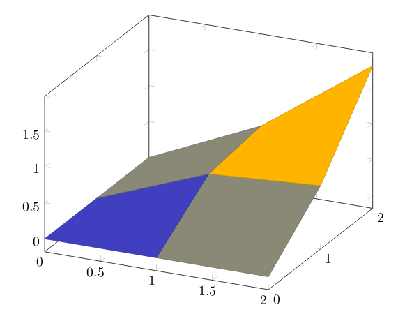
The points passed to the coordinates parameter are treated as contained in a 3 x 3 matrix, being a white row space the separator of each matrix row.
All the options for 3d plots in this article apply to data surfaces.
Open an example of the pgfplots package in ShareLaTeX
Parametric plot
The syntax for parametric plots is slightly different. Let's see:
\begin{tikzpicture}

\begin{axis}

    [

    view={60}{30},

    ]

\addplot3[

    domain=0:5*pi,

    samples = 60,

    samples y=0,

]

({sin(deg(x))},

{cos(deg(x))},

{x});

\end{axis}

\end{tikzpicture}
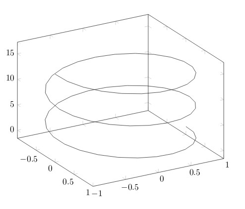
There are only two new things in this example: first, the samples y=0 to prevent pgfplots from joining the extreme points of the spiral and; second, the way the function to plot is passed to the addplot3environment. Each parameter function is grouped inside curly brackets and the three parameters are delimited with parenthesis.
Open an example of the pgfplots package in ShareLaTeX
Reference guide
| Command/Option/Environment | Description | Possible Values |
|---|---|---|
| axis | Normal plots with linear scaling | |
| semilogxaxis | logaritmic scaling of x and normal scaling for y | |
| semilogyaxis | logaritmic scaling for y and normal scaling for x | |
| loglogaxis | logaritmic scaling for the x and y axes | |
| axis lines | changes the way the axes are drawn. default is 'box | box, left, middle, center, right, none |
| legend pos | position of the legend box | south west, south east, north west, north east, outer north east |
| mark | type of marks used in data plotting. When a single-character is used, the character appearance is very similar to the actual mark. | *, x , +, |, o, asterisk, star, 10-pointed star, oplus, oplus*, otimes, otimes*, square, square*, triangle, triangle*, diamond, halfdiamond*, halfsquare*, right*, left*, Mercedes star, Mercedes star flipped, halfcircle, halfcircle*, pentagon, pentagon*, cubes. (cubes only work on 3d plots). |
| colormap | colour scheme to be used in a plot, can be personalized but there are some predefined colormaps | hot, hot2, jet, blackwhite, bluered, cool, greenyellow, redyellow, violet. |
from: https://www.sharelatex.com/learn/Pgfplots_package
LaTeX绘图宏包 Pgfplots package的更多相关文章
- Windows 下 LaTeX 手动安装宏包(package)以及生成帮助文档的整套流程
本文简单介绍如何手动安装一个 LaTeX 宏包. 一般来说,下载的 TeX 发行版已经自带了很多宏包,可以满足绝大部分需求,但是偶尔我 们也可能碰到需要使用的宏包碰巧没有安装的情况,这时我们就需要自己 ...
- CTEX - 在线文档 - TeX/LaTeX 常用宏包
CTEX - 在线文档 - TeX/LaTeX 常用宏包 页面与章节标题式样 浮动对象及标题设计 生成与插入图形 表格与列表 目录与索引 参考文献 数学与化学公式 ...
- LaTeX手动安装宏包(package)以及生成帮助文档的整套流程
注意:版权所有,转载请注明出处. 我使用的是ctex套装,本来已经自带了许多package,但是有时候还是需要使用一些没有预装的宏包,这时就需要自己安装package了.下载package可以从CTA ...
- LaTeX-手动安装宏包(package)以及生成帮助文档的整套流程
我使用的是ctex套装,本来已经自带了许多package,但是有时候还是需要使用一些没有预装的宏包,这时就需要自己安装package了.下载package可以从CTAN(Comprehensive T ...
- LaTeX自定义宏包、类文件的默认搜索路径设置方法
对于自定义的LaTeX宏包与类,在调用时可以通过在命令\documentclass{}与\usepackage{}命令中指定完整路径或者相对路径,这样确实可以调用,但是编译时总是有烦人的警告信息, ...
- TeX系列: tikz-3dplot绘图宏包
tikz-3dplot包提供了针对TikZ的命令和坐标变换样式, 能够相对直接地绘制三维坐标系统和简单三维图形. tikz-3dplot包当前处于初创期, 有很多功能有待完善. 安装过程如下: (1) ...
- Latex graphicx 宏包 scalebox命令
scalebox 命令需要加载 \usepackage{graphicx} \scalebox{水平缩放因子}[垂直缩放因子]{对象} \scalebox 命令对其作用的对象进行缩放,使缩放后的对 ...
- LaTeX源代码显示宏包listings应用备忘之新语言定义
我目前了解的LaTeX中有关源代码显示的宏包有两个,这里介绍其中的listings宏包.listings宏包中已经定义了部分计算机语言的显示样式,但还是有些语言没有定义,我们一起看一下如何定义新的 ...
- [原创][LaTex]LaTex学习笔记之框架及宏包
0. 简介 LaTex在书写文档时的最基本单元就是首部的写作,变相的也可以说是头文件.本文章就来总结一下文档的基本格式和常用宏包. 1. 基本单元 基本单元需要对LaTex语法有一定的了解,这个很简单 ...
随机推荐
- 回文词(UVa401)
详细题目描述见:https://uva.onlinejudge.org/index.php?option=com_onlinejudge&Itemid=8&page=show_prob ...
- python开发学习-day06(模块拾忆、面向对象)
s12-20160130-day06 *:first-child { margin-top: 0 !important; } body>*:last-child { margin-bottom: ...
- 易普优APS应用案例:线束行业生产计划排产
一.线束行业生产现状 (1)产品种类以及标准繁多,生产计划难协调 线束行业的生产,虽然原材料不多,但线束产品却多达几万种.一般线束企业,虽然不是每个月都生产数万种产品,但每月生产的产品品种在300种以 ...
- python的select和epoll
python的select和epoll 1.select模型: linux中每个套接字都是文件,都有唯一的文件描述符,这些设备的文件描述符被放在一个数组中,然后select调用的时候遍历这个数组,如果 ...
- 2017年浙江工业大学大学生程序设计迎新赛预赛 H - 栗酱的文明
题目描述 “伟大的勇士兔栽栗女王,所有栗子看到您都不寒而栗,但也非常尊重您.您骑着威风凛凛的小白兔,带领兔栽栗们奋勇前行.伟大史诗告诉我们,烈兔勇栗从大草原飞奔出来,冲在每场战争的前线 ...
- scrapy抓取拉勾网职位信息(五)——代码优化
上一篇我们已经让代码跑起来,各个字段也能在控制台输出,但是以item类字典的形式写的代码过于冗长,且有些字段出现的结果不统一,比如发布日期. 而且后续要把数据存到数据库,目前的字段基本都是string ...
- Hibernate对象的状态转换
Hibernate中的实体对象可以分为三种状态:Transient(临时).Persistent(持久).Detached(游离) Transient 用new创建出对象,这些对象还没有与数据库发生任 ...
- 【BZOJ 3527】 3527: [Zjoi2014]力 (FFT)
3527: [Zjoi2014]力 Time Limit: 30 Sec Memory Limit: 256 MBSec Special JudgeSubmit: 2003 Solved: 11 ...
- hdu 1171 多重背包
题意:给出价值和数量,求能分开的最近的两个总价值,例如10,20*2,30,分开就是40,40 链接:点我 #include<cstdio> #include<iostream> ...
- pat 素数对猜想
让我们定义dn为:dn=pn+1−pn,其中pi是第i个素数.显然有d1=1,且对于n>1有dn是偶数.“素数对猜想”认为“存在无穷多对相邻且差为2的素 ...