[WPF实用技巧]如何使WPF的TreeView节点之间有连线
示例代码:TreeViewEx.zip
原文地址:http://www.codeproject.com/Tips/673071/WPF-TreeView-with-WinForms-Style-Fomat
Introduction
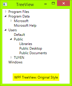
WPF default TreeView is very good, but many people still want it to have lines join each of its child elements, like Windows Forms TreeView, including me. I have searched on the internet and have some examples, but they were not designed well enough.
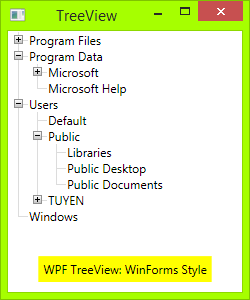
Now, I myself designed a TreeView with style as WinForms. Hope this will help many people!
Source Code
All you need is an XAML file and a code behind.
First, you need draw Toggle Button: From Triangle button to Plus-Minus button: draw a rectangle with dark border, then draw two lines, one vertical line and one horizontal line. When TreeViewItem is expanded, the vertical line will hide:
<!-- Toggle Button -->

<Style x:Key="ExpandCollapseToggleStyle" TargetType="ToggleButton">

    <Setter Property="Focusable" Value="False"/>

    <Setter Property="Template">

        <Setter.Value>

            <ControlTemplate TargetType="ToggleButton">

                <Grid Width="15" Height="13" SnapsToDevicePixels="True">

<!-- Rectangle 9x9 pixels -->

                    <Rectangle Width="9" Height="9"

                    Stroke="#919191" SnapsToDevicePixels="true">

                        <Rectangle.Fill>

                            <LinearGradientBrush EndPoint="0.5,2" StartPoint="0.5,0">

                                <GradientStop Color="White" Offset="0"/>

                                <GradientStop Color="Silver" Offset="0.5"/>

                                <GradientStop Color="LightGray" Offset="1"/>

                            </LinearGradientBrush>

                        </Rectangle.Fill>

                    </Rectangle>

<!-- Vertical line inside rectangle -->

                    <Rectangle x:Name="ExpandPath" Width="1"

                    Height="5" Stroke="Black" SnapsToDevicePixels="true"/>

<!-- Horizontal line inside rectangle -->

                    <Rectangle Width="5" Height="1"

                    Stroke="Black" SnapsToDevicePixels="true"/>

                </Grid>

                <ControlTemplate.Triggers>

                    <Trigger Property="IsChecked" Value="True">

                        <Setter Property="Visibility"

                        TargetName="ExpandPath" Value="Collapsed"/>

                    </Trigger>

                </ControlTemplate.Triggers>

            </ControlTemplate>

        </Setter.Value>

    </Setter>

</Style>
In the above code, you can see a trigger, it will make the vertical line inside toggle button hide if item is expanded, or show if its children collapsed.
Then, you need to draw vertical and horizontal connecting lines between nodes: You need to redesignTreeViewItem control. Add these connecting lines:
 <!-- Horizontal line -->

<Rectangle x:Name="HorLn" Margin="9,1,0,0" Height="1"

Stroke="#DCDCDC" SnapsToDevicePixels="True"/>

<!-- Vertical line -->

<Rectangle x:Name="VerLn" Width="1" Stroke="#DCDCDC"

Margin="0,0,1,0" Grid.RowSpan="2" SnapsToDevicePixels="true"

Fill="White"/>
to your TreeViewItem template like this:
<!-- TreeViewItem -->

<Style x:Key="{x:Type TreeViewItem}" TargetType="{x:Type TreeViewItem}">

    <Setter Property="Template">

        <Setter.Value>

            <ControlTemplate TargetType="{x:Type TreeViewItem}">

                <Grid>

                    <Grid.ColumnDefinitions>

                        <ColumnDefinition MinWidth="19" Width="Auto"/>

                        <ColumnDefinition Width="Auto"/>

                        <ColumnDefinition Width="*"/>

                    </Grid.ColumnDefinitions>

                    <Grid.RowDefinitions>

                        <RowDefinition Height="Auto"/>

                        <RowDefinition/>

                    </Grid.RowDefinitions>

                    <!-- Connecting Lines -->

                    <!-- Horizontal line -->

                    <Rectangle x:Name="HorLn" Margin="9,1,0,0" Height="1" Stroke="#DCDCDC" SnapsToDevicePixels="True"/>

                    <!-- Vertical line -->

                    <Rectangle x:Name="VerLn" Width="1"

                    Stroke="#DCDCDC" Margin="0,0,1,0" Grid.RowSpan="2"

                    SnapsToDevicePixels="true" Fill="White"/>

                    <!-- Insert Toggle Button -->

                    <ToggleButton Margin="-1,0,0,0" x:Name="Expander"

                    Style="{StaticResource ExpandCollapseToggleStyle}"

                    IsChecked="{Binding Path=IsExpanded,

                    RelativeSource={RelativeSource TemplatedParent}}" ClickMode="Press"/>

                    <Border Name="Bd" Grid.Column="1"

                    Background="{TemplateBinding Background}"

                    BorderBrush="{TemplateBinding BorderBrush}"

                    BorderThickness="{TemplateBinding BorderThickness}"

                    Padding="{TemplateBinding Padding}" SnapsToDevicePixels="True">

                        <ContentPresenter x:Name="PART_Header"

                        ContentSource="Header"

                        HorizontalAlignment="{TemplateBinding HorizontalContentAlignment}"

                        MinWidth="20"/>

                    </Border>

                    <ItemsPresenter x:Name="ItemsHost" Grid.Row="1"

                    Grid.Column="1" Grid.ColumnSpan="2"/>

                </Grid>

            </ControlTemplate>

        </Setter.Value>

    </Setter>

</Style>
Then, you need put the class TreeViewLineConverter to your namespace. This class will change the connecting lines if the item is the last in the list:
using System;

using System.Windows;

using System.Windows.Controls;

using System.Windows.Data;

namespace TreeViewEx

{

    public partial class MainWindow : Window

    {

        public MainWindow()

        {

            InitializeComponent();

        }

    }

    class TreeViewLineConverter : IValueConverter

    {

        public object Convert(object value, Type targetType,

        object parameter, System.Globalization.CultureInfo culture)

        {

            TreeViewItem item = (TreeViewItem)value;

            ItemsControl ic = ItemsControl.ItemsControlFromItemContainer(item);

            return ic.ItemContainerGenerator.IndexFromContainer(item) == ic.Items.Count - 1;

        }

        public object ConvertBack(object value, Type targetType,

        object parameter, System.Globalization.CultureInfo culture)

        {

            return false;

        }

    }

}
Insert your namespace to your XAML, i.e.:
<Window x:Class="TreeViewEx.MainWindow"

        xmlns="http://schemas.microsoft.com/winfx/2006/xaml/presentation"

        xmlns:x="http://schemas.microsoft.com/winfx/2006/xaml"

        xmlns:local="clr-namespace:TreeViewEx"/>
Add this line to Window.Resources:
<local:TreeViewLineConverter x:Key="LineConverter"/>
Add trigger to TreeViewItem template, this trigger changes the connecting lines if the item is the last in the list:
<!-- This trigger changes the connecting lines if the item is the last in the list -->

<DataTrigger Binding="{Binding RelativeSource={RelativeSource Self},

Converter={StaticResource LineConverter}}" Value="true">

    <Setter TargetName="VerLn" Property="Height" Value="9"/>

    <Setter TargetName="VerLn" Property="VerticalAlignment" Value="Top"/>

</DataTrigger>
The TreeView will have WinForms style now. You can add more trigger to control behavior of TreeView if you want. The full trigger can be found in the attached file.
ToDo
In WinForms TreeView, the connecting line is a dotted line. To make these lines dotted, change:
<!-- Connecting Lines -->

<Rectangle x:Name="HorLn" Margin="9,1,0,0" Height="1"

Stroke="#DCDCDC" SnapsToDevicePixels="True"/>

<Rectangle x:Name="VerLn" Width="1" Stroke="#DCDCDC"

Margin="0,0,1,0" Grid.RowSpan="2" SnapsToDevicePixels="true"

Fill="White"/>
To:
<!-- Connecting Lines -->

<Rectangle x:Name="HorLn" Margin="9,1,0,0" Height="1"

Stroke="Blue" StrokeDashCap="Square" StrokeDashArray="0,2"

StrokeDashOffset="1" SnapsToDevicePixels="True"/>

<Rectangle x:Name="VerLn" Width="1"  Stroke="Blue"

StrokeDashCap="Square" StrokeDashArray="0,2" Margin="0,0,1,0"

Grid.RowSpan="2" SnapsToDevicePixels="true" Fill="White"/>
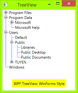
But it is not pretty, as you see. As I'm a newbie in WPF, I don't know to style these lines perfectly.
Reference
This is the code I referenced before I wrote my own:
[WPF实用技巧]如何使WPF的TreeView节点之间有连线的更多相关文章
- wpf中,一个简单的自定义treeview
首先创建一个自定义控件,在里面定义好treeview的样式,将本来的三角形的图标变为加号的图标,并且添加节点之间的连线. <UserControl x:Class="TreeViewE ...
- WPF进阶技巧和实战03-控件(4-基于范围的控件及日期控件)
系列文章链接 WPF进阶技巧和实战01-小技巧 WPF进阶技巧和实战02-布局 WPF进阶技巧和实战03-控件(1-控件及内容控件) WPF进阶技巧和实战03-控件(2-特殊容器) WPF进阶技巧和实 ...
- WPF进阶技巧和实战03-控件(3-文本控件及列表控件)
系列文章链接 WPF进阶技巧和实战01-小技巧 WPF进阶技巧和实战02-布局 WPF进阶技巧和实战03-控件(1-控件及内容控件) WPF进阶技巧和实战03-控件(2-特殊容器) WPF进阶技巧和实 ...
- 使WPF程序应用预置的控件风格, 如Aero, Luna, Royale, Classic等
原文:使WPF程序应用预置的控件风格, 如Aero, Luna, Royale, Classic等 WPF预设有Aero, Classic, Luna, Royale主题, WPF程序会根据 ...
- WPF实用指南一:在WPF窗体的边框中添加搜索框和按钮
原文:WPF实用指南一:在WPF窗体的边框中添加搜索框和按钮 在边框中加入一些元素,在应用程序的界面设计中,已经开始流行起来.特别是在浏览器(Crome,IE,Firefox,Opera)中都有应用. ...
- WPF实用指南二:移除窗体的图标
原文:WPF实用指南二:移除窗体的图标 WPF没有提供任何功能来移除窗体上的icon图标.一般的做法是设置一个空白的图标,如下图1: 这种做法在窗体边框与标题之间仍然会保留一片空白. 比较好的做法是使 ...
- WPF如何实现TreeView节点重命名
我们经常看到一些软件比如酷狗音乐,在对列表右键进行重命名的时候,当前列表会泛白并且进入可编辑状态,当我们更改完成后就会并进入非编辑状态,这些具体是怎么实现的呢?下面的方法也许会提供一些思路,下面的Tr ...
- WPF 之 TreeView节点重命名
下面的TreeView节点是通过数据双向绑定的方式,绑定到TextBlock控件和TextBox控件的Text属性上,并且让两者绑定相同的属性,同时使TextBox控件刚好完全覆盖TextBlock控 ...
- WPF实用知识点
1.一个基本的WPF程序, 需要引入的程序集WindowsBase, PresentationCore, PresentationFramework using System; using Syste ...
随机推荐
- XE3随笔17:实例 - 模拟 Google 搜索
本例测试效果图: 代码文件: unit Unit1; interface uses Windows, Messages, SysUtils, Variants, Classes, Graphics ...
- mac 10.11.6,Xcode8下,ruby2.3安装,Cocoapods安装~
适用环境 mac: 10.11.6 Xcode:8.1 命令执行步骤(安装ruby2.3前准备工作) 查看ruby更新源 gem sources -L 删除默认官方或者淘宝,新增 https://g ...
- 手机safari图片上传竖变横处理
在手机safari上传图片时,竖着的照片会变成横着的照片,以下程序片段利用图片exif信息把图片旋转回去,代码抄自php.net官网. http://php.net/manual/zh/functio ...
- 关于公司VPN专线接入的一个案例
最近互通网络技术部门收到一到封邮件,是关于公司VPN接入的问题,问题如下: 条件:A区为办公地点1,其他办公电脑20台,并通过写字楼的宽带接口联通外网. B区为新办公地点2,预设应用.数据库.备份服务 ...
- Spring IOC 注入方式
依赖注入通常有如下两种方式: ①设值注入:IOC容器使用属性的Setter方法来注入被依赖的实例. 设值注入是指IOC容器使用属性的Setter方法来注入被依赖的实例.这种注入方式简单.直观,因而在S ...
- 使用自定义的framework
1.创建framework工程,创建需要的类将接口暴露在public中
- hdoj 2039 三角形
Problem Description 给定三条边,请你判断一下能不能组成一个三角形. Input 输入数据第一行包含一个数M,接下有M行,每行一个实例,包含三个正数A,B,C.其中A,B,C & ...
- 使用C#代码部署SharePoint 2013开发包简单总结(一)
这篇文章将总结下如何将自己开发的列表.Web部件.事件接收器等元素部署到SharePoint的服务器.因水平有限,我的做法未必是最佳实践,会有些错误理解和疏漏,欢迎各位高手批评指正——但一定要能给出更 ...
- iOS 利用webView加载html代码,在代理中获取html页面的链接时出现的问题
getDetailWebview.loadHTMLString(webViewData as String, baseURL:NSURL(string: "\(ProBaseWeb)&quo ...
- JavaScript-取消事件-e.preventDefault();
取消事件:(阻止默认行为) 当事件执行过程中,遇到问题,可取消事件.不再触发 如何e.preventDefault(); <!DOCTYPE html> <html> < ...