css3实现循环执行动画,且动画每次都有延迟
一、最终效果

需求:gift图片的小动画每隔2s执行一次。
需求就一句话,我们看一下实现过程。
二、实现过程
1、网页结构
<!DOCTYPE html>

<html lang="en">

<head>

    <meta charset="UTF-8">

    <title>Document</title>

    <style>

    a {

        display: inline-block;

        background-color: #cc2222;

        text-decoration: none;

        color: #fff;

        font-size: 14px;

        padding: 10px 12px;

        width: 100px;

        position: relative;

    }

    .ico {

        position: absolute;

        width: 14px;

        height: 16px;

        background: url(images/ico.png) no-repeat center;

        background-size: 100%;

        position: absolute;

        top: 4px;

        right: 27px;

    }

    </style>

</head>

<body>

    <nav>

        <a href="javascript:;" class="box">

                            一元夺宝

                            <div class="ico"></div>

                        </a>

    </nav>

</body>

</html>

2、原始动画
原始动画效果为:鼠标hover上去出现动画。
动画样式如下:
/*动画*/

    .ico:hover{

    -webkit-animation: Tada 1s both;

    -moz-animation: Tada 1s both;

    -ms-animation: Tada 1s both;

    animation: Tada 1s both

}

/*浏览器兼容性部分略过*/

@keyframes Tada {

    0% {

        transform: scale(1);

        transform: scale(1)

    }

    10%,20% {

        transform: scale(0.9) rotate(-3deg);

        transform: scale(0.9) rotate(-3deg)

    }

    30%,50%,70%,90% {

        transform: scale(1.1) rotate(3deg);

        transform: scale(1.1) rotate(3deg)

    }

    40%,60%,80% {

        transform: scale(1.1) rotate(-3deg);

        transform: scale(1.1) rotate(-3deg)

    }

    100% {

        transform: scale(1) rotate(0);

        transform: scale(1) rotate(0)

    }

}
效果:鼠标hover上去gift图片会动一动。

3、实现变化后的需求
需求变动,要求不再是hover上去展示动画,而是每隔2s展示一次动画。
思路:不需要hover上去出现动画,就把hover去掉,每隔2s显示一次动画,很容易想到延迟2s,然后动画一直执行。
此时相关样式变成:
.ico{

-webkit-animation: Tada 1s  2s both infinite;

-moz-animation: Tada 1s 2s both infinite;

-ms-animation: Tada 1s 2s both infinite;

animation: Tada 1s 2s both infinite;

}
但是显示的效果是:页面加载第一次出现动画会延迟2s,后面的动画将不再有延迟。如下,这是不符合需求的。
为了看出效果,下图为延迟6s的效果。

此时换种思路,不要延迟执行动画,而是动画的效果本身就是前2s元素不动,后1s是元素动,然后一直循环执行。 这样在视觉上就会看起来是延迟2s执行1s动画。
计算一下,原来的百分比节点变成了多少。
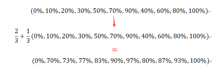
将动画总时长变成3s,用计算出的百分比替换原来的百分比,代码如下:
.ico{

    -webkit-animation: Tada 3s both infinite;

    -moz-animation: Tada 3s both infinite;

    -ms-animation: Tada 3s both infinite;

    animation: Tada 3s both infinite;

}

@keyframes Tada {

    0% {

        transform: scale(1);

        transform: scale(1)

    }

    70%,73%{

        transform: scale(0.9) rotate(-3deg);

        transform: scale(0.9) rotate(-3deg)

    }

    77%,83%,90%,97%  {

        transform: scale(1.1) rotate(3deg);

        transform: scale(1.1) rotate(3deg)

    }

    80%,87%,93%{

        transform: scale(1.1) rotate(-3deg);

        transform: scale(1.1) rotate(-3deg)

    }

    100% {

        transform: scale(1) rotate(0);

        transform: scale(1) rotate(0)

    }

}
效果就是我们期望的了。

完整代码如下:
<!DOCTYPE html>

<html lang="en">

<head>

    <meta charset="UTF-8">

    <title>demo of starof</title>

    <style>

    a {

        display: inline-block;

        background-color: #cc2222;

        text-decoration: none;

        color: #fff;

        font-size: 14px;

        padding: 10px 12px;

        width: 100px;

        position: relative;

    }

    .ico {

        position: absolute;

        width: 14px;

        height: 16px;

        background: url(images/ico.png) no-repeat center;

        background-size: 100%;

        position: absolute;

        top: 4px;

        right: 27px;

    }

    /*动画*/

    .ico{

    -webkit-animation: Tada 3s both infinite;

    -moz-animation: Tada 3s both infinite;

    -ms-animation: Tada 3s both infinite;

    animation: Tada 3s both infinite;

}

@-webkit-keyframes Tada {

    0% {

        -webkit-transform: scale(1);

        transform: scale(1)

    }

    70%,73% {

        -webkit-transform: scale(0.9) rotate(-3deg);

        transform: scale(0.9) rotate(-3deg)

    }

    77%,83%,90%,97% {

        -webkit-transform: scale(1.1) rotate(3deg);

        transform: scale(1.1) rotate(3deg)

    }

    80%,87%,93% {

        -webkit-transform: scale(1.1) rotate(-3deg);

        transform: scale(1.1) rotate(-3deg)

    }

    100% {

        -webkit-transform: scale(1) rotate(0);

        transform: scale(1) rotate(0)

    }

}

@-moz-keyframes Tada {

    0% {

        -moz-transform: scale(1);

        transform: scale(1)

    }

    70%,73% {

        -moz-transform: scale(0.9) rotate(-3deg);

        transform: scale(0.9) rotate(-3deg)

    }

    77%,83%,90%,97% {

        -moz-transform: scale(1.1) rotate(3deg);

        transform: scale(1.1) rotate(3deg)

    }

    80%,87%,93%{

        -moz-transform: scale(1.1) rotate(-3deg);

        transform: scale(1.1) rotate(-3deg)

    }

    100% {

        -moz-transform: scale(1) rotate(0);

        transform: scale(1) rotate(0)

    }

}

@-ms-keyframes Tada {

    0% {

        -ms-transform: scale(1);

        transform: scale(1)

    }

    70%,73% {

        -ms-transform: scale(0.9) rotate(-3deg);

        transform: scale(0.9) rotate(-3deg)

    }

    77%,83%,90%,97% {

        -ms-transform: scale(1.1) rotate(3deg);

        transform: scale(1.1) rotate(3deg)

    }

    80%,87%,93% {

        -ms-transform: scale(1.1) rotate(-3deg);

        transform: scale(1.1) rotate(-3deg)

    }

    100% {

        -ms-transform: scale(1) rotate(0);

        transform: scale(1) rotate(0)

    }

}

@keyframes Tada {

    0% {

        transform: scale(1);

        transform: scale(1)

    }

    70%,73%{

        transform: scale(0.9) rotate(-3deg);

        transform: scale(0.9) rotate(-3deg)

    }

    77%,83%,90%,97%  {

        transform: scale(1.1) rotate(3deg);

        transform: scale(1.1) rotate(3deg)

    }

    80%,87%,93%{

        transform: scale(1.1) rotate(-3deg);

        transform: scale(1.1) rotate(-3deg)

    }

    100% {

        transform: scale(1) rotate(0);

        transform: scale(1) rotate(0)

    }

}

    </style>

</head>

<body>

    <nav>

        <a href="javascript:;" class="box">

                            一元夺宝

                            <div class="ico"></div>

        </a>

    </nav>

</body>

</html>
本文只是介绍一种思路,关于动画各个参数详情可参考:
本文作者starof,因知识本身在变化,作者也在不断学习成长,文章内容也不定时更新,为避免误导读者,方便追根溯源,请诸位转载注明出处:http://www.cnblogs.com/starof/p/5443445.html有问题欢迎与我讨论,共同进步。
css3实现循环执行动画,且动画每次都有延迟的更多相关文章
- CSS3与页面布局学习总结(六)——CSS3新特性(阴影、动画、渐变、变形、伪元素等)
CSS3在CSS2.1的基础上新增加了许多属性,这里选择了较常用的一些功能与大家分享,帮助文档中有很详细的描述,可以在本文的示例中获得帮助文档. 一.阴影 1.1.文字阴影 text-shadow&l ...
- 详解用CSS3制作圆形滚动进度条动画效果
主 题 今天手把手教大家用CSS3制作圆形滚动进度条动画,想不会都难!那么,到底是什么东东呢?先不急,之前我分享了一个css实现进度条效果的博客<CSS实现进度条和订单进度条>,但是呢, ...
- CSS3与页面布局学习笔记(六)——CSS3新特性(阴影、动画、渐变、变形( transform)、透明、伪元素等)
一.阴影 1.1.文字阴影 text-shadow<length>①: 第1个长度值用来设置对象的阴影水平偏移值.可以为负值 <length>②: 第2个长度值用来设置对象的阴 ...
- Magic CSS3 – 创建各种神奇的交互动画效果
Magic CSS3 Animations 动画是一个独特的 CSS3 动画特效包,你可以自由地使用您的 Web 项目中.只需简单的在页面上引入 CSS 样式: magic.css 或者压缩版本 ma ...
- CSS3 skew倾斜、rotate旋转动画
css3出现之前,我们实现一个对象的一组连续动画需要通过JavaScript或Jquery编写,脚本代码较为复杂: 若需要实现倾斜.旋转之类的动画难度将更高(我还没试过用JavaScript或Jque ...
- CSS3新特性(阴影、动画、渐变、变形、伪元素等)
CSS3与页面布局学习总结(六)--CSS3新特性(阴影.动画.渐变.变形.伪元素等) 目录 一.阴影 1.1.文字阴影 1.2.盒子阴影 二.背景 2.1.背景图像尺寸 2.2.背景图像显示的原 ...
- CSS3新特性(阴影、动画、渐变、变形、伪元素等) CSS3与页面布局学习总结——CSS3新特性(阴影、动画、渐变、变形、伪元素等)
目录 一.阴影 1.1.文字阴影 1.2.盒子阴影 二.背景 2.1.背景图像尺寸 2.2.背景图像显示的原点 三.伪元素 3.1.before 3.2.after 3.3.清除浮动 四.圆角与边 ...
- CSS3新特性(阴影、动画、渐变)
一.阴影 1.1文字阴影: text-shadow<length>①: 第1个长度值用来设置对象的阴影水平偏移值.可以为负值 <length>②: 第2个长度值用来设置对象的阴 ...
- 显示层封装及实现与优化(无动画+css3动画+js动画)
showhide.html <!DOCTYPE html> <html lang="en"> <head> <meta charset=& ...
随机推荐
- UML类图简单介绍
先上一张图: 概述 类图(Class Diagram)是面向对象系统建模中最常用和最重要的图,是定义其它图的基础.类图主要是用来显示系统中的类.接口以及它们之间的静态结构和关系的一种静态模型. 类图组 ...
- Windows 10 密钥分享
Windows 10 Technical Preview for Enterprise:KEY:PBHCJ-Q2NYD-2PX34-T2TD6-233PKhttp://technet.microsof ...
- C#基础-out与ref字段
using System; using System.Collections.Generic; using System.Linq; using System.Text; namespace Cons ...
- hammer用法 jquery.hammer.js
jquery.hammer.js使用时要先引入hammer.min.js 下面代码是滑动效果: $("#nav").hammer().bind('swiperight', fu ...
- 应用程序启动管理 Winform版
★前言 开发这个小工具的想法主要是机器中安装了数据库,每次设置开机启动数据库服务的话,则系统启动很慢,每次都得手动到服务管理器中停止服务,很是繁琐,相信不少做开发的朋友会遇到同样的问题,就有 ...
- Netty(二)入门
在上篇<Netty(一)引题>中,分别对AIO,BIO,PIO,NIO进行了简单的阐述,并写了简单的demo.但是这里说的简单,我也只能呵呵了,特别是NIO.AIO(我全手打的,好麻烦). ...
- Asp.net mvc5开源项目"超级冷笑话"
业务时间做了个小网站,超级冷笑话,地址:http://www.superjokes.cn/ 开发技术: asp.net mvc5 +SQLServer2012 ORM:NPoco 用了简单的三层结构 ...
- 2015年最佳的12个 CSS 开发工具推荐
CSS所能做的就是改变网页的布局.排版和调整字间距等,但编写 CSS 并不是一项容易的任务,当你接触新的 CSS3 属性及其各自的浏览器前缀的时候,你会发现很伤脑经.值得庆幸的是一些优秀的开发人员提供 ...
- 取出session中的所有属性与值的方法
如果你想取出session中所有的属性和值,可以通过getAttributeNames()方法来实现,具体代码如下 //获取session HttpSession session = request. ...
- 弹出页面遮罩层,以及web端和移动端阻止遮罩层的滑动。
最近项目遇到了遮罩层的一些问题,总结一下: 弹出遮罩层 遮罩层弹出有非常多的方法,这里只写出本人用的代码,使用jq操作dom的方法进行实现的. <style>.box{position:a ...