css常用技巧1
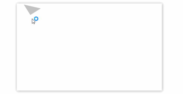
css绘制三角形
<style>

	.triangle-box{

        margin: 50px auto;

        height: 300px;

        width: 500px;

        box-shadow: 1px 1px 10px rgba(0,0,0,0.3);

        position: relative;

    }

    .triangle{

        position: absolute;

        top: 10px;

        left: 20px;

        border-width: 30px;

        border-color: #c2c2c2 transparent transparent transparent;

        border-style: solid;

        transition: all 0.5s;

        -webkit-transition: all 0.2s;

        /*设置旋转重心*/

        transform-origin: 30px 15px;

    }

    .triangle:hover{

        transform: rotateZ(180deg);

    }

</style>

<div class="triangle-box">

    <span class="triangle"></span>

</div>
知识点
border
- border-color: #c2c2c2 transparent transparent transparent;
transparent:透明
transition:all 0.2s
动画效果,all指的是所有属性,如width、transform等
transform-origin: 30px 15px;
修改坐标原点位置
transform:rotateZ(180deg);
沿着Z轴旋转180°
css制作下拉菜单
<style>

    *{

        padding: 0; margin: 0;

        list-style: none;

    }

    a{

        text-decoration: none;

        color: white;

    }

    .nav-box{

        height: 50px;

    }

    /*一级导航*/

    ul.nav{

        display: flex;

        height: 100%;

    }

    ul.nav>li{

        background-color: #ccc;

        box-sizing: border-box;

        width: 150px;

        height: 100%;

        line-height: 50px;

        text-align: center;

        position: relative;

    }

    .nav>li:hover{

        background-color: #c3c3c3;

        cursor: pointer;

        font-weight: bold;

    }

    ul.nav>li>a{

        display: block;

        height: 100%;

        width: 100%;

        z-index: 10;

    }

    /*二级导航*/

    ul.sub-nav{

        position: absolute;

        width: 100%;

        display: none;

        z-index: 100;

        border-radius: 2px;

        box-shadow: 0 2px 4px rgba(0,0,0,0.25);

        transition: all 2s;

    }

    ul.sub-nav>li{

        background-color: #c1c1c1;

        box-sizing: border-box;

        border-top: 1px solid white;

    }

    @keyframes moveUp {

        from{

            top: 55px;

            opacity: 0;

        }

        to{

            top: 50px;

            opacity: 1;

        }

    }

    /*显示二级导航,关键的地方*/

    ul.nav>li>a:hover+ul,ul.sub-nav:hover{

        display: block;

        animation: moveUp .3s ease;

    }

</style>

<div class="nav-box">

    <ul class="nav">

        <li>index</li>

        <li>

            <a href="javascript:void(0);">contact</a>

            <ul class="sub-nav">

                <li>111</li>

                <li>222</li>

            </ul>

        </li>

        <li>about</li>

    </ul>

</div>
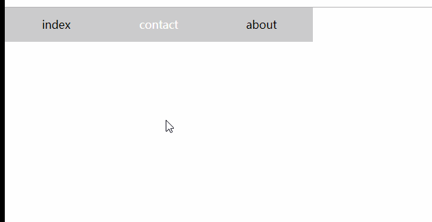
知识点
父相子绝,子元素附属于父级元素
li.item{position: relative;}

li.item>ul{position:absolute;}
关键点
当鼠标移动到contact时,触发a的hover事件,显示二级菜单;
当鼠标移动到二级菜单时,触发二级菜单【ul】的hover事件,显示自身;注意这里有个临界值,父级容器和子集必须有重叠的地方,可以在子元素中使用padding-top来填充,来实现表面上分离的效果。
动画
二级菜单从隐藏【display:none】到显示,需要一个动画。
注意:对于display:none的元素不能使用transition动画,否则无效果,必须使用animation属性来定义
左侧导航栏

<style>

    *{

        padding: 0; margin: 0;

        list-style: none; text-decoration: none;

    }

    body,html{

        height: 100%;

    }

    body{

        display: flex; flex-direction: column;

    }

    .header{

        display: flex; justify-content: center; align-items: center;

        height: 80px;

        background-color: #d1d1d1;

    }

    .main{

        display: flex;

        height: 100%;

    }

    /*左侧导航栏, 外侧隐藏溢出,固定宽度*/

    .side{

        width: 200px;

        height: 100%;

        background-color: #20222A;

        overflow: hidden;

        position: relative;

    }

    /*中间,使用绝对定位,不指定宽度*/

    .side-scroll{

        height: 100%;

        position: absolute;

        overflow-x: hidden;

        overflow-y: scroll;

    }

    /*.side-scroll::-webkit-scrollbar{*/

    /*    display:none;*/

    /*}*/

    /*内容指定宽度*/

    ul.side-nav{

        width: 200px;

    }

    /*a*/

    .side-nav a{

        color: white; display: flex;

        height: 56px;width: 100%;

        justify-content: left; align-items: center;

        box-sizing: content-box;

        padding-left: 30px;

    }

    /*一级li*/

    ul.side-nav>li{

        /*height: 56px;*/

        box-sizing: border-box;

        display: flex;

        flex-direction: column;

        align-items: center;

    }

    /*右侧内容*/

    .content-box{

        height: 100%; flex: 1;

    }

</style>

<div class="header">

    header

</div>

<div class="main">

    <div class="side">

        <div class="side-scroll">

            <ul class="side-nav">

                <li>

                    <a href="javascript:void(0);">主页</a>

                </li>

                <li>

                    <a href="javascript:void(0);">组件</a>

                    <ul class="nav-child">

                        <li><a href="javascript:void(0);">控制台</a></li>

                        <li><a href="javascript:void(0);">主页一</a></li>

                        <li><a href="javascript:void(0);">主页二</a></li>

                    </ul>

                </li>

            </ul>

        </div>

    </div>

    <div class="content-box">

content

    </div>

</div>
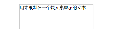
文本溢出
显示省略号
<style>

    *{

        font-size: 18px;

    }

    div{

        margin: 90px; width: 300px; height: 5em; border: 1px solid #ccc;

        overflow: hidden; text-overflow: ellipsis; white-space: nowrap;

    }

</style>

<div>

    用来限制在一个块元素显示的文本的行数。 为了实现该效果,它需要组合其他的WebKit属性。常见结合属用来限制在一个块元素显示的文本的行数。

    为了实现该效果,它需要组合其他的WebKit属性。常见结合属

</div>
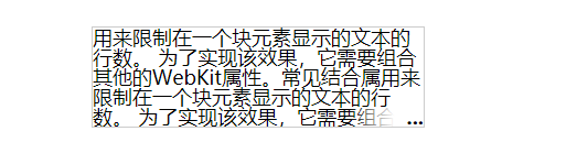
- 只能单行显示
- 多行显示,使用定位,伪元素,兼容除ie6-7
<style>

    *{

        font-size: 18px;

    }

    div{

        margin: 90px; width: 300px; height: 5em; line-height: 1; position: relative;

        border: 1px solid #ccc;

        overflow: hidden; text-overflow: ellipsis;

    }

    div:after{

        content: '...';

        position: absolute; right: 0; bottom: 0; padding-left: 3em;

        font-weight: bold;

        background: -webkit-linear-gradient(left, transparent, #fff 62%);

        background: -o-linear-gradient(right, transparent, #fff 62%);

        background: -moz-linear-gradient(right, transparent, #fff 62%);

        background: linear-gradient(to right, transparent, #fff 62%);

    }

</style>

<div>

    用来限制在一个块元素显示的文本的行数。 为了实现该效果,它需要组合其他的WebKit属性。常见结合属用来限制在一个块元素显示的文本的行数。

    为了实现该效果,它需要组合其他的WebKit属性。常见结合属

</div>
css常用技巧1的更多相关文章
- HTML、CSS常用技巧
一.HTML 在介绍HTML之前,我们先看一下HTML的文档树结构,主要包括哪些: (一).头部标签 1,Doctype Doctype告诉浏览器使用什么样的HTML或XHTML规范来解析HTML文档 ...
- CSS 常用技巧
概述 相信大家在写css属性的时候,会遇到一些问题,比如说:垂直对齐,垂直居中,背景渐变动画,表格宽度自适应,模糊文本,样式重置,清除浮动,通用媒体查询,自定义选择文本,强制出现滚动条,固定头部和页脚 ...
- api日常总结:前端常用js函数和CSS常用技巧
我的移动端media html{font-size:10px} @media screen and (min-width:321px) and (max-width:375px){html{font- ...
- css常用技巧集合
1 不想让按钮touch时有蓝色的边框或半透明灰色遮罩(根据系统而定) /*解决方式一*/ -webkit-tap-highlight-color:rgba(0,0,0,0); -webkit-use ...
- css常用技巧:input提示文字;placeholder字体修改
1 很多网站都需要更改 <input>内部的placeholder 文字颜色属性:下面来介绍下这个技巧. 2 源代码: <!DOCTYPE html><html> ...
- css常用技巧
去点号 list-style:none; 字体居中 text-align:center; 链接去下划线 text-decoration:none; 鼠标禁止右键 <body oncontextm ...
- DIV+CSS常用网页布局技巧!
以下是我整理的DIV+CSS常用网页布局技巧,仅供学习与参考! 第一种布局:左边固定宽度,右边自适应宽度 HTML Markup <div id="left">Left ...
- Css常用的技巧
一.使用css缩写 使用缩写可以帮助减少你CSS文件的大小,更加容易阅读. 具体内容请浏览:CSS常用缩写语法 二.明确定义单位,除非值为0. 忘记定义尺寸的单位是CSS新手普遍的错误.在HTML中 ...
- CSS兼容常用技巧
请尽量用xhtml格式写代码,而且DOCTYPE影响 CSS 处理,作为W3C标准,一定要加DOCTYPE声明. 1.div的垂直居中问题 vertical-align:middle; 将行距增加到和 ...
随机推荐
- SpringMVC 转发、重定向
转发.重定向到其它业务方法 @org.springframework.stereotype.Controller @RequestMapping("/userController" ...
- SciPy 线性代数
章节 SciPy 介绍 SciPy 安装 SciPy 基础功能 SciPy 特殊函数 SciPy k均值聚类 SciPy 常量 SciPy fftpack(傅里叶变换) SciPy 积分 SciPy ...
- leetcode1019 Next Greater Node In Linked List
""" We are given a linked list with head as the first node. Let's number the nodes in ...
- Unity 打开其他exe文件
using UnityEngine; using System.Collections; using System.Diagnostics;///// public class FeiYuZhu : ...
- 中兴将用“加减乘除”建立理想 5G 网络
6 月 28 日,MWC 2019 上海展期间,中兴通讯执行董事.总裁徐子阳发表演讲表示,面对 5G 建网大势,要看破大势,不破不立.为此中兴将用“加减乘除”建立理想 5G 网络. 何为“加减乘除 ...
- GNS3 模拟Arp命令2
R1 : conf t int f0/0 no shutdown ip add 192.168.1.1 255.255.255.0 no ip routing end R2 f0/0: conf t ...
- Exceeded memory limit for $group, but didn't allow external sort. Pass allowDiskUse:true to opt in
原语句: db.carMongoDTO.aggregate({}}}, {}}}) 报错: Exceeded memory limit for $group, but didn't allow ext ...
- .nerCore-RabbitMQDemo消息队列
1.定义:MQ全称为Message Queue, 消息队列(MQ)是一种应用程序对应用程序的通信方法.应用程序通过读写出入队列的消息(针对应用程序的数据)来通信,而无需专用连接来链接它们.MQ是消费- ...
- bzoj 4008、4011、1499
全是扒题解,,,太弱了... 不乱BB了. 4008 #include <bits/stdc++.h> #define LL long long #define lowbit(x) x&a ...
- cf 762D. Maximum path
天呢,好神奇的一个DP23333%%%%% 因为1.向左走1格的话相当于当前列和向左走列全选 2.想做走超过1的话可以有上下走替代.而且只能在相邻行向左. 全选的情况只能从第1行和第3行转移,相反全选 ...