Python数据分析--Pandas知识点(三)
本文主要是总结学习pandas过程中用到的函数和方法, 在此记录, 防止遗忘.
下面将是在知识点一, 二的基础上继续总结.
前面所介绍的都是以表格的形式中展现数据, 下面将介绍Pandas与Matplotlib配合绘制出折线图, 散点图, 饼图, 柱形图, 直方图等五大基本图形.
Matplotlib是python中的一个2D图形库, 它能以各种硬拷贝的格式和跨平台的交互式环境生成高质量的图形, 比如说柱状图, 功率谱, 条形图, 误差图, 散点图等. 其中, matplotlib.pyplot 提供了一个类似matlab的绘图框架, 使用该框架前, 必须先导入它.
19. 折线图
折线图: 数据随着时间的变化情况描点连线而形成的图形, 通常被用于显示在相等时间间隔下数据的趋势. 下面将采用两种方式进行绘制折线图, 一种是pandas中plot()方法, 该方法用来绘制图形, 然后在matplotlib中的绘图框架中展示; 另一种则是直接利用matplotlib中绘图框架的plot()方法.
19.1 采用pandas中的plot()方法绘制折线图
在pandas中绘制折线图的函数是plot(x=None, y=None, kind='line', figsize = None, legend=True, style=None, color = "b", alpha = None):
第一个: x轴的数据
第二个: y轴的数据
第三个: kind表示图形种类, 默认为折线图
第四个: figsize表示图像大小的元组
第五个: legend=True表示使用图例, 否则不使用, 默认为True.
第六个: style表示线条样式
第七个: color表示线条颜色, 默认为蓝色
第八个: alpha表示透明度, 介于0~1之间.
plot()函数更多参数请查看官方文档:http://pandas.pydata.org/pandas-docs/stable/generated/pandas.DataFrame.plot.html?highlight=plot#pandas.DataFrame.plot
数据来源: https://assets.datacamp.com/production/course_1639/datasets/percent-bachelors-degrees-women-usa.csv
import pandas as pd
import matplotlib.pyplot as plt
#第一步读取数据: 使用read_csv()函数读取csv文件中的数据
df = pd.read_csv(r"D:\Data\percent-bachelors-degrees-women-usa.csv")
#第二步利用pandas的plot方法绘制折线图
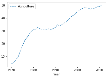
df.plot(x = "Year", y = "Agriculture")
#第三步: 通过plt的show()方法展示所绘制图形
plt.show()
在执行上述代码过程了报错ImportError: matplotlib is required for plotting, 若遇到请点击参考办法
最终显示效果:

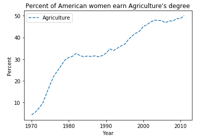
如果想将实线变为虚线呢, 可修改style参数为"--":
 import pandas as pd

 import matplotlib.pyplot as plt

 df = pd.read_csv(r"D:\Data\percent-bachelors-degrees-women-usa.csv")

 #添加指定的style参数

 df.plot(x = "Year", y = "Agriculture", style = "--")

 plt.show()
添加坐标轴标签以及标题:
 import pandas as pd

 import matplotlib.pyplot as plt

 df = pd.read_csv(r"D:\Data\percent-bachelors-degrees-women-usa.csv")

 df.plot(x = "Year", y = "Agriculture", style = "--")

 #添加横坐标轴标签

 plt.xlabel("Year")

 #添加纵坐标轴标签

 plt.ylabel("Percent")

 #添加标题

 plt.title("Percent of American women earn Agriculture's degree")

 plt.show()
19.2 采用matplotlib.pyplot的plot()方法绘制折线图
matplotlib.pyplot.plot(x, y, style, color, linewidth)函数的参数分别表示: x轴数据, y轴数据, style线条样式, color线条颜色, linewidth线宽.
 import pandas as pd

 import matplotlib.pyplot as plt

 #第一步: 读取数据

 df = pd.read_csv(r"D:\Data\percent-bachelors-degrees-women-usa.csv")

 #第二步: 将所需数据赋值给对应的变量

 df_year, df_Agriculture = df["Year"], df["Agriculture"]

 #第三步: 用matplotlib中绘图框架的plot()方法绘制红色的折线图

 plt.plot(df_year, df_Agriculture,"-", color = "r",linewidth = 10)

 #添加横坐标轴标签

 plt.xlabel("Year")

 #添加纵坐标轴标签

 plt.ylabel("Percent")

 #添加标题

 plt.title("Percent of American women earn Agriculture's degree")

 plt.show()
显示效果:

20. 散点图
散点图: 用两组数据构成多个坐标点, 考察坐标点的分布, 判断两变量之间是否存在某种关联或总结坐标点的分布模式. 各点的值由点在坐标中的位置表示, 用不同的标记方式表示各点所代表的不同类别.
20.1 采用pandas中的plot()方法绘制散点图
只需将plot()函数中的kind参数的值改为"scatter"即可.
数据来源: http://archive.ics.uci.edu/ml/machine-learning-databases/iris/
 import pandas as pd

 import matplotlib.pyplot as plt

 #读取数据

 df = pd.read_csv(r"D:\Data\Iris.csv")

 #原始数据中没有给出字段名, 在这里指定

 df.columns = ['sepal_len', 'sepal_wid', 'petal_len', 'petal_wid','species']

 #指定x轴与y轴数据并绘制散点图

 df.plot(x = "sepal_len", y = "sepal_wid", kind = "scatter" )

 #添加横坐标轴标签

 plt.xlabel("sepal length")

 #添加纵坐标轴标签

 plt.ylabel("sepal width")

 #添加标题

 plt.title("Iris sepal length and width analysis")

 plt.show()

20.2 采用matplotlib.pyplot的plot()方法绘制散点图
 import pandas as pd

 import matplotlib.pyplot as plt

 df = pd.read_csv(r"D:\Data\Iris.csv")

 df.columns = ['sepal_len', 'sepal_wid', 'petal_len', 'petal_wid','species']

 #用绘图框架的plot()方法绘图, 样式为".", 颜色为红色

 plt.plot(df["sepal_len"], df["sepal_wid"],".", color = "r")

 plt.xlabel("sepal length")

 plt.ylabel("sepal width")

 plt.title("Iris sepal length and width analysis")

 plt.show()

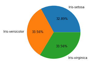
21. 饼图
饼图: 将一个圆形划分为多个扇形的统计图, 它通常被用来显示各个组成部分所占比例.
由于在绘制饼状图先要对数据进行分类汇总, 先查看数据的总体信息
 import pandas as pd

 df = pd.read_csv(r"D:\Data\Iris.csv")

 df.columns = ['sepal_len', 'sepal_wid', 'petal_len', 'petal_wid','species']

 #查看数据总体信息

 df.describe()
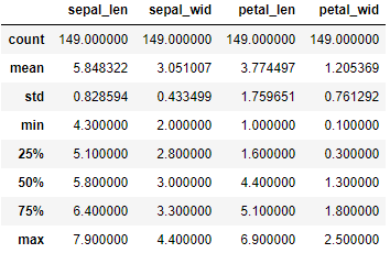
可以看出每一列都是149个数据, 那么接下来对species列进行分类汇总
import pandas as pd
df = pd.read_csv(r"D:\Data\Iris.csv")
df.columns = ['sepal_len', 'sepal_wid', 'petal_len', 'petal_wid','species']
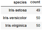
#对species列进行分类并对sepal_len列进行计数
df_gbsp = df.groupby("species")["sepal_len"].agg(["count"])
df_gbsp
21.1 采用pandas中的plot()方法绘制饼状图
 import pandas as pd

 import matplotlib.pyplot as plt

 df = pd.read_csv(r"D:\Data\Iris.csv")

 df.columns = ['sepal_len', 'sepal_wid', 'petal_len', 'petal_wid','species']

 #对species列进行分类并对sepal_len列进行计数

 df_gbsp = df.groupby("species")["sepal_len"].agg(["count"])

 #绘制图形样式为饼图, 百分比保留两位小数, 字体大小为20, 图片大小为6x6, subplots为True表示将数据每列绘制为一个子图,legend为True表示隐藏图例

 df_gbsp.plot(kind = "pie", autopct='%.2f%%', fontsize=20, figsize=(6, 6), subplots = True, legend = False)

 plt.show()

21.2 采用matplotlib.pyplot的pie()方法绘制饼状图
pie(x, explode = None, labels = None, colors=None, autopct=None)的参数分别表示:
第一个: x表示要绘图的序列
第二个: explode要突出显示的组成部分
第三个: labels各组成部分的标签
第四个: colors各组成部分的颜色
第五个: autopct数值显示格式
 import pandas as pd

 import matplotlib.pyplot as plt

 df = pd.read_csv(r"D:\Data\Iris.csv")

 df.columns = ['sepal_len', 'sepal_wid', 'petal_len', 'petal_wid','species']

 df["species"] = df["species"].apply(lambda x: x.replace("Iris-",""))

 df_gbsp = df.groupby("species",as_index = False)["sepal_len"].agg({"counts": "count"})

 #对counts列的数据绘制饼状图.

 plt.pie(df_gbsp["counts"],labels = df_gbsp["species"], autopct = "%.2f%%" )

 plt.show()
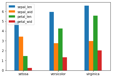
22. 柱形图
柱形图: 又称为长条图, 是一种以长方形的长度为变量的统计图. 柱形图常用来比较两个或以上的数据不同时间或者不同条件).
22.1 采用pandas的plot()方法绘制柱形图
 import pandas as pd

 import matplotlib.pyplot as plt

 df = pd.read_csv(r"D:\Data\Iris.csv")

 df.columns = ['sepal_len', 'sepal_wid', 'petal_len', 'petal_wid','species']

 df["species"] = df["species"].apply(lambda x: x.replace("Iris-",""))

 #对species分组求均值

 df_gbsp = df.groupby("species", as_index = False).mean()

 #绘制柱形图

 df_gbsp.plot(kind = "bar")

 #修改横坐标轴刻度值

 plt.xticks(df_gbsp.index,df_gbsp["species"],rotation=360)

 plt.show()
当然也可以绘制横向柱形图
 import pandas as pd

 import matplotlib.pyplot as plt

 df = pd.read_csv(r"D:\Data\Iris.csv")

 df.columns = ['sepal_len', 'sepal_wid', 'petal_len', 'petal_wid','species']

 df["species"] = df["species"].apply(lambda x: x.replace("Iris-",""))

 df_gbsp = df.groupby("species", as_index = False).mean()

 #将bar改为barh即可绘制横向柱形图

 df_gbsp.plot(kind = "barh")

 plt.yticks(df_gbsp.index,df_gbsp["species"],rotation=360)

 plt.show()

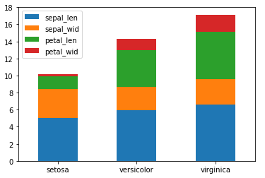
若想要将样式改为堆积柱形图:
#修改stacked参数为True即可

df_gbsp.plot(kind = "barh", stacked = True)
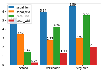
22.2 采用matplotlib.pyplot的bar()方法绘制柱形图
bar( x, height, width=0.8, color = None, label =None, bottom =None, tick_label = None)的参数分别表示:
第一个: x表示x轴的位置序列
第二个: height表示某个系列柱形图的高度
第三个: width表示某个系列柱形图的宽度
第四个: label表示图例
第五个: bottom表示底部为哪个系列, 常被用在堆积柱形图中
第六个: tick_label刻度标签
 import pandas as pd

 import matplotlib.pyplot as plt

 df = pd.read_csv(r"D:\Data\Iris.csv")

 df.columns = ['sepal_len', 'sepal_wid', 'petal_len', 'petal_wid','species']

 df["species"] = df["species"].apply(lambda x: x.replace("Iris-",""))

 df_gbsp = df.groupby("species").mean()

 #绘制"sepal_len"列柱形图

 plt.bar(df_gbsp.index,df_gbsp["sepal_len"], width= 0.5 , color = "g")

 plt.show()

绘制多组柱形图:
 import numpy as np

 import pandas as pd

 import matplotlib.pyplot as plt

 df = pd.read_csv(r"D:\Data\Iris.csv")

 df.columns = ['sepal_len', 'sepal_wid', 'petal_len', 'petal_wid','species']

 df["species"] = df["species"].apply(lambda x: x.replace("Iris-",""))

 df_gbsp = df.groupby("species").mean()

 #计算有多少个列

 len_spe = len(df_gbsp.count())

 #计算有多少行, 并生成一个步进为1的数组

 index = np.arange(len(df_gbsp.index))

 #设置每组总宽度

 total_width= 1.4

 #求出每组每列宽度

 width = total_width/len_spe

 #对每个字段进行遍历

 for i in range(len_spe):

     #得出每个字段的名称

     het = df_gbsp.columns[i]

     #求出每个字段所包含的数组, 也就是对应的高度

     y_values = df_gbsp[het]

     #设置x轴标签

     x_tables = index * 1.5 + i*width

     #绘制柱形图

     plt.bar(x_tables, y_values, width =width)

     #通过zip接收(x_tables,y_values),返回一个可迭代对象, 每一个元素都是由(x_tables,y_values)组成的元组.

     for x, y in zip(x_tables, y_values):

         #通过text()方法设置数据标签, 位于柱形中心, 最顶部, 字体大小为10.5

         plt.text(x, y ,'%.2f'% y ,ha='center', va='bottom', fontsize=10.5)

 #设置x轴刻度标签位置

 index1 = index * 1.5 + 1/2

 #通过xticks设置x轴标签为df_gbsp的索引

 plt.xticks(index1 , df_gbsp.index)

 #添加图例

 plt.legend(df_gbsp.columns)

 plt.show()
绘制堆积柱形图
 import numpy as np

 import pandas as pd

 import matplotlib.pyplot as plt

 df = pd.read_csv(r"D:\Data\Iris.csv")

 df.columns = ['sepal_len', 'sepal_wid', 'petal_len', 'petal_wid','species']

 df["species"] = df["species"].apply(lambda x: x.replace("Iris-",""))

 df_gbsp = df.groupby("species").mean()

 len_spe = len(df_gbsp.count())

 index = np.arange(len(df_gbsp.index))

 total_width= 1

 width = total_width/len_spe

 ysum = 0

 for i in range(len_spe):

     het = df_gbsp.columns[i]

     y_values = df_gbsp[het]

     #将x轴标签改为index/2, 之后在设置bottom为ysum.

     plt.bar(index/2, y_values, width =width, bottom = ysum)

     ysum, ysum1= ysum+ y_values, ysum

     #计算堆积后每个区域中心对应的高度

     zsum = ysum1 + (ysum - ysum1)/2

     for x, y , z in zip(index/2, y_values, zsum):

         plt.text(x, z ,'%.2f'% y ,ha='center', va='center', fontsize=10.5)

 plt.xticks(index/2 , df_gbsp.index)

 plt.legend(df_gbsp.columns)

 plt.show()

bar()函数是用来绘制竖直柱形图, 而绘制横向柱形图用barh()函数即可, 两者用法相差不多
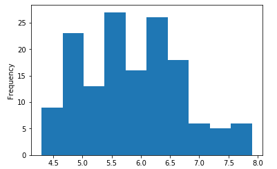
23. 直方图
直方图: 由一系列高度不等的长方形表示数据分布的情况, 宽度表示间隔, 高度表示在对应宽度下出现的频数.
23.1 采用pandas中的plot()方法绘制折线图
将plot()方法中的kind参数改为"hist"即可, 参考官方文档: http://pandas.pydata.org/pandas-docs/version/0.15.0/visualization.html#histograms
 import numpy as np

 import pandas as pd

 import matplotlib.pyplot as plt

 df = pd.read_csv(r"D:\Data\Iris.csv")

 df.columns = ['sepal_len', 'sepal_wid', 'petal_len', 'petal_wid','species']

 df["species"] = df["species"].apply(lambda x: x.replace("Iris-",""))

 df_gbsp = df["sepal_len"]

 #绘制直方图

 df_gbsp.plot(kind = "hist")

 plt.show()
#可修改cumulative=True实现累加直方图, 以及通过bins参数修改分组数

df_gbsp.plot(kind = "hist", cumulative='True', bins = 20)

23.2 采用matplotlib.pyplot的hist()方法绘制折线图
 import numpy as np

 import pandas as pd

 import matplotlib.pyplot as plt

 df = pd.read_csv(r"D:\Data\Iris.csv")

 df.columns = ['sepal_len', 'sepal_wid', 'petal_len', 'petal_wid','species']

 df["species"] = df["species"].apply(lambda x: x.replace("Iris-",""))

 #hist()方法绘制直方图

 plt.hist(df["sepal_wid"], bins =20, color = "k")

 plt.show()

#修改为累加直方图, 透明度为0.7
plt.hist(df["sepal_wid"], bins =20, color = "K", cumulative=True, alpha = 0.7)

以上是对pandas的几个基本可视化视图的总结, 更多pandas可视化相关参考官方文档: http://pandas.pydata.org/pandas-docs/version/0.15.0/visualization.html
参考资料:
https://www.cnblogs.com/dev-liu/p/pandas_plt_basic.html
https://blog.csdn.net/qq_29721419/article/details/71638912
Python数据分析--Pandas知识点(三)的更多相关文章
- Python数据分析--Pandas知识点(二)
本文主要是总结学习pandas过程中用到的函数和方法, 在此记录, 防止遗忘. Python数据分析--Pandas知识点(一) 下面将是在知识点一的基础上继续总结. 13. 简单计算 新建一个数据表 ...
- Python数据分析--Pandas知识点(一)
本文主要是总结学习pandas过程中用到的函数和方法, 在此记录, 防止遗忘 1. 重复值的处理 利用drop_duplicates()函数删除数据表中重复多余的记录, 比如删除重复多余的ID. im ...
- Python数据分析-Pandas(Series与DataFrame)
Pandas介绍: pandas是一个强大的Python数据分析的工具包,是基于NumPy构建的. Pandas的主要功能: 1)具备对其功能的数据结构DataFrame.Series 2)集成时间序 ...
- 利用Python进行数据分析-Pandas(第三部分)
访问数据是使用本书所介绍的这些工具的第一步.这里会着重介绍pandas的数据输入与输出,虽然别的库中也有不少以此为目的的工具. 输入输出通常可以划分为几个大类:读取文本文件和其他更高效的磁盘存储格式, ...
- python 数据分析--pandas
接下来pandas介绍中将学习到如下8块内容:1.数据结构简介:DataFrame和Series2.数据索引index3.利用pandas查询数据4.利用pandas的DataFrames进行统计分析 ...
- Python之Pandas知识点
很多人都分不清Numpy,Scipy,pandas三个库的区别. 在这里简单分别一下: NumPy:数学计算库,以矩阵为基础的数学计算模块,包括基本的四则运行,方程式以及其他方面的计算什么的,纯数学: ...
- Python数据分析Pandas库方法简介
Pandas 入门 Pandas简介 背景:pandas是一个Python包,提供快速,灵活和富有表现力的数据结构,旨在使“关系”或“标记”数据的使用既简单又直观.它旨在成为在Python中进行实际, ...
- Python数据分析 Pandas模块 基础数据结构与简介(一)
pandas 入门 简介 pandas 组成 = 数据面板 + 数据分析工具 poandas 把数组分为3类 一维矩阵:Series 把ndarray强大在可以存储任意数据类型可以专门处理时间数据 二 ...
- python数据分析pandas中的DataFrame数据清洗
pandas中的DataFrame中的空数据处理方法: 方法一:直接删除 1.查看行或列是否有空格(以下的df为DataFrame类型,axis=0,代表列,axis=1代表行,以下的返回值都是行或列 ...
随机推荐
- C#的发展历程 -- 系列介绍
C#的发展历程第五 - C# 7开始进入快速迭代道路 C#与C++的发展历程第四 - C#6的新时代 C#与C++的发展历程第三 - C#5.0异步编程巅峰 C#与C++的发展历程第二 - C#4.0 ...
- lsof一些使用
查看某进程和哪些文件相关 [root@linux-node2 ~]# netstat -lntp Active Internet connections (only servers) Proto Re ...
- [转]Servlet的学习之Filter过滤器技术
本篇将讲诉Servlet中一项非常重要的技术,Filter过滤器技术.通过过滤器,可以对来自客户端的请求进行拦截,进行预处理或者对最终响应给客户端的数据进行处理后再输出. 要想使用Filter过滤器, ...
- win10+vs2015编译caffe的cpu debug版本、部署matcaffe
一.编译caffe 1.安装python-3.5.2-amd64.exe https://www.python.org/ftp/python/3.5.2/python-3.5.2-amd64.exe ...
- gcc centos 新版本的安装方法
因为centos默认安装的gcc是GCC 4.*.* 是不支持 C++11 的,所以有些新的程序或软件要安装就行要升级GCC,否则无法编译通过 一.如下步骤安装不成功(yum install devt ...
- C# 代码小技巧
一 .自动属性. 1.vs下输入prop,Tab键就出现了. 2.有了自动属性,我们不用再额外为一个类的每个公共属性定义一个私有字段(实际上没多大用处的字段), 但是通过反射还是可以看到对应的私有 ...
- 在高并发情况nginx的作用
1 场景一:如图 在单机的情况下例如:单个tomcat 有100w条请求的时候,而默认tomcat支持的并发数量并不能达到要求,所所以单台服务器 扛不住 容易宕机,瘫痪 2 高并发的情况下要让服务器不 ...
- python导入requests库一直报错原因总结 (文件名与库名冲突)
花了好长时间一直在搞这个 源代码: 一直报如下错误: 分析原因: 总以为没有导入requests库,一直在网上搜索各种的导入库方法(下载第三方的requests库,用各种命令工具安装),还是报错 后来 ...
- 【比赛打分展示双屏管理系统-加强版】的两个ini配置文件功能解释及排行榜滚动界面的简答配置等
加强版目录下有两个ini文件,功能解释如下: 1. ScoreTip.ini: bScoreTip:如果为1,可以启用 回避 功能 或 高低分差值超出 iScoreRange 的 提示功能. iSco ...
- 关于CoreData的用法
有些同事觉得CoreData是一个看不懂,理解不清的神秘东东,其实ios的本地数据储存是一个sqlite数据库,一个简易的数据库,而这个CoreData是否支持所有储存的数据呢,显然不是的,站在我的角 ...