
css border制作小三角形状及气泡框(兼容IE6)
先看下CSS盒模型
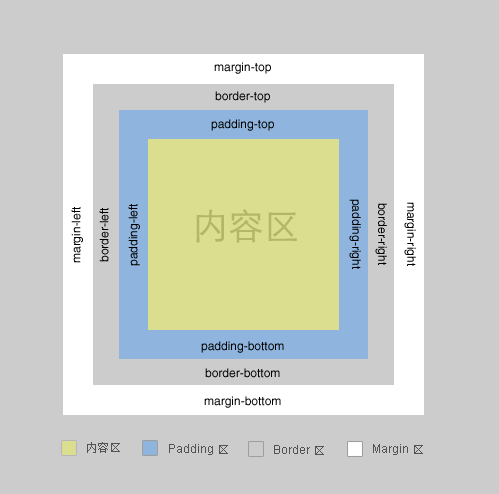
一个盒子包括: margin+border+padding+content
上下左右边框交界处出呈现平滑的斜线.
利用这个特点, 通过设置不同的上下左右边框宽度或者颜色可以得到小三角, 小梯形等.
调整宽度大小可以调节三角形形状.
一般情况下, 我们设置盒子的宽高度, 及上下左右边框
<head>

<meta http-equiv="Content-Type" content="text/html; charset=utf-8" />

<title></title>

<style type="text/css">

  .test{

      height:60px;

      width:60px;

      border-color:red green blue yellow;

      border-style:solid;

      border-width:30px;

  }

</style>

</head>

<body>

<div class="test"></div>

</body>
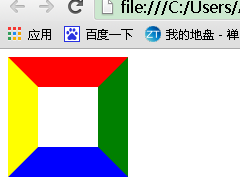
根据盒子模型,我们把div宽高度都设为0时,
<head>

<meta http-equiv="Content-Type" content="text/html; charset=utf-8" />

<title></title>

<style type="text/css">

  .test{

      height:0px;/* div盒子设置高度设置为0 */

      width:0px;/* div盒子设置宽度设置为0 */

      border-color:red green blue yellow;

      border-style:solid;

      border-width:30px;

  }

</style>

</head>

<body>

<div class="test"></div>

</body>

为了兼容IE6,需要添加代码 _font-size: 0; _line-height: 0;
<head>

<meta http-equiv="Content-Type" content="text/html; charset=utf-8" />

<title></title>

<style type="text/css">

  .test{

      height:0px;/* div盒子设置高度设置为0 */

      width:0px;/* div盒子设置宽度设置为0 */

      border-color:red green blue yellow;

      border-style:solid;

      border-width:30px;

      overflow: hidden; /* 这里设置overflow, font-size, line-height */

      font-size: 0;     /*是因为, 虽然宽高度为0, 但在IE6下会具有默认的 */

      line-height: 0;  /* 字体大小和行高, 导致盒子呈现被撑开的长矩形 */

  }

</style>

</head>

<body>

<div class="test"></div>

</body>
这时, 其实我们已经看到有上下左右四个三角形了..如果, 我们把4种颜色, 只保留一种颜色, 余下3种颜色设置为透明(或者设置为和背景色相同的颜色), 那不就是一个小三角了么
<head>

<meta http-equiv="Content-Type" content="text/html; charset=utf-8" />

<title></title>

<style type="text/css">

  .test{

      height:0px;/* div盒子设置高度设置为0 */

      width:0px;/* div盒子设置宽度设置为0 */

      border-color:red  transparent transparent transparent;

      border-style:solid;

      border-width:30px;

      overflow: hidden; /* 这里设置overflow, font-size, line-height */

      font-size: 0;     /*是因为, 虽然宽高度为0, 但在IE6下会具有默认的 */

      line-height: 0;  /* 字体大小和行高, 导致盒子呈现被撑开的长矩形 */

  }

</style>

</head>

<body>

<div class="test"></div>

</body>
可是, IE6下不支持透明啊~~~, 会出现下图的样子(换句话说IE6不支持transparent,而使用默认的背景色黑色)

为了解决这个兼容性问题,IE6下, 设置余下三条边的border-style为dashed,利用虚线样式的border可以形成天然无污染的空白,即可达到透明的效果。
即把原来的代码中的
border-style:solid;
换成
border-style:solid dashed dashed dashed;
上面我们画的小三角的斜边都是依靠原来盒子的边, 还有另外一种形式的小三角, 就是斜边在盒子的对角线上
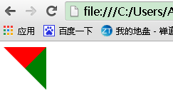
<meta http-equiv="Content-Type" content="text/html; charset=utf-8" />

<title></title>

<style type="text/css">

  .test{

      height:0px;/* div盒子设置高度设置为0 */

      width:0px;/* div盒子设置宽度设置为0 */

      border-color:red green transparent transparent;

      border-style:solid solid dashed dashed;

      border-width:30px;

      overflow: hidden; /* 这里设置overflow, font-size, line-height */

      font-size: 0;     /*是因为, 虽然宽高度为0, 但在IE6下会具有默认的 */

      line-height: 0;  /* 字体大小和行高, 导致盒子呈现被撑开的长矩形 */

  }

</style>

</head>

<body>

<div class="test"></div>

</body>
保留其中一种颜色, 就可以得到斜边在对角线上的三角形了…多个这样的三角形, 通过设置边框大小, 颜色, 拼凑起来可以形成任意形状的三角形.

像这种不规则的三角形, 延伸一下, 放在气泡框上, 就可以省去拼背景图片的麻烦了.
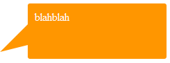
另外, 关于气泡框, 可以用特殊字符模拟小三角同样需要用到定位和重叠覆盖,只不过不需要调整border属性了。
先来看一个菱形“◆” ,它在页面中的代码是“◆”,需要注意的是页面编码需要设置为utf-8,在网页中可以把◆当作文字处理,可以通过调整font-size来它的大小、通过color来设置它的颜色。
HTML结构依然用前面的,不同的是在em、span标签中加入了 ◆
<head>

<meta http-equiv="Content-Type" content="text/html; charset=utf-8" />

<title></title>

<style type="text/css">

  /*先来设置最外层div的样式,得到一个矩形框*/

  .tag{

    width:300px;

    height:100px;

    position:relative;

    border:5px solid #09F;

  }

  /*接着定位箭头最外层容器div,便于观察可以先设置一个背景色*/

  .arrow{

    position:absolute;

    width:40px;

    height:40px;

    left:100px;

    bottom:-40px;

    overflow:hidden;

  }

  /*再对◆设置样式*/

  .arrow *{

    display:block;

    position:absolute;

    font-size:40px;

    line-height:40px;

    width:40px;

    font-family:SimSun;

    font-style:normal;

    font-weight:normal;

    text-align:center;

    vertical-align:middle;

  }

  /*注意:为了◆主流浏览器中显示一致,需要清除浏览器的默认字体样式,特别注意这里字体的设置再分别修改em、span标签的字体颜色,并对这两个标签定位:*/

  .arrow em{

    color:#09F;

    top:-15px;

  }

  .arrow span{

    color:#FFF;

    top:-22px;

  }

</style>

</head>

<body>

  <div class="tag">

      <div class="arrow">

        <em>◆</em>

        <span>◆</span>

      </div>

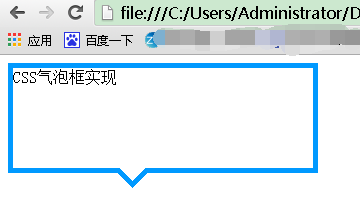
      CSS气泡框实现

  </div>

</body>
效果图为:
补充:以上方式实现小三角的过程中不可避免的增加了多余的标签,如果不要求所有浏览器中显示一致的话, 我们可以利用css3来实现这个小三角
<div class="tag">

    css3气泡框

</div>
.tag{

    width:300px;

    height:100px;

    border:5px solid #09F;

    position:relative;

    background-color:#FFF;

}

.tag:before,.tag:after{

    content:"";display:block;

    border-width:20px;

    position:absolute; bottom:-40px;

    left:100px;

    border-style:solid dashed dashed;

    border-color:#09F transparent transparent;

    font-size:;

    line-height:;

}

.tag:after{

    bottom:-33px;

    border-color:#FFF transparent transparent;

}
css border制作小三角形状及气泡框(兼容IE6)的更多相关文章
- 纯css写带小三角对话框
在实际样式中经常会遇到要写类似对话框的样式,而这种样式往往会有一个小三角,如下所示: 那么如何用css写出来呢,其实很简单,先让父元素相对定位,然后运用css的伪类before或after.就可以写个 ...
- css制作小三角
视觉稿中经常有些小三角,如下图.每次用图片做太不方便了,我们看看用css实现的效果(支持ie6,7哦) <style> /*border实现三角*/ /*箭头向上*/ .arrow-top ...
- 纯css制作小三角
在网站制作的过程中常涉及一些小图标,以前大部分会采用小图片.但有了css3后很多变得方便了,比如要在li列表的每行文字的前面加个小三角,可以这么写: <!DOCTYPE html> < ...
- 用CSS制作小三角提示符号
今天在项目中遇到了如下图的切图要求. 对,重点就是那个小三角提示符号. html 结构如下 <div class="wrap"> <div class=" ...
- 【小技巧】只用css实现带小三角的对话框样式
一个小小的技巧: 如图所示,这种小三角,不用图片,只用css怎么实现呢? 直接上代码吧: <!DOCTYPE html> <html> <head> <tit ...
- css border 制作三角形
border 边框 上三角 是只有上面的border 有颜色,其余的边框都是tranparents,下三角只有下面的border 有颜色,其余的边框都是tranparents,左三角只有左面的bord ...
- CSS-border属性制作小三角
1--三角向上下左上.右上.右下.左下这四个方向突出的样式 向左上角突出: border-color: transparent transparent transparent #FFCC00; bor ...
- css中书写小三角
我们在开发过程中,有很多的方向标签不是图片,而是用css方法书写上去的. 首先我们要了解原理,border的边框的脚步是45度角. 向左方向: width:0px: height:0px: borde ...
- 无图片,用css border实现尖三角
<!DOCTYPE HTML> <html> <head> <meta charset="gbk" /> <style typ ...
随机推荐
- 第五章 动态SQL 批量操作
用于实现动态SQL的元素主要有 if trim where set choose(when.otherwise) foreach MyBatis 缓存 一级缓存 在test类中 调用相同的方法 第二 ...
- 关于JS动画和CSS3动画的性能差异
本文章为综合其它资料所得. 根据Google Developer,Chromium项目里,渲染线程分为main thread和compositor thread. 如果CSS动画只是改变transfo ...
- GRASP软件设计的模式和原则
GRASP 模式:每一个模式描述了一个在我们周围不断重复发生的问题,以及该问题的解决方案的核心.”这是关于模式最经典的定义,作者是建筑大师Christopher Alexander.如果是第一次看到这 ...
- 转《vue引入第三方js库》
一.绝对路径直接引入,全局可用 二.绝对路径直接引入,配置后,import 引入后再使用 三.webpack中配置 alias,import 引入后再使用 四.webpack 中配置 plugins, ...
- 在windows 7上安装TensorFlow
TensorFlow是一个开源软件库,用于各种感知和语言理解任务的机器学习.目前被50个团队用于研究和生产许多Google商业产品,如语音识别.Gmail.Google 相册和搜索,其中许多产品曾使用 ...
- 数据库迁移(创建关联等操作) Target database is not up to date报错
使用Mysql-sqlalchemy执行数据库迁移 来更新数据库: 队长试探性的在网上找了几种方案 依然没有解决报错问题: 后来看了https://www.aliyun.com/jiaocheng/4 ...
- vue axios 封装(二)
封装二: http.js import axios from 'axios' import storeHelper from './localstorageHelper' // 全局设置 const ...
- 2.ansible-playbook基本参数
ansible-playbook的参数--force-handlers run handlers even if a task fails 强制执行handler--list-tags list al ...
- iframe与src一个性质 当js中修改了src的值后会重新向后台发送请求 ;为了防止浏览器缓存问题 当我们修改src时候 需要添加不同的值 这样浏览器就不会从缓存中取值 而是重新发起后台请求
- 将数组Arrays转成集合List
String[] split = pids.split("-"); //将数组split转成集合 List<String> asList = Arrays.asList ...