
flex布局各种情况总结分析及实例演示
2009年,W3C提出了一种新的方案----Flex布局,可以简便、完整、响应式地实现各种页面布局。目前,它已经得到了所有浏览器的支持,这意味着,现在就能很安全地使用这项功能。
通过笔者大量实践,发现flex布局屡试不爽,尤其在移动端自适应方面。但处于其大量的属性记忆混乱,今天图文并茂梳理如下。
语法及概念部分
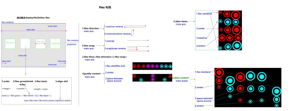
实例演示部分
结合笛卡尔坐标系(仅考虑一个item情况,其它情况可以据此的排列组合实现)

css部分
/*骰子的布局*/

.box {

  display: flex;

  width: 50px;

  height: 50px;

  border: 1px solid #ccc;

  border-radius: 2px;

}

.box .item{

	display: inline-block;

	width: 10px;

	height: 10px;

	margin:3px;

	border-radius: 50%;

	background: #000;

}

/*中上(1,0)*/

.c2{

	justify-content: center;

}

/*右上(2,0)*/

.c3{

	justify-content: flex-end;

}

/*左间(0,1)*/

.c4{

	align-items: center;

}

/*左下(0,2)*/

.c5{

  align-items: flex-end;

}

/*中间(1,1)*/

.c6{

  justify-content: center;

  align-items: center;

}

/*右间(2,1)*/

.c7{

	justify-content: flex-end;

  align-items: center;

}

/*中下(1,2)*/

.c8{

  justify-content: center;

  align-items: flex-end;

}

/*右下(2,2)*/

.c9{

  justify-content: flex-end;

    align-items: flex-end;

}

/*两个*/

/*space-between*/

.c21{

	justify-content: space-between;

}

/*两个flex-direction+column*/

.c22{

	justify-content: space-between;

	flex-direction: column;

}

/*2.3两个space-between+flex-direction+ align-items*/

.c23{

	justify-content: space-between;

	flex-direction: column;

	align-items: center;

}

/*2.4两个space-between+flex-direction+ align-items*/

.c24{

	justify-content: space-between;

	flex-direction: column;

	 align-items: flex-end;

}

/*2.5两个space-between+flex-direction+ align-items*/

.c25 .item:nth-child(2) {

	 align-self: center;

}

/*2.6两个space-between+flex-direction+ align-items*/

.c26{

	justify-content: space-between;

}

.c26 .item:nth-child(2) {

	 align-self:  flex-end;

}

/*3.1三个align-self:center+flex-end*/

.c31 .item:nth-child(2) {

	 align-self:  center;

}

.c31 .item:nth-child(3) {

	 align-self:  flex-end;

}

/*4.1四个*/

.c41 {

	flex-wrap: wrap;

  justify-content: flex-end;

  align-content: space-between;

}

/*4.2四个*/

.c42 {

	flex-wrap: wrap;

  align-content: space-between;

}

.column {

  flex-basis: 100%;

  display: flex;

  justify-content: space-between;

}

/*6.1六个*/

.c61{

	flex-wrap: wrap;

}

.row{

  flex-basis: 100%;

  display:flex;

}

.row:nth-child(2){

  justify-content: center;

}

.row:nth-child(3){

  justify-content: space-between;

}

/*九个*/

.c9{

	flex-wrap: wrap;

}

/*网格布局*/

/*基本*/

.Grid {

  display: flex;

}

.Grid-cell {

  flex: 1;

}

/*百分比布局*/

.Grid-cell.u-full {

  flex: 0 0 100%;

}

.Grid-cell.u-1of2 {

  flex: 0 0 50%;

}

.Grid-cell.u-1of3 {

  flex: 0 0 33.3333%;

}

.Grid-cell.u-1of4 {

  flex: 0 0 25%;

}

/*圣杯布局圣杯布局(Holy Grail Layout)*/

.fh {

    display: flex;

    min-height: 98vh;

    flex-direction: column;

    margin: 1rem;

}

.fh-header {

    display: flex;

    flex: 1.2;

    border: 1px solid #ccc;

}

.fh>.fh-middle {

    flex: 1;

    border: 1px solid #ccc;

    margin: 1rem 0;

}

.fh>.fh-footer {

    flex: 2.5;

    border: 1px solid #ccc;

}

.fh-content {

    flex: 1;

    border: 1px solid #ccc;

}

.fh-nav {

    /* 边栏的宽度设为20rem */

    flex: 0 0 20rem;

    border: 1px solid #ccc;

}

.fh-nav {

    /* 导航放到最左边 */

    order: -1;

    margin-right: 1rem;

}

/*输入框布局*/

.InputAddOn {

  display: flex;

}

.InputAddOn-field {

  flex: 1;

}

/*悬挂式布局*/

.Media {

  display: flex;

  align-items: flex-start;

}

.Media-figure {

  margin-right: 1em;

}

/*固定低栏*/

.Site {

  display: flex;

  min-height: 100vh;

  flex-direction: column;

}

.Site-content {

  flex: 1;

}

/*流式布局*/

.parent {

  width: 200px;

  height: 150px;

  background-color: black;

  display: flex;

  flex-flow: row wrap;

}

.child {

  box-sizing: border-box;

  background-color: white;

  flex: 0 0 25%;

  height: 50px;

  border: 1px solid red;

}
html部分
<!DOCTYPE html>

<html lang="en">

<head>

	<meta charset="UTF-8">

	<title>fh-main</title>

	<link rel="stylesheet" href="flex.css">

</head>

<body >

<h4>骰子的布局(左0中1右2,上0间1下2)</h4>

<p>1.1一个左上(0,0):justify-content:flex-start(default);</p>

	<div class="box c1">

		<span class="item"></span>

	</div>

<p>1.2一个中上(1,0):justify-content:center;</p>

	<div class="box c2">

		<span class="item"></span>

	</div>

<p>1.3一个右上(2,0):justify-content:flex-end;</p>

	<div class="box c3">

		<span class="item"></span>

	</div>

<p>1.4一个左间(0,1)

  :align-items: center;</p>

	<div class="box c4">

		<span class="item"></span>

	</div>

<p>1.5一个左下(0,2):align-items: flex-end;</p>

	<div class="box c5">

		<span class="item"></span>

	</div>

<p>1.6一个中间(1,1):justify-content: center;align-items:center;</p>

	<div class="box c6">

		<span class="item"></span>

	</div>

<p>1.7一个右间(2,1):justify-content:flex-end;align-items:center;</p>

	<div class="box c7">

		<span class="item"></span>

	</div>

<p>1.8一个中下(1,2) :justify-content:center;align-items:flex-end;</p>

	<div class="box c8">

		<span class="item"></span>

	</div>

<p>1.9一个右下(2,2) justify-content: flex-end;

  align-items: flex-end;</p>

	<div class="box c9">

		<span class="item"></span>

	</div>

<p>2.1两个space-between</p>

	<div class="box c21">

		<span class="item"></span>

		<span class="item"></span>

	</div>

<p>2.2两个space-between+flex-direction</p>

	<div class="box c22">

		<span class="item"></span>

		<span class="item"></span>

	</div>

<p>2.3两个space-between+flex-direction+ align-items</p>

	<div class="box c23">

		<span class="item"></span>

		<span class="item"></span>

	</div>

<p>2.4两个space-between+flex-direction+ align-items:flex-end</p>

	<div class="box c24">

		<span class="item"></span>

		<span class="item"></span>

	</div>

<p>2.5两个align-self</p>

	<div class="box c25">

		<span class="item"></span>

		<span class="item"></span>

	</div>

<p>2.6两个align-self</p>

	<div class="box c26">

		<span class="item"></span>

		<span class="item"></span>

	</div>

<p>3.1三个align-self:center+flex-end</p>

	<div class="box c31">

		<span class="item"></span>

		<span class="item"></span>

		<span class="item"></span>

	</div>

<p>4.1四个</p>

	<div class="box c41">

		<span class="item"></span>

		<span class="item"></span>

		<span class="item"></span>

		<span class="item"></span>

	</div>

<p>4.2四个</p>

	<div class="box c42">

		<span class="column">

			<span class="item"></span>

			<span class="item"></span>

		</span>

		<span class="column">

			<span class="item"></span>

			<span class="item"></span>

		</span>

	</div>

<p>6.1六个</p>

<div class="box c61">

  <div class="row">

    <span class="item"></span>

    <span class="item"></span>

    <span class="item"></span>

  </div>

  <div class="row">

    <span class="item"></span>

  </div>

  <div class="row">

     <span class="item"></span>

     <span class="item"></span>

  </div>

</div>

<p>9九个</p>

	<div class="box c9">

     <span class="item"></span>

     <span class="item"></span>

     <span class="item"></span>

     <span class="item"></span>

     <span class="item"></span>

     <span class="item"></span>

     <span class="item"></span>

     <span class="item"></span>

     <span class="item"></span>

  </div>

<h2>网格布局</h2>

<p>2.1基本网格布局</p>

<div class="Grid">

  <div class="Grid-cell">Grid-cell</div>

  <div class="Grid-cell">Grid-cell</div>

  <div class="Grid-cell">Grid-cell</div>

</div>

<p>2.2百分比布局</p>

<div class="Grid">

  <div class="Grid-cell u-1of4">u-1of4</div>

  <div class="Grid-cell">...</div>

  <div class="Grid-cell u-1of3">u-1of3</div>

</div>

<h2>圣杯布局</h2>

<div class="fh">

	<header class="fh-header">

		<nav class="fh-nav">nav</nav>

		<main class="fh-content">mian</main>

	</header>

	<div class="fh-middle">middle</div>

	<footer class="fh-footer">footer</footer>

</div>

<h2>输入框的布局</h2>

<div class="InputAddOn">

  <span class="InputAddOn-item">icon</span>

  <input class="InputAddOn-field">

  <button class="InputAddOn-item">btn</button>

</div>

<h2>悬挂式布局</h2>

<div class="Media">

  <img class="Media-figure" src="a/img" alt="aa">

  <p class="Media-body">...</p>

</div>

<h2>固定低栏</h2>

<div class="site">

  <header>header</header>

  <main class="Site-content">main </main>

  <footer>footer</footer>

</div>

<h2>流式布局</h2>

<div class="parent">

	<span class="child"></span>

	<span class="child"></span>

	<span class="child"></span>

	<span class="child"></span>

	<span class="child"></span>

	<span class="child"></span>

	<span class="child"></span>

	<span class="child"></span>

	<span class="child"></span>

</div>

</body>

</html>
flex布局各种情况总结分析及实例演示的更多相关文章
- Flex 布局教程:实例
分类: 开发者手册 Flex 布局教程:实例篇 作者: 阮一峰 日期: 2015年7月14日 上一篇文章介绍了Flex布局的语法,今天介绍常见布局的Flex写法. 你会看到,不管是什么布局,Fle ...
- Flex 布局教程:语法和实例
语法篇 网页布局(layout)是 CSS 的一个重点应用. 布局的传统解决方案,基于盒状模型,依赖 display 属性 + position属性 + float属性.它对于那些特殊布局非常不方便, ...
- Flex 布局教程:实例篇【转】
Flex 布局教程:实例篇 作者: 阮一峰 日期: 2015年7月14日 原文:http://www.ruanyifeng.com/blog/2015/07/flex-examples.html ...
- flex布局语法+实例
一.什么是flex布局 flex 是 flexible box 的缩写,意为"弹性布局",用来为盒状模型提供最大的灵活性. 任何一个容器都可以指定为 flex 布局.你可以将前端页 ...
- Flex 布局教程:实例篇
该教程整理自 阮一峰Flexible教程 今天介绍常见布局的Flex写法.你会看到,不管是什么布局,Flex往往都可以几行命令搞定. 我的主要参考资料是Landon Schropp的文章和Solved ...
- Flex 布局教程:实例篇(转)
你会看到,不管是什么布局,Flex往往都可以几行命令搞定. 我只列出代码,详细的语法解释请查阅<Flex布局教程:语法篇>.我的主要参考资料是Landon Schropp的文章和Solve ...
- flex布局实例demo全解
上篇文章介绍了Flex布局的语法,今天介绍常见布局的Flex写法. 你会看到,不管是什么布局,Flex往往都可以几行命令搞定. 我只列出代码,详细的语法解释请查阅<Flex布局教程:语法篇> ...
- CSS实例详解:Flex布局
本文由云+社区发表 本文将通过三个简单的实例,实际应用上篇文章的基础理论知识,展示下Flex布局是如何解决CSS布局问题. 一.垂直居中 这里同时用非flex布局和flex布局两种方式来实现,可以对比 ...
- Flex 布局:实例篇
上一篇文章介绍了Flex布局的语法,今天介绍常见布局的Flex写法.你会看到,不管是什么布局,Flex往往都可以几行命令搞定. 我只列出代码,详细的语法解释请查阅<Flex布局教程:语法篇& ...
随机推荐
- UVA 1210 Sum of Consecutive Prime Numbers
https://vjudge.net/problem/UVA-1210 统计质数前缀和,枚举左右端点,这一段的区间和+1 #include<cstdio> #define N 10001 ...
- vijos 1081 野生动物园 函数式线段树
描述 cjBBteam拥有一个很大的野生动物园.这个动物园坐落在一个狭长的山谷内,这个区域从南到北被划分成N个区域,每个区域都饲养着一头狮子.这些狮子从北到南编号为1,2,3,…,N.每头狮子都有一个 ...
- [Luogu 1533] 可怜的狗狗
平衡树,我用的SBT. 排一下序尽量减少操作次数. 第K大询问. 以及插入删除. #include <algorithm> #include <cstdio> #include ...
- go通过名称来调用对应的方法
仅仅是为了学习go语言中的反射. package main import ( "errors" "fmt" "reflect" ) func ...
- bzoj3940&&bzoj3942 Ac自动机||kpm算法
方法就是维护一个动态栈 记录栈的每一位匹配到串的哪一位的编号 第一道kmp第二道ac自动机 自己理会 #include<cstdio> #include<cstring> #i ...
- 【BZOJ】2200: [Usaco2011 Jan]道路和航线
[题意]给定n个点的图,正权无向边,正负权有向边,保证对有向边(u,v),v无法到达u,求起点出发到达所有点的最短距离. [算法]拓扑排序+dijkstra [题解]因为有负权边,直接对原图进行spf ...
- 【BZOJ】1202: [HNOI2005]狡猾的商人
[题意]w组数据,给定n和m,给出m段区间[s,t](1<=s<=t<=n)的数字和,求是否矛盾.n<100,m<1000,w<100. [算法]带权并查集 [题解 ...
- Windows Phone 8.1基础教程(1) 页面导航、弹出框
1. 跳转到其他页面 Frame.Navigate(typeof(页面),参数); 2. 后退回历史页面 Frame.GoBack(); 3. 回跳时判断 if(e.NavigationMode == ...
- UIImageView属性---iOS-Apple苹果官方文档翻译
本系列所有开发文档翻译链接地址:iOS7开发-Apple苹果iPhone开发Xcode官方文档翻译PDF下载地址 //转载请注明出处--本文永久链接:http://www.cnblogs.com/C ...
- 两小时快速构建微信小程序
小程序在2017年1月上线之初,被社会极力吹捧,刻意去将其制造为一个“风口”,透支其价值.但是在之后一个月里,石破天惊迅速归为沉寂.媒体又开始过度消费小程序,大谈其鸡肋之处. 个人认为小程序的一个分水 ...