
【技术实战】Vue功能样式实战【六】
需求实战一
样式展示
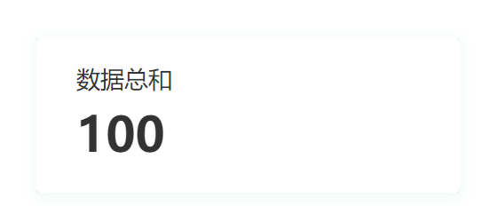
代码展示
<template>

    <ARow>

        <ACol style="background-color:#F1F4F5 ">

            <div class="info-card">

                <div class="info-title">

                    数据总和

                </div>

                <div class="info-value">

                    100

                </div>

            </div>

        </ACol>

    </ARow>

</template>

<script setup lang="ts">

</script>

<style scoped>

:deep(.info-card){

    width: 318px;

    height: 116px;

    background-color: #FFFFFF;

    box-shadow: 0px 2px 10px 1px rgba(23,179,163,0.07);

    border-radius: 4px;

}

:deep(.info-title){

    font-size: 18px;

    font-family: Microsoft YaHei;

    font-weight: 400;

    color: #333333;

    line-height: 21px;

    padding:20px 0 20px 30px;

}

:deep(.info-value){

    font-size: 36px;

    font-family: Microsoft YaHei;

    font-weight: bold;

    color: #333333;

    line-height: 21px;

    padding:0 0 0 30px;

}

</style>
代码解读
这段代码是一个Vue组件的模板部分,用于展示一个信息卡片。具体解释如下:
- <template> 标签用于定义组件的模板部分。
- <ARow> 和 <ACol> 是自定义的组件,用于布局。<ARow> 表示一行,<ACol> 表示一列。
- <ACol> 标签内部有一个 style 属性,用于设置背景颜色为 #F1F4F5。
- <div class="info-card"> 是一个具有 info-card 类名的 div 元素,表示信息卡片的容器。
- <div class="info-title"> 是一个具有 info-title 类名的 div 元素,表示信息卡片的标题。
- <div class="info-value"> 是一个具有 info-value 类名的 div 元素,表示信息卡片的数值。
接下来是 <script setup lang="ts"> 标签,用于编写组件的逻辑部分,这里是空的,没有任何代码。
最后是 <style scoped> 标签,用于定义组件的样式。:deep() 是一个深度选择器,用于选择组件内部的元素。.info-card 表示选择具有 info-card 类名的元素,设置了宽度、高度、背景颜色、阴影和边框圆角等样式。.info-title 和 .info-value 分别表示选择具有对应类名的元素,设置了字体大小、字体样式、颜色、行高和内边距等样式。
这段代码的作用是创建一个信息卡片组件,显示一个标题为 "数据总和",数值为 "100" 的信息。信息卡片具有特定的样式,包括背景颜色、阴影和边框圆角等。
需求实战二
样式展示
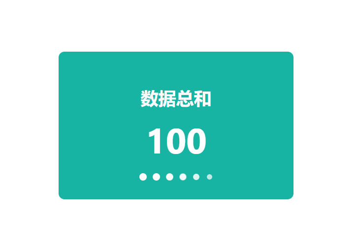
代码展示
<template>

    <div class="info-card">

        <div class="info-title">

            数据总和

        </div>

        <div class="info-value">

            100

        </div>

        <div class="animation-container">

            <div class="circle"></div>

            <div class="circle"></div>

            <div class="circle"></div>

            <div class="circle"></div>

            <div class="circle"></div>

            <div class="circle"></div>

        </div>

    </div>

</template>

<script setup lang="ts"></script>

<style scoped>

.info-card {

    width: 318px;

    height: 200px;

    background-color: #17b3a3;

    border-radius: 8px;

    display: flex;

    flex-direction: column;

    align-items: center;

    justify-content: center;

    position: relative;

}

.info-title {

    font-size: 24px;

    font-weight: bold;

    color: #FFFFFF;

}

.info-value {

    font-size: 48px;

    font-weight: bold;

    color: #FFFFFF;

}

.animation-container {

    display: flex;

    position: absolute;

    bottom: 25px;

}

.circle {

    width: 10px;

    height: 10px;

    background-color: #FFFFFF;

    border-radius: 50%;

    margin: 0 4px;

    transform: scale(0);

    animation: pulse 1.5s infinite cubic-bezier(0.215, 0.61, 0.355, 1) alternate;

}

.circle:nth-child(1) {

    animation-delay: 0.1s;

}

.circle:nth-child(2) {

    animation-delay: 0.2s;

}

.circle:nth-child(3) {

    animation-delay: 0.3s;

}

.circle:nth-child(4) {

    animation-delay: 0.4s;

}

.circle:nth-child(5) {

    animation-delay: 0.5s;

}

.circle:nth-child(6) {

    animation-delay: 0.6s;

}

@keyframes pulse {

    0% {

        opacity: 0;

        transform: scale(0);

    }

    50% {

        opacity: 1;

        transform: scale(1);

    }

    100% {

        opacity: 0;

        transform: scale(0);

    }

}

</style>
代码解读
这段代码是一个Vue组件的模板部分,用于展示一个带有动画效果的信息卡片。具体解释如下:
- <template> 标签用于定义组件的模板部分。
- <div class="info-card"> 是一个具有 info-card 类名的 div 元素,表示信息卡片的容器。
- <div class="info-title"> 是一个具有 info-title 类名的 div 元素,表示信息卡片的标题。
- <div class="info-value"> 是一个具有 info-value 类名的 div 元素,表示信息卡片的数值。
- <div class="animation-container"> 是一个具有 animation-container 类名的 div 元素,用于容纳动画效果的圆圈。
- <div class="circle"> 是一个具有 circle 类名的 div 元素,表示一个圆圈。
接下来是 <script setup lang="ts"> 标签,用于编写组件的逻辑部分,这里是空的,没有任何代码。
最后是 <style scoped> 标签,用于定义组件的样式。.info-card 表示选择具有 info-card 类名的元素,设置了宽度、高度、背景颜色、边框圆角等样式,并使用了 Flex 布局使内容垂直居中。.info-title 和 .info-value 分别表示选择具有对应类名的元素,设置了字体大小、字体样式、颜色等样式。.animation-container 表示选择具有 animation-container 类名的元素,设置了绝对定位和底部偏移量。.circle 表示选择具有 circle 类名的元素,设置了圆圈的样式,包括宽度、高度、背景颜色、边框圆角、外边距和动画效果。
动画效果使用了 @keyframes 关键字定义了一个名为 pulse 的关键帧动画,通过改变透明度和缩放来实现圆圈的闪烁效果。.circle:nth-child(n) 选择了第 n 个具有 circle 类名的元素,并设置了不同的动画延迟时间,以实现圆圈的依次闪烁效果。
这段代码的作用是创建一个带有动画效果的信息卡片组件,显示一个标题为 "数据总和",数值为 "100" 的信息。信息卡片具有特定的样式,包括背景颜色、边框圆角和居中对齐等。同时,信息卡片底部有一组圆圈,通过动画效果实现闪烁的效果。
需求实战三
样式展示
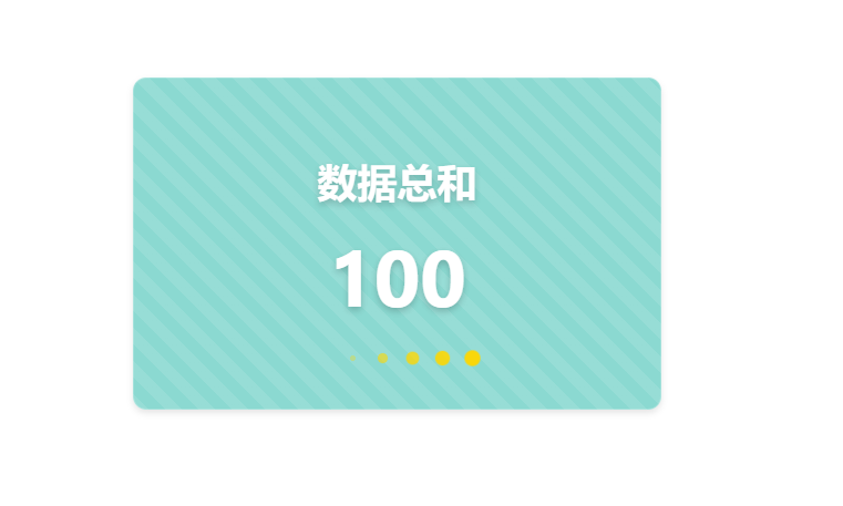
代码展示
<template>

    <div class="info-card">

        <div class="info-title">

            数据总和

        </div>

        <div class="info-value">

            100

        </div>

        <div class="animation-container">

            <div class="circle"></div>

            <div class="circle"></div>

            <div class="circle"></div>

            <div class="circle"></div>

            <div class="circle"></div>

            <div class="circle"></div>

        </div>

    </div>

</template>

<script setup lang="ts"></script>

<style scoped>

.info-card {

    width: 318px;

    height: 200px;

    background-color: rgba(23, 179, 163, 0.5);

    backdrop-filter: blur(10px);

    border-radius: 8px;

    display: flex;

    flex-direction: column;

    align-items: center;

    justify-content: center;

    position: relative;

    border: 1px solid rgba(255, 255, 255, 0.2);

    box-shadow: 0 2px 4px rgba(0, 0, 0, 0.1);

    background-image: linear-gradient(45deg, rgba(255, 255, 255, 0.1) 25%, transparent 25%, transparent 50%, rgba(255, 255, 255, 0.1) 50%, rgba(255, 255, 255, 0.1) 75%, transparent 75%, transparent);

    background-size: 20px 20px;

}

.info-title {

    font-size: 24px;

    font-weight: bold;

    color: #FFFFFF;

    text-shadow: 0 2px 4px rgba(0, 0, 0, 0.2);

}

.info-value {

    font-size: 48px;

    font-weight: bold;

    color: #FFFFFF;

    text-shadow: 0 2px 4px rgba(0, 0, 0, 0.2);

}

.animation-container {

    display: flex;

    position: absolute;

    bottom: 25px;

}

.circle {

    width: 10px;

    height: 10px;

    background-color: #FFD700;

    border-radius: 50%;

    margin: 0 4px;

    transform: scale(0);

    animation: pulse 1.5s infinite cubic-bezier(0.215, 0.61, 0.355, 1) alternate;

}

.circle:nth-child(1) {

    animation-delay: 0.1s;

}

.circle:nth-child(2) {

    animation-delay: 0.2s;

}

.circle:nth-child(3) {

    animation-delay: 0.3s;

}

.circle:nth-child(4) {

    animation-delay: 0.4s;

}

.circle:nth-child(5) {

    animation-delay: 0.5s;

}

.circle:nth-child(6) {

    animation-delay: 0.6s;

}

@keyframes pulse {

    0% {

        opacity: 0;

        transform: scale(0);

    }

    50% {

        opacity: 1;

        transform: scale(1);

    }

    100% {

        opacity: 0;

        transform: scale(0);

    }

}

</style>
代码解读
这段代码是一个Vue组件的模板部分,用于展示一个带有动画效果和背景模糊的信息卡片。具体解释如下:
- <template> 标签用于定义组件的模板部分。
- <div class="info-card"> 是一个具有 info-card 类名的 div 元素,表示信息卡片的容器。
- <div class="info-title"> 是一个具有 info-title 类名的 div 元素,表示信息卡片的标题。
- <div class="info-value"> 是一个具有 info-value 类名的 div 元素,表示信息卡片的数值。
- <div class="animation-container"> 是一个具有 animation-container 类名的 div 元素,用于容纳动画效果的圆圈。
- <div class="circle"> 是一个具有 circle 类名的 div 元素,表示一个圆圈。
接下来是 <script setup lang="ts"> 标签,用于编写组件的逻辑部分,这里是空的,没有任何代码。
最后是 <style scoped> 标签,用于定义组件的样式。.info-card 表示选择具有 info-card 类名的元素,设置了宽度、高度、背景颜色、背景模糊、边框圆角、阴影和背景图案等样式,并使用了 Flex 布局使内容垂直居中。.info-title 和 .info-value 分别表示选择具有对应类名的元素,设置了字体大小、字体样式、颜色和文字阴影等样式。.animation-container 表示选择具有 animation-container 类名的元素,设置了绝对定位和底部偏移量。.circle 表示选择具有 circle 类名的元素,设置了圆圈的样式,包括宽度、高度、背景颜色、边框圆角、外边距和动画效果。
动画效果使用了 @keyframes 关键字定义了一个名为 pulse 的关键帧动画,通过改变透明度和缩放来实现圆圈的闪烁效果。.circle:nth-child(n) 选择了第 n 个具有 circle 类名的元素,并设置了不同的动画延迟时间,以实现圆圈的依次闪烁效果。
这段代码的作用是创建一个带有动画效果和背景模糊的信息卡片组件,显示一个标题为 "数据总和",数值为 "100" 的信息。信息卡片具有特定的样式,包括背景颜色、背景模糊、边框圆角、阴影和背景图案等。同时,信息卡片底部有一组圆圈,通过动画效果实现闪烁的效果。
需求实战四
样式展示
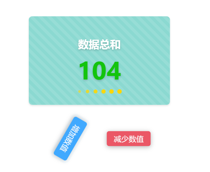
代码展示
<template>

    <div class="home-component">

        <ARow style="padding:0 0 30px 0">

            <div class="info-card">

                <div class="info-title">

                    数据总和

                </div>

                <transition name="number-transition">

                    <div class="info-value" :class="{ init:init,changed: isNumberIncreased, decreased: isNumberDecreased }">

                        {{ animatedValue }}

                    </div>

                </transition>

                <div class="animation-container">

                    <div class="circle"></div>

                    <div class="circle"></div>

                    <div class="circle"></div>

                    <div class="circle"></div>

                    <div class="circle"></div>

                    <div class="circle"></div>

                </div>

            </div>

        </ARow>

        <ARow>

            <ACol span="10">

                <div class="button-container">

                    <a-button class="increase-button" type="primary" @click="addNumber">增加数值</a-button>

                </div>

            </ACol>

            <ACol span="4">

            </ACol>

            <ACol span="10">

                <div class="button-container">

                    <a-button class="decrease-button" type="primary" @click="minNumber">减少数值</a-button>

                </div>

            </ACol>

        </ARow>

    </div>

</template>

<script setup lang="ts">

import { ref, watch } from 'vue';

const value = ref(100);

const isNumberIncreased = ref(false);

const isNumberDecreased = ref(false);

const animatedValue = ref(value.value);

const init=ref(true)

const addNumber = () => {

        const startValue = value.value;

        const endValue = startValue + 10;

        animateNumber(startValue, endValue);

        value.value = endValue;

        init.value=false;

    isNumberDecreased.value = false;

    isNumberIncreased.value = true;

};

const minNumber = () => {

        const startValue = value.value;

        const endValue = startValue - 10;

        animateNumber(startValue, endValue);

        value.value = endValue;

        init.value=false;

    isNumberIncreased.value = false;

    isNumberDecreased.value = true;

};

const animateNumber = (startValue:any, endValue:any) => {

    const duration = 1000; // 动画持续时间,单位为毫秒

    const frameRate = 10; // 每秒帧数

    const totalFrames = duration / (1000 / frameRate);

    const frameIncrement = (endValue - startValue) / totalFrames;

    let currentFrame = 0;

    const timer = setInterval(() => {

        currentFrame++;

        animatedValue.value = Math.round(startValue + frameIncrement * currentFrame);

        if (currentFrame === totalFrames) {

            clearInterval(timer);

        }

    }, 1000 / frameRate);

};

watch(value, () => {

    animatedValue.value = value.value;

});

</script>

<style scoped>

.home-component {

    display: flex;

    flex-direction: column;

    align-items: center;

    justify-content: center;

}

.info-card {

    width: 318px;

    height: 200px;

    background-color: rgba(23, 179, 163, 0.5);

    backdrop-filter: blur(10px);

    border-radius: 8px;

    display: flex;

    flex-direction: column;

    align-items: center;

    justify-content: center;

    position: relative;

    border: 1px solid rgba(255, 255, 255, 0.2);

    box-shadow: 0 2px 4px rgba(0, 0, 0, 0.1);

    background-image: linear-gradient(

        45deg,

        rgba(255, 255, 255, 0.1) 25%,

        transparent 25%,

        transparent 50%,

        rgba(255, 255, 255, 0.1) 50%,

        rgba(255, 255, 255, 0.1) 75%,

        transparent 75%,

        transparent

    );

    background-size: 20px 20px;

}

.info-title {

    font-size: 24px;

    font-weight: bold;

    color: #ffffff;

    text-shadow: 0 2px 4px rgba(0, 0, 0, 0.2);

}

.info-value {

    font-size: 48px;

    font-weight: bold;

    color: #ffffff;

    text-shadow: 0 2px 4px rgba(0, 0, 0, 0.2);

}

.info-value.init {

    color: #ffffff;

    transform: scale(1.2);

}

.info-value.changed {

    color: #13c40d;

    transform: scale(1.2);

}

.info-value.decreased {

    color: #eb5766;

    transform: scale(1.2);

}

.animation-container {

    display: flex;

    position: absolute;

    bottom: 25px;

}

.circle {

    width: 10px;

    height: 10px;

    background-color: #ffd700;

    border-radius: 50%;

    margin: 0 4px;

    transform: scale(0);

    animation: pulse 1.5s infinite cubic-bezier(0.215, 0.61, 0.355, 1) alternate;

}

.circle:nth-child(1) {

    animation-delay: 0.1s;

}

.circle:nth-child(2) {

    animation-delay: 0.2s;

}

.circle:nth-child(3) {

    animation-delay: 0.3s;

}

.circle:nth-child(4) {

    animation-delay: 0.4s;

}

.circle:nth-child(5) {

    animation-delay: 0.5s;

}

.circle:nth-child(6) {

    animation-delay: 0.6s;

}

@keyframes pulse {

    0% {

        opacity: 0;

        transform: scale(0);

    }

    50% {

        opacity: 1;

        transform: scale(1);

    }

    100% {

        opacity: 0;

        transform: scale(0);

    }

}

.button-container {

    display: flex;

    justify-content: center;

    padding: 30px 0;

    animation: bounce 2s infinite;

    animation-delay: 1s;

}

.increase-button,

.decrease-button {

    font-size: 16px;

    font-weight: bold;

    text-transform: uppercase;

    box-shadow: 0 2px 10px rgba(0, 0, 0, 0.3);

    border: none;

    transform: scale(1.05) rotate(360deg);

    transition: transform 1s;

    border-radius: 5px;

}

.increase-button {

    background-color: #38b2ac;

    margin-right: 10px;

}

.decrease-button {

    background-color: #eb5766;

    margin-left: 10px;

}

.increase-button:hover,

.decrease-button:hover {

    transform: scale(1.05);

    box-shadow: 0 2px 15px rgba(0, 0, 0, 0.4);

}

</style>
代码解读
这段代码是一个Vue组件的模板部分,用于展示一个带有动画效果和交互功能的信息卡片。具体解释如下:
- <template> 标签用于定义组件的模板部分。
- <div class="home-component"> 是一个具有 home-component 类名的 div 元素,表示整个组件的容器。
- <ARow> 和 <ACol> 是自定义的组件,用于布局。<ARow> 表示一行,<ACol> 表示一列。
- <div class="info-card"> 是一个具有 info-card 类名的 div 元素,表示信息卡片的容器。
- <div class="info-title"> 是一个具有 info-title 类名的 div 元素,表示信息卡片的标题。
- <transition> 标签用于添加过渡效果,name 属性指定过渡效果的名称。
- <div class="info-value"> 是一个具有 info-value 类名的 div 元素,表示信息卡片的数值。使用了动态绑定 :class 来根据条件添加不同的类名,实现数值变化时的样式变化。
- {{ animatedValue }} 是一个插值表达式,用于显示动态绑定的 animatedValue 变量的值。
- <div class="animation-container"> 是一个具有 animation-container 类名的 div 元素,用于容纳动画效果的圆圈。
- <div class="circle"> 是一个具有 circle 类名的 div 元素,表示一个圆圈。
接下来是 <script setup lang="ts"> 标签,用于编写组件的逻辑部分。通过 import 导入了 ref 和 watch 方法,用于创建响应式数据和监听数据变化。定义了一些变量和方法,包括 value、isNumberIncreased、isNumberDecreased、animatedValue、init、addNumber、minNumber 和 animateNumber。addNumber 方法用于增加数值,minNumber 方法用于减少数值,animateNumber 方法用于实现数值变化的动画效果。使用 watch 监听 value 的变化,并更新 animatedValue 的值。
最后是 <style scoped> 标签,用于定义组件的样式。.home-component 表示选择具有 home-component 类名的元素,设置了居中对齐等样式。.info-card 表示选择具有 info-card 类名的元素,设置了宽度、高度、背景颜色、背景模糊、边框圆角、阴影和背景图案等样式。.info-title 和 .info-value 分别表示选择具有对应类名的元素,设置了字体大小、字体样式、颜色和文字阴影等样式。.info-value.init、.info-value.changed 和 .info-value.decreased 分别表示根据条件添加的类名,用于实现数值变化时的样式变化。.animation-container 表示选择具有 animation-container 类名的元素,设置了绝对定位和底部偏移量。.circle 表示选择具有 circle 类名的元素,设置了圆圈的样式,包括宽度、高度、背景颜色、边框圆角、外边距和动画效果。
动画效果使用了 @keyframes 关键字定义了一个名为 pulse 的关键帧动画,通过改变透明度和缩放来实现圆圈的闪烁效果。.circle:nth-child(n) 选择了第 n 个具有 circle 类名的元素,并设置了不同的动画延迟时间,以实现圆圈的依次闪烁效果。
这段代码的作用是创建一个带有动画效果和交互功能的信息卡片组件。信息卡片显示一个标题为 "数据总和",数值初始值为 "100",并根据用户点击增加或减少数值,同时显示数值的变化动画效果。信息卡片具有特定的样式,包括背景颜色、背景模糊、边框圆角、阴影和背景图案等。同时,信息卡片底部有一组圆圈,通过动画效果实现闪烁的效果。
【技术实战】Vue功能样式实战【六】的更多相关文章
- 学习Vue 入门到实战——学习笔记
闲聊: 自从进了现在的公司,小颖就再没怎么接触vue了,最近不太忙,所以想再学习下vue,就看了看vue相关视频,顺便做个笔记嘻嘻. 视频地址:Vue 入门到实战1.Vue 入门到实战2 学习内容: ...
- 新书上线:《Spring Boot+Spring Cloud+Vue+Element项目实战:手把手教你开发权限管理系统》,欢迎大家买回去垫椅子垫桌脚
新书上线 大家好,笔者的新书<Spring Boot+Spring Cloud+Vue+Element项目实战:手把手教你开发权限管理系统>已上线,此书内容充实.材质优良,乃家中必备垫桌脚 ...
- vue+uni-app商城实战 | 第一篇:【有来小店】微信小程序快速开发接入Spring Cloud OAuth2认证中心完成授权登录
一. 前言 本篇通过实战来讲述如何使用uni-app快速进行商城微信小程序的开发以及小程序如何接入后台Spring Cloud微服务. 有来商城 youlai-mall 项目是一套全栈商城系统,技术栈 ...
- ThinkPHP5+Apicloud+vue商城APP实战
ThinkPHP5+Apicoud+vue商城APP实战 目录 章节1:项目概述 课时1apicloud平台介绍.04:38 课时2知识体系架构介绍.16:10 章节2:apicloud50分钟快速入 ...
- Vue公司项目实战步骤
一.无权限,无验证的Vue项目 1.打好HTML+CSS+JS基础,及<Vue 2.0 实战> 2.编写用mock设计的案例: 3.将以上案例的后台用C#改写: 二.带安全验证的Vue项目 ...
- vue+vue-router+vuex实战
shopping vue + vue-router + vuex实现电商网站 效果展示 install 下载代码: git clone https://github.com/chenchangyuan ...
- 阿里云云主机swap功能设置实战案例
阿里云云主机swap功能设置实战案例 阿里云提供的云服务器(Elastic Compute Service,简称 ECS),是云主机的一种,当前采用的虚拟化驱动是Xen(这一点可以通过bios ven ...
- Spring Cloud实战之初级入门(六)— 服务网关zuul
目录 1.环境介绍 2.api网关服务 2.1 创建工程 2.3 api网关中使用token机制 2.4 测试 2.5 小结 3.一点点重要的事情 1.环境介绍 好了,不知不觉中我们已经来到了最后一篇 ...
- vue.js2.0实战(1):搭建开发环境及构建项目
Vue.js学习系列: vue.js2.0实战(1):搭建开发环境及构建项目 https://my.oschina.net/brillantzhao/blog/1541638 vue.js2.0实战( ...
- 微信小程序实战 购物车功能
代码地址如下:http://www.demodashi.com/demo/12400.html 一.准备工作 软件环境:微信开发者工具 官方下载地址:https://mp.weixin.qq.com/ ...
随机推荐
- 2022-07-17:1、2、3...n-1、n、n、n+1、n+2... 在这个序列中,只有一个数字有重复(n)。 这个序列是无序的,找到重复数字n。 这个序列是有序的,找到重复数字n。
2022-07-17:1.2.3-n-1.n.n.n+1.n+2- 在这个序列中,只有一个数字有重复(n). 这个序列是无序的,找到重复数字n. 这个序列是有序的,找到重复数字n. 答案2022-07 ...
- SICP:惰性求值、流和尾递归(Python实现)
求值器完整实现代码我已经上传到了GitHub仓库:TinySCM,感兴趣的童鞋可以前往查看.这里顺便强烈推荐UC Berkeley的同名课程CS 61A. 即使在变化中,它也丝毫未变. --赫拉克利特 ...
- Python从0到1丨了解图像形态学运算中腐蚀和膨胀
摘要:这篇文章将详细讲解图像形态学知识,主要介绍图像腐蚀处理和膨胀处理. 本文分享自华为云社区<[Python从零到壹] 四十七.图像增强及运算篇之腐蚀和膨胀详解>,作者: eastmou ...
- 代码随想录算法训练营Day14 二叉树
代码随想录算法训练营 代码随想录算法训练营Day14 二叉树|理论基础 递归遍历 基础知识 二叉树都是通过栈来实现的. 二叉树的种类 在我们解题过程中二叉树有两种主要的形式:满二叉树和完全二叉树. 满 ...
- HTML入门笔记1
一.HTML是谁发明的? 1990年Tim Berners Lee发明了www(world wide web万维网),为了方面人们于阅读网页,与此同时自己又发明了HTML.HTTP.URL:用自己写的 ...
- Linux 中多终端同步 history 记录
很多文章都是第一时间在语雀进行了更新和发布,公众号的文章只是在语雀平台的基础上进行同步的,而且更新频率也会比语雀要慢.最近弃坑简书,入驻语雀,欢迎阅读原文来语雀一起交流学习. 基本认识 Linux 默 ...
- EF Core + MySQL 基本增删改查
前言 基于EF Core + MySQL的基本增删改查,示例是基于.NET6 + EF Core + MySQL 创建实体和数据库.EFCore 数据迁移项目基础上的内容增加.同时也是对基于Canal ...
- Linux网络编程(学习笔记)
文中python代码来自老师的教学代码,感谢我的老师~~ 1. linux网络数据处理过程: 网卡->协议栈->网络 1)应用层输出数据 socket层->协议层->接口层 2 ...
- 【论文阅读】Pyramid Scene Parsing Network
解决的问题:(FCN) Mismatched Relationship: 匹配关系错误,如将在水中的船识别为车. Confusion Categories: 模糊的分类,如 hill 和 mounta ...
- RPA自动化如何帮助企业提高业务业务洞察力
目录 1. 引言 2. 技术原理及概念 2.1 基本概念解释 2.2 技术原理介绍 2.3 相关技术比较 3. 实现步骤与流程 3.1 准备工作:环境配置与依赖安装 3.2 核心模块实现 3.3 集成 ...