【html】【17】高级篇--loading加载
参考: http://aspx.sc.chinaz.com/query.aspx?keyword=%E5%8A%A0%E8%BD%BD&classID=835
下载: http://sc.chinaz.com/jiaoben/140219222930.htm
html:
 <div class="zzsc6">    //样式1

   <div class="bounce1"></div>

   <div class="bounce2"></div>

   <div class="bounce3"></div>

 </div>

 <div class="zzsc8">    //样式2

   <div class="zzsc8-container container1">

     <div class="circle1"></div>

     <div class="circle2"></div>

     <div class="circle3"></div>

     <div class="circle4"></div>

   </div>

   <div class="zzsc8-container container2">

     <div class="circle1"></div>

     <div class="circle2"></div>

     <div class="circle3"></div>

     <div class="circle4"></div>

   </div>

   <div class="zzsc8-container container3">

     <div class="circle1"></div>

     <div class="circle2"></div>

     <div class="circle3"></div>

     <div class="circle4"></div>

   </div>

 </div>
css
 .zzsc1 {

   margin: 100px auto;

   width: 50px;

   height: 60px;

   text-align: center;

   font-size: 10px;

 }

 .zzsc1 > div {

   background-color: #67CF22;

   height: 100%;

   width: 6px;

   display: inline-block;

   -webkit-animation: stretchdelay 1.2s infinite ease-in-out;

   animation: stretchdelay 1.2s infinite ease-in-out;

 }

 .zzsc1 .rect2 {

   -webkit-animation-delay: -1.1s;

   animation-delay: -1.1s;

 }

 .zzsc1 .rect3 {

   -webkit-animation-delay: -1.0s;

   animation-delay: -1.0s;

 }

 .zzsc1 .rect4 {

   -webkit-animation-delay: -0.9s;

   animation-delay: -0.9s;

 }

 .zzsc1 .rect5 {

   -webkit-animation-delay: -0.8s;

   animation-delay: -0.8s;

 }

 @-webkit-keyframes stretchdelay {

   0%, 40%, 100% { -webkit-transform: scaleY(0.4) }

   20% { -webkit-transform: scaleY(1.0) }

 }

 @keyframes stretchdelay {

   0%, 40%, 100% {

     transform: scaleY(0.4);

     -webkit-transform: scaleY(0.4);

   }  20% {

     transform: scaleY(1.0);

     -webkit-transform: scaleY(1.0);

   }

 }

 .zzsc2 {

   width: 60px;

   height: 60px;

   background-color: #67CF22;

   margin: 100px auto;

   -webkit-animation: rotateplane 1.2s infinite ease-in-out;

   animation: rotateplane 1.2s infinite ease-in-out;

 }

 @-webkit-keyframes rotateplane {

   0% { -webkit-transform: perspective(120px) }

   50% { -webkit-transform: perspective(120px) rotateY(180deg) }

   100% { -webkit-transform: perspective(120px) rotateY(180deg)  rotateX(180deg) }

 }

 @keyframes rotateplane {

   0% {

     transform: perspective(120px) rotateX(0deg) rotateY(0deg);

     -webkit-transform: perspective(120px) rotateX(0deg) rotateY(0deg)

   } 50% {

     transform: perspective(120px) rotateX(-180.1deg) rotateY(0deg);

     -webkit-transform: perspective(120px) rotateX(-180.1deg) rotateY(0deg)

   } 100% {

     transform: perspective(120px) rotateX(-180deg) rotateY(-179.9deg);

     -webkit-transform: perspective(120px) rotateX(-180deg) rotateY(-179.9deg);

   }

 }

 .zzsc3 {

   width: 60px;

   height: 60px;

   position: relative;

   margin: 100px auto;

 }

 .double-bounce1, .double-bounce2 {

   width: 100%;

   height: 100%;

   border-radius: 50%;

   background-color: #67CF22;

   opacity: 0.6;

   position: absolute;

   top:;

   left:;

   -webkit-animation: bounce 2.0s infinite ease-in-out;

   animation: bounce 2.0s infinite ease-in-out;

 }

 .double-bounce2 {

   -webkit-animation-delay: -1.0s;

   animation-delay: -1.0s;

 }

 @-webkit-keyframes bounce {

   0%, 100% { -webkit-transform: scale(0.0) }

   50% { -webkit-transform: scale(1.0) }

 }

 @keyframes bounce {

   0%, 100% {

     transform: scale(0.0);

     -webkit-transform: scale(0.0);

   } 50% {

     transform: scale(1.0);

     -webkit-transform: scale(1.0);

   }

 }

 .zzsc4 {

   margin: 100px auto;

   width: 32px;

   height: 32px;

   position: relative;

 }

 .cube1, .cube2 {

   background-color: #67CF22;

   width: 30px;

   height: 30px;

   position: absolute;

   top:;

   left:;

   -webkit-animation: cubemove 1.8s infinite ease-in-out;

   animation: cubemove 1.8s infinite ease-in-out;

 }

 .cube2 {

   -webkit-animation-delay: -0.9s;

   animation-delay: -0.9s;

 }

 @-webkit-keyframes cubemove {

   25% { -webkit-transform: translateX(42px) rotate(-90deg) scale(0.5) }

   50% { -webkit-transform: translateX(42px) translateY(42px) rotate(-180deg) }

   75% { -webkit-transform: translateX(0px) translateY(42px) rotate(-270deg) scale(0.5) }

   100% { -webkit-transform: rotate(-360deg) }

 }

 @keyframes cubemove {

   25% {

     transform: translateX(42px) rotate(-90deg) scale(0.5);

     -webkit-transform: translateX(42px) rotate(-90deg) scale(0.5);

   } 50% {

     transform: translateX(42px) translateY(42px) rotate(-179deg);

     -webkit-transform: translateX(42px) translateY(42px) rotate(-179deg);

   } 50.1% {

     transform: translateX(42px) translateY(42px) rotate(-180deg);

     -webkit-transform: translateX(42px) translateY(42px) rotate(-180deg);

   } 75% {

     transform: translateX(0px) translateY(42px) rotate(-270deg) scale(0.5);

     -webkit-transform: translateX(0px) translateY(42px) rotate(-270deg) scale(0.5);

   } 100% {

     transform: rotate(-360deg);

     /* www.datouwang.com */

     -webkit-transform: rotate(-360deg);

   }

 }

 .zzsc5 {

   margin: 100px auto;

   width: 90px;

   height: 90px;

   position: relative;

   text-align: center;

   -webkit-animation: rotate 2.0s infinite linear;

   animation: rotate 2.0s infinite linear;

 }

 .dot1, .dot2 {

   width: 60%;

   height: 60%;

   display: inline-block;

   position: absolute;

   top:;

   background-color: #67CF22;

   border-radius: 100%;

   -webkit-animation: bounce 2.0s infinite ease-in-out;

   animation: bounce 2.0s infinite ease-in-out;

 }

 .dot2 {

   top: auto;

   bottom: 0px;

   -webkit-animation-delay: -1.0s;

   animation-delay: -1.0s;

 }

 @-webkit-keyframes rotate { 100% { -webkit-transform: rotate(360deg) }}

 @keyframes rotate { 100% { transform: rotate(360deg); -webkit-transform: rotate(360deg) }}

 @-webkit-keyframes bounce {

   0%, 100% { -webkit-transform: scale(0.0) }

   50% { -webkit-transform: scale(1.0) }

 }

 @keyframes bounce {

   0%, 100% {

     transform: scale(0.0);

     -webkit-transform: scale(0.0);

   } 50% {

     transform: scale(1.0);

     -webkit-transform: scale(1.0);

   }

 }

 .zzsc6 {

   margin: 100px auto 0;

   width: 150px;

   text-align: center;

 }

 .zzsc6 > div {

   width: 30px;

   height: 30px;

   background-color: #67CF22;

   border-radius: 100%;

   display: inline-block;

   -webkit-animation: bouncedelay 1.4s infinite ease-in-out;

   animation: bouncedelay 1.4s infinite ease-in-out;

   /* Prevent first frame from flickering when animation starts */

   -webkit-animation-fill-mode: both;

   animation-fill-mode: both;

 }

 .zzsc6 .bounce1 {

   -webkit-animation-delay: -0.32s;

   animation-delay: -0.32s;

 }

 .zzsc6 .bounce2 {

   -webkit-animation-delay: -0.16s;

   animation-delay: -0.16s;

 }

 @-webkit-keyframes bouncedelay {

   0%, 80%, 100% { -webkit-transform: scale(0.0) }

   40% { -webkit-transform: scale(1.0) }

 }

 @keyframes bouncedelay {

   0%, 80%, 100% {

     transform: scale(0.0);

     -webkit-transform: scale(0.0);

   } 40% {

     transform: scale(1.0);

     -webkit-transform: scale(1.0);

   }

 }

 .zzsc7 {

   width: 40px;

   height: 40px;

   margin: 100px auto;

   background-color: #333;

   border-radius: 100%;

   -webkit-animation: scaleout 1.0s infinite ease-in-out;

   animation: scaleout 1.0s infinite ease-in-out;

 }

 @-webkit-keyframes scaleout {

   0% { -webkit-transform: scale(0.0) }

   100% {

     -webkit-transform: scale(1.0);

     opacity:;

   }

 }

 @keyframes scaleout {

   0% {

     transform: scale(0.0);

     -webkit-transform: scale(0.0);

   } 100% {

     transform: scale(1.0);

     -webkit-transform: scale(1.0);

     opacity:;

   }

 }

 .zzsc8 {

   margin: 100px auto;

   width: 20px;

   height: 20px;

   position: relative;

 }

 .container1 > div, .container2 > div, .container3 > div {

   width: 6px;

   height: 6px;

   background-color: #333;

   border-radius: 100%;

   position: absolute;

   -webkit-animation: bouncedelay 1.2s infinite ease-in-out;

   animation: bouncedelay 1.2s infinite ease-in-out;

   -webkit-animation-fill-mode: both;

   animation-fill-mode: both;

 }

 .zzsc8 .zzsc8-container {

   position: absolute;

   width: 100%;

   height: 100%;

 }

 .container2 {

   -webkit-transform: rotateZ(45deg);

   transform: rotateZ(45deg);

 }

 .container3 {

   -webkit-transform: rotateZ(90deg);

   transform: rotateZ(90deg);

 }

 .circle1 { top:; left:; }

 .circle2 { top:; right:; }

 .circle3 { right:; bottom:; }

 .circle4 { left:; bottom:; }

 .container2 .circle1 {

   -webkit-animation-delay: -1.1s;

   animation-delay: -1.1s;

 }

 .container3 .circle1 {

   -webkit-animation-delay: -1.0s;

   animation-delay: -1.0s;

 }

 .container1 .circle2 {

   -webkit-animation-delay: -0.9s;

   animation-delay: -0.9s;

 }

 .container2 .circle2 {

   -webkit-animation-delay: -0.8s;

   animation-delay: -0.8s;

 }

 .container3 .circle2 {

   -webkit-animation-delay: -0.7s;

   animation-delay: -0.7s;

 }

 .container1 .circle3 {

   -webkit-animation-delay: -0.6s;

   animation-delay: -0.6s;

 }

 .container2 .circle3 {

   -webkit-animation-delay: -0.5s;

   animation-delay: -0.5s;

 }

 .container3 .circle3 {

   -webkit-animation-delay: -0.4s;

   animation-delay: -0.4s;

 }

 .container1 .circle4 {

   -webkit-animation-delay: -0.3s;

   animation-delay: -0.3s;

 }

 .container2 .circle4 {

   -webkit-animation-delay: -0.2s;

   animation-delay: -0.2s;

 }

 .container3 .circle4 {

   -webkit-animation-delay: -0.1s;

   animation-delay: -0.1s;

 }

 @-webkit-keyframes bouncedelay {

   0%, 80%, 100% { -webkit-transform: scale(0.0) }

   40% { -webkit-transform: scale(1.0) }

 }

 @keyframes bouncedelay {

   0%, 80%, 100% {

     transform: scale(0.0);

     -webkit-transform: scale(0.0);

   } 40% {

     transform: scale(1.0);

     -webkit-transform: scale(1.0);

   }

 }
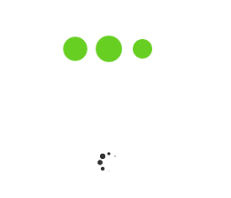
效果:
【html】【17】高级篇--loading加载的更多相关文章
- loading加载和layer.js
layer.js中的loading加载 l本篇主要介绍layerjs中的loading加载在实际项目中的应用 1.使用的技术 前端:HTML5+CSS3+JS+layer.js 后端:.net 2.遇 ...
- APP的六种loading加载样式,全在这...
今天这篇文章是给大家分享的loading加载的设计,文章里面会有一些实例在这分享给大家! 大多数App都要与服务器进行数据的交换,App向服务器发出数据请求,服务器接收到请求之后向App传输相应数据, ...
- WPF动画 - Loading加载动画
存在问题: 最近接手公司一个比较成熟的产品项目开发(WPF桌面端),其中,在登陆系统加载时,60张图片切换,实现loading闪烁加载,快有密集恐惧症了!!! 代码如下: private void L ...
- iOS开发UI篇—懒加载
iOS开发UI篇—懒加载 1.懒加载基本 懒加载——也称为延迟加载,即在需要的时候才加载(效率低,占用内存小).所谓懒加载,写的是其get方法. 注意:如果是懒加载的话则一定要注意先判断是否已经有了, ...
- [js开源组件开发]loading加载效果
loading加载效果 由于程序和网络的原因,常常我们需要在交互的时候,给用户一个正在加载中的动画,于是,loading组件横空出世.不需要复杂的代码,也能完成大多数业务,这就是我做组件的原则. 效果 ...
- 2款不同样式的CSS3 Loading加载动画 附源码
原文:2款不同样式的CSS3 Loading加载动画 附源码 我们经常看到的Loading加载很多都是转圈圈的那种,今天我们来换一种有创意的CSS3 Loading加载动画,一种是声波形状的动画,另一 ...
- HTML5 五彩圆环Loading加载动画实现教程
原文:HTML5 五彩圆环Loading加载动画实现教程 今天我们要来介绍一款效果很特别的HTML5 Loading加载动画,不像其他的Loading动画,这款Loading动画颜色很丰富,并且在转圈 ...
- 使用Dialog实现全局Loading加载框
Dialog实现全局Loading加载框 很多人在实现Loading加载框的时候,都是在当前的页面隐藏一个Loading布局,需要加载的时候,显示出来,加载完再隐藏 使用Dialog实现Loading ...
- vue+elementUI+axios实现的全局loading加载动画
在项目中,很多时候都需要loading加载动画来缓解用户的焦虑等待,比如说,我打开了一个页面,而这个页面有很多接口请求,但浏览器的请求并发数就那么几个,再加上如果网速不行的话,那么这时候,用户很可能就 ...
随机推荐
- Mac OS环境下媒体文件分割工具mediafilesegmenter的简单使用(生成M3U8 TS文件)
mediafilesegmenter是苹果开发的一款用于分割媒体文件的工具,其功能与mediastreamsegmenter相似,但操作更简单. * 具体可以对比博客中的另一篇简介<Mac OS ...
- uml 在需求分析阶段的应用
上一篇博客写了uml在软件开发过程中的应用,这以篇要详细介绍一下UML在需求分析过程中的应用. 以机房收费系统为例进行讲解,先介绍一个该系统. 首先该系统的用户分为三个等级,一般用户,操作员,管理员, ...
- DDD 领域驱动设计-谈谈 Repository、IUnitOfWork 和 IDbContext 的实践
http://www.cnblogs.com/xishuai/p/ddd-repository-iunitofwork-and-idbcontext.html
- SVN遇到的几个错误问题解决办法
1.svn更新被锁 清理之后陷入死循环问题 Attempted to lock an already-locked dir svn: Working copy 'E:\Workspaces\eclip ...
- Xcode7如何添加pch文件
我们在写项目的时候,大部分宏定义,头文件导入都在这里,Xcode6去掉Precompile Prefix Header的主要原因可能在于Prefix Header大大的增加了Build的时间.但是没有 ...
- c#后台修改前台DOM的css属性
<div id = 'div1' runat="server">haha</div> ----------- 后台代码中这样调用 div1.Style[&q ...
- PostgreSQL的prepare 和 execute 动作背后
我给PostgreSQL的源代码加入了调试信息以后,会有如下表现: 我执行Prepare: postgres=# prepare s(; PREPARE postgres=# 背后的反应: ** In ...
- BZOJ 1878: [SDOI2009]HH的项链 离线树状数组
1878: [SDOI2009]HH的项链 Time Limit: 1 Sec Memory Limit: 256 MB 题目连接 http://www.lydsy.com/JudgeOnline/p ...
- iOS之宏定义#define
最基本的宏定义用法 #define aaa bbb 表示用aaa替换bbb的内容. 宏作用范围 宏的作用范围是在当前文件内, 如果需要作用于其他类(如在类b调用类a已定义宏),那么需要在类b引入类a的 ...
- iOS开发——高级技术&生成二维码
生成二维码 因为项目里需要新增个功能,该功能用到了二维码技术.于是我便查阅了资料,先学习了二维码的生成. 我们使用libqrencode库来生成二维码.下载地址http://download.cs ...