利用border属性制作各种图形。
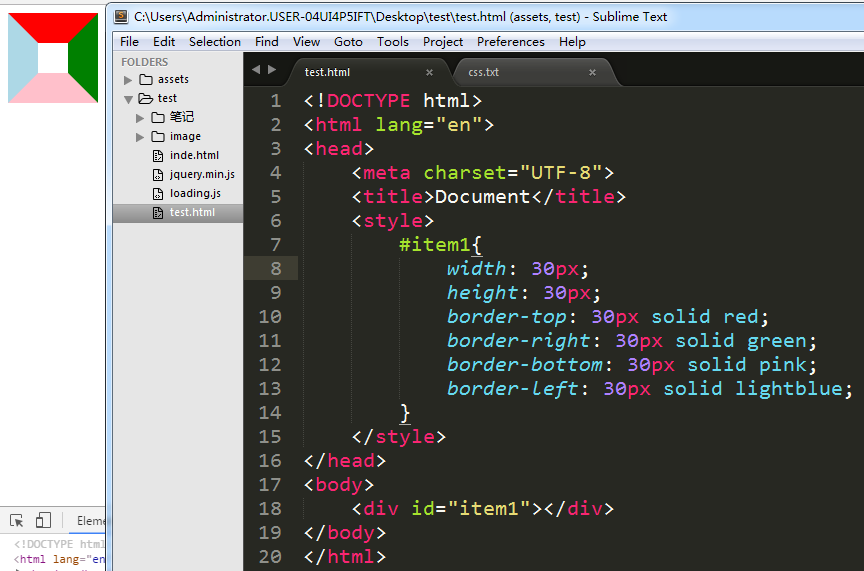
这是一个比较正常的

但如果我们把宽度和高度去掉呢?
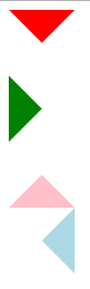
好像看不太出来对吧,我们来给边框加上不同颜色。

看出啥了没,分明就是每个边都是一个三角形啊。
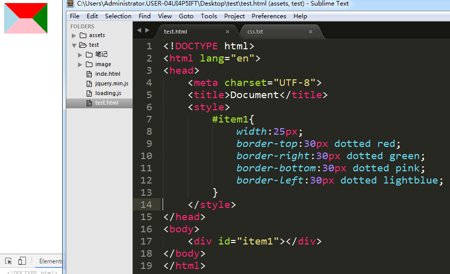
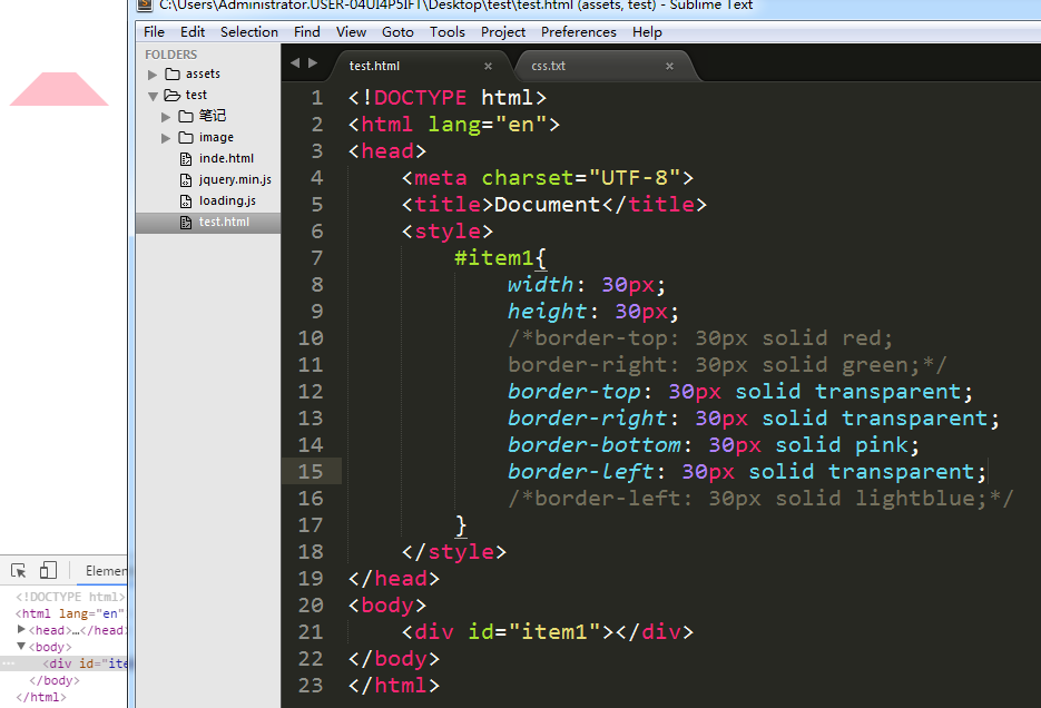
那假如我想要一个朝下的三角形是不是我只要把border-top给显示出来,其他的隐藏就好了啊。OK,说干就干

transparent表示透明,所以可以当做隐藏来使用。你可能会说那直接只设置border-top不就好了吗,但你可以发现是不行的,你试试就知道了。
单个:
代码:
 <!DOCTYPE html>

 <html lang="en">

 <head>

     <meta charset="UTF-8">

     <title>Document</title>

     <style>

         #item1{

             width:0px;

             height:0px;

             border:30px solid transparent;

             border-top:30px solid red;

         }

         #item2{

             width:0px;

             height:0px;

             border:30px solid transparent;

             border-left:30px solid green;

         }

         #item3{

             width:0px;

             height:0px;

             border:30px solid transparent;

             border-bottom:30px solid pink;

         }

         #item4{

             width:0px;

             height:0px;

             border:30px solid transparent;

             border-right:30px solid lightblue;

         }

     </style>

 </head>

 <body>

     <div id="item1"></div>

     <div id="item2"></div>

     <div id="item3"></div>

     <div id="item4"></div>

 </body>

 </html>
两个组合:

代码:
 <!DOCTYPE html>

 <html lang="en">

 <head>

     <meta charset="UTF-8">

     <title>Document</title>

     <style>

         #item1{

             width:0px;

             height:0px;

             border:30px solid transparent;

             border-top:30px solid red;

             border-right:30px solid red;

         }

         #item2{

             width:0px;

             height:0px;

             border:30px solid transparent;

             border-top:30px solid green;

             border-left:30px solid green;

         }

         #item3{

             width:0px;

             height:0px;

             border:30px solid transparent;

             border-top:30px solid pink;

             border-bottom:30px solid pink;

         }

         #item4{

             width:0px;

             height:0px;

             border:30px solid transparent;

             border-right:30px solid lightblue;

             border-bottom:30px solid lightblue;

         }

         #item5{

             width:0px;

             height:0px;

             border:30px solid transparent;

             border-right:30px solid lightsalmon;

             border-left:30px solid lightsalmon;

         }

         #item6{

             width:0px;

             height:0px;

             border:30px solid transparent;

             border-bottom:30px solid red;

             border-left:30px solid red;

         }

     </style>

 </head>

 <body>

     <div id="item1"></div>

     <div id="item2"></div>

     <div id="item3"></div>

     <div id="item4"></div>

     <div id="item5"></div>

     <div id="item6"></div>

 </body>

 </html>
三个组合:

代码:
 <!DOCTYPE html>

 <html lang="en">

 <head>

     <meta charset="UTF-8">

     <title>Document</title>

     <style>

         #item1{

             width:0px;

             height:0px;

             border-left:30px solid transparent;

             border-top:30px solid red;

             border-right:30px solid red;

             border-bottom:30px solid red;

         }

         #item2{

             width:0px;

             height:0px;

             border-bottom:30px solid transparent;

             border-top:30px solid green;

             border-right:30px solid green;

             border-left:30px solid green;

         }

         #item3{

             width:0px;

             height:0px;

             border-right:30px solid transparent;

             border-top:30px solid pink;

             border-left:30px solid pink;

             border-bottom:30px solid pink;

         }

         #item4{

             width:0px;

             height:0px;

             border-top:30px solid transparent;

             border-right:30px solid lightblue;

             border-left:30px solid lightblue;

             border-bottom:30px solid lightblue;

         }

     </style>

 </head>

 <body>

     <div id="item1"></div>

     <div id="item2"></div>

     <div id="item3"></div>

     <div id="item4"></div>

 </body>

 </html>
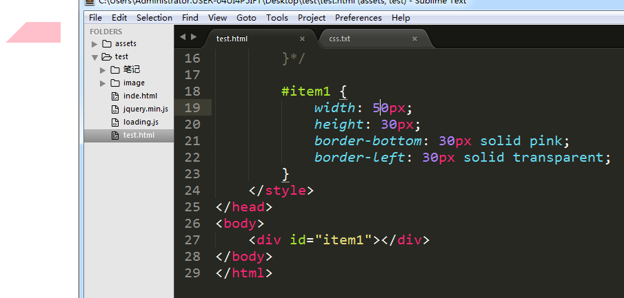
配合宽度使用。
注意宽度别超过边框长度。
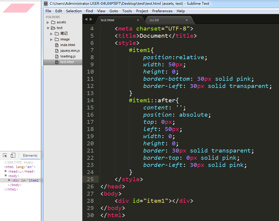
平行四边形
完。
利用border属性制作各种图形。的更多相关文章
- css 利用border属性制作箭头 Using Borders to Make Pure CSS Arrows
不再需要多余的图片 用border属性自然能创造箭头效果 学习地址:http://tech.patientslikeme.com/2010/11/09/using-borders-to-make-pu ...
- 纯css3样式属性制作各种图形图标
<!DOCTYPE html PUBLIC "-//W3C//DTD XHTML 1.0 Transitional//EN" "http://www.w3.org/ ...
- CSS深入了解border:利用border画三角形等图形
三角形实际上是border的产物 我们正常使用的border都是四边一个颜色,当我们把四边换上不同颜色 那么你就会发现,三角来了~! <!DOCTYPE html> <html la ...
- 2017年总结的前端文章——border属性的多方位应用和实现自适应三角形
border属性是在实际的应用中使用频率比较高的一个属性,除了作为边框使用,利用border属性的一些特征以及表现方式,可以在实现一些比较常见的效果(如等高布局,上下固定内容滚动布局和绘制CSS图标等 ...
- 利用border制作三角形原理
网站前端页面中,有时候会使用一些三角形,除了使用图片的方式之外,利用css的border属性也可以做出相对应的三角形.那么,利用border是如何实现三角形的制作的呢? 先看下面一个例子: CSS代码 ...
- CSS border三角、圆角图形生成技术简介
http://www.zhangxinxu.com/wordpress/?p=794 一.前言 利用CSS的border属性可以生成一些图形,例如三角或是圆角.纯粹的CSS2的内容,没有兼容性的问题, ...
- 重温CSS:Border属性
边界是众所周知的,有什么新的东西吗?好吧,我敢打赌,在这篇文章中,有很多你不看永远不知道的东西! 不仅可以用CSS3来创建圆角,使用原有CSS一样可以显示自定义图形.这是正确的(有待考究):在过去,没 ...
- CSS:不可思议的border属性
原文:Magic of CSS border property 译文:不可思议的CSS border属性 译者:dwqs 在CSS中,其border属性有很多的规则.对于一些事物,例如三角形或者其它的 ...
- 利用Bootstrap框架制作查询页面的界面
UI设计实战篇——利用Bootstrap框架制作查询页面的界面 Bootstrap框架是一个前端UI设计的框架,它提供了统一的UI界面,简化了设计界面UI的过程(缺点是定制了界面,调整的余地不是太 ...
随机推荐
- Websocket Component
As of Camel 2.10, the Websocket component supports SSL/TLS configuration through the Camel JSSE Conf ...
- dataGrid转换dataTable
#region dataGrid转换dataTable /// <summary> /// dataGrid转换dataTable /// </summary> ...
- Core Audio(一)
Core Audio APIs core audio apis是vista之后引入的,不使用与之前的windows版本:core audio apis提供访问endpoint devices,比如耳机 ...
- CentOS 7 安装 vmware-tools
[原创]标题:<CentOS 7 安装 vmware-tools>:作者:肖雪峰,QQ:35360657. 用 VMware Workstation 11 新安装了CentOS 7虚拟机, ...
- 深入探究 WinRT 和 await
在最近发布的使用 Windows 运行时中异步性来始终保持应用程序能够快速流畅地运行这篇博文中,包含了一些如何在 C# 和 Visual Basic 中使用 await 关键字的示例,允许开发人员在使 ...
- 视频文件写入转换之图像处理-OpenCV应用学习笔记五
在<笔记二>中我们做了视频播放和控制的实现,仅仅算是完成了对视频文件的读取操作:今天我们来一起练习下对视频文件的写入操作:格式转换. 实现功能: 打开一个视频文件play.avi,读取文件 ...
- Git 的origin和master分析
首先要明确一点,对git的操作是围绕3个大的步骤来展开的(其实几乎所有的SCM都是这样) 1. 从git取数据(git clone) 2. 改动代码 3. 将改动传回git(g ...
- 使用Roboguice依赖注入规划Android项目
前言 好久没写博客了,罪过啊-记事本里累积了不少东西,整理整理放上来. 关于依赖注入 Dependency Injection( 依赖注入)可以很好的帮助我们分离模块,降低耦合.提高可测试性.(PS: ...
- smartroute简单集成集群聊天通讯
在制定一个规模比较多大的聊天应用时,往往需要制定部署多个应用服务,其一可以保障服务的可靠性,其二可以增加用户负载量.但制定这样一种应用体系是一件复杂的事情,毕竟同一群体的用户实际上会在不同的服务器接入 ...
- MVC+EF6使用MySQL+CodeFirst的详细配置
环境: WIN7(64位旗舰版)+VS2012+MySQL5.6(32位版,在另一台服务器中,环境是win2003) 1.下载并安装MysqlforVisualStudio.zip,此软件功能是让VS ...