在Android L推出后,Google提出了全新的设计语言:材质设计。其中很重要的一点就是阴影效果的使用,你可以为每一个View设置一个elevation值,相当于除了x、y之外的z值,z值决定了阴影的大小,z值越大表示阴影越大。z值包含两个成分:elevation和translation。elevation是一个静态的成分,translation使用了动画:Z = elevation + translationZ。
在layout中设置elevation,使用android:elevation属性。在代码中设置,使用View.setElevation()方法。设置一个View的translation,使用View.setTranslationZ()方法。ViewPropertyAnimator.z()和ViewPropertyAnimator.translationZ()能使你更轻易的推动Views的elevation。
因此,想要在5.0(API 21)以及以后想要设置阴影非常简单我们只需要设置elevation属性就可以了。比如我们想让一张图片显示阴影:
1
2
3
4
5
6
7
|
<ImageView
   android:layout_width="100dp"
   android:layout_height="100dp"
   android:layout_marginTop="10dp"
   android:background="#fff"
   android:elevation="10dp"
   android:src="@drawable/ic_launcher" />
|
需要注意的一点是:必须要设置background并且不能设置是透明背景,这样在真机上才能显示出来,没有设置的话预览能显示,但是真机并没有效果,在ViewGroup中也是一样。
那我们想在5.0之前也实现阴影效果怎么办呢?有两个办法:第一种是自定义layer-list,第二种办法是使用nine-patch图片。
先来看看nine-patch方案:大概原理就是使用一张边界是阴影效果的.9图片,然后设置为背景,可以让美工帮忙切一张,也可以使用系统自带的,有个叫android:background="@android:drawable/dialog_holo_light_frame”,设置后的效果就是带阴影的效果。
再来看看layer-list方案,如果我们需要一张矩形的阴影效果,则大概应该这么定义:
1
2
3
4
5
6
7
8
9
10
11
12
13
14
15
16
17
18
19
20
21
22
23
24
25
26
27
28
29
30
31
32
33
34
35
36
37
38
39
40
41
42
43
44
45
46
47
48
49
50
51
52
53
54
55
56
57
58
59
60
61
|
<?xmlversion="1.0"encoding="utf-8"?>
<layer-list xmlns:android="http://schemas.android.com/apk/res/android">
    <!-- Drop Shadow Stack -->
    <item>
        <shape>
            <padding
                android:bottom="2dp"
                android:left="2dp"
                android:right="2dp"
                android:top="2dp" />
            <solid android:color="#10CCCCCC" />
        </shape>
    </item>
    <item>
        <shape>
            <padding
                android:bottom="2dp"
                android:left="2dp"
                android:right="2dp"
                android:top="2dp" />
            <solid android:color="#20CCCCCC" />
        </shape>
    </item>
    <item>
        <shape>
            <padding
                android:bottom="2dp"
                android:left="2dp"
                android:right="2dp"
                android:top="2dp" />
            <solid android:color="#40CCCCCC" />
        </shape>
    </item>
    <item>
        <shape>
            <padding
                android:bottom="2dp"
                android:left="2dp"
                android:right="2dp"
                android:top="2dp" />
            <solid android:color="#50CCCCCC" />
        </shape>
    </item>
    <item>
        <shape>
            <padding
                android:bottom="2dp"
                android:left="2dp"
                android:right="2dp"
                android:top="2dp" />
            <solid android:color="#60CCCCCC" />
        </shape>
    </item>
    <!-- Background -->
    <item>
        <shape>
            <solid android:color="#FFFFFF" />
            <corners android:radius="3dp" />
        </shape>
    </item></layer-list>
|
原理就是沿着边界一层一层的绘制,颜色由深到浅。
同样,如果需要实现像FAB(Floating ActionBar)一样的阴影效果,也能这么定义,把矩形换做圆形即可:
1
2
3
4
5
6
7
8
9
10
11
12
13
14
15
16
17
18
19
20
21
22
23
24
25
26
27
28
29
30
31
32
33
34
35
36
37
38
39
40
41
42
43
44
45
46
47
48
49
50
51
52
53
54
55
56
57
58
59
60
61
62
63
64
65
66
67
68
69
70
71
72
73
74
75
76
77
78
79
80
81
82
83
84
85
86
87
88
89
90
91
92
93
94
95
96
97
98
99
100
101
102
103
104
105
106
107
108
109
110
111
112
113
114
115
116
117
118
119
120
121
122
123
124
125
126
127
128
129
130
131
132
133
134
135
136
137
138
139
140
141
142
143
144
145
146
147
148
149
150
151
152
153
154
155
156
157
158
159
160
161
162
163
164
165
166
167
168
169
170
171
172
173
174
175
176
177
178
179
180
181
182
183
184
185
186
187
188
189
190
191
192193194195196197198199200201202203204205206207208209210211212213214215216217218219220221222223224225226227228229230231
|
<?xmlversion="1.0"encoding="utf-8"?>
<selectorxmlns:android="http://schemas.android.com/apk/res/android">
<itemandroid:state_pressed="true">
<layer-list>
<!-- Shadow -->
<itemandroid:top="1dp"android:right="1dp">
<layer-list>
<item>
<shape android:shape="oval">
<solid android:color="#08000000"/>
<padding
android:bottom="3px"
android:left="3px"
android:right="3px"
android:top="3px"
/>
</shape>
</item>
<item>
<shape android:shape="oval">
<solid android:color="#09000000"/>
<padding
android:bottom="2px"
android:left="2px"
android:right="2px"
android:top="2px"
/>
</shape>
</item>
<item>
<shape android:shape="oval">
<solid android:color="#10000000"/>
<padding
android:bottom="2px"
android:left="2px"
android:right="2px"
android:top="2px"
/>
</shape>
</item>
<item>
<shape android:shape="oval">
<solid android:color="#11000000"/>
<padding
android:bottom="1px"
android:left="1px"
android:right="1px"
android:top="1px"
/>
</shape>
</item>
<item>
<shape android:shape="oval">
<solid android:color="#12000000"/>
<padding
android:bottom="1px"
android:left="1px"
android:right="1px"
android:top="1px"
/> </shape> </item> <item> <shape android:shape="oval"> <solid android:color="#13000000"/> <padding android:bottom="1px" android:left="1px" android:right="1px" android:top="1px" /> </shape> </item> <item> <shape android:shape="oval"> <solid android:color="#14000000"/> <padding android:bottom="1px" android:left="1px" android:right="1px" android:top="1px" /> </shape> </item> <item> <shape android:shape="oval"> <solid android:color="#15000000"/> <padding android:bottom="1px" android:left="1px" android:right="1px" android:top="1px" /> </shape> </item> <item> <shape android:shape="oval"> <solid android:color="#16000000"/> <padding android:bottom="1px" android:left="1px" android:right="1px" android:top="1px" /> </shape> </item> </layer-list> </item> <!-- Blue button pressed --> <item> <shape android:shape="oval"> <solid android:color="#90CAF9"/> </shape> </item> </layer-list> </item> <item android:state_enabled="true"> <layer-list> <!-- Shadow --> <item android:top="2dp"android:right="1dp"> <layer-list> <item> <shape android:shape="oval"> <solid android:color="#08000000"/> <padding android:bottom="4px" android:left="4px" android:right="4px" android:top="4px" /> </shape> </item> <item> <shape android:shape="oval"> <solid android:color="#09000000"/> <padding android:bottom="2px" android:left="2px" android:right="2px" android:top="2px" /> </shape> </item> <item> <shape android:shape="oval"> <solid android:color="#10000000"/> <padding android:bottom="2px" android:left="2px" android:right="2px" android:top="2px" /> </shape> </item> <item> <shape android:shape="oval"> <solid android:color="#11000000"/> <padding android:bottom="1px" android:left="1px" android:right="1px" android:top="1px" /> </shape> </item> <item> <shape android:shape="oval"> <solid android:color="#12000000"/> <padding android:bottom="1px" android:left="1px" android:right="1px" android:top="1px" /> </shape> </item> <item> <shape android:shape="oval"> <solid android:color="#13000000"/> <padding android:bottom="1px" android:left="1px" android:right="1px" android:top="1px" /> </shape> </item> <item> <shape android:shape="oval"> <solid android:color="#14000000"/> <padding android:bottom="1px" android:left="1px" android:right="1px" android:top="1px" /> </shape> </item> <item> <shape android:shape="oval"> <solid android:color="#15000000"/> <padding android:bottom="1px" android:left="1px" android:right="1px" android:top="1px" /> </shape> </item> <item> <shape android:shape="oval"> <solid android:color="#16000000"/> <padding android:bottom="1px" android:left="1px" android:right="1px" android:top="1px" /> </shape> </item> </layer-list> </item> <!-- Blue button --> <item> <shape android:shape="oval"> <solid android:color="#03A9F4"/> </shape> </item> </layer-list> </item></selector>
|
这样就能实现通用平台的阴影效果了,还有一点不要被迷惑了,support-v4里面有个ViewCompat.setElevation(iv, 2.0f);方法,试验证明是没用的。
更多的学习大家可以参考API DEMO的ShadowCardDrag和ShadowCardStack两个Demo。
最后来看看实现的效果图:
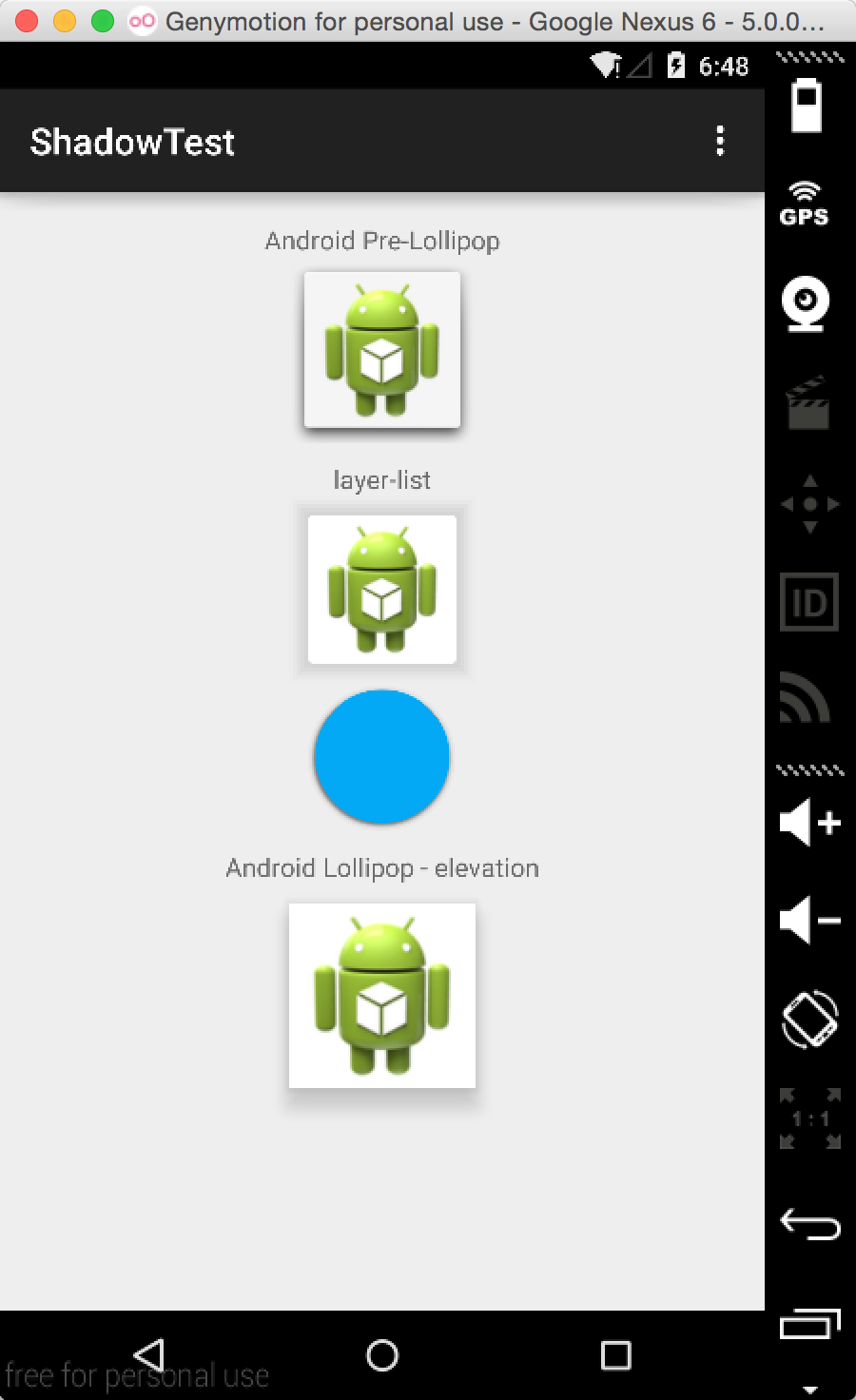
第一个是使用的.9背景图片,也就是之前提到的属性,第二个和第三个是使用的layer-list,最后一个是使用的elevation属性。
- 彻底理解 Android 中的阴影
如果我们想创造更好的 Android App,我相信我们需要遵循 Material Design 的设计规范.一般而言,Material Design 是一个包含光线,材质和投影的三维环境.如果我们想 ...
- Android中的LinearLayout布局
LinearLayout : 线性布局 在一般情况下,当有很多控件需要在一个界面列出来时,我们就可以使用线性布局(LinearLayout)了, 线性布局是按照垂直方向(vertical)或水平方向 ...
- Android中BroadcastReceiver的两种注册方式(静态和动态)详解
今天我们一起来探讨下安卓中BroadcastReceiver组件以及详细分析下它的两种注册方式. BroadcastReceiver也就是"广播接收者"的意思,顾名思义,它就是用来 ...
- Android中使用ExpandableListView实现微信通讯录界面(完善仿微信APP)
之前的博文<Android中使用ExpandableListView实现好友分组>我简单介绍了使用ExpandableListView实现简单的好友分组功能,今天我们针对之前的所做的仿微信 ...
- Android中ListView实现图文并列并且自定义分割线(完善仿微信APP)
昨天的(今天凌晨)的博文<Android中Fragment和ViewPager那点事儿>中,我们通过使用Fragment和ViewPager模仿实现了微信的布局框架.今天我们来通过使用Li ...
- Android中Fragment和ViewPager那点事儿(仿微信APP)
在之前的博文<Android中使用ViewPager实现屏幕页面切换和引导页效果实现>和<Android中Fragment的两种创建方式>以及<Android中Fragm ...
- Android中Fragment与Activity之间的交互(两种实现方式)
(未给Fragment的布局设置BackGound) 之前关于Android中Fragment的概念以及创建方式,我专门写了一篇博文<Android中Fragment的两种创建方式>,就如 ...
- 【月入41万】Mono For Android中使用百度地图SDK
借助于Mono For Android技术,.Net开发者也可以使用自己熟悉的C#语言以及.Net来开发Android应用.由于Mono For Android把Android SDK中绝大部分类库都 ...
- mono for android中使用dapper或petapoco对sqlite进行数据操作
在mono for android中使用dapper或petapoco,很简单,新建android 类库项目,直接把原来的文件复制过来,对Connection连接报错部分进行注释和修改就可以运行了.( ...
随机推荐
- Python+Selenium练习篇之11-浏览器上前进和后退操作
本文来介绍上如何,利用webdriver中的方法来演示浏览器中地址栏旁边的前进和后退功能. 相关脚本代码如下: # coding=utf-8import timefrom selenium impor ...
- java 二叉树递归遍历算法
//递归中序遍历 public void inorder() { System.out.print("binaryTree递归中序遍历:"); inorderTraverseRec ...
- android AsyncTask使用限制
由于AsyncTask内部是使用线程池(ThreadPoolExecutor)来管理要处理的任务的,所以AsyncTask的弊端就非常明确了:要extcute的任务数量超过线程池最大容量时,必然会报错 ...
- MySql 存储过程实例(附完整注释)(转)
MySql 存储过程实例(附完整注释) 将下面的语句复制粘贴可以一次性执行完,我已经测试过,没有问题! MySql存储过程简单实例: ...
- php函数总结
1. isset($var) 变量存在且不为NULL,则返回TRUE 变量不存在或为NULL,则返回FALSE 2. empty($var) 若变量不存在或变量值为"".0.&qu ...
- codechef May Challenge 2016 CHSC: Che and ig Soccer dfs处理
Description All submissions for this problem are available. Read problems statements in Mandarin Chi ...
- 洛谷P2056 采花
P2056 采花 52通过 99提交 题目提供者shengmingkexue 标签云端↑ 难度省选/NOI- 时空限制1s / 128MB 提交 讨论 题解 最新讨论更多讨论 求助莫队为什么被卡 ...
- lcx 端口转发
1.查看3389端口开放情况: REG query HKLM\SYSTEM\CurrentControlSet\Control\Terminal" "Server\WinStati ...
- redis在linux上的安装和配置
https://blog.csdn.net/lzding/article/details/52040501(直接可以用的安装phpredis) http://www.runoob.com/redis/ ...
- [BZOJ]5018: [Snoi2017]英雄联盟 DP
[Snoi2017]英雄联盟 Time Limit: 15 Sec Memory Limit: 512 MBSubmit: 270 Solved: 139[Submit][Status][Disc ...
