
【CSS】水平居中和垂直居中
水平居中和垂直居中
2019-11-12 15:35:37 by冲冲
1、水平居中
(1)父级元素是行内元素,子级元素是行内元素,子级元素水平居中
① 设置父级元素为块级元素 display:block;
② 给父级元素添加 text-aglin:center;
 1 <!DOCTYPE html>

 2 <html>

 3 <head>

 4 <meta charset="utf-8">

 5 <title>居中测试</title>

 6 <style>

 7 #father {

 8   background-color: skyblue;

 9   display:block;

10   text-align:center;

11 }

12 #son {

13   background-color: green;

14 }

15 </style>

16 </head>

17

18 <body>

19 <span id="father">

20   <span id="son">我将居中</span>

21 </span>

22 </body>

23 </html>
(2)父级元素是块级元素,子级元素是行内元素,子级元素水平居中
① 给父级元素添加 text-aglin:center;
(3)父级元素是块级元素,子级元素是块级元素,子级元素水平居中
方案一
(31)父级元素和子级元素有宽度
① 给子级元素添加 margin: 0 auto;
 1 <!DOCTYPE html>

 2 <html>

 3 <head>

 4 <meta charset="utf-8">

 5 <title>居中测试</title>

 6 <style>

 7 #father {

 8   width: 500px;

 9   height: 300px;

10   background-color: skyblue;

11 }

12 #son {

13   width: 200px;

14   height: 100px;

15   background-color: green;

16   margin: 0 auto;

17 }

18 </style>

19 </head>

20

21 <body>

22 <div id="father">

23   <div id="son">我将居中</div>

24 </div>

25 </body>

26 </html>
(32)父级元素有宽度,子级元素没有宽度(特点:会默认子元素的宽度和父元素一样)
① 设置子级元素为行内块元素 display:inline-block;
② 给父级元素添加 text-align:center;
 1 <!DOCTYPE html>

 2 <html>

 3 <head>

 4 <meta charset="utf-8">

 5 <title>居中测试</title>

 6 <style>

 7 #father {

 8   width: 500px;

 9   height: 300px;

10   background-color: skyblue;

11   text-align: center;

12 }

13 #son {

14   background-color: green;

15   display: inline-block;

16 }

17 </style>

18 </head>

19

20 <body>

21 <div id="father">

22   <div id="son">我将居中</div>

23 </div>

24 </body>

25 </html>
方案二 -- 使用定位属性
(31)父级元素和子级元素有宽度
<!DOCTYPE html>

<html>

<head>

<meta charset="utf-8">

<title>居中测试</title>

<style>

#father {

  width: 500px;

  height: 300px;

  background-color: skyblue;

  position: relative;

}

#son {

  width: 200px;

  height: 100px;

  background-color: green;

  position: absolute;

  left: 150px;

}

</style>

</head>

<body>

<div id="father">

  <div id="son">我将居中</div>

</div>

</body>

</html>
(32)父级元素有宽度,子级元素没有宽度
 1 <!DOCTYPE html>

 2 <html>

 3 <head>

 4 <meta charset="utf-8">

 5 <title>居中测试</title>

 6 <style>

 7 #father {

 8   width: 500px;

 9   height: 300px;

10   background-color: skyblue;

11   position: relative;

12 }

13 #son {

14   background-color: green;

15   position: absolute;

16   left: 50%;/*元素的左侧居中,而非元素的中心居中*/

17   transform: translateX(-50%);/*把元素沿着横向(x轴)移动自身宽度的50%*/

18 }

19 </style>

20 </head>

21

22 <body>

23 <div id="father">

24   <div id="son">我将居中</div>

25 </div>

26 </body>

27 </html>
注意:left:50%;不会中心居中,而是左边居中。
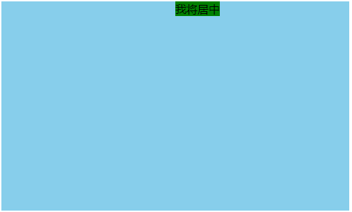
方案三 -- flexbox布局
使用flex布局,宽度有或无都OK。
 1 <!DOCTYPE html>

 2 <html>

 3 <head>

 4 <meta charset="utf-8">

 5 <title>居中测试</title>

 6 <style>

 7 #father {

 8   width: 500px;

 9   height: 300px;

10   background-color: skyblue;

11   display: flex;

12   justify-content: center;

13 }

14 #son {

15   background-color: green;

16 }

17 </style>

18 </head>

19

20 <body>

21 <div id="father">

22   <div id="son">我将居中</div>

23 </div>

24 </body>

25 </html>
2、垂直居中
(1)父级元素是块元素,子级元素是行内元素,子级元素垂直居中
(11)单行文本居中
① 父级元素设置行高等于盒子高 height=500px;line-height:500px;
 1 <!DOCTYPE html>

 2 <html>

 3 <head>

 4 <meta charset="utf-8">

 5 <title>居中测试</title>

 6 <style>

 7 #father {

 8   width: 500px;

 9   height: 300px;

10   background-color: skyblue;

11   line-height: 300px;

12 }

13 #son {

14   background-color: green;

15 }

16 </style>

17 </head>

18

19 <body>

20 <div id="father">

21   <div id="son">我将居中</div>

22 </div>

23 </body>

24 </html>
(12)多行文本居中
① 父级元素设置 display:table-cell;vertical-align:middle;
 1 <!DOCTYPE html>

 2 <html>

 3 <head>

 4 <meta charset="utf-8">

 5 <title>居中测试</title>

 6 <style>

 7 #father {

 8   width: 500px;

 9   height: 300px;

10   background-color: skyblue;

11   display:table-cell;

12   vertical-align: middle;

13 }

14 #son {

15   background-color: green;

16 }

17 </style>

18 </head>

19

20 <body>

21 <div id="father">

22   <div id="son">我将居中我是多行的行内元素我是多行的行内元素我是多行的行内元素我是多行的行内元素我是多行的行内元素我是多行的行内元素我是多行的行内元素我是多行的行内元素</div>

23 </div>

24 </body>

25 </html>
(2)父级元素和子级元素都是块级元素
(21)父级元素和子级元素都有高度
方案一 -- 使用定位
 1 <!DOCTYPE html>

 2 <html>

 3 <head>

 4 <meta charset="utf-8">

 5 <title>居中测试</title>

 6 <style>

 7 #father {

 8   width: 500px;

 9   height: 300px;

10   background-color: skyblue;

11   position: relative;

12 }

13 #son {

14   background-color: green;

15   height: 100px;

16   position: absolute;

17   top: 100px;

18 }

19 </style>

20 </head>

21

22 <body>

23 <div id="father">

24   <div id="son">我将居中</div>

25 </div>

26 </body>

27 </html>
方案二 -- flexbox布局(子级元素高度有或无都OK)
 1 <!DOCTYPE html>

 2 <html>

 3 <head>

 4 <meta charset="utf-8">

 5 <title>居中测试</title>

 6 <style>

 7 #father {

 8   width: 500px;

 9   height: 300px;

10   background-color: skyblue;

11   display: flex;

12   align-items: center;

13 }

14 #son {

15   background-color: green;

16   height: 100px;

17 }

18 </style>

19 </head>

20

21 <body>

22 <div id="father">

23   <div id="son">我将居中</div>

24 </div>

25 </body>

26 </html>
(22)父级元素有高度,子级元素没有高度
方案一 -- 定位属性
 1 <!DOCTYPE html>

 2 <html>

 3 <head>

 4 <meta charset="utf-8">

 5 <title>居中测试</title>

 6 <style>

 7 #father {

 8   width: 500px;

 9   height: 300px;

10   background-color: skyblue;

11   position: relative;

12 }

13 #son {

14   background-color: green;

15   position: absolute;

16   top: 50%;

17   transform: translateY(-50%);

18 }

19 </style>

20 </head>

21

22 <body>

23 <div id="father">

24   <div id="son">我将居中</div>

25 </div>

26 </body>

27 </html>
方案二 -- flexbox布局
 1 <!DOCTYPE html>

 2 <html>

 3 <head>

 4 <meta charset="utf-8">

 5 <title>居中测试</title>

 6 <style>

 7 #father {

 8   width: 500px;

 9   height: 300px;

10   background-color: skyblue;

11   display: flex;

12   align-items: center;

13 }

14 #son {

15   background-color: green;

16 }

17 </style>

18 </head>

19

20 <body>

21 <div id="father">

22   <div id="son">我将居中</div>

23 </div>

24 </body>

25 </html>
3、同时水平和垂直居中
(1)父级元素和子级元素都已知高度和宽度
① flexbox布局推荐
② 定位属性
(2)父级元素已知高度和宽度,子级元素没有高度和宽度
① flexbox布局
 1 <!DOCTYPE html>

 2 <html>

 3 <head>

 4 <meta charset="utf-8">

 5 <title>居中测试</title>

 6 <style>

 7 #father {

 8   width: 500px;

 9   height: 300px;

10   background-color: skyblue;

11   display: flex;

12   justify-content: center;

13   align-items: center;

14 }

15 #son {

16   background-color: green;

17 }

18 </style>

19 </head>

20

21 <body>

22 <div id="father">

23   <div id="son">我将居中</div>

24 </div>

25 </body>

26 </html>
② 定位属性
 1 <!DOCTYPE html>

 2 <html>

 3 <head>

 4 <meta charset="utf-8">

 5 <title>居中测试</title>

 6 <style>

 7 #father {

 8   width: 500px;

 9   height: 300px;

10   background-color: skyblue;

11   position: relative;

12 }

13 #son {

14   background-color: green;

15   position: absolute;

16   left:50%;

17   top:50%;

18   transform:translateX(-50%) translateY(-50%);

19 }

20 </style>

21 </head>

22

23 <body>

24 <div id="father">

25   <div id="son">我将居中</div>

26 </div>

27 </body>

28 </html>
【CSS】水平居中和垂直居中的更多相关文章
- CSS 水平居中与垂直居中
前言 在CSS布局中,水平居中与垂直居中一直是用到比较多的,在本篇中将介绍水平居中.垂直居中的几种方式. 示例 HTML: <div class="parent"> & ...
- CSS水平居中和垂直居中解决方案
一.CSS 居中 — 水平居中 DIV等标签本身没有定义自己居中的属性,网上很多的方法都是介绍用上级的text-align: center,然后嵌套一层DIV来解决问题. 可是这个方法有时候完全不起作 ...
- CSS 水平居中/布局 垂直居中 (月经问题)
水平居中 如果它是一个行内元素 对其父元素使用 text-align:center 即可实现. <p style = " text-align:center; width:300px; ...
- css水平居中和垂直居中
水平居中:内联元素:text-align:center;相对于父级居中显示块级元素:margin:0 auto;但是需要同时width,否则无法看到效果多个块级元素居中:在此想要探讨一下display ...
- CSS 水平居中和垂直居中
1.水平居中——行内元素 text-align: center; 2.水平居中——定宽块状元素 margin: auto,满足定宽和块状两个条件的元素是可以通过设置“左右margin”值为“auto” ...
- CSS水平居中与垂直居中的方法
一.水平居中 1.行内元素水平居中 在父元素里添加text-align:center即可.代码如下: <style> .container-1 { height: 50px; border ...
- CSS的水平居中和垂直居中解决方案
在写CSS样式的时候,有时为了美观,会添加水平居中和垂直居中,这时候你有可能会遇到很棘手的问题,有些水平居中和垂直居中的属性添加上去完全没反应,下面给大家列举一些CSS水平居中和垂直居中的终极解决方案 ...
- css确定元素水平居中和垂直居中
---恢复内容开始--- 首先,我们在了解如何通过css了解元素水平和垂直居中之前,先要了解下html都有哪些元素,这些元素与偶有哪些分类,因为不同类别的元素的水平垂直居中方法是完全不同的,究其根本当 ...
- CSS设置行内元素和块级元素的水平居中、垂直居中
CSS设置行内元素的水平居中 div{text-align:center} /*DIV内的行内元素均会水平居中*/ CSS设置行内元素的垂直居中 div{height:30px; line-heigh ...
- CSS中元素水平居中和垂直居中的方法
#CSS中水平居中和垂直居中的方法 一. 水平居中 1.行内元素(文本,图片等) 如果被设置元素为文本.图片等行内元素时,可以通过给父元素设置` text-align:center;` 来实现 2.定 ...
随机推荐
- mysql创建用户及赋予某用户权限(附带基础查看表内容)
首先登陆mysql 一:show databases; 展示所有数据库(root用户下) 二:use xxx (数据库名)使用use选择数据库 三:show xxx 查看数据库中的表 四:des ...
- 题解 SP6779 【GSS7 - Can you answer these queries VII】
题目传送门 题目大意 给出一个\(n\)个点的树,每个点有权值.有\(m\)次操作,每次要么查询一条链上的最大子段和,要么把一条链的权值都修改为一个常数. \(n,m\le 10^5\) 思路 如果是 ...
- jenkins容器内安装python3
前言 很多小伙伴可能在考虑 jenkins 拉取了 github 上的代码后,发现还越少 python3 环境,那能怎么办呢? 咨询了一位运维朋友给我的答案是,将 python3 挂载到容器工作目录上 ...
- 【HMS Core 6.0全球上线】华为钥匙环服务,打造跨应用跨形态无缝登录体验
华为钥匙环服务(Keyring),是HMS Core在安全领域开放的全新服务,为全球开发者提供用户认证凭据(以下简称"凭据")本地存储和跨应用.跨形态共享能力,帮助您在安卓应用.快 ...
- 【Java虚拟机10】ClassLoader.getSystemClassLoader()流程简析
前言 学习类加载必然离开不了sun.misc.Launcher这个类和Class.forName()这个方法. 分析ClassLoader.getSystemClassLoader()这个流程可以明白 ...
- 浅谈如何爆踩TLEcoders
对付一些速度比老奶奶都慢的评测姬, 除了超级小的常数,往往还不得不使用一些不算办法的办法 比如说这个让人无语的$ACcoders$的评测姬, 当我们感到代码已经无法再卡常的时候,对人生已经近乎绝望的时 ...
- Noip模拟12 2021.7.12
T1 interval 亏得昨天晚上改掉了T3并且理解了单调栈,今天一扫这题目就知道要用啥了. 先预处理出以a[i]为最大值的最大左右区间.然后再将a[i]取%!!!是的,要不然会影响单调栈的使用.. ...
- mipi csi接口,1条lane支持多少像素,200w像素需要几条lane,为什么,怎么计算出来的?谢谢!
按帧频FRAME=60HZ, 分辨率480*800来计算;以WVGA 显示分辨率,24BIT图片,60幁为例,在理想状态下(未包含RGB信号前后肩宽度),总传输速率最小为:480*800*8BIT*3 ...
- Android编译执行envsetup.sh,产生工具命令m、mm、mmm、mmma、tapas 、croot、cgrep、jgrep、 resgrep、godir
一般来说编译一个sdk或者一个比较大的工程项目,第一步都是执行 envsetup.sh这个脚本,比如编译android,qt源码以及其他一些嵌入式的sdk. 而且执行的时候需要特别注意使用 sourc ...
- hdu 2176 取(m堆)石子游戏 (裸Nim)
题意: m堆石头,每堆石头个数:a[1]....a[m]. 每次只能在一堆里取,至少取一个. 最后没石子取者负. 先取者负输出NO,先取胜胜输出YES,然后输出先取者第1次取子的所有方法.如果从有a个 ...