R:ggplot2数据可视化——基础知识
1 安装
# 获取ggplot2 最容易的就是下载整个tidyverse:

install.packages("tidyverse")

# 也可以选择只下载ggplot2:

install.packages("ggplot2")

# 或者下载GitHub上的开发者版本

# install.packages("devtools")

devtools::install_github("tidyverse/ggplot2")
2 快速入门
1 基本设置
library(ggplot2)
ggplot(diamonds) #以diamonds数据集为例
#gg <- ggplot(df, aes(x=xcol, y=ycol)) 其中df只能是数据框
ggplot(diamonds, aes(x=carat)) # 如果只有X-axis值 Y-axis can be specified in respective geoms.
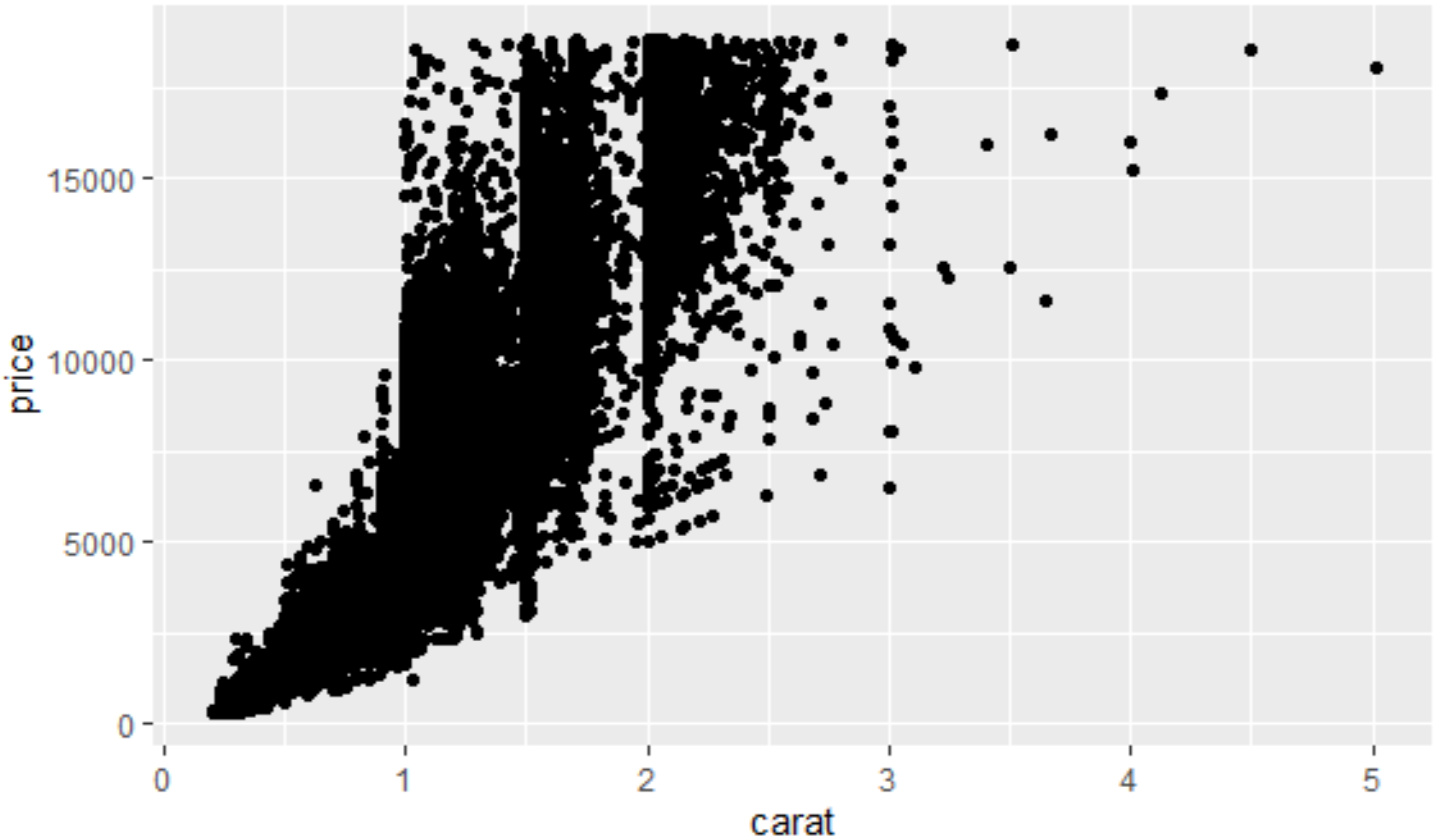
ggplot(diamonds, aes(x=carat, y=price)) # if both X and Y axes are fixed for all layers.
ggplot(diamonds, aes(x=carat, color=cut)) # 'cut' 变量每种类型单独一个颜色, once a geom is added. #aes代表美化格式 ggplot2 把 X 和 Y 轴也当作和颜色、尺寸、形状等相同的格式 设定颜色(不是基于数据框中的变量),需要在aes()外面设置 ggplot(diamonds, aes(x=carat), color="steelblue")
2 层
ggplot2 中的层也叫做 ‘geoms’.一旦完成基本设置,就可以再上面添加不同的层 此documentation 中提供所有的层的信息,增加层后,图形才会展示出来。
library(ggplot2)

gg <- ggplot(diamonds, aes(x=carat, y=price))

gg + geom_point()
gg + geom_point(size=1, shape=1, color="steelblue", stroke=2) # 'stroke' 控制点边界的宽度 静态设置格式

gg + geom_point(aes(size=carat, shape=cut, color=color, stroke=carat)) # carat, cut color 动态根据数据框中变量设置格式

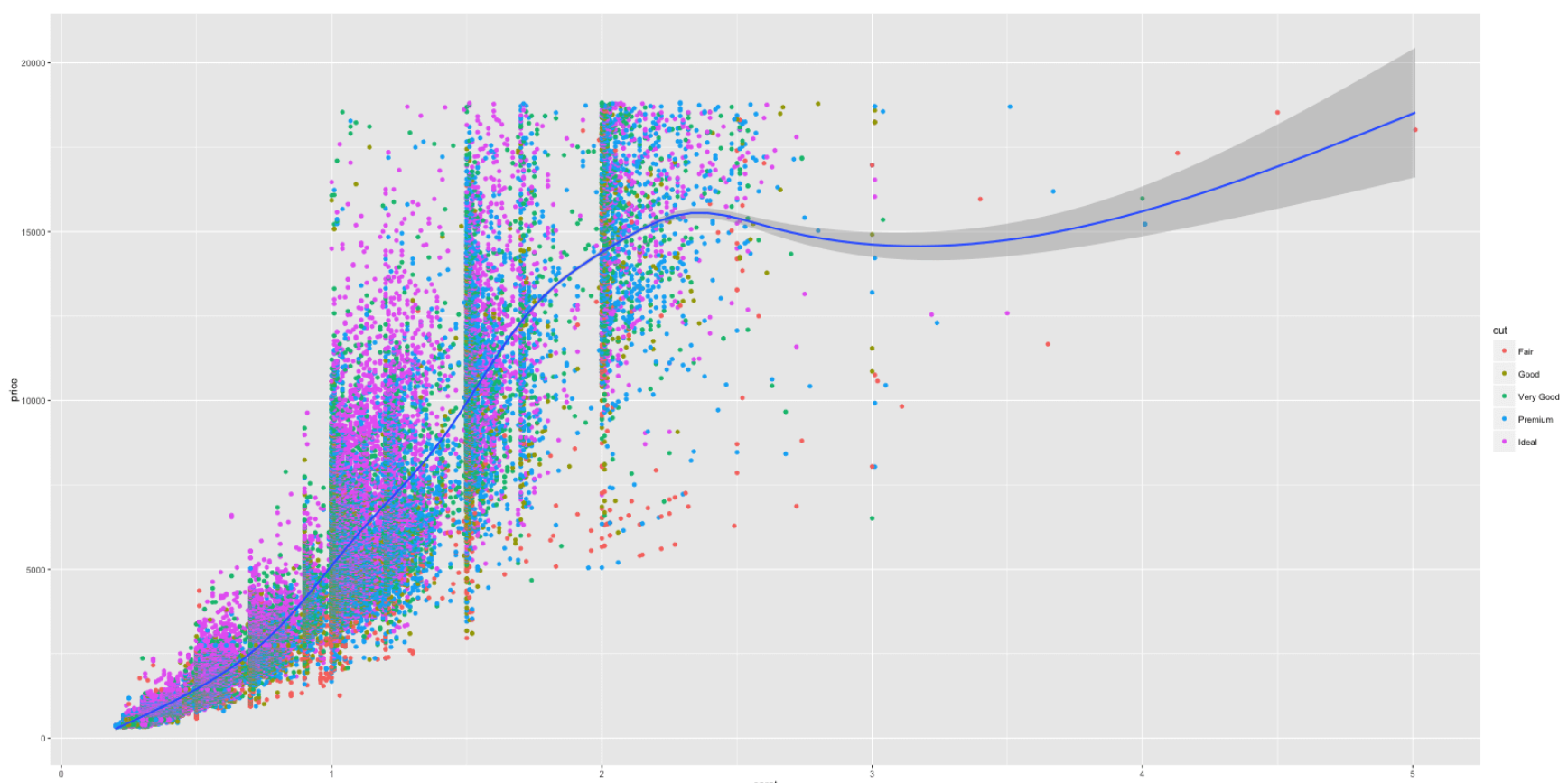
ggplot(diamonds, aes(x=carat, y=price, color=cut)) + geom_point() + geom_smooth() # Adding scatterplot geom (layer1) and smoothing geom (layer2).
#或者是在geom层里面自定义美化格式ggplot(diamonds) + geom_point(aes(x=carat, y=price, color=cut)) + geom_smooth(aes(x=carat, y=price, color=cut))

#把不同平滑曲线整合成一条
library(ggplot2)

ggplot(diamonds) + geom_point(aes(x=carat, y=price, color=cut)) + geom_smooth(aes(x=carat, y=price)) # Remove color from geom_smooth

ggplot(diamonds, aes(x=carat, y=price)) + geom_point(aes(color=cut)) + geom_smooth()  # same but simpler
# 把不同颜色的散点的形状设成不同的

ggplot(diamonds, aes(x=carat, y=price, color=cut, shape=color)) + geom_point()
添加水平或者垂直线
p1 <- gg3 + geom_hline(yintercept=5000, size=2, linetype="dotted", color="blue") # linetypes: solid, dashed, dotted, dotdash, longdash and twodash

p2 <- gg3 + geom_vline(xintercept=4, size=2, color="firebrick")#添加垂直线

p3 <- gg3 + geom_segment(aes(x=4, y=5000, xend=4, yend=10000, size=2, lineend="round"))#添加方块

p4 <- gg3 + geom_segment(aes(x=carat, y=price, xend=carat, yend=price-500, color=color), size=2) + coord_cartesian(xlim=c(3, 5))  # x, y: start points. xend, yend: end points

gridExtra::grid.arrange(p1,p2,p3,p4, ncol=2)

3 标签
使用 labs 层来自定义标签
library(ggplot2)

gg <- ggplot(diamonds, aes(x=carat, y=price, color=cut)) + geom_point() + labs(title="Scatterplot", x="Carat", y="Price")  # 增加坐标轴和图像标题

print(gg)#保存图形

4 主题和格式调整
使用Theme函数控制标签的尺寸、颜色等,在element_text()函数内自定义具体的格式,想要清除格式,则设为element_blank()即可
gg1 <- gg + theme(plot.title=element_text(size=30, face="bold"),

                  axis.text.x=element_text(size=15), #x轴文本

                  axis.text.y=element_text(size=15),

                  axis.title.x=element_text(size=25),

                  axis.title.y=element_text(size=25)) +

  scale_color_discrete(name="Cut of diamonds")  # add title and axis text, 改变图例标题

#scale_shape_discrete(name="legend title") 基于离散分类变量生成对应图例标题

#scale_shape_continuous(name="legend title") 基于连续变量 shape fill color属性

print(gg1)

#改变图形中所有文本的颜色等

gg2 + theme(text=element_text(color="blue"))  # all text turns blue.
#改变点的颜色

gg3 + scale_colour_manual(name='Legend', values=c('D'='grey', 'E'='red', 'F'='blue', 'G'='yellow', 'H'='black', 'I'='green', 'J'='firebrick'))

颜色表:

调整x y轴范围
三种方法:
- Using coord_cartesian(xlim=c(x1,x2))
- Using xlim(c(x1,x2))
- Using scale_x_continuous(limits=c(x1,x2)) 注意:第2、3种方法会删除数据框中不在范围之内的点的信息
#调整x y 轴范围

gg3 + coord_cartesian(xlim=c(0,3), ylim=c(0, 5000)) + geom_smooth()  # zoom in

#删除坐标范围之外的点 注意这时候平滑线也会相应改变 可能会误导分析

gg3 + scale_x_continuous(limits=c(0,3)) + scale_y_continuous(limits=c(0, 5000)) + geom_smooth()  # deletes the points outside limits

#> Warning message:

#> Removed 14714 rows containing missing values (geom_point).

#改变x y轴标签 间隔等

gg3 + scale_x_continuous(labels=c("zero", "one", "two", "three", "four", "five")) + scale_y_continuous(breaks=seq(0, 20000, 4000))  # Y 是连续变量  X 是类型变量

#旋转文本角度

gg3 + theme(axis.text.x=element_text(angle=45), axis.text.y=element_text(angle=45))
gg3 + coord_flip() #把x和y轴对换
#设置图形内背景网格

gg3 + theme(panel.background = element_rect(fill = 'springgreen'),

  panel.grid.major = element_line(colour = "firebrick", size=3),

  panel.grid.minor = element_line(colour = "blue", size=1))
图形背景与边距

#设置图形外背景颜色和边距

gg3 + theme(plot.background=element_rect(fill="yellowgreen"), plot.margin = unit(c(2, 4, 1, 3), "cm")) # top, right, bottom, left

图例
gg3 + scale_color_discrete(name="")  # 删除图例标题

p1 <- gg3 + theme(legend.title=element_blank())  # 删除图例标题

p2 <- gg3 + scale_color_discrete(name="Diamonds")  # 改变图例标题

gg3 + scale_colour_manual(name='Legend', values=c('D'='grey', 'E'='red', 'F'='blue', 'G'='yellow', 'H'='black', 'I'='green', 'J'='firebrick'))# 改变图例标题和点颜色

#隐藏图例标题

gg3 + theme(legend.position="none")  # hides the legend

#改变图例位置

p1 <- gg3 + theme(legend.position="top")  # top / bottom / left / right 图形外

#图形内

p2 <- gg3 + theme(legend.justification=c(1,0), legend.position=c(1,0))  # legend justification 是图例的定标点 把图例的左下点作为 (0,0)

gridExtra::grid.arrange(p1, p2, ncol=2)

#相当于library(gridExtra)

#grid.arrange(p1, p2, ncol=2)

#改变图例具体项目的顺序 按照需求在图例中创建一个新的类型变量

df$newLegendColumn <- factor(df$legendcolumn, levels=c(new_order_of_legend_items), ordered = TRUE)

#legend.title - 图例标题

#legend.text - 图例文本

#legend.key - 图例背景框

#guides - 图例符号

gg3 + theme(legend.title = element_text(size=20, color = "firebrick"), legend.text = element_text(size=15), legend.key=element_rect(fill='steelblue')) + guides(colour = guide_legend(override.aes = list(size=2, shape=4, stroke=2)))

# legend title color and size, box color, symbol color, size and shape.


5 多图绘制
gg1 + facet_wrap( ~ cut, ncol=3)  # cut类型变量的每种类型是一个图 设置为三列

gg1 + facet_wrap(color ~ cut)  # row: color, column: cut 左边的对应行 右边的对应列

gg1 + facet_wrap(color ~ cut, scales="free")  # row: color, column: cut 释放尺度限制

gg1 + facet_grid(color ~ cut)   # 为方便比较 把所有图片放在网格中 头信息去掉 更多的空间给图形

6 一些经常用到的特征
制作时间序列图形(使用ggfortify)
使用ggfortify包很容易直接用一个时间序列对象来画时间序列图形,而不用把数据类型转换为数据框,更多请见
#下载ggfortify包

library(devtools)

install_github('sinhrks/ggfortify')
ggfortify 使得 ggplot2 知道怎么解译 ts 对象. 加载 ggfortify 包后, 你可以使用 ggplot2::autoplot 函数来操作 ts 对象
library(ggfortify)

autoplot(AirPassengers) + labs(title="AirPassengers")  # where AirPassengers is a 'ts' object

autoplot(AirPassengers, ts.colour = 'red', ts.linetype = 'dashed')#改变线的颜色和类型

#使用 help(autoplot.ts) (or help(autoplot.*) for any other objects) 来查询可以改变的选项

autoplot 也能处理其他时间序列类型. 支持的包有:
zoo::zooregxts::xtstimeSeries::timSeriestseries::irts
library(xts)

autoplot(as.xts(AirPassengers), ts.colour = 'green')

也能通过命名改变{ggplot2} 几何图形类型. 支持线、条形、点图
autoplot(AirPassengers, ts.geom = 'bar', fill = 'blue')

autoplot(AirPassengers, ts.geom = 'point', shape = 3)

同一张图上画多个时间序列
要求数据是数据框类型,且一列必须为时间数据
(1)转换成数据框后,累加层
# Approach 1:
data(economics, package="ggplot2") # 数据初始化
economics <- data.frame(economics) # 转换为数据框类型
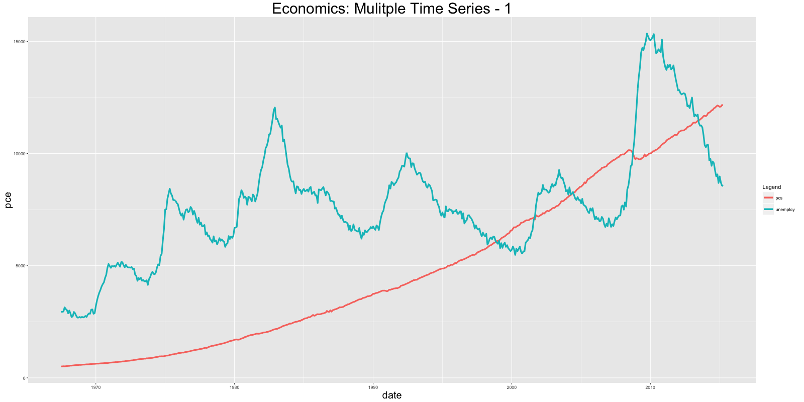
ggplot(economics) + geom_line(aes(x=date, y=pce, col="pcs")) + geom_line(aes(x=date, y=unemploy, col="unemploy")) + scale_color_discrete(name="Legend") + labs(title="Economics") # 画多条线 使用 'geom_line's
(2)使用 reshape2::melt 设置 id 到日期格式来合并数据框. 然后增加一个 geom_line 把颜色格式设置为variable (此变量是在合并过程中被创建).
# Approach 2:

library(reshape2)

df <- melt(economics[, c("date", "pce", "unemploy")], id="date")

ggplot(df) + geom_line(aes(x=date, y=value, color=variable)) + labs(title="Economics")# plot multiple time series by melting
条形图
ggplot 默认创建的是 ‘counts’ 型的条形图,即计算某一列变量中每种值出现的频数,这时候无需指定y轴的变量
但是呢,如果想具体指定y轴的值,这时候一定要在geom_bar内设置stat="identity"
# 绝对条形图: Specify both X adn Y axis. Set stat="identity"

df <- aggregate(mtcars$mpg, by=list(mtcars$cyl), FUN=mean)  # 计算每个'cyl'对应的mpg变量均值

names(df) <- c("cyl", "mpg")#为数据框增加变量名字

head(df)

#>   cyl    mpg

#> 1   4  26.66

#> 2   6  19.74

#> 3   8  15.10

gg_bar <- ggplot(df, aes(x=cyl, y=mpg)) + geom_bar(stat = "identity")  # Y axis is explicit. 'stat=identity'

print(gg_bar)

改变条形图的颜色和宽度
df$cyl <- as.factor(df$cyl)#把cyl作为类型变量

gg_bar <- ggplot(df, aes(x=cyl, y=mpg)) + geom_bar(stat = "identity", aes(fill=cyl), width = 0.25)

gg_bar + scale_fill_manual(values=c("4"="steelblue", "6"="firebrick", "8"="darkgreen"))

改变颜色
library(RColorBrewer)

display.brewer.all(n=20, exact.n=FALSE)  # 展示所有颜色方案

ggplot(mtcars, aes(x=cyl, y=carb, fill=factor(cyl))) + geom_bar(stat="identity") + scale_fill_brewer(palette="Reds")  # "Reds" is palette name

gg <- ggplot(mtcars, aes(x=cyl))

p1 <- gg + geom_bar(position="dodge", aes(fill=factor(vs)))  # side-by-side 并列

p2 <- gg + geom_bar(aes(fill=factor(vs)))  # stacked 堆积

gridExtra::grid.arrange(p1, p2, ncol=2)

折线图
# 方法 1:

gg <- ggplot(economics, aes(x=date))  # 基本设置

gg + geom_line(aes(y=psavert), size=2, color="firebrick") + geom_line(aes(y=uempmed), size=1, color="steelblue", linetype="twodash")  #没有图例

# 折线类型有: solid, dashed, dotted, dotdash, longdash and twodash

# 方法 2:
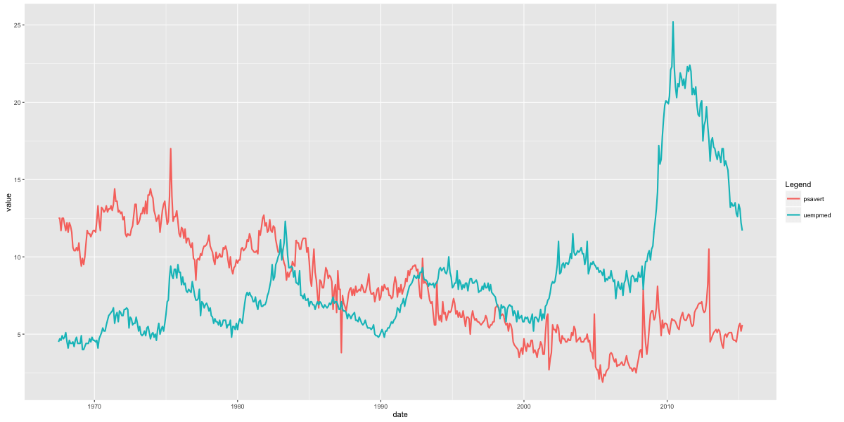
library(reshape2)
df_melt <- melt(economics[, c("date", "psavert", "uempmed")], id="date") # melt by date.
gg <- ggplot(df_melt, aes(x=date)) # setup
gg + geom_line(aes(y=value, color=variable), size=1) + scale_color_discrete(name="Legend") # gets legend.有图例
丝带图
使用 geom_ribbon()画填充时间序列图 需要 ymin and ymax 两个参量
# Prepare the dataframe

st_year <- start(AirPassengers)[1] #开始年份

st_month <- "01"

st_date <- as.Date(paste(st_year, st_month, "01", sep="-"))#开始日期

dates <- seq.Date(st_date, length=length(AirPassengers), by="month")#生产日期数组 以月为间隔

df <- data.frame(dates, AirPassengers, AirPassengers/2)#一定要记得构建数据框

head(df)

#>        dates AirPassengers AirPassengers.2

#> 1 1949-01-01           112            56.0

#> 2 1949-02-01           118            59.0

#> 3 1949-03-01           132            66.0

#> 4 1949-04-01           129            64.5

#> 5 1949-05-01           121            60.5

#> 6 1949-06-01           135            67.5

# Plot ribbon with ymin=0

gg <- ggplot(df, aes(x=dates)) + labs(title="AirPassengers") + theme(plot.title=element_text(size=30), axis.title.x=element_text(size=20), axis.text.x=element_text(size=15))

gg + geom_ribbon(aes(ymin=0, ymax=AirPassengers)) + geom_ribbon(aes(ymin=0, ymax=AirPassengers.2), fill="green")

gg + geom_ribbon(aes(ymin=AirPassengers-20, ymax=AirPassengers+20)) + geom_ribbon(aes(ymin=AirPassengers.2-20, ymax=AirPassengers.2+20), fill="green")

区域图
geom_area和 geom_ribbon类似,只是 ymin设置为 0,如果想画重叠的区域图,使用 alpha aesthetic 使得最外层为透明的
# Method1: 非重叠区域

df <- reshape2::melt(economics[, c("date", "psavert", "uempmed")], id="date")

head(df, 3)

#>         date variable value

#> 1 1967-07-01  psavert  12.5

#> 2 1967-08-01  psavert  12.5

#> 3 1967-09-01  psavert  11.7

p1 <- ggplot(df, aes(x=date)) + geom_area(aes(y=value, fill=variable)) + labs(title="Non-Overlapping - psavert and uempmed")

# Method2: 重叠区域 PS:因为没有构建成数据框,也就相应没有图例啦

p2 <- ggplot(economics, aes(x=date)) + geom_area(aes(y=psavert), fill="yellowgreen", color="yellowgreen") + geom_area(aes(y=uempmed), fill="dodgerblue", alpha=0.7, linetype="dotted") + labs(title="Overlapping - psavert and uempmed")

gridExtra::grid.arrange(p1, p2, ncol=2)

箱形图和小提琴图
可以使用: * outlier.shape * outlier.stroke * outlier.size * outlier.colour 来控制异常点的形状 大小 边缘
如果 notch 被设为 TRUE,见下图
p1 <- ggplot(mtcars, aes(factor(cyl), mpg)) + geom_boxplot(aes(fill = factor(cyl)),
width=0.5, outlier.colour = "dodgerblue", outlier.size = 4, outlier.shape = 16, outlier.stroke = 2, notch=T) + labs(title="Box plot")  # boxplot

p2 <- ggplot(mtcars, aes(factor(cyl), mpg)) + geom_violin(aes(fill = factor(cyl)), width=0.5, trim=F) + labs(title="Violin plot (untrimmed)")  # violin plot

gridExtra::grid.arrange(p1, p2, ncol=2)

密度图
ggplot(mtcars, aes(mpg)) + geom_density(aes(fill = factor(cyl)), size=2) + labs(title="Density plot") # Density plot

瓦片图(热力图)
corr <- round(cor(mtcars), 2)#生成相关系数矩阵 对称的

df <- reshape2::melt(corr)

gg <- ggplot(df, aes(x=Var1, y=Var2, fill=value, label=value)) + geom_tile() + theme_bw() + geom_text(aes(label=value, size=value), color="white") + labs(title="mtcars - Correlation plot") + theme(text=element_text(size=20), legend.position="none")

library(RColorBrewer)

p2 <- gg + scale_fill_distiller(palette="Reds")

p3 <- gg + scale_fill_gradient2()

gridExtra::grid.arrange(gg, p2, p3, ncol=3)

相同坐标轴范围
ggplot(diamonds, aes(x=price, y=price+runif(nrow(diamonds), 100, 10000), color=cut)) + geom_point() + geom_smooth() + coord_equal()
自定义布局
gridExtra包能在一个网格中安排放置多个图形
library(gridExtra)

grid.arrange(plot1, plot2, ncol=2)
改变主题
切换不同的内置主题:
- theme_gray()
- theme_bw()
- theme_linedraw()
- theme_light()
- theme_minimal()
- theme_classic()
- theme_void()
ggthemes 包提供 另外的主题 这些主题模仿啦一些著名杂志或者软件的风格
#从 CRAN下载稳定版

install.packages('ggthemes', dependencies = TRUE)

#或者下载开发者版本

library("devtools")

install_github(c("hadley/ggplot2", "jrnold/ggthemes"))
ggplot(diamonds, aes(x=carat, y=price, color=cut)) + geom_point() + geom_smooth() +theme_bw() + labs(title="bw Theme")

注记
library(grid)

my_grob = grobTree(textGrob("This text is at x=0.1 and y=0.9, relative!\n Anchor point is at 0,0", x=0.1,  y=0.9, hjust=0,gp=gpar(col="firebrick", fontsize=25, fontface="bold")))

ggplot(mtcars, aes(x=cyl)) + geom_bar() + annotation_custom(my_grob) + labs(title="Annotation Example")

保存图片
plot1 <- ggplot(mtcars, aes(x=cyl)) + geom_bar()

ggsave("myggplot.png")  # 保存最近创建的图片

ggsave("myggplot.png", plot=plot1)  #保存指定的图形
相关链接:
非常有用:https://ggplot2.tidyverse.org/reference/
Cheatsheets:http://www.rstudio.com/wp-content/uploads/2015/12/ggplot2-cheatsheet-2.0.pdf
教程:http://r-statistics.co/ggplot2-Tutorial-With-R.html
https://ggplot2.tidyverse.org/
时间序列画图包:http://rpubs.com/sinhrks/plot_ts
主题“https://github.com/jrnold/ggthemes
R:ggplot2数据可视化——基础知识的更多相关文章
- R:ggplot2数据可视化——进阶(1)
,分为三个部分,此篇为Part1,推荐学习一些基础知识后阅读~ Part 1: Introduction to ggplot2, 覆盖构建简单图表并进行修饰的基础知识 Part 2: Customiz ...
- R:ggplot2数据可视化——进阶(3)
Part 3: Top 50 ggplot2 Visualizations - The Master List, 结合进阶1.2内容构建图形 有效的图形是: 不扭曲事实 传递正确的信息 简洁优雅 美观 ...
- R:ggplot2数据可视化——进阶(2)
Part 2: Customizing the Look and Feel, 更高级的自定义化,比如说操作图例.注记.多图布局等 # Setup options(scipen=999) librar ...
- 最棒的7种R语言数据可视化
最棒的7种R语言数据可视化 随着数据量不断增加,抛开可视化技术讲故事是不可能的.数据可视化是一门将数字转化为有用知识的艺术. R语言编程提供一套建立可视化和展现数据的内置函数和库,让你学习这门艺术.在 ...
- 第一篇:R语言数据可视化概述(基于ggplot2)
前言 ggplot2是R语言最为强大的作图软件包,强于其自成一派的数据可视化理念.当熟悉了ggplot2的基本套路后,数据可视化工作将变得非常轻松而有条理. 本文主要对ggplot2的可视化理念及开发 ...
- 第三篇:R语言数据可视化之条形图
条形图简介 数据可视化中,最常用的图非条形图莫属,它主要用来展示不同分类(横轴)下某个数值型变量(纵轴)的取值.其中有两点要重点注意: 1. 条形图横轴上的数据是离散而非连续的.比如想展示两商品的价格 ...
- 在我的新书里,尝试着用股票案例讲述Python爬虫大数据可视化等知识
我的新书,<基于股票大数据分析的Python入门实战>,预计将于2019年底在清华出版社出版. 如果大家对大数据分析有兴趣,又想学习Python,这本书是一本不错的选择.从知识体系上来看, ...
- 数据可视化基础专题(六):Pandas基础(五) 索引和数据选择器(查找)
1.序言 如何切片,切块,以及通常获取和设置pandas对象的子集 2.索引的不同选择 对象选择已经有许多用户请求的添加,以支持更明确的基于位置的索引.Pandas现在支持三种类型的多轴索引. .lo ...
- Python数据可视化基础讲解
前言 本文的文字及图片来源于网络,仅供学习.交流使用,不具有任何商业用途,版权归原作者所有,如有问题请及时联系我们以作处理. 作者:爱数据学习社 首先,要知道我们用哪些库来画图? matplotlib ...
随机推荐
- html+css+dom补充
补充1:页面布局 一般像京东主页左侧右侧都留有空白,用margin:0 auto居中,一般.w. <!DOCTYPE html> <html lang="en"& ...
- Unity学习--捕鱼达人笔记
1.2D模式和3D模式的区别,2D模式默认的摄像机的模式是Orthographic(正交摄像机),3D模式默认的摄像机的模式是Perspective(透视摄像机).3D会额外给你一个平衡光.3D模式修 ...
- 【POJ - 3176】牛保龄球 (简单dp)
牛保龄球 直接中文了 Descriptions 奶牛打保龄球时不使用实际的保龄球.它们各自取一个数字(在0..99范围内),然后排成一个标准的保龄球状三角形,如下所示: 7 3 8 8 1 0 2 7 ...
- EFCore + MySql codeFirst 迁移 Migration出现的问题
第二次使用Migration update-database的时候出现以下错误: System.NotImplementedException: The method or operation is ...
- 实测总结 挂载远程文件夹方案 smb ftp sftp nfs webdav
挂载远程文件夹的方法有: 1.smb 2.ftp 3.sftp 4.nfs 5.webdav 1.smb windows局域网使用的协议,windows网上邻居发现的共享文件夹即使用的smb协议,可以 ...
- Vue cli2.0 项目中使用Monaco Editor编辑器
monaco-editor 是微软出的一条开源web在线编辑器支持多种语言,代码高亮,代码提示等功能,与Visual Studio Code 功能几乎相同. 在项目中可能会用带代码编辑功能,或者展示代 ...
- Go类型别名与类型定义区别
类型别名和自定义类型区别 自定义类型 //自定义类型是定义了一个全新的类型 //将MyInt定义为int类型 type MyInt int 类型别名 //类型别名规定:TypeAlias只是Type的 ...
- 台式机主机u盘安装centos7报错及注意事项
利用UltraISO制作U盘启动安装台式机CentOS7系统:流程及报错解决 一.制作U盘 1.首先打开UltraISO软件,尽量下载最新版的 2.点击工具栏中的第二个打开镜像文件工具,如图红色方框标 ...
- Selenium+java - 手把手一起搭建一个最简单自动化测试框架
写在前面 我们刚开始做自动化测试,可能写的代码都是基于原生写的代码,看起来特别不美观,而且感觉特别生硬. 来看下面一段代码,如下图所示: 从上面图片代码来看,具体特征如下: driver对象在测试类中 ...
- JAVA开发奇淫巧技(一)
本章节持续收录常用且好用的IDE开发工具,基于myeclipse 1.Lombok是一种Java实用工具,可以帮助开发人员消除Java的冗长,具体看lombok的官网:http://projectlo ...