
mobile adaptor & css media query
mobile adaptor & css media query
移动端适配 & 媒体查询
device-aspect-ratio & 设备纵横比
https://developer.mozilla.org/en-US/docs/Web/CSS/Media_Queries/Using_media_queries
https://www.w3schools.com/css/css_rwd_mediaqueries.asp
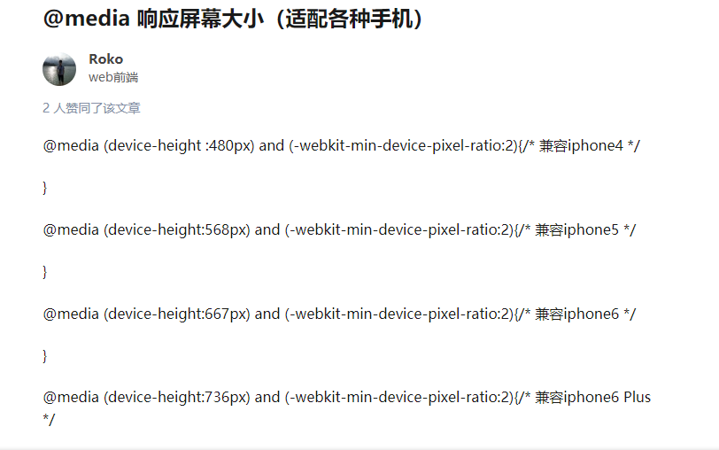
demos
https://css-tricks.com/snippets/css/media-queries-for-standard-devices/
Phones and Handhelds
/* ----------- iPhone 4 and 4S ----------- */

/* Portrait and Landscape */

@media only screen

  and (min-device-width: 320px)

  and (max-device-width: 480px)

  and (-webkit-min-device-pixel-ratio: 2) {

}

/* Portrait */

@media only screen

  and (min-device-width: 320px)

  and (max-device-width: 480px)

  and (-webkit-min-device-pixel-ratio: 2)

  and (orientation: portrait) {

}

/* Landscape */

@media only screen

  and (min-device-width: 320px)

  and (max-device-width: 480px)

  and (-webkit-min-device-pixel-ratio: 2)

  and (orientation: landscape) {

}

/* ----------- iPhone 5, 5S, 5C and 5SE ----------- */

/* Portrait and Landscape */

@media only screen

  and (min-device-width: 320px)

  and (max-device-width: 568px)

  and (-webkit-min-device-pixel-ratio: 2) {

}

/* Portrait */

@media only screen

  and (min-device-width: 320px)

  and (max-device-width: 568px)

  and (-webkit-min-device-pixel-ratio: 2)

  and (orientation: portrait) {

}

/* Landscape */

@media only screen

  and (min-device-width: 320px)

  and (max-device-width: 568px)

  and (-webkit-min-device-pixel-ratio: 2)

  and (orientation: landscape) {

}

/* ----------- iPhone 6, 6S, 7 and 8 ----------- */

/* Portrait and Landscape */

@media only screen

  and (min-device-width: 375px)

  and (max-device-width: 667px)

  and (-webkit-min-device-pixel-ratio: 2) {

}

/* Portrait */

@media only screen

  and (min-device-width: 375px)

  and (max-device-width: 667px)

  and (-webkit-min-device-pixel-ratio: 2)

  and (orientation: portrait) {

}

/* Landscape */

@media only screen

  and (min-device-width: 375px)

  and (max-device-width: 667px)

  and (-webkit-min-device-pixel-ratio: 2)

  and (orientation: landscape) {

}

/* ----------- iPhone 6+, 7+ and 8+ ----------- */

/* Portrait and Landscape */

@media only screen

  and (min-device-width: 414px)

  and (max-device-width: 736px)

  and (-webkit-min-device-pixel-ratio: 3) {

}

/* Portrait */

@media only screen

  and (min-device-width: 414px)

  and (max-device-width: 736px)

  and (-webkit-min-device-pixel-ratio: 3)

  and (orientation: portrait) {

}

/* Landscape */

@media only screen

  and (min-device-width: 414px)

  and (max-device-width: 736px)

  and (-webkit-min-device-pixel-ratio: 3)

  and (orientation: landscape) {

}

/* ----------- iPhone X ----------- */

/* Portrait and Landscape */

@media only screen

  and (min-device-width: 375px)

  and (max-device-width: 812px)

  and (-webkit-min-device-pixel-ratio: 3) {

}

/* Portrait */

@media only screen

  and (min-device-width: 375px)

  and (max-device-width: 812px)

  and (-webkit-min-device-pixel-ratio: 3)

  and (orientation: portrait) {

}

/* Landscape */

@media only screen

  and (min-device-width: 375px)

  and (max-device-width: 812px)

  and (-webkit-min-device-pixel-ratio: 3)

  and (orientation: landscape) {

}
/* ----------- Galaxy S3 ----------- */

/* Portrait and Landscape */

@media screen

  and (device-width: 360px)

  and (device-height: 640px)

  and (-webkit-device-pixel-ratio: 2) {

}

/* Portrait */

@media screen

  and (device-width: 320px)

  and (device-height: 640px)

  and (-webkit-device-pixel-ratio: 2)

  and (orientation: portrait) {

}

/* Landscape */

@media screen

  and (device-width: 320px)

  and (device-height: 640px)

  and (-webkit-device-pixel-ratio: 2)

  and (orientation: landscape) {

}

/* ----------- Galaxy S4, S5 and Note 3 ----------- */

/* Portrait and Landscape */

@media screen

  and (device-width: 320px)

  and (device-height: 640px)

  and (-webkit-device-pixel-ratio: 3) {

}

/* Portrait */

@media screen

  and (device-width: 320px)

  and (device-height: 640px)

  and (-webkit-device-pixel-ratio: 3)

  and (orientation: portrait) {

}

/* Landscape */

@media screen

  and (device-width: 320px)

  and (device-height: 640px)

  and (-webkit-device-pixel-ratio: 3)

  and (orientation: landscape) {

}

/* ----------- Galaxy S6 ----------- */

/* Portrait and Landscape */

@media screen

  and (device-width: 360px)

  and (device-height: 640px)

  and (-webkit-device-pixel-ratio: 4) {

}

/* Portrait */

@media screen

  and (device-width: 360px)

  and (device-height: 640px)

  and (-webkit-device-pixel-ratio: 4)

  and (orientation: portrait) {

}

/* Landscape */

@media screen

  and (device-width: 360px)

  and (device-height: 640px)

  and (-webkit-device-pixel-ratio: 4)

  and (orientation: landscape) {

}
* ----------- Google Pixel ----------- */

/* Portrait and Landscape */

@media screen

  and (device-width: 360px)

  and (device-height: 640px)

  and (-webkit-device-pixel-ratio: 3) {

}

/* Portrait */

@media screen

  and (device-width: 360px)

  and (device-height: 640px)

  and (-webkit-device-pixel-ratio: 3)

  and (orientation: portrait) {

}

/* Landscape */

@media screen

  and (device-width: 360px)

  and (device-height: 640px)

  and (-webkit-device-pixel-ratio: 3)

  and (orientation: landscape) {

}

/* ----------- Google Pixel XL ----------- */

/* Portrait and Landscape */

@media screen

  and (device-width: 360px)

  and (device-height: 640px)

  and (-webkit-device-pixel-ratio: 4) {

}

/* Portrait */

@media screen

  and (device-width: 360px)

  and (device-height: 640px)

  and (-webkit-device-pixel-ratio: 4)

  and (orientation: portrait) {

}

/* Landscape */

@media screen

  and (device-width: 360px)

  and (device-height: 640px)

  and (-webkit-device-pixel-ratio: 4)

  and (orientation: landscape) {

}
/* ----------- HTC One ----------- */

/* Portrait and Landscape */

@media screen

  and (device-width: 360px)

  and (device-height: 640px)

  and (-webkit-device-pixel-ratio: 3) {

}

/* Portrait */

@media screen

  and (device-width: 360px)

  and (device-height: 640px)

  and (-webkit-device-pixel-ratio: 3)

  and (orientation: portrait) {

}

/* Landscape */

@media screen

  and (device-width: 360px)

  and (device-height: 640px)

  and (-webkit-device-pixel-ratio: 3)

  and (orientation: landscape) {

}
/* ----------- Windows Phone ----------- */

/* Portrait and Landscape */

@media screen

  and (device-width: 480px)

  and (device-height: 800px) {

}

/* Portrait */

@media screen

  and (device-width: 480px)

  and (device-height: 800px)

  and (orientation: portrait) {

}

/* Landscape */

@media screen

  and (device-width: 480px)

  and (device-height: 800px)

  and (orientation: landscape) {

}
Tablets
/* ----------- iPad 1, 2, Mini and Air ----------- */

/* Portrait and Landscape */

@media only screen

  and (min-device-width: 768px)

  and (max-device-width: 1024px)

  and (-webkit-min-device-pixel-ratio: 1) {

}

/* Portrait */

@media only screen

  and (min-device-width: 768px)

  and (max-device-width: 1024px)

  and (orientation: portrait)

  and (-webkit-min-device-pixel-ratio: 1) {

}

/* Landscape */

@media only screen

  and (min-device-width: 768px)

  and (max-device-width: 1024px)

  and (orientation: landscape)

  and (-webkit-min-device-pixel-ratio: 1) {

}

/* ----------- iPad 3, 4 and Pro 9.7" ----------- */

/* Portrait and Landscape */

@media only screen

  and (min-device-width: 768px)

  and (max-device-width: 1024px)

  and (-webkit-min-device-pixel-ratio: 2) {

}

/* Portrait */

@media only screen

  and (min-device-width: 768px)

  and (max-device-width: 1024px)

  and (orientation: portrait)

  and (-webkit-min-device-pixel-ratio: 2) {

}

/* Landscape */

@media only screen

  and (min-device-width: 768px)

  and (max-device-width: 1024px)

  and (orientation: landscape)

  and (-webkit-min-device-pixel-ratio: 2) {

}

/* ----------- iPad Pro 10.5" ----------- */

/* Portrait and Landscape */

@media only screen

  and (min-device-width: 834px)

  and (max-device-width: 1112px)

  and (-webkit-min-device-pixel-ratio: 2) {

}

/* Portrait */

/* Declare the same value for min- and max-width to avoid colliding with desktops */

/* Source: https://medium.com/connect-the-dots/css-media-queries-for-ipad-pro-8cad10e17106*/

@media only screen

  and (min-device-width: 834px)

  and (max-device-width: 834px)

  and (orientation: portrait)

  and (-webkit-min-device-pixel-ratio: 2) {

}

/* Landscape */

/* Declare the same value for min- and max-width to avoid colliding with desktops */

/* Source: https://medium.com/connect-the-dots/css-media-queries-for-ipad-pro-8cad10e17106*/

@media only screen

  and (min-device-width: 1112px)

  and (max-device-width: 1112px)

  and (orientation: landscape)

  and (-webkit-min-device-pixel-ratio: 2) {

}

/* ----------- iPad Pro 12.9" ----------- */

/* Portrait and Landscape */

@media only screen

  and (min-device-width: 1024px)

  and (max-device-width: 1366px)

  and (-webkit-min-device-pixel-ratio: 2) {

}

/* Portrait */

/* Declare the same value for min- and max-width to avoid colliding with desktops */

/* Source: https://medium.com/connect-the-dots/css-media-queries-for-ipad-pro-8cad10e17106*/

@media only screen

  and (min-device-width: 1024px)

  and (max-device-width: 1024px)

  and (orientation: portrait)

  and (-webkit-min-device-pixel-ratio: 2) {

}

/* Landscape */

/* Declare the same value for min- and max-width to avoid colliding with desktops */

/* Source: https://medium.com/connect-the-dots/css-media-queries-for-ipad-pro-8cad10e17106*/

@media only screen

  and (min-device-width: 1366px)

  and (max-device-width: 1366px)

  and (orientation: landscape)

  and (-webkit-min-device-pixel-ratio: 2) {

}
/* ----------- Galaxy Tab 2 ----------- */

/* Portrait and Landscape */

@media

  (min-device-width: 800px)

  and (max-device-width: 1280px) {

}

/* Portrait */

@media

  (max-device-width: 800px)

  and (orientation: portrait) {

}

/* Landscape */

@media

  (max-device-width: 1280px)

  and (orientation: landscape) {

}

/* ----------- Galaxy Tab S ----------- */

/* Portrait and Landscape */

@media

  (min-device-width: 800px)

  and (max-device-width: 1280px)

  and (-webkit-min-device-pixel-ratio: 2) {

}

/* Portrait */

@media

  (max-device-width: 800px)

  and (orientation: portrait)

  and (-webkit-min-device-pixel-ratio: 2) {

}

/* Landscape */

@media

  (max-device-width: 1280px)

  and (orientation: landscape)

  and (-webkit-min-device-pixel-ratio: 2) {

}
/* ----------- Nexus 7 ----------- */

/* Portrait and Landscape */

@media screen

  and (device-width: 601px)

  and (device-height: 906px)

  and (-webkit-min-device-pixel-ratio: 1.331)

  and (-webkit-max-device-pixel-ratio: 1.332) {

}

/* Portrait */

@media screen

  and (device-width: 601px)

  and (device-height: 906px)

  and (-webkit-min-device-pixel-ratio: 1.331)

  and (-webkit-max-device-pixel-ratio: 1.332)

  and (orientation: portrait) {

}

/* Landscape */

@media screen

  and (device-width: 601px)

  and (device-height: 906px)

  and (-webkit-min-device-pixel-ratio: 1.331)

  and (-webkit-max-device-pixel-ratio: 1.332)

  and (orientation: landscape) {

}

/* ----------- Nexus 9 ----------- */

/* Portrait and Landscape */

@media screen

  and (device-width: 1536px)

  and (device-height: 2048px)

  and (-webkit-min-device-pixel-ratio: 1.331)

  and (-webkit-max-device-pixel-ratio: 1.332) {

}

/* Portrait */

@media screen

  and (device-width: 1536px)

  and (device-height: 2048px)

  and (-webkit-min-device-pixel-ratio: 1.331)

  and (-webkit-max-device-pixel-ratio: 1.332)

  and (orientation: portrait) {

}

/* Landscape */

@media screen

  and (device-width: 1536px)

  and (device-height: 2048px)

  and (-webkit-min-device-pixel-ratio: 1.331)

  and (-webkit-max-device-pixel-ratio: 1.332)

  and (orientation: landscape) {

}
/* ----------- Kindle Fire HD 7" ----------- */

/* Portrait and Landscape */

@media only screen

  and (min-device-width: 800px)

  and (max-device-width: 1280px)

  and (-webkit-min-device-pixel-ratio: 1.5) {

}

/* Portrait */

@media only screen

  and (min-device-width: 800px)

  and (max-device-width: 1280px)

  and (-webkit-min-device-pixel-ratio: 1.5)

  and (orientation: portrait) {

}

/* Landscape */

@media only screen

  and (min-device-width: 800px)

  and (max-device-width: 1280px)

  and (-webkit-min-device-pixel-ratio: 1.5)

  and (orientation: landscape) {

}

/* ----------- Kindle Fire HD 8.9" ----------- */

/* Portrait and Landscape */

@media only screen

  and (min-device-width: 1200px)

  and (max-device-width: 1600px)

  and (-webkit-min-device-pixel-ratio: 1.5) {

}

/* Portrait */

@media only screen

  and (min-device-width: 1200px)

  and (max-device-width: 1600px)

  and (-webkit-min-device-pixel-ratio: 1.5)

  and (orientation: portrait) {

}

/* Landscape */

@media only screen

  and (min-device-width: 1200px)

  and (max-device-width: 1600px)

  and (-webkit-min-device-pixel-ratio: 1.5)

  and (orientation: landscape) {

}
Laptops
/* ----------- Non-Retina Screens ----------- */

@media screen

  and (min-device-width: 1200px)

  and (max-device-width: 1600px)

  and (-webkit-min-device-pixel-ratio: 1) {

}

/* ----------- Retina Screens ----------- */

@media screen

  and (min-device-width: 1200px)

  and (max-device-width: 1600px)

  and (-webkit-min-device-pixel-ratio: 2)

  and (min-resolution: 192dpi) {

}
Wearables
/* ----------- Apple Watch ----------- */

@media

  (max-device-width: 42mm)

  and (min-device-width: 38mm) {

}
/* ----------- Moto 360 Watch ----------- */

@media

  (max-device-width: 218px)

  and (max-device-height: 281px) {

}
mobile adaptor & css media query的更多相关文章
- CSS Media Query
[CSS Media Query] CSS Media Queries are a feature in CSS3 which allows you to specify when certain C ...
- css Media Query详解
Media Queries详解 Media Queries直译过来就是“媒体查询”,在我们平时的Web页面中head部分常看到这样的一段代码: 1 <link href="css/re ...
- CSS media query应用中的层叠特性使用最佳实践
media query是css3规范中引入的,它提供了一种responsive design的基础机制:浏览器在不同size的设备中将以不同样式展现网页,这就给一个网页能够适应不同device一种可能 ...
- iPhone CSS media query(媒体查询)
iPhone5 iPhone6 iPhone6Plus iPad设备 media query(媒体查询)代码. iPhone < 5: @media screen and (device-a ...
- 一些实用的CSS Media Query代码片段,个人采集
CSS3的出现让响应式Web设计变得简单,CSS3提供了强大的media queries,允许你针对不同的条件设置不同的样式,可以在不修改页面内容的情况下,为不同设备提供不同的样式效果. 以下是一些C ...
- 响应式设计的思考:媒体查询(media query)
Jason Grigsby发表了篇文章,<CSS Media Query for Mobile is Fool’s Gold>对媒体查询(media query)吐槽,大意是在移动设备上使 ...
- CSS media queries
最近在做一些页面打印时的特殊处理接触到了media queries,想系统学习一下,在MOZILLA DEVELOPER NETWORK看到一篇文章讲的很不错,结合自己的使用总结一下. CSS2/me ...
- 采用CSS3 Media Query技术适应Android平板屏幕分辨率和屏幕像素密度
采用HTML5在开发移动应用程序满足各种需求Android分辨率和屏幕的平板设备密度,这是非常麻烦的过程,最终的解决方案是使用css media query,匹配相同的时间分辨率和屏幕像素密度.上进行 ...
- 脚本检测 media query 分界点
当需要为不同屏幕大小添加不同脚本的时候,首先需要检测对应的media query 是否起效 也就是CSS( @screen only and (min-width: 40em) {})和javascr ...
随机推荐
- html js获取URL传参
每天学习一点点 编程PDF电子书.视频教程免费下载:http://www.shitanlife.com/code function GetQueryString(name) { var re ...
- Python:Day15 函数
函数参数补充: 还可以这样传参: def f(*args): print(args) f(*[1,3,4,5]) #输出结果:(1, 3, 4, 5) 注意这是一个元组 def f2(**kwargs ...
- VS2015P配置opencv340
1添加系统环境变量 F:\dongdong\0tool\navidia_cuda_opencv\opencv\build\x64\vc14\bin 注销重启 2 工程配置 选择好工程 x64 包含目 ...
- selenium中遇到div弹框,一起引申到其他弹框
1.div弹框和DOM普通元素一样处理 2.出现一下就自动消失的弹框,也是在DOM中有描述的,可以使用xpath,用其内容定位 3.(转,其他弹框处理,包括alert和不同windows) https ...
- Sharding-JDBC实践(一)简介
转载自:ShardingSphere官网 目录 一.介绍 1. Sharding-JDBC 2. Sharding-Proxy 3. Sharding-Sidecar(TBD) 4. 混合架构 二.功 ...
- Numpy求均值、中位数、众数的方法
首先需要数据源,这里随便写了一个: nums = [1,2,3,4] 求均值和中位数均可以使用numpy库的方法: import numpy as np #均值 np.mean(nums) #中位数 ...
- CountDownLatch和CyclicBarrier模拟同时并发请求
有时候要测试一下某个功能的并发能力,又不要想借助于其他测试工具,索性就自己写简单的demo模拟一个并发请求就最方便了.如果熟悉jemter的测试某接口的并发能力其实更专业,此处只是自己折腾着玩. Co ...
- Ubuntu Desktop: 备份与还原
Ubuntu Desktop 版本默认自带了图形化的备份/还原工具 Déjà Dup.该工具主要用来备份和还原用户的数据,当然我们也可以用它来备份/还原系统的数据.本文主要介绍 Déjà Dup 的主 ...
- 《梦断代码》Scott Rosenberg著(一)
两打程序员,3年时间,4732个bug,只为打造超卓软件. --序 在我们平时看到的大部分书籍只是讲技术和理论,但我们其实并不知道在真实的软件开发过程中,这些技术和理论究竟是被什么样的人如何去使用, ...
- Notepad++插件下载和介绍
20款Notepad++插件下载和介绍 - findumars - 博客园https://www.cnblogs.com/findumars/p/5180562.html