CSS3动画属性:动画(animation)
一:动画(animation)的参数详解
由于上面用到了animation动画,这里详细介绍下这个animation的参数。
简介
CSS动画(Animations)简单说就是在一段固定的动画时间内暗中在某一频率内改变其CSS某个或某些值,从而达到视觉上的转换动画效果。Animations的很多方面都是可以控制的,包括动画运行时间,开始值和结束值,还有动画的暂停和延迟其开始时间等。
语法
<single-animation> = <single-animation-name> || <time> || <single-animation-timing-function> || <time> || <single-animation-iteration-count> || <single-animation-direction> || <single-animation-fill-mode> || <single-animation-play-state>
<' animation-name '>:检索或设置对象所应用的动画名称<' animation-duration '>:检索或设置对象动画的持续时间<' animation-timing-function '>:检索或设置对象动画的过渡类型<' animation-delay '>:检索或设置对象动画延迟的时间<' animation-iteration-count '>:检索或设置对象动画的循环次数<' animation-direction '>:检索或设置对象动画在循环中是否反向运动<' animation-fill-mode '>:检索或设置对象动画时间之外的状态<' animation-play-state '>:检索或设置对象动画的状态。w3c正考虑是否将该属性移除,因为动画的状态可以通过其它的方式实现,比如重设样式
animation
所有动画属性的简写属性,除了 animation-play-state 属性。
animation-name
规定 @keyframes 动画的名称。就是@keyframes后面跟着的动画名称。
animation-duration
规定动画完成一个周期所花费的秒或毫秒。默认是 0。
animation-timing-function
规定动画的速度曲线。默认是 "ease"。
常见的动画速度参数:
linear:线性过渡。等同于贝塞尔曲线(0.0, 0.0, 1.0, 1.0)
ease:平滑过渡。等同于贝塞尔曲线(0.25, 0.1, 0.25, 1.0)
ease-in:由慢到快。等同于贝塞尔曲线(0.42, 0, 1.0, 1.0)
ease-out:由快到慢。等同于贝塞尔曲线(0, 0, 0.58, 1.0)
ease-in-out:由慢到快再到慢。等同于贝塞尔曲线(0.42, 0, 0.58, 1.0)
step-start:等同于 steps(1, start)
step-end:等同于 steps(1, end)
steps(<integer>[, [ start | end ] ]?):接受两个参数的步进函数。第一个参数必须为正整数,指定函数的步数。第二个参数取值可以是start或end,指定每一步的值发生变化的时间点。第二个参数是可选的,默认值为end。
cubic-bezier(<number>, <number>, <number>, <number>):特定的贝塞尔曲线类型,4个数值需在[0, 1]区间内
animation-delay
规定动画何时开始。默认是 0。也即是指动画延时执行时间。
animation-iteration-count
规定动画被播放的次数。默认是 1。当然,我们可以设置2次,3次,依次递推。还有个无线循环关键字infinite,也即是反复循环播放动画。
animation-direction
规定动画是否在下一周期逆向地播放。默认是 "normal"。当然还有下列值:
reverse:反方向运行alternate:动画先正常运行再反方向运行,并持续交替运行alternate-reverse:动画先反运行再正方向运行,并持续交替运行
animation-fill-mode
规定对象动画时间之外的状态。
none:默认值。不设置对象动画之外的状态forwards:设置对象状态为动画结束时的状态backwards:设置对象状态为动画开始时的状态both:设置对象状态为动画结束或开始的状态,动画开始之前是"from"或"0%"关键帧;动画完成之后是"to"或"100%"关键帧状态。
animation-play-state
规定动画是否正在运行或暂停。默认是 "running"。还有个值paused:暂停。
二:animation动画实例
实例一使用from to:
div{

    width:100px;

    height:100px;

    background:red;

    position:relative;

    animation:mymove 5s infinite;

    -moz-animation:mymove 5s infinite; /*Firefox*/

    -webkit-animation:mymove 5s infinite; /*Safari and Chrome*/

}

@keyframes mymove{

    from {left:0px;}

    to {left:200px;}

}

@-moz-keyframes mymove { /*Firefox*/

    from {left:0px;}

    to {left:200px;}

}

@-webkit-keyframes mymove{ /*Safari and Chrome*/

    from {left:0px;}

    to {left:200px;}

}
实例二使用百分比:
@keyframes myfirst{

    0%   {background: red; left:0px; top:0px;}

    25%  {background: yellow; left:200px; top:0px;}

    50%  {background: blue; left:200px; top:200px;}

    75%  {background: green; left:0px; top:200px;}

    100% {background: red; left:0px; top:0px;}

}

@-moz-keyframes myfirst{ /* Firefox */

    0%   {background: red; left:0px; top:0px;}

    25%  {background: yellow; left:200px; top:0px;}

    50%  {background: blue; left:200px; top:200px;}

    75%  {background: green; left:0px; top:200px;}

    100% {background: red; left:0px; top:0px;}

}

@-webkit-keyframes myfirst{ /* Safari 和 Chrome */

    0%   {background: red; left:0px; top:0px;}

    25%  {background: yellow; left:200px; top:0px;}

    50%  {background: blue; left:200px; top:200px;}

    75%  {background: green; left:0px; top:200px;}

    100% {background: red; left:0px; top:0px;}

}

@-o-keyframes myfirst {/* Opera */

    0%   {background: red; left:0px; top:0px;}

    25%  {background: yellow; left:200px; top:0px;}

    50%  {background: blue; left:200px; top:200px;}

    75%  {background: green; left:0px; top:200px;}

    100% {background: red; left:0px; top:0px;}

}
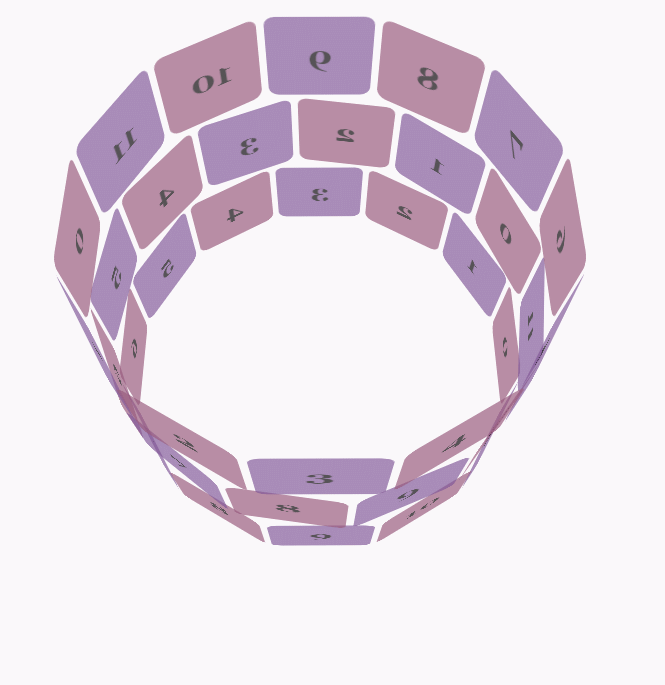
实例三,利用js+Transform和Animation实现3D动画
示例地址:https://webkit.org/blog-files/3d-transforms/poster-circle.html
只有webkit内核的浏览器才能看到相关3D动画效果。
实现效果如图所示:
css代码:
body {

        font-family: 'Lucida Grande', Verdana, Arial;

        font-size: 12px;

      }

      #stage {

        margin: 150px auto;

        width: 600px;

        height: 400px;

        -webkit-perspective:;

      }

      #rotate {

        margin: 0 auto;

        width: 600px;

        height: 400px;

        -webkit-transform-style: preserve-3d;

        -webkit-animation-name: x-spin;

        -webkit-animation-duration: 7s;

        -webkit-animation-iteration-count: infinite;

        -webkit-animation-timing-function: linear;

      }

      .ring {

        margin: 0 auto;

        height: 110px;

        width: 600px;

        -webkit-transform-style: preserve-3d;

        -webkit-animation-iteration-count: infinite;

        -webkit-animation-timing-function: linear;

      }

      .ring > :nth-child(odd) {

        background-color: #995C7F;

      }

      .ring > :nth-child(even) {

        background-color: #835A99;

      }

      .poster {

        position: absolute;

        left: 250px;

        width: 100px;

        height: 100px;

        opacity: 0.7;

        color: rgba(0,0,0,0.9);

        -webkit-border-radius: 10px;

      }

      .poster > p {

        font-family: 'Georgia', serif;

        font-size: 36px;

        font-weight: bold;

        text-align: center;

        margin-top: 28px;

      }

      #ring-1 {

        -webkit-animation-name: y-spin;

        -webkit-animation-duration: 5s;

      }

      #ring-2 {

        -webkit-animation-name: back-y-spin;

        -webkit-animation-duration: 4s;

      }

      #ring-3 {

        -webkit-animation-name: y-spin;

        -webkit-animation-duration: 3s;

      }

      @-webkit-keyframes x-spin {

        0%    { -webkit-transform: rotateX(0deg); }

        50%   { -webkit-transform: rotateX(180deg); }

        100%  { -webkit-transform: rotateX(360deg); }

      }

      @-webkit-keyframes y-spin {

        0%    { -webkit-transform: rotateY(0deg); }

        50%   { -webkit-transform: rotateY(180deg); }

        100%  { -webkit-transform: rotateY(360deg); }

      }

      @-webkit-keyframes back-y-spin {

        0%    { -webkit-transform: rotateY(360deg); }

        50%   { -webkit-transform: rotateY(180deg); }

        100%  { -webkit-transform: rotateY(0deg); }

      }
html代码:
<div id="stage">

  <div id="rotate">

    <div id="ring-1" class="ring"></div>

    <div id="ring-2" class="ring"></div>

    <div id="ring-3" class="ring"></div>

  </div>

</div>
js代码:
const POSTERS_PER_ROW = 12;

const RING_RADIUS = 200;

function setup_posters (row){

    var posterAngle = 360 / POSTERS_PER_ROW;

    for (var i = 0; i < POSTERS_PER_ROW; i ++) {

      var poster = document.createElement('div');

      poster.className = 'poster';

      var transform = 'rotateY(' + (posterAngle * i) + 'deg) translateZ(' + RING_RADIUS + 'px)';

      poster.style.webkitTransform = transform;

      var content = poster.appendChild(document.createElement('p'));

      content.textContent = i;

      row.appendChild(poster);

    }

}

function init (){

    setup_posters(document.getElementById('ring-1'));

    setup_posters(document.getElementById('ring-2'));

    setup_posters(document.getElementById('ring-3'));

}

window.addEventListener('load', init, false);
参考地址:
CSS参考手册:animation
CSS3动画属性:动画(animation)的更多相关文章
- android 帧动画,补间动画,属性动画的简单总结
帧动画——FrameAnimation 将一系列图片有序播放,形成动画的效果.其本质是一个Drawable,是一系列图片的集合,本身可以当做一个图片一样使用 在Drawable文件夹下,创建ani ...
- CSS3动画属性之Animation
首先定义一个动画规则: @keyframes mymove { from {top:0px;} to {top:200px;} } @-moz-keyframes mymove /* Firefox ...
- Android 动画——属性动画Property Animation
Android在3.0之前只提供了两种动画:View Animation .Drawable Animation .也就是我们在<Android 动画——Frame Animation与Twee ...
- Animation-list,帧动画+属性动画,做出Flash般的效果
我们会用到PS,即使不会也不要怂,只需要几步傻瓜式操作即可. 属性动画可以看看我另一篇文章:属性动画详解 效果图 相信机智的各位,看完之后一定能发挥创意,做出更酷更炫的效果 图层获取 首先你需要找一张 ...
- Android笔记(六十五) android中的动画——属性动画(propertyanimation)
补间动画只能定义起始和结束两个帧在“透明度”.“旋转”.“倾斜”.“位移”4个方面的变化,逐帧动画也只能是播放多个图片,无法满足我们日常复杂的动画需求,所以谷歌在3.0开始,推出了属性动画(prope ...
- Android 动画 属性动画 视图动画 补间动画 帧动画 详解 使用
Android动画 Property Animation res/animator/filename.xml In Java: R.animator.filename In XML: @[packag ...
- CSS3动画属性animation的用法
转载: 赞生博客 高端订制web开发工作组 » CSS3动画属性animation的用法 CSS3提供了一个令人心动的动画属性:animation,尽管利用animation做出来的动画没有flash ...
- 【属性动画总结】Property Animation
属性动画概述 3.0以前,android仅支持两种动画模式,tweened animation 和 frame-by-frame animation,在android3.0中又引入了一个新的动画系统: ...
- View动画和属性动画
在应用中, 动画效果提升用户体验, 主要分为View动画和属性动画. View动画变换场景图片效果, 效果包括平移(translate), 缩放(scale), 旋转(rotate), 透明(alph ...
- 属性动画详解 Interpolator TypeEvaluator
概述 产生原因 3.0以前,android支持两种动画模式,tween animation,frame animation,在android3.0中又引入了一个新的动画系统:prope ...
随机推荐
- Docker学习笔记-CentOS7镜像
前言: 环境:centos7.5 64 位 正文: 第一步:下载centos7镜像 docker pull centos 第二步:建立centos7的容器 sudo docker run --priv ...
- 《http权威指南》读书笔记14
概述 最近对http很感兴趣,于是开始看<http权威指南>.别人都说这本书有点老了,而且内容太多.我个人觉得这本书写的太好了,非常长知识,让你知道关于http的很多概念,不仅告诉你怎么做 ...
- jupyter notebook的安装与基本操作
0.前言 最近正在重温Python基础知识,为了方便练习敲代码,于是选择安装jupyter notebook作为代码编辑器. Project Jupyter exists to develop ope ...
- 神经网络架构PYTORCH-几个概念
使用Pytorch之前,有几个概念需要弄清楚. 什么是Tensors(张量)? 这个概念刚出来的时候,物理科班出身的我都感觉有点愣住了,好久没有接触过物理学的概念了. 这个概念,在物理学中怎么解释呢? ...
- Ubuntu16.04下安装opencv3.4.2
1.安装官方给的opencv依赖包 GCC 4.4.x or later CMake 2.6 or higher Git GTK+2.x or higher, including headers (l ...
- 使用Json封装scroll,已处理其兼容性问题
scroll.js /* 使用Json封装scroll */ function scroll(){ //标准模式(遵循W3C标准) if(pageYOffset!==null){ return { t ...
- Linux常用命令英文全称与中文解释
man: Manual 意思是手册,可以用这个命令查询其他命令的用法. pwd:Print working directory 意思是密码. su:Swith user 切换用户,切换到root用户 ...
- 项目ITP(四) javaweb http json 交互 in action (服务端 spring 手机端 提供各种工具类)勿喷!
前言 系列文章:[传送门] 洗了个澡,准备写篇博客.然后看书了.时间 3 7 分.我慢慢规律生活,向目标靠近. 很喜欢珍惜时间像叮当猫一样 正文 慢慢地,二维码实现签到将要落幕了.下篇文章出二维码实 ...
- MySQL表行数查询最佳实践
日常应用运维工作中,Dev或者db本身都需要统计表的行数,以此作为应用或者维护的一个信息参考.也许很多人会忽略select count(*) from table_name类似的sql对数据库性能的影 ...
- 【Apache Pulsar】Apache Pulsar单机环境及Go语言开发环境搭建
0x01 简介 Apache Pulsar是一个开源的分布式发布-订阅消息系统,与Kafka类似,但比后者更加强大.Pulsar最初由Yahoo开发并维护,目前已经成为Apache软件组织的一个孵化子 ...