炫酷CSS3垂直时间轴特效
<!DOCTYPE html>
<html lang="en"> <head>
<meta charset="UTF-8">
<meta name="viewport" content="width=device-width, initial-scale=1.0">
<meta http-equiv="X-UA-Compatible" content="ie=edge">
<link href="https://cdn.bootcss.com/bootstrap/3.3.7/css/bootstrap.min.css" rel="stylesheet">
<title>Document</title>
<style>
.main-timeline {
overflow: hidden;
position: relative;
} .main-timeline .timeline {
position: relative;
margin-top: -79px;
} .main-timeline .timeline:first-child {
margin-top: 0;
} .main-timeline .timeline:before,
.main-timeline .timeline:after {
content: "";
display: block;
width: 100%;
clear: both;
} .main-timeline .timeline:before {
content: "";
width: 100%;
height: 100%;
box-shadow: -8px 0 5px -5px rgba(0, 0, 0, 0.5) inset;
position: absolute;
top: 0;
right: 0;
z-index: 2;
} .main-timeline .timeline-icon {
width: 210px;
height: 210px;
border-radius: 50%;
border: 25px solid transparent;
border-top-color: #f44556;
border-right-color: #f44556;
margin: auto;
position: absolute;
top: 0;
left: 0;
bottom: 0;
right: 0;
z-index: 1;
transform: rotate(45deg);
} .main-timeline .year {
display: block;
width: 110px;
height: 110px;
line-height: 110px;
border-radius: 50%;
background: #fff;
box-shadow: 0 0 20px rgba(0, 0, 0, 0.4);
margin: auto;
font-size: 30px;
font-weight: bold;
color: #f44556;
text-align: center;
position: absolute;
top: 0;
left: 0;
bottom: 0;
right: 0;
transform: rotate(-45deg);
} .main-timeline .timeline-content {
width: 35%;
float: right;
background: #f44556;
padding: 30px 20px;
margin: 50px 0;
z-index: 1;
position: relative;
} .main-timeline .timeline-content:before {
content: "";
width: 20%;
height: 15px;
background: #f44556;
position: absolute;
top: 50%;
left: -20%;
z-index: -1;
transform: translateY(-50%);
} .main-timeline .title {
font-size: 20px;
font-weight: bold;
color: #fff;
margin: 0 0 10px 0;
} .main-timeline .description {
font-size: 16px;
color: #fff;
line-height: 24px;
margin: 0;
} .main-timeline .timeline:nth-child(2n):before {
box-shadow: 8px 0 5px -5px rgba(0, 0, 0, 0.5) inset;
} .main-timeline .timeline:nth-child(2n) .timeline-icon {
transform: rotate(-135deg);
} .main-timeline .timeline:nth-child(2n) .year {
transform: rotate(135deg);
} .main-timeline .timeline:nth-child(2n) .timeline-content {
float: left;
} .main-timeline .timeline:nth-child(2n) .timeline-content:before {
left: auto;
right: -20%;
} .main-timeline .timeline:nth-child(2n) .timeline-icon {
border-top-color: #e97e2e;
border-right-color: #e97e2e;
} .main-timeline .timeline:nth-child(2n) .year {
color: #e97e2e;
} .main-timeline .timeline:nth-child(2n) .timeline-content,
.main-timeline .timeline:nth-child(2n) .timeline-content:before {
background: #e97e2e;
} .main-timeline .timeline:nth-child(3n) .timeline-icon {
border-top-color: #13afae;
border-right-color: #13afae;
} .main-timeline .timeline:nth-child(3n) .year {
color: #13afae;
} .main-timeline .timeline:nth-child(3n) .timeline-content,
.main-timeline .timeline:nth-child(3n) .timeline-content:before {
background: #13afae;
} .main-timeline .timeline:nth-child(4n) .timeline-icon {
border-top-color: #105572;
border-right-color: #105572;
} .main-timeline .timeline:nth-child(4n) .year {
color: #105572;
} .main-timeline .timeline:nth-child(4n) .timeline-content,
.main-timeline .timeline:nth-child(4n) .timeline-content:before {
background: #105572;
} @media only screen and (max-width: 1199px) {
.main-timeline .timeline {
margin-top: -103px;
} .main-timeline .timeline-content:before {
left: -18%;
} .main-timeline .timeline:nth-child(2n) .timeline-content:before {
right: -18%;
}
} @media only screen and (max-width: 990px) {
.main-timeline .timeline {
margin-top: -127px;
} .main-timeline .timeline-content:before {
left: -2%;
} .main-timeline .timeline:nth-child(2n) .timeline-content:before {
right: -2%;
}
} @media only screen and (max-width: 767px) {
.main-timeline .timeline {
margin-top: 0;
overflow: hidden;
} .main-timeline .timeline:before,
.main-timeline .timeline:nth-child(2n):before {
box-shadow: none;
} .main-timeline .timeline-icon,
.main-timeline .timeline:nth-child(2n) .timeline-icon {
margin-top: -30px;
margin-bottom: 20px;
position: relative;
transform: rotate(135deg);
} .main-timeline .year,
.main-timeline .timeline:nth-child(2n) .year {
transform: rotate(-135deg);
} .main-timeline .timeline-content,
.main-timeline .timeline:nth-child(2n) .timeline-content {
width: 100%;
float: none;
border-radius: 0 0 20px 20px;
text-align: center;
padding: 25px 20px;
margin: 0 auto;
} .main-timeline .timeline-content:before,
.main-timeline .timeline:nth-child(2n) .timeline-content:before {
width: 15px;
height: 25px;
position: absolute;
top: -22px;
left: 50%;
z-index: -1;
transform: translate(-50%, 0);
}
}
</style>
</head> <body>
<div class="demo">
<div class="container">
<div class="row">
<div class="col-md-12">
<div class="main-timeline">
<div class="timeline">
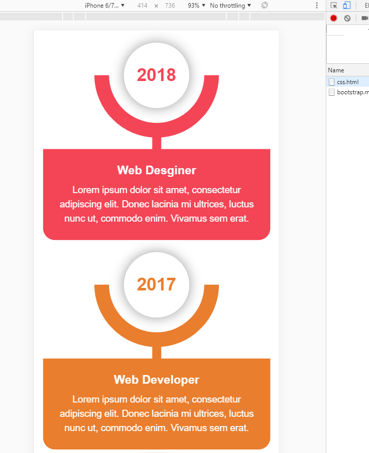
<div class="timeline-icon"><span class="year">2018</span></div>
<div class="timeline-content">
<h3 class="title">Web Desginer</h3>
<p class="description">
Lorem ipsum dolor sit amet, consectetur adipiscing elit. Donec lacinia mi ultrices,
luctus nunc ut, commodo enim. Vivamus sem erat.
</p>
</div>
</div>
<div class="timeline">
<div class="timeline-icon"><span class="year">2017</span></div>
<div class="timeline-content">
<h3 class="title">Web Developer</h3>
<p class="description">
Lorem ipsum dolor sit amet, consectetur adipiscing elit. Donec lacinia mi ultrices,
luctus nunc ut, commodo enim. Vivamus sem erat.
</p>
</div>
</div>
<div class="timeline">
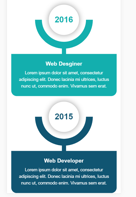
<div class="timeline-icon"><span class="year">2016</span></div>
<div class="timeline-content">
<h3 class="title">Web Desginer</h3>
<p class="description">
Lorem ipsum dolor sit amet, consectetur adipiscing elit. Donec lacinia mi ultrices,
luctus nunc ut, commodo enim. Vivamus sem erat.
</p>
</div>
</div>
<div class="timeline">
<div class="timeline-icon"><span class="year">2015</span></div>
<div class="timeline-content">
<h3 class="title">Web Developer</h3>
<p class="description">
Lorem ipsum dolor sit amet, consectetur adipiscing elit. Donec lacinia mi ultrices,
luctus nunc ut, commodo enim. Vivamus sem erat.
</p>
</div>
</div>
</div>
</div>
</div>
</div>
</div>
</body> </html>
效果:移动和PC端

内容来源于链接https://www.toutiao.com/i6738373341314286088/
炫酷CSS3垂直时间轴特效的更多相关文章
- HTML5+CSS3实现的响应式垂直时间轴
<!DOCTYPE HTML><html><head><meta charset="utf-8"><meta name=&qu ...
- Jquery实现超酷的时间轴特效
Timeline时间轴Jquery特效是一款现在互联网上非常流行的一种布局结构,结合了瀑布流布局,最近很多网友问到这种特效,网站上有网友们分享过一款,功能虽然实现,但样式不太好看,今天就把它整理出来分 ...
- 10大炫酷的HTML5文字动画特效欣赏
文字是网页中最基本的元素,在CSS2.0时代,我们只能在网页上展示静态的文字,只能改变他的大小和颜色,显得枯燥无味.随着HTML5的发展,现在网页中的文字样式变得越来越丰富了,甚至出现了文字动画,HT ...
- html5跟随鼠标炫酷网站引导页动画特效
html5跟随鼠标炫酷网站引导页动画特效一款非常不错的引导页,文字效果渐变,鼠标跟随出绚丽的条纹.html5炫酷网站引导页,鼠标跟随出特效. 体验效果:http://hovertree.com/tex ...
- CSS3实现时间轴效果
原文:CSS3实现时间轴效果 最近打开电脑就能看到极客学院什么新用户vip免费一个月,就进去看看咯,这里就不说它的课程怎么滴了,里面实战路径图页面看到了这个效果: 有点像时间轴的赶脚,而且每一块鼠标悬 ...
- 基于jQuery发展历程时间轴特效代码
分享一款基于jQuery发展历程时间轴特效代码,带左右箭头,数字时间轴选项卡切换特效下载.效果图如下: 在线预览 源码下载 实现的代码. html代码: <div id="time ...
- 发展简史jQuery时间轴特效
发展简史jQuery时间轴特效.这是一款鼠标滚动到一定的高度动画显示企业发展时间轴特效.效果图如下: 在线预览 源码下载 实现的代码. html代码: <div class="wr ...
- 基于jQuery和CSS3炫酷图片3D旋转幻灯片特效
在线预览 源码下载 iPresenter是一款效果非常炫酷的jQuery和CSS3 3D旋转幻灯片特效插件.你可以使用它来制作产品展示.图片画廊或者各种幻灯片和轮播图特效.这款幻灯片插件的特点有: ...
- 基于HTML5 SVG和CSS3炫酷蹦床式图片切换特效
今天给大家分享一款效果非常炫酷的HTML5 SVG和CSS3蹦床式图片切换特效插件.该图片切换插件在进行图片切换时,整个屏幕就像一张大蹦床一样,将图片弹射出去,切换到另一张图片,效果非常有创意.效果图 ...
随机推荐
- /tmp/orbit-oracle/目录inode耗尽
[root@iZ25zpeock2Z orbit-oracle]# cd /[root@iZ25zpeock2Z /]# du -cks * |sort -nr|head -n 20du: canno ...
- SQL用法三(游标和Fetch)
/一般情况下,我们用SELECT这些查询语句时,都是针对的一行记录而言,如果要在查询分析器中对多行记录(即记录集)进行读取操作时,则需要使用到游标或WHILE等循环/以下内容摘自http://www. ...
- # Clion中编译多个cpp(实现单文件编译)
Clion中编译多个cpp(实现单文件编译) 在不做任何配置情况下,Clion工程下只能有一个main()函数,新建多个cpp会导致报main()函数重复定义的错误,所以默认情况下无法在一个工程下编译 ...
- php栈的定义和出栈、入栈的实现
栈是线性表的一种,他的特点是后入先出,可以这么理解,栈就像一个存东西的盒子,先放进去的在最底层,后放进去的在上层,因为上层的东西把底层的东西压住了,下层的想要出去就必须把上层的先拿开才行. 定义:栈是 ...
- php 简单的 单例模式
php单例模式简单说明 使用注意事项: 1.使用时不能用反射模式创建单例,否则会实例化一个新的对象 2.使用懒单例模式时注意线程安全问题 3.饿单例模式和懒单例模式构造方法都是 ...
- wc、iconv命令
一.wc:统计文件打印换行符,单词和字节数 语法: wc [OPTION] ... [FILE] ... wc [OPTION] ... --files0-from = F 描 ...
- mongodb 批量替换内容的语句
// 注意上面的集合要和下面的集合名称相同 db.rand_web_test.find( { 'content': /^.*要替换的字符串.*$/ } ).forEach( function (ite ...
- 服务端相关知识学习(五)之Zookeeper leader选举
在上一篇文章中我们大致浏览了zookeeper的启动过程,并且提到在Zookeeper的启动过程中leader选举是非常重要而且最复杂的一个环节.那么什么是leader选举呢?zookeeper为什么 ...
- HTML学习记录和总结
版权声明:本文为博主原创文章,遵循CC 4.0 BY-SA 版权协议,转载请附上原文出处链接及本声明. 作者:struct_mooc 博客地址:https://www.cnblogs.com/stru ...
- vue移动端出现遮罩层时在遮罩层滑动时禁止遮罩层下方页面滑动
h5页面 点击出现弹框时 在遮罩层上面滑动时 下方的页面会出现滑动现象 解决方法 我知道的有以下两种 在遮罩层标签上添加@touchmove.prevent 把遮罩层显示时把下方的父盒子css设置为固 ...