炫酷CSS3垂直时间轴特效
<!DOCTYPE html>
<html lang="en"> <head>
<meta charset="UTF-8">
<meta name="viewport" content="width=device-width, initial-scale=1.0">
<meta http-equiv="X-UA-Compatible" content="ie=edge">
<link href="https://cdn.bootcss.com/bootstrap/3.3.7/css/bootstrap.min.css" rel="stylesheet">
<title>Document</title>
<style>
.main-timeline {
overflow: hidden;
position: relative;
} .main-timeline .timeline {
position: relative;
margin-top: -79px;
} .main-timeline .timeline:first-child {
margin-top: 0;
} .main-timeline .timeline:before,
.main-timeline .timeline:after {
content: "";
display: block;
width: 100%;
clear: both;
} .main-timeline .timeline:before {
content: "";
width: 100%;
height: 100%;
box-shadow: -8px 0 5px -5px rgba(0, 0, 0, 0.5) inset;
position: absolute;
top: 0;
right: 0;
z-index: 2;
} .main-timeline .timeline-icon {
width: 210px;
height: 210px;
border-radius: 50%;
border: 25px solid transparent;
border-top-color: #f44556;
border-right-color: #f44556;
margin: auto;
position: absolute;
top: 0;
left: 0;
bottom: 0;
right: 0;
z-index: 1;
transform: rotate(45deg);
} .main-timeline .year {
display: block;
width: 110px;
height: 110px;
line-height: 110px;
border-radius: 50%;
background: #fff;
box-shadow: 0 0 20px rgba(0, 0, 0, 0.4);
margin: auto;
font-size: 30px;
font-weight: bold;
color: #f44556;
text-align: center;
position: absolute;
top: 0;
left: 0;
bottom: 0;
right: 0;
transform: rotate(-45deg);
} .main-timeline .timeline-content {
width: 35%;
float: right;
background: #f44556;
padding: 30px 20px;
margin: 50px 0;
z-index: 1;
position: relative;
} .main-timeline .timeline-content:before {
content: "";
width: 20%;
height: 15px;
background: #f44556;
position: absolute;
top: 50%;
left: -20%;
z-index: -1;
transform: translateY(-50%);
} .main-timeline .title {
font-size: 20px;
font-weight: bold;
color: #fff;
margin: 0 0 10px 0;
} .main-timeline .description {
font-size: 16px;
color: #fff;
line-height: 24px;
margin: 0;
} .main-timeline .timeline:nth-child(2n):before {
box-shadow: 8px 0 5px -5px rgba(0, 0, 0, 0.5) inset;
} .main-timeline .timeline:nth-child(2n) .timeline-icon {
transform: rotate(-135deg);
} .main-timeline .timeline:nth-child(2n) .year {
transform: rotate(135deg);
} .main-timeline .timeline:nth-child(2n) .timeline-content {
float: left;
} .main-timeline .timeline:nth-child(2n) .timeline-content:before {
left: auto;
right: -20%;
} .main-timeline .timeline:nth-child(2n) .timeline-icon {
border-top-color: #e97e2e;
border-right-color: #e97e2e;
} .main-timeline .timeline:nth-child(2n) .year {
color: #e97e2e;
} .main-timeline .timeline:nth-child(2n) .timeline-content,
.main-timeline .timeline:nth-child(2n) .timeline-content:before {
background: #e97e2e;
} .main-timeline .timeline:nth-child(3n) .timeline-icon {
border-top-color: #13afae;
border-right-color: #13afae;
} .main-timeline .timeline:nth-child(3n) .year {
color: #13afae;
} .main-timeline .timeline:nth-child(3n) .timeline-content,
.main-timeline .timeline:nth-child(3n) .timeline-content:before {
background: #13afae;
} .main-timeline .timeline:nth-child(4n) .timeline-icon {
border-top-color: #105572;
border-right-color: #105572;
} .main-timeline .timeline:nth-child(4n) .year {
color: #105572;
} .main-timeline .timeline:nth-child(4n) .timeline-content,
.main-timeline .timeline:nth-child(4n) .timeline-content:before {
background: #105572;
} @media only screen and (max-width: 1199px) {
.main-timeline .timeline {
margin-top: -103px;
} .main-timeline .timeline-content:before {
left: -18%;
} .main-timeline .timeline:nth-child(2n) .timeline-content:before {
right: -18%;
}
} @media only screen and (max-width: 990px) {
.main-timeline .timeline {
margin-top: -127px;
} .main-timeline .timeline-content:before {
left: -2%;
} .main-timeline .timeline:nth-child(2n) .timeline-content:before {
right: -2%;
}
} @media only screen and (max-width: 767px) {
.main-timeline .timeline {
margin-top: 0;
overflow: hidden;
} .main-timeline .timeline:before,
.main-timeline .timeline:nth-child(2n):before {
box-shadow: none;
} .main-timeline .timeline-icon,
.main-timeline .timeline:nth-child(2n) .timeline-icon {
margin-top: -30px;
margin-bottom: 20px;
position: relative;
transform: rotate(135deg);
} .main-timeline .year,
.main-timeline .timeline:nth-child(2n) .year {
transform: rotate(-135deg);
} .main-timeline .timeline-content,
.main-timeline .timeline:nth-child(2n) .timeline-content {
width: 100%;
float: none;
border-radius: 0 0 20px 20px;
text-align: center;
padding: 25px 20px;
margin: 0 auto;
} .main-timeline .timeline-content:before,
.main-timeline .timeline:nth-child(2n) .timeline-content:before {
width: 15px;
height: 25px;
position: absolute;
top: -22px;
left: 50%;
z-index: -1;
transform: translate(-50%, 0);
}
}
</style>
</head> <body>
<div class="demo">
<div class="container">
<div class="row">
<div class="col-md-12">
<div class="main-timeline">
<div class="timeline">
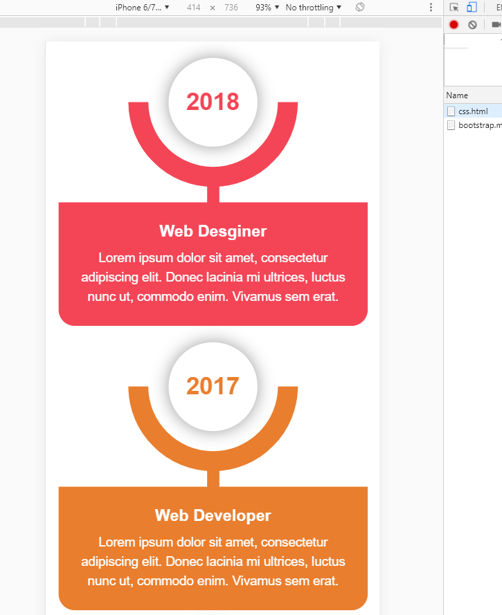
<div class="timeline-icon"><span class="year">2018</span></div>
<div class="timeline-content">
<h3 class="title">Web Desginer</h3>
<p class="description">
Lorem ipsum dolor sit amet, consectetur adipiscing elit. Donec lacinia mi ultrices,
luctus nunc ut, commodo enim. Vivamus sem erat.
</p>
</div>
</div>
<div class="timeline">
<div class="timeline-icon"><span class="year">2017</span></div>
<div class="timeline-content">
<h3 class="title">Web Developer</h3>
<p class="description">
Lorem ipsum dolor sit amet, consectetur adipiscing elit. Donec lacinia mi ultrices,
luctus nunc ut, commodo enim. Vivamus sem erat.
</p>
</div>
</div>
<div class="timeline">
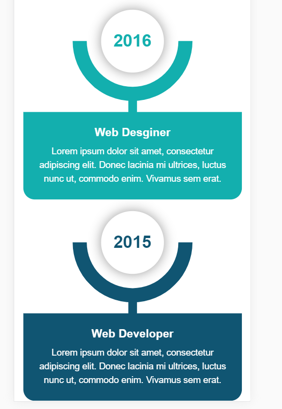
<div class="timeline-icon"><span class="year">2016</span></div>
<div class="timeline-content">
<h3 class="title">Web Desginer</h3>
<p class="description">
Lorem ipsum dolor sit amet, consectetur adipiscing elit. Donec lacinia mi ultrices,
luctus nunc ut, commodo enim. Vivamus sem erat.
</p>
</div>
</div>
<div class="timeline">
<div class="timeline-icon"><span class="year">2015</span></div>
<div class="timeline-content">
<h3 class="title">Web Developer</h3>
<p class="description">
Lorem ipsum dolor sit amet, consectetur adipiscing elit. Donec lacinia mi ultrices,
luctus nunc ut, commodo enim. Vivamus sem erat.
</p>
</div>
</div>
</div>
</div>
</div>
</div>
</div>
</body> </html>
效果:移动和PC端

内容来源于链接https://www.toutiao.com/i6738373341314286088/
炫酷CSS3垂直时间轴特效的更多相关文章
- HTML5+CSS3实现的响应式垂直时间轴
<!DOCTYPE HTML><html><head><meta charset="utf-8"><meta name=&qu ...
- Jquery实现超酷的时间轴特效
Timeline时间轴Jquery特效是一款现在互联网上非常流行的一种布局结构,结合了瀑布流布局,最近很多网友问到这种特效,网站上有网友们分享过一款,功能虽然实现,但样式不太好看,今天就把它整理出来分 ...
- 10大炫酷的HTML5文字动画特效欣赏
文字是网页中最基本的元素,在CSS2.0时代,我们只能在网页上展示静态的文字,只能改变他的大小和颜色,显得枯燥无味.随着HTML5的发展,现在网页中的文字样式变得越来越丰富了,甚至出现了文字动画,HT ...
- html5跟随鼠标炫酷网站引导页动画特效
html5跟随鼠标炫酷网站引导页动画特效一款非常不错的引导页,文字效果渐变,鼠标跟随出绚丽的条纹.html5炫酷网站引导页,鼠标跟随出特效. 体验效果:http://hovertree.com/tex ...
- CSS3实现时间轴效果
原文:CSS3实现时间轴效果 最近打开电脑就能看到极客学院什么新用户vip免费一个月,就进去看看咯,这里就不说它的课程怎么滴了,里面实战路径图页面看到了这个效果: 有点像时间轴的赶脚,而且每一块鼠标悬 ...
- 基于jQuery发展历程时间轴特效代码
分享一款基于jQuery发展历程时间轴特效代码,带左右箭头,数字时间轴选项卡切换特效下载.效果图如下: 在线预览 源码下载 实现的代码. html代码: <div id="time ...
- 发展简史jQuery时间轴特效
发展简史jQuery时间轴特效.这是一款鼠标滚动到一定的高度动画显示企业发展时间轴特效.效果图如下: 在线预览 源码下载 实现的代码. html代码: <div class="wr ...
- 基于jQuery和CSS3炫酷图片3D旋转幻灯片特效
在线预览 源码下载 iPresenter是一款效果非常炫酷的jQuery和CSS3 3D旋转幻灯片特效插件.你可以使用它来制作产品展示.图片画廊或者各种幻灯片和轮播图特效.这款幻灯片插件的特点有: ...
- 基于HTML5 SVG和CSS3炫酷蹦床式图片切换特效
今天给大家分享一款效果非常炫酷的HTML5 SVG和CSS3蹦床式图片切换特效插件.该图片切换插件在进行图片切换时,整个屏幕就像一张大蹦床一样,将图片弹射出去,切换到另一张图片,效果非常有创意.效果图 ...
随机推荐
- Python time strptime()方法
Python time strptime()方法 描述 Python time strptime() 函数根据指定的格式把一个时间字符串解析为时间元组. 语法 strptime()方法语法: time ...
- 【LOJ】#3032. 「JOISC 2019 Day1」馕
LOJ#3032. 「JOISC 2019 Day1」馕 处理出每个人把馕切成N段,每一段快乐度相同,我们选择第一个排在最前的人分给他的第一段,然后再在未选取的的人中选一个第二个排在最前的切一下,并把 ...
- SpringBoot起飞系列-数据访问(九)
一.前言 前边我们已经学些了开发的基本流程,最重要的一步来了,怎么样和数据库交互才是最重要的,毕竟没有数据那就相当于什么也没做,本文我们来学习使用springboot整合jdbc.mybatis.jp ...
- C++学习 之 程序的组成部分(部分知识笔记)
1.预处理器编译指令#include: 预处理器是在程序编译前运行的工具.预处理器编译指令是向预处理器发送的命令,总是以#为标识,include便是其中常见的一种,用于引用文件,比如:iostream ...
- C语言基础练习——最大值及其位置(二维数组)
C语言基础练习——最大值及其位置(二维数组) 时间限制: 1 Sec 内存限制: 10 MB 题目描述 有一个n×m的矩阵,要求编程序求出: 每行元素的最大值,以及其所在的行号和列号.求出所有元素的 ...
- 一个非常好用的php后台模板
http://www.h-ui.net/H-ui.admin.shtml
- 用python实现自己的http服务器——多进程、多线程、协程、单进程非堵塞版、epoll版
了解http协议 http请求头 GET / HTTP/1.1 Host: www.baidu.com Connection: keep-alive Pragma: no-cache Cache-Co ...
- T100——接口代码记录,jsonArray和json
{<section id="cs_t1client.description" >} #應用 a00 樣板自動產生(Version:) #+ Version..: T10 ...
- 使用Iview时候 报:no-parsing-error Parsing error: x-invalid-end-tag 解决办法
解决办法有两种解决办法: 1.MenuItem修改为:menu-item 2.在根目录下 .eslintrc.js 文件 rules 下添加: "vue/no-parsing-error&q ...
- Function(Of T) as T 泛型类型多态返回对象的实现
Shared Function ResultT(Of T As result)(msg As String, Optional success As Boolean = False) As T Dim ...