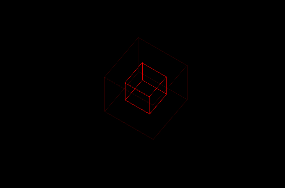
css3正方体
使用animation和调整页面角度做出来
<html lang="zh">

<head>

    <meta charset="UTF-8" />

    <title>Document</title>

    <style type="text/css">

        html{

    background: #;

    height: %;

}

/*最外层容器样式*/

.wrap{

    position: relative;

    position: absolute;

    top: ;

    right: ;

    bottom: ;

    left: ;

    width: 200px;

    height: 200px;

    margin: auto;

    /*改变左右上下,图片方块移动*/

}

/*包裹所有容器样式*/

.cube{

    width: 200px;

    height: 200px;

    margin:  auto;

    transform-style: preserve-3d;

    transform: rotateX(-30deg) rotateY(-80deg);

    -webkit-animation: rotate 20s infinite;

    /*匀速*/

    animation-timing-function: linear;

}

@-webkit-keyframes rotate{

    from{transform: rotateX(0deg) rotateY(0deg);}

    to{transform: rotateX(360deg) rotateY(360deg);}

}

.cube div{

    position: absolute;

    width: 200px;

    height: 200px;

    /*opacity: 0.2;*/

    transition: all .4s;

}

/*定义所有图片样式*/

.pic{

    opacity: 0.2;

    width: 200px;

    height: 200px;

    border: 1px solid red;

    background-size: % %;

}

.pic:hover{

    opacity: 0.9;

}

.cube .out_front{

    transform: rotateY(0deg) translateZ(100px);

}

.cube .out_back{

    transform: translateZ(-100px) rotateY(180deg);

}

.cube .out_left{

    transform: rotateY(90deg) translateZ(100px);

}

.cube .out_right{

    transform: rotateY(-90deg) translateZ(100px);

}

.cube .out_top{

    transform: rotateX(90deg) translateZ(100px);

}

.cube .out_bottom{

    transform: rotateX(-90deg) translateZ(100px);

}

/*定义小正方体样式*/

.cube span{

    display: bloack;

    width: 100px;

    height: 100px;

    position: absolute;

    top: 50px;

    left: 50px;

}

.cube .in_pic{

    width: 100px;

    height: 100px;

    border: 1px solid red;

    background-size: % %;

}

.cube .in_front{

    transform: rotateY(0deg) translateZ(50px);

}

.cube .in_back{

    transform: translateZ(-50px) rotateY(180deg);

}

.cube .in_left{

    transform: rotateY(90deg) translateZ(50px);

}

.cube .in_right{

    transform: rotateY(-90deg) translateZ(50px);

}

.cube .in_top{

    transform: rotateX(90deg) translateZ(50px);

}

.cube .in_bottom{

    transform: rotateX(-90deg) translateZ(50px);

}

/*鼠标移入后样式*/

.cube:hover .out_front{

    transform: rotateY(0deg) translateZ(200px);

}

.cube:hover .out_back{

    transform: translateZ(-200px) rotateY(180deg);

}

.cube:hover .out_left{

    transform: rotateY(90deg) translateZ(200px);

}

.cube:hover .out_right{

    transform: rotateY(-90deg) translateZ(200px);

}

.cube:hover .out_top{

    transform: rotateX(90deg) translateZ(200px);

}

.cube:hover .out_bottom{

    transform: rotateX(-90deg) translateZ(200px);

}

    </style>

</head>

<body>

    <!--/*外层最大容器*/-->

        <div class="wrap">

    <!--    /*包裹所有元素的容器*/-->

        <div class="cube">

            <!--前面图片 -->

            <div class="out_front">

                <div class="pic">

                </div>

            </div>

            <!--后面图片 -->

            <div class="out_back">

                <div class="pic">

                </div>

            </div>

            <!--左图片 -->

            <div class="out_left">

                <div class="pic">

                </div>

            </div>

            <div class="out_right">

                <div class="pic">

                </div>

            </div>

            <div class="out_top">

                <div class="pic">

                </div>

            </div>

            <div class="out_bottom">

                <div class="pic">

                </div>

            </div>

            <!--小正方体 -->

            <span class="in_front">

                <div class="in_pic">

                </div>

            </span>

            <span class="in_back">

                 <div class="in_pic">

                </div>

            </span>

            <span class="in_left">

                <div class="in_pic">

                </div>

            </span>

            <span class="in_right">

                <div class="in_pic">

                </div>

            </span>

            <span class="in_top">

                <div class="in_pic">

                </div>

            </span>

            <span class="in_bottom">

                <div class="in_pic">

                </div>

            </span>

        </div>

        </div>

</body>

</html>
页面效果:
css3正方体的更多相关文章
- 纯手写的css3正方体旋转效果
<!DOCTYPE html> <html> <head> <meta charset="UTF-8"> <title> ...
- css3 正方体旋转
<div class="contain"> <div class="box"> <div class="face one ...
- CSS3 正方体
<!DOCTYPE html><html lang="en"><head> <meta charset="UTF-8" ...
- css3正方体效果
<!doctype html> <html> <head> <meta charset="utf-8"> <title> ...
- css3实践之摩天轮式图片轮播+3D正方体+3D标签云(perspective、transform-style、perspective-origin)
本文主要通过摩天轮式图片轮播的例子来讲解与css3 3D有关的一些属性. demo预览: 摩天轮式图片轮播(貌似没兼容360 最好用chrome) 3D正方体(chrome only) 3D标签云(c ...
- 从零开始的全栈工程师——利用CSS3画一个正方体 ( css3 )
transform属性 CSS3的变形(transform)属性让元素在一个坐标系统中变形.transform属性的基本语法如下: transform:none | <transform-fun ...
- css3 利用perspective实现翻页效果和正方体 以及翻转效果
要点: 1 实现3D效果就需要使用perspective属性 1 页面旋转使用css3的rorate 2 使用backface-visibility 实现正面元素翻转之后背面不可见,显示出反面的元素 ...
- CSS3 制作正方体
一.预备知识 变形属性 2D变形属性 transform:他是css3中的变形属性: 通过transform(变形) 来实现2d 或者3d 转换,其中2d 有,缩放 scale(x, y) ,移动 t ...
- 用css3做一个正方体
<!DOCTYPE html> <html> <head> <meta charset="UTF-8"> <title> ...
随机推荐
- Javascript学习笔记三——操作DOM(二)
Javascript学习笔记 在我的上一个博客讲了对于DOM的基本操作内容,这篇继续巩固一下对于DOM的更新,插入和删除的操作. 对于HTML解析的DOM树来说,我们肯定会时不时对其进行一些更改,在原 ...
- JavaSE基础(三)--Java基础语法
Java 基础语法 一个 Java 程序可以认为是一系列对象的集合,而这些对象通过调用彼此的方法来协同工作.下面简要介绍下类.对象.方法和实例变量的概念. 对象:对象是类的一个实例,有状态和行为.例如 ...
- libmkl 学习笔记
libmkl 学习笔记 1.libkml下载地址为: https://github.com/libkml/libkml/releases 这里下载1.3.0版本 2.编译与安装 mkdir build ...
- [转帖]socks5 协议简介
socks5 协议简介 http://zhihan.me/network/2017/09/24/socks5-protocol/ 什么是socks5 或许你没听说过socks5,但你一定听说过Shad ...
- idea快捷生成
列模式: shift+alt+insert进入列选择模式,可选择一列或者多列 shift+alt+insert退出列选择模式 大小写转换: Ctrl + Shift + U 循环: iter 增强版 ...
- MySQL安装及初级增删改查一
学习MYsql 是参照这个维C果糖的总结,学习目录网址:https://blog.csdn.net/qq_35246620/article/details/70823903,谢谢大神的无私分享. 一. ...
- tomcat日志报Invalid message received with signature的解决办法
这位大神说的是正解,大家可以参考一下这个链接:https://blog.csdn.net/bugdongwenlong/article/details/84261424
- HashMap—— values() remove方法 containsKey()方法 containsValue()方法
values()方法:看下面的实例,就是把所有的value值封装成一个connection型的数组 Map<Integer,Student> students=new HashMap< ...
- Mac之常见问题
1. 在命令行下无法使用ll命令 需要设置命令的别名. 文件位置:-/.bash_profile source ~/.profile export PATH="/usr/local/opt/ ...
- jquery文件上传版 插件
/*! * jQuery Form Plugin * version: 4.2.2 * Requires jQuery v1.7.2 or later * Project repository: ht ...