
使用CoordinatorLayout打造各种炫酷的效果
自定义Behavior —— 仿知乎,FloatActionButton隐藏与展示
ViewPager,ScrollView 嵌套ViewPager滑动冲突解决
自定义 behavior - 完美仿 QQ 浏览器首页,美团商家详情页
CoordinatorLayout简介
CoordinatorLayout是在 Google IO/15 大会发布的,遵循Material 风格,包含在 support Library中,结合AppbarLayout, CollapsingToolbarLayout等 可 产生各种炫酷的效果
CoordinatorLayout简介通常用来 干什么
CoordinatorLayout is intended for two primary use cases:
As a top-level application decor or chrome layout
As a container for a specific interaction with one or more child views
简单来说就是
- 作为最上层的View
- 作为一个 容器与一个或者多个子View进行交互
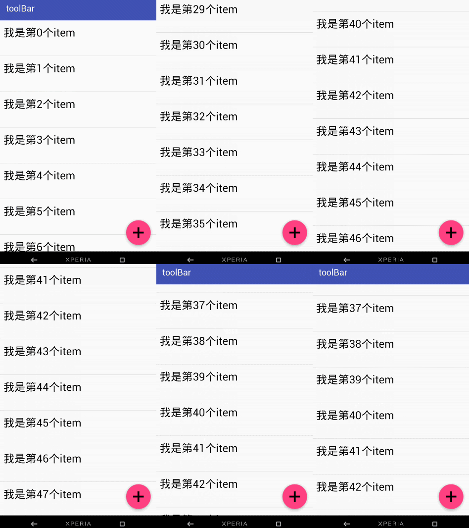
下面我们一起先来看一下我们实现的效果图
动态图
结合ToolBar
结合ViewPager

结合ViewPager的视觉特差

AppBarLayout
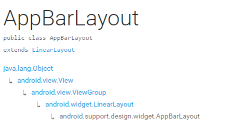
它是继承与LinearLayout的,默认 的 方向 是Vertical
| 类型 | 说明 |
|---|---|
| int SCROLL_FLAG_ENTER_ALWAYS | When entering (scrolling on screen) the view will scroll on any downwards scroll event, regardless of whether the scrolling view is also scrolling. |
| int SCROLL_FLAG_ENTER_ALWAYS_COLLAPSED | An additional flag for 'enterAlways' which modifies the returning view to only initially scroll back to it's collapsed height. |
| int SCROLL_FLAG_EXIT_UNTIL_COLLAPSED | When exiting (scrolling off screen) the view will be scrolled until it is 'collapsed'. |
| int SCROLL_FLAG_SCROLL | The view will be scroll in direct relation to scroll events. |
| int SCROLL_FLAG_SNAP | Upon a scroll ending, if the view is only partially visible then it will be snapped and scrolled to it's closest edge. |
| 类型 | 说明 |
|---|---|
| int SCROLL_FLAG_ENTER_ALWAYS | W((entering) / (scrolling on screen))下拉的时候,这个View也会跟着滑出。 |
| int SCROLL_FLAG_ENTER_ALWAYS_COLLAPSED | 另一种enterAlways,但是只显示折叠后的高度。 |
| int SCROLL_FLAG_EXIT_UNTIL_COLLAPSED | ((exiting) / (scrolling off screen))上拉的时候,这个View会跟着滑动直到折叠。 |
| int SCROLL_FLAG_SCROLL | 这个View将会响应Scroll事件 |
| int SCROLL_FLAG_SNAP | 在Scroll滑动事件结束以前 ,如果这个View部分可见,那么这个View会停在最接近当前View的位置 |
我们可以通过两种 方法设置这个Flag
- 方法一
setScrollFlags(int)
- 方法二
app:layout_scrollFlags="scroll|enterAlways"
注意事项
AppBarLayout必须作为CoordinatorLayout的直接子View,否则它的大部分功能将不会生效,如layout_scrollFlags等。
首先我们先来看一下我们 效果图一是怎样实现的
代码
<android.support.design.widget.CoordinatorLayout

    android:id="@+id/main_content"

    xmlns:android="http://schemas.android.com/apk/res/android"

    xmlns:app="http://schemas.android.com/apk/res-auto"

    android:layout_width="match_parent"

    android:layout_height="match_parent">

    <android.support.design.widget.AppBarLayout

        android:id="@+id/appbar"

        android:layout_width="match_parent"

        android:layout_height="wrap_content"

        android:theme="@style/ThemeOverlay.AppCompat.Dark.ActionBar">

        <android.support.v7.widget.Toolbar

            android:id="@+id/toolbar"

            android:layout_width="match_parent"

            android:layout_height="?attr/actionBarSize"

            android:background="?attr/colorPrimary"

            app:layout_scrollFlags="scroll|enterAlways"

            app:popupTheme="@style/ThemeOverlay.AppCompat.Light"/>

       .

    </android.support.design.widget.AppBarLayout>

    <android.support.v7.widget.RecyclerView

        android:id="@+id/recyclerView"

        android:layout_width="match_parent"

        android:layout_height="match_parent"

        app:layout_behavior="@string/appbar_scrolling_view_behavior"/>

    <android.support.design.widget.FloatingActionButton

        android:id="@+id/fab"

        android:layout_width="wrap_content"

        android:layout_height="wrap_content"

        android:layout_gravity="end|bottom"

        android:layout_margin="15dp"

        android:src="@drawable/add_2"/>

</android.support.design.widget.CoordinatorLayout>
思路 分析
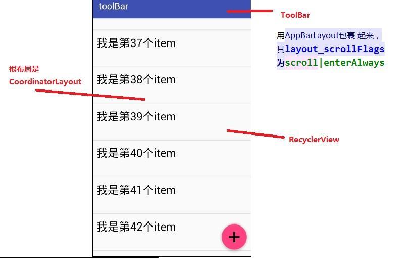
从图中我们可以知道 layout_scrollFlags="scroll|enterAlways,
前面已经说到layout_scrollFlags=scroll的时候,这个View会 跟着 滚动 事件响应,
layout_scrollFlags=“enterAlways”的时候 这个View会响应下拉事件
所以呈现出来的结果应该是我们在上拉的时候toolBar 会隐藏,下拉的时候toolBar会出来
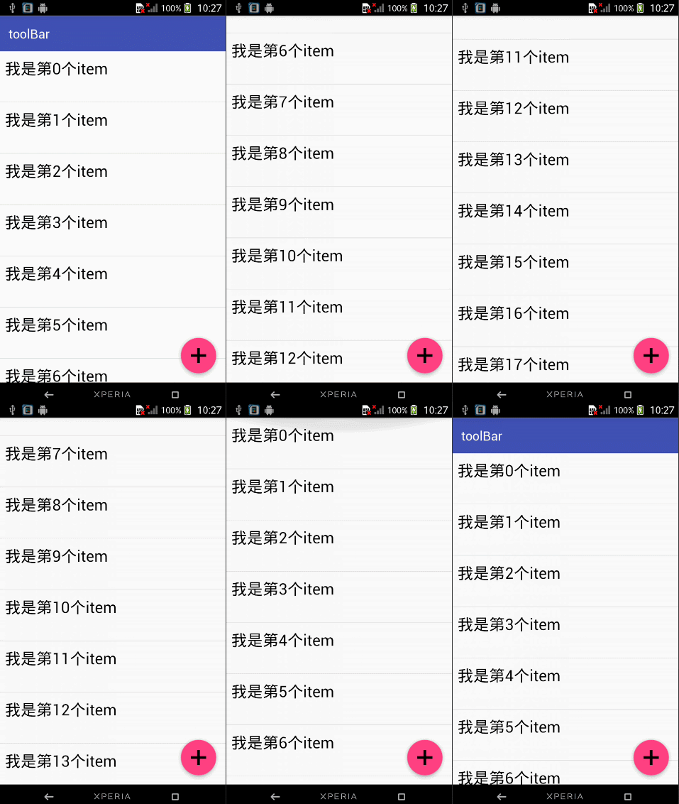
那如果当我们的toolBar 等于 app:layout_scrollFlags="scroll|snap"的时候 ,
layout_scrollFlags=scroll的时候,这个View会 跟着 滚动 事件响应,
layout_scrollFlags=“snap”的时候 在Scroll滑动事件结束以前 ,如果这个View部分可见,那么这个View会停在最接近当前View的位置。
综上呈现的效果如下,代码见ToolBarSampleSnar的布局文件
结合ViewPager
布局代码如下
<android.support.design.widget.CoordinatorLayout

    android:id="@+id/main_content"

    xmlns:android="http://schemas.android.com/apk/res/android"

    xmlns:app="http://schemas.android.com/apk/res-auto"

    android:layout_width="match_parent"

    android:layout_height="match_parent">

    <android.support.design.widget.AppBarLayout

        android:layout_width="match_parent"

        android:layout_height="250dp">

        <ImageView android:layout_width="match_parent"

                   android:layout_height="200dp"

                   android:background="?attr/colorPrimary"

                   android:scaleType="fitXY"

                   android:src="@drawable/tangyan"

                   app:layout_scrollFlags="scroll|enterAlways"/>

        <android.support.design.widget.TabLayout

            android:id="@+id/tabs"

            android:layout_width="match_parent"

            android:layout_height="wrap_content"

            android:layout_alignParentBottom="true"

            android:background="?attr/colorPrimary"

            app:tabIndicatorColor="@color/colorAccent"

            app:tabIndicatorHeight="4dp"

            app:tabSelectedTextColor="#000"

            app:tabTextColor="#fff"/>

    </android.support.design.widget.AppBarLayout>

    <android.support.v4.view.ViewPager

        android:id="@+id/viewpager"

        android:layout_width="match_parent"

        android:layout_height="match_parent"

        app:layout_behavior="@string/appbar_scrolling_view_behavior"/>

    <android.support.design.widget.FloatingActionButton

        android:id="@+id/fab"

        android:layout_width="wrap_content"

        android:layout_height="wrap_content"

        android:layout_gravity="end|bottom"

        android:layout_margin="15dp"

        android:src="@drawable/add_2"/>

</android.support.design.widget.CoordinatorLayout>
思路分析
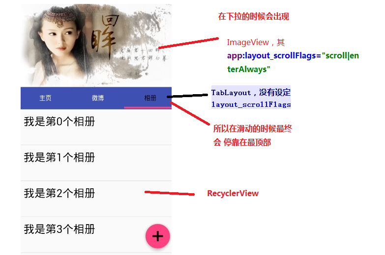
其实相对于前 一个例子,只是把 摆放RecyclerView 的位置替换成ViewPager而已,为了有页面导航器的效果,再使用 TabLayout而已,而TabLayout 在我们滑动的时候最终会停靠在 最顶部,是因为我们没有设置其layout_scrollFlags,即TabLayout是静态的
运行以后,即可看到以下的结果
下面我们一起来看一下 TabLayout是怎样结合ViewPager直线 导航器的效果的
代码注释 里面已经解释地很清楚了 ,这里我就不解释了
public class ViewPagerSample extends AppCompatActivity {

    ViewPager mViewPager;

    List<Fragment> mFragments;

    String[] mTitles = new String[]{

            "主页", "微博", "相册"

    };

    private TabLayout mTabLayout;

    @Override

    protected void onCreate(Bundle savedInstanceState) {

        super.onCreate(savedInstanceState);

        setContentView(R.layout.activity_third);

        // 第一步,初始化ViewPager和TabLayout

        mViewPager = (ViewPager) findViewById(R.id.viewpager);

        mTabLayout = (TabLayout) findViewById(R.id.tabs);

        setupViewPager();

    }

    private void setupViewPager() {

        mFragments = new ArrayList<>();

        for (int i = 0; i < mTitles.length; i++) {

            ListFragment listFragment = ListFragment.newInstance(mTitles[i]);

            mFragments.add(listFragment);

        }

        // 第二步:为ViewPager设置适配器

        BaseFragmentAdapter adapter =

                new BaseFragmentAdapter(getSupportFragmentManager(), mFragments, mTitles);

        mViewPager.setAdapter(adapter);

        //  第三步:将ViewPager与TableLayout 绑定在一起

        mTabLayout.setupWithViewPager(mViewPager);

    }

}
如果我们想更改Indicator的相关样式,我们可以在布局文件里面使用
<android.support.design.widget.TabLayout

    android:id="@+id/tabs"

    android:layout_width="match_parent"

    android:layout_height="wrap_content"

    android:layout_alignParentBottom="true"

    android:background="?attr/colorPrimary"

    app:tabIndicatorColor="@color/colorAccent"

    app:tabIndicatorHeight="4dp"

    app:tabSelectedTextColor="#000"

    app:tabTextColor="#fff"/>
如果你不想使用Google 帮我们 封装好的控件的话,你也可以自己自定义一个控件,你可以参考我的这一篇博客仿网易新闻的顶部导航指示器
在看例子结合ViewPager的视觉特差之前 ,我们需要先了解CollapsingToolbarLayout这个控件
CollapsingToolbarLayout
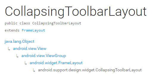
CollapsingToolbarLayout继承与FrameLayout,官网地址,请自备梯子。
简单来说 ,CollapsingToolbarLayout是工具栏的包装器,它通常作为AppBarLayout的孩子。主要实现以下功能
- Collapsing title(可以折叠 的 标题 )
- Content scrim(内容装饰),当我们滑动的位置 到达一定阀值的时候,内容 装饰将会被显示或者隐藏
- Status bar scrim(状态栏布)
- Parallax scrolling children,滑动的时候孩子呈现视觉特差效果
- Pinned position children,固定位置的 孩子
下面我们一起来看一下几个常量
| 常量 | 解释说明 |
|---|---|
| int COLLAPSE_MODE_OFF | The view will act as normal with no collapsing behavior.(这个 View将会 呈现正常的结果,不会表现出折叠效果) |
| int COLLAPSE_MODE_PARALLAX | The view will scroll in a parallax fashion. See setParallaxMultiplier(float) to change the multiplier used.(在滑动的时候这个View 会呈现 出 视觉特差效果 ) |
| int COLLAPSE_MODE_PIN | The view will pin in place until it reaches the bottom of the CollapsingToolbarLayout.(当这个View到达 CollapsingToolbarLayout的底部的时候,这个View 将会被放置,即代替整个CollapsingToolbarLayout) |
我们有两种方法可以设置这个常量,
方法一:在代码中使用这个方法
setCollapseMode(int collapseMode)
方法 二:在布局文件中使用自定义属性
app:layout_collapseMode="pin"
到此 ,CollapsingToolbarLayout的一些重要属性已经讲解完毕,下面我们一起来看一下我们是怎样结合ViewPager实现视差效果的
结合ViewPager的视觉特差
布局代码
<?xml version="1.0" encoding="utf-8"?>

<android.support.design.widget.CoordinatorLayout

    xmlns:android="http://schemas.android.com/apk/res/android"

    xmlns:app="http://schemas.android.com/apk/res-auto"

    android:layout_width="match_parent"

    android:layout_height="match_parent"

    android:background="@android:color/background_light"

    android:fitsSystemWindows="true"

>

    <android.support.design.widget.AppBarLayout

        android:id="@+id/main.appbar"

        android:layout_width="match_parent"

        android:layout_height="300dp"

        android:fitsSystemWindows="true"

        android:theme="@style/ThemeOverlay.AppCompat.Dark.ActionBar"

    >

        <android.support.design.widget.CollapsingToolbarLayout

            android:id="@+id/main.collapsing"

            android:layout_width="match_parent"

            android:layout_height="250dp"

            android:fitsSystemWindows="true"

            app:contentScrim="?attr/colorPrimary"

            app:expandedTitleMarginEnd="64dp"

            app:expandedTitleMarginStart="48dp"

            app:layout_scrollFlags="scroll|exitUntilCollapsed"

        >

            <ImageView

                android:id="@+id/main.backdrop"

                android:layout_width="match_parent"

                android:layout_height="match_parent"

                android:fitsSystemWindows="true"

                android:scaleType="centerCrop"

                android:src="@drawable/tangyan"

                app:layout_collapseMode="parallax"

            />

            <android.support.v7.widget.Toolbar

                android:id="@+id/toolbar"

                android:layout_width="match_parent"

                android:layout_height="?attr/actionBarSize"

                app:layout_collapseMode="pin"

                app:popupTheme="@style/ThemeOverlay.AppCompat.Light"

            />

        </android.support.design.widget.CollapsingToolbarLayout>

        <android.support.design.widget.TabLayout

            android:id="@+id/tabs"

            android:layout_width="match_parent"

            android:layout_height="wrap_content"

            android:layout_alignParentBottom="true"

            android:background="?attr/colorPrimary"

            app:tabIndicatorColor="@color/colorAccent"

            app:tabIndicatorHeight="4dp"

            app:tabSelectedTextColor="#000"

            app:tabTextColor="#fff"/>

    </android.support.design.widget.AppBarLayout>

    <android.support.v4.view.ViewPager

            android:id="@+id/viewpager"

            android:layout_width="match_parent"

            android:layout_height="match_parent"

            app:layout_behavior="@string/appbar_scrolling_view_behavior">

    </android.support.v4.view.ViewPager>

    <android.support.design.widget.FloatingActionButton

        android:id="@+id/fab"

        android:layout_width="wrap_content"

        android:layout_height="wrap_content"

        android:layout_gravity="end|bottom"

        android:layout_margin="15dp"

        android:src="@drawable/add_2"/>

</android.support.design.widget.CoordinatorLayout>
效果图如下
思路解析
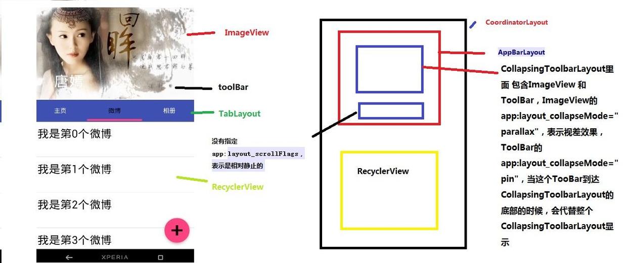
结构图如图片所示,先说明CollapsingToolbarLayout的变化
CollapsingToolbarLayout里面 包含ImageView 和ToolBar,ImageView的app:layout_collapseMode="parallax",表示视差效果,ToolBar的 app:layout_collapseMode="pin",当这个TooBar到达 CollapsingToolbarLayout的底部的时候,会代替整个CollapsingToolbarLayout显示
接着说明TabLayout的变化
从前面的描述我们已经知道当 没有指定app:layout_scrollFlags的时候,最终TabLayout会静止,不会随着滑动的 时候消失不见
拓展
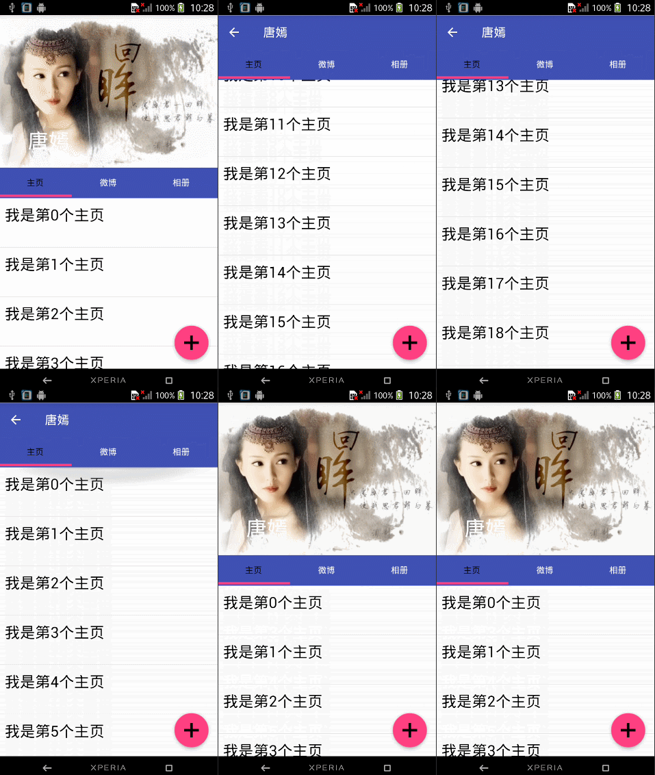
如果我们仅仅 改变CollapsingToolbarLayout的app:layout_scrollFlags="scroll|exitUntilCollapsed|snap"的时候,其它代码不变,运行以后,我们将可以看到如下效果图
总结
这篇博客主要讲解了CoordinatorLayout,AppBarLayout,CollapsingToolbarLayout的一些相关属性。
- 对于AppBarLayout,我们主要 讲解了这个属性app:layout_scrollFlags,设置不同 的属性我们可以在滚动的时候显示不同 的效果
- 对于CollapsingToolbarLayout,我们主要讲解了app:layout_collapseMode这个属性,设置不同的值,我们可以让其子View呈现不同的 炫酷效果,如parallax和pin等
CoordinatorLayout的相关用法还有很多,有兴趣 了解的请自行阅读: 官方文档地址
题外话
CoordinatorLayout这个控件真的很强大,使用它可以实现各种炫酷的效果,简化了开发者的许多工作,有能力的话可以去研究一下源码 ,看是怎样实现的?
参考文章:android-[译]掌握CoordinatorLayout
源码下载地址:https://github.com/gdutxiaoxu/CoordinatorLayoutExample.git
欢迎大家关注我的微信公众号号 stormjun949(徐公码字),即可关注。 目前专注于 Android 开发,主要分享 Android开发相关知识和一些相关的优秀文章,包括个人总结,职场经验等。

使用CoordinatorLayout打造各种炫酷的效果的更多相关文章
- 2019基于Hexo快速搭建个人博客,打造一个炫酷博客(1)-奥怪的小栈
本文转载于:奥怪的小栈 这篇文章告诉你如何在2019快速上手搭建一个像我一样的博客:基于HEXO+Github搭建.并完成SEO优化,打造一个炫酷博客. 本站基于HEXO+Github搭建.所以你需要 ...
- 教你用canvas打造一个炫酷的碎片切图效果
前言 今天分享一个炫酷的碎片式切图效果,这个其实在自己的之前的博客上有实现过,本人觉得这个效果还是挺炫酷的,这次还是用我们的canvas来实现,代码量不多,但有些地方还是需要花点时间去理解的,需要点数 ...
- HTML5打造的炫酷本地音乐播放器-喵喵Player
将之前捣腾的音乐频谱效果加上一个播放列表就成了现在的喵喵播放器(Meow meow Player,额知道这名字很二很装萌~),全HTML5打造的网页程序,可本地运行也可以挂服务器上用. 在线Demo及 ...
- HTML5 canvas炫酷棱镜效果的幻灯片特效
这是一款效果很炫酷华丽的HTML5 canvas带棱镜效果的幻灯片特效. 这个特效在每个幻灯片的前面放置一个图形.并将图形制作为三棱镜效果.它底下的幻灯片图片会被"折射"到棱镜上面 ...
- 2019Hexo博客Next主题深度美化 打造一个炫酷博客(2)-奥怪的小栈
219/8/1 更新 本文转载于:奥怪的小栈 这篇文章告诉你在搭建好博客后,面对网上千篇一律的美化教程怎么才能添加自己独特点,使人眼前一亮. 本站基于HEXO+Github搭建. 所以你需要准备好HE ...
- 利用UIWebView打造一个炫酷的视频背景视图(OC & Swift)
http://www.cocoachina.com/ios/20151023/13860.html 2015-10-6更新:适配 Swift2.0 如有需要,可以通过pjin.elvin@gmail. ...
- 使用css3变量创建炫酷悬停效果
原文地址:www.zcfy.cc/article/stunning-hover-effects-with-css-variables 效果: 主要使用css中的var做动画效果,代码如下: <! ...
- 高仿京东到家APP引导页炫酷动画效果
前言 京东到家APP的引导页做的可圈可点,插画+动效,简明生动地说明了APP最吸引用户的几个亮点(商品多,价格低,配送快...).本文主要分析拆解这些动画效果,并完成一个高仿Demo,完整的Demo代 ...
- vue+canvas实现炫酷时钟效果的倒计时插件(已发布到npm的vue2插件,开箱即用)
前言: 此事例是在vue组件中,使用canvas实现倒计时动画的效果.其实,实现效果的逻辑跟vue没有关系,只要读懂canvas如何实现效果的这部分逻辑就可以了 canvas动画的原理:利用定时器,给 ...
随机推荐
- Streaming-大数据的未来
分享一篇关于实时流式计算的经典文章,这篇文章名为Streaming 101: The world beyond batch 那么流计算如何超越批处理呢? 从这几个方面说明:实时流计算系统,数据处理模式 ...
- (四)Lock,ReentrantLock,ReentrantReadWriteLock类的使用以及相关api---synchronized进阶
这篇博客记录了Lock,ReentrantLock,ReentrantReadWriteLock类的使用以及其一些api: 码字不易~~另外<java多线程编程核心技术>这本书读着很爽 前 ...
- 《Java 8 in Action》Chapter 1:为什么要关心Java 8
自1998年 JDK 1.0(Java 1.0) 发布以来,Java 已经受到了学生.项目经理和程序员等一大批活跃用户的欢迎.这一语言极富活力,不断被用在大大小小的项目里.从 Java 1.1(199 ...
- Linux环境搭建 | 手把手教你配置Linux虚拟机
在上一节 「手把你教你安装Linux虚拟机」 里,我们已经安装好了Linux虚拟机,在这一节里,我们将配置安装好的Linux虚拟机,使其达到可以开发的程度. Ubuntu刚安装完毕之后,还无法进行开发 ...
- deepin 15.11 安装 pyenv
GitHub:官方环境:https://github.com/pyenv/pyenv/wiki/Common-build-problems GitHub:官方文档:https://github.com ...
- MSIL实用指南-生成foreach语句
foreach可以迭代数组或者一个集合对象.foreach语句格式是它的生成步骤是foreach (<成员> in <集合>) <循环体> 一.声明三个变量,loc ...
- C#开发BIMFACE系列1 BIMFACE 简介
系列目录 [已更新最新开发文章,点击查看详细] BIMFACE 是什么 BIMFACE = 国内领先的BIM轻量化引擎 BIMFACE 是广联达公司旗下的一款具有完全自主知识产权的BIM轻量化 ...
- hdu-6681 Rikka with Cake
题目链接 hdu-6681 Problem Description Rikka's birthday is on June 12th. The story of this problem happen ...
- lightoj 1061 - N Queen Again(状压dp)
题目链接:http://www.lightoj.com/volume_showproblem.php?problem=1061 题解:显然能满足情况的8皇后的摆法不多,于是便可以用题目给出的状态来匹配 ...
- CodeForces Educational Codeforces Round 51 (Rated for Div. 2)
A:Vasya And Password 代码: #include<bits/stdc++.h> using namespace std; #define Fopen freopen(&q ...