纯CSS实现内容放大缩小效果
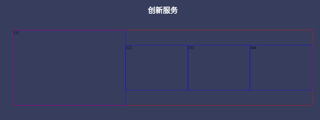
先搭架子
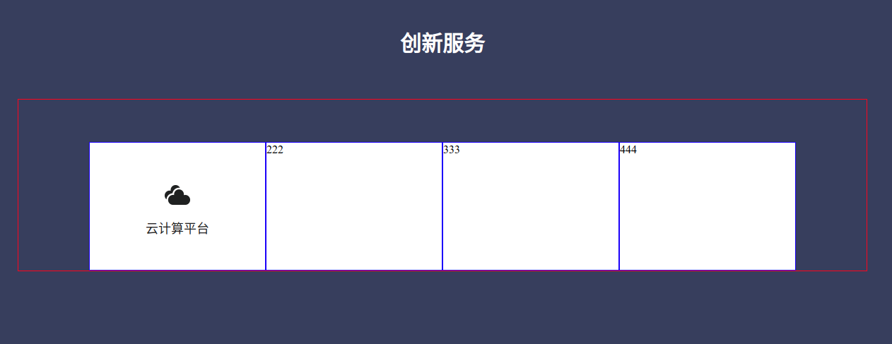
再实现第一个内容

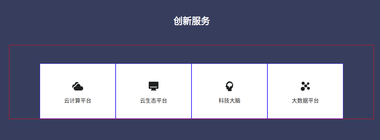
填充更多内容
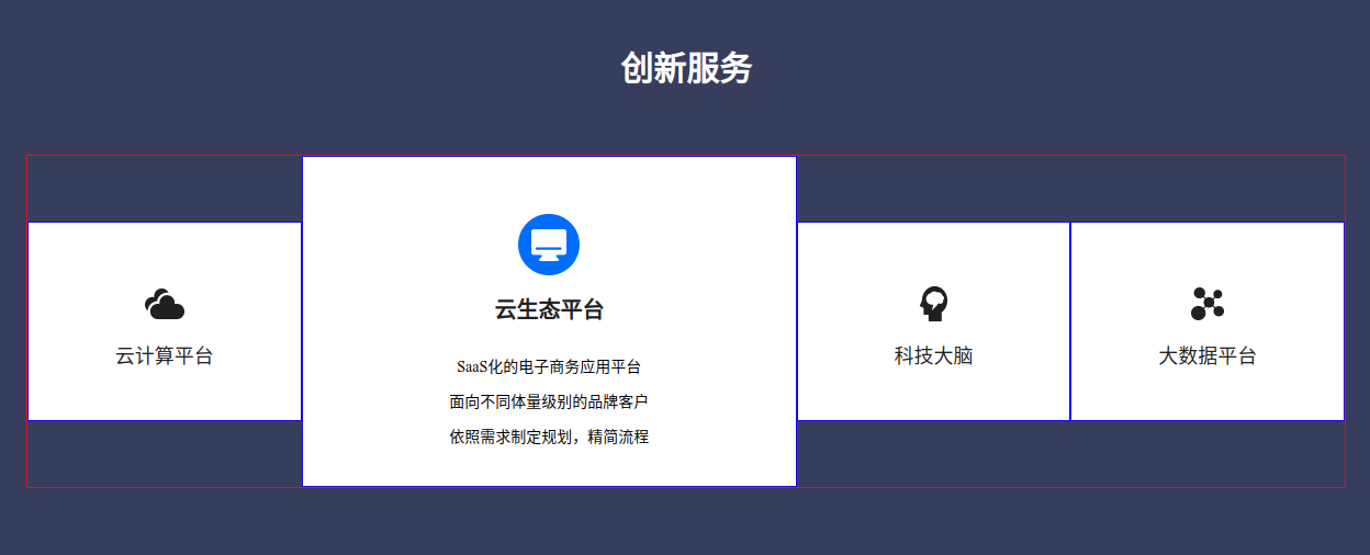
拆掉border,查看最终效果
html代码
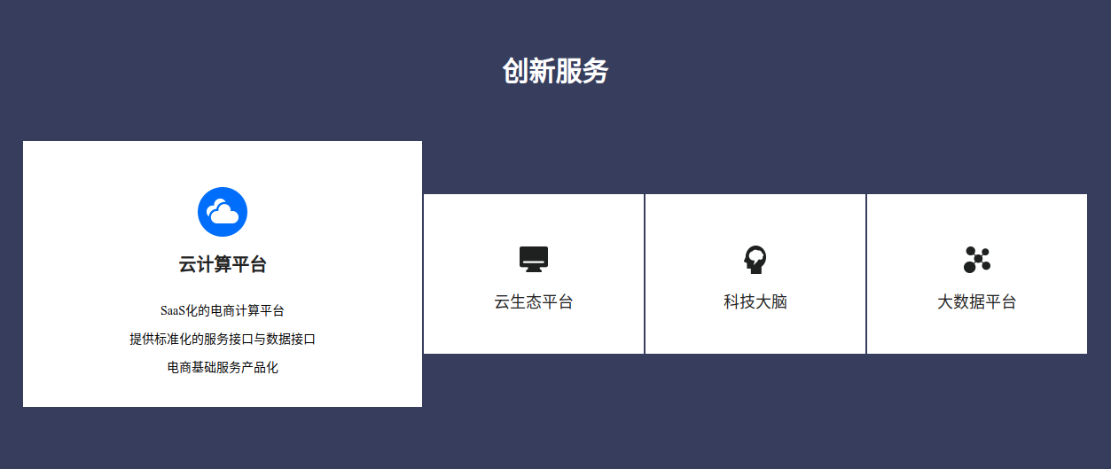
<!-- 服务 -->
<div class="service">
<div class="service-title">
创新服务
</div>
<div class="service-container">
<div class="service-item">
<div class="service-item-common">
<div class="service-item-icon">
<img src="/Index/Index/image/innovate/yunjisuan.png" alt="">
</div>
<div class="service-item-title">
云计算平台
</div>
</div>
<div class="service-item-hover">
<div class="service-item-icon-hover">
<img src="/Index/Index/image/innovate/yunjisuan1.png" alt="">
</div>
<div class="service-item-title-hover">
云计算平台
</div>
<div class="service-item-content-hover">
<p>SaaS化的电商计算平台</p>
<p>提供标准化的服务接口与数据接口<p>
<p>电商基础服务产品化<p>
</div>
</div>
</div>
<div class="service-item">
<div class="service-item-common">
<div class="service-item-icon">
<img src="/Index/Index/image/innovate/yunshengtai.png" alt="">
</div>
<div class="service-item-title">
云生态平台
</div>
</div>
<div class="service-item-hover">
<div class="service-item-icon-hover">
<img src="/Index/Index/image/innovate/yunshengtai1.png" alt="">
</div>
<div class="service-item-title-hover">
云生态平台
</div>
<div class="service-item-content-hover">
<p>SaaS化的电子商务应用平台</p>
<p>面向不同体量级别的品牌客户<p>
<p>依照需求制定规划,精简流程<p>
<!-- <p>优化预算支出与业务能力<p>-->
</div>
</div>
</div>
<div class="service-item">
<div class="service-item-common">
<div class="service-item-icon">
<img src="/Index/Index/image/innovate/danao.png" alt="">
</div>
<div class="service-item-title">
科技大脑
</div>
</div>
<div class="service-item-hover">
<div class="service-item-icon-hover">
<img src="/Index/Index/image/innovate/danao1.png" alt="">
</div>
<div class="service-item-title-hover">
科技大脑
</div>
<div class="service-item-content-hover">
<p>用AI技术解决电商场景问题,轻松实现提升</p>
<p>基于大数据和深度学习,识别图片、视频中的视觉内容<p>
<p>构建知识图谱,挖掘潜在商业机会<p>
</div>
</div>
</div>
<div class="service-item">
<div class="service-item-common">
<div class="service-item-icon">
<img src="/Index/Index/image/innovate/dashuju.png" alt="">
</div>
<div class="service-item-title">
大数据平台
</div>
</div>
<div class="service-item-hover">
<div class="service-item-icon-hover">
<img src="/Index/Index/image/innovate/dashuju1.png" alt="">
</div>
<div class="service-item-title-hover">
大数据平台
</div>
<div class="service-item-content-hover">
<p>以核心技术能力为依托,提供数据产品和分析服务</p>
<p>AI人工智能决策<p>
<!-- <p>与国内外知名学府深度合作智能工具<p>-->
<p>提升商业效率,开拓业务场景,优化用户体验<p>
</div>
</div>
</div>
</div>
</div>
css代码
.service {

    height: 608px;

    background-color: #373F5E;

    .service-title {

        font-size: 30px;

        font-weight: bold;

        color: #FFFFFF;

        margin-top: 100px;

        text-align: center;

    }

    .service-container {

        width: 1200px;

        //border:1px solid red;

        margin:0 auto;

        margin-top: 60px;

        display: flex;

        justify-content: center;

        .service-item {

            width: 248px;

            height: 180px;

            //border:1px solid blue;

            margin-top: 60px;

            transition: all 0.4s ease; /* 柔和过渡 */

            background-color: #FFFFFF;

            .service-item-icon {

                display: flex;

                justify-content: center;

                margin-top: 56px;

            }

            .service-item-title {

                font-size: 18px;

                color: #222222;

                text-align: center;

                margin-top: 20px;

            }

            .service-item-hover {

                display: none;

            }

        }

        .service-item:hover {

            //transform: scale(1.66, 1.66); /* 其他元素位移不会变动 */

            width: 450px;

            height: 300px;

            margin-top: 0px;

            .service-item-common {

                display: none;

            }

            .service-item-hover {

                display: block;

                .service-item-icon-hover {

                    display: flex;

                    justify-content: center;

                    margin-top: 52px;

                }

                .service-item-title-hover {

                    font-size: 20px;

                    color: #222222;

                    font-weight: bold;

                    text-align: center;

                    margin-top: 20px;

                }

                .service-item-content-hover {

                    margin-top: 24px;

                    text-align: center;

                    line-height: 32px;

                    font-size: 14px;

                }

            }

        }

        .service-item:nth-child(n+2) {

            margin-left: 2px;

        }

    }

}
这里巧妙的运用了hover属性,结合transition平滑过渡。不需要js,一样可以实现动态效果。
纯CSS实现内容放大缩小效果的更多相关文章
- css scale 元素放大缩小效果
<style> .trans-scale { width: 300px; height:300px; margin:100px auto; background:#99F; transit ...
- 纯CSS实现3D正方体动画效果
前言 纯CSS实现3D正方体动画效果,此方法是通过transform的旋转(rotate)和位移(translate)实现的,具体效果是鼠标滑过时正方体的一个面会产生位移 效果图
- 制作一个顶部图片可以拉伸放大缩小效果的tableViewHeader
最近负责公司项目个人中心的项目模块研发,首页是一个头部图片可以拉伸放大缩小效果的tableViewHeader,今天这个demo和教程我增加了模糊效果和头像缩小效果.具体效果如图: 如果这个效果是想要 ...
- 纯CSS实现的风车转动效果特效演示
<!DOCTYPE html> <html> <head> <meta http-equiv="Content-Type" content ...
- 【CSS】纯css实现立体摆放图片效果
1. 元素的 width/height/padding/margin 的百分比基准 设置 一个元素 width/height/padding/margin 的百分比的时候,大家可知道基准是什么? 举 ...
- 自定义ImageView实现图片手势滑动,多点触摸放大缩小效果
首先呢,还是一贯作风,我们先来看看众多应用中的示例:(这种效果是很常见的,可以说应用的必须品.) 搜狐客户端 ...
- html 图片在一个div中放大缩小效果
<html xmlns="http://www.w3.org/1999/xhtml"> <head runat="server"> &l ...
- 纯CSS实现轮播图效果,你不知道的CSS3黑科技
前言 轮播图已经是一个很常见的东西,尤其是在各大App的首页顶部栏,经常会轮番显示不同的图片. 一提到轮播图如何实现时,很多人的第一反应就是使用Javascript的定时器,当然这种方法是可以实现的. ...
- 一个CSS+jQuery的放大缩小动画效果
日期: 2013年9月23日 作者:铁锚 // 今天帮朋友写了一些代码,自己觉得写着写着,好几个版本以后,有点满意,于是就贴出来. // 都是定死了的.因为需求就只有4个元素.如果是要用CSS的cla ...
随机推荐
- 基于Servlet体系的HTTP请求代理转发Spring Boot组件
背景概述 两个项目组原本都是各自负责两个产品线(产品A.产品B),由于公司业务的发展,目前需要将两个产品合并成一个大产品(功能整合,部分做取舍,最终产出产品C),前后端代码必然也需要整合,包括两个产品 ...
- NodeRED - 全局变量的使用笔记
NodeRED - 全局变量的使用笔记 global global.get(..) :获取全局范围的上下文属性 global.set(..) :设置全局范围的上下文属性 global.keys(..) ...
- 自定义 ocelot 中间件输出自定义错误信息
自定义 ocelot 中间件输出自定义错误信息 Intro ocelot 中默认的 Response 中间件在出错的时候只会设置 StatusCode 没有具体的信息,想要展示自己定义的错误信息的时候 ...
- Is It A Tree? POJ - 1308
题意: 题目给你一组单向边,当遇到输入0 0就证明这是一组边,当遇到-1 -1就要停止程序.让你判断这是不是一棵树 题解: 题目很简单,但是程序要考虑的很多 1.因为是一颗树,所以肯定不能出现环,这个 ...
- cs寄存器
练习 答案: 代码段: cs:ip指定的cpu认为是指令
- K8S(12)配置中心实战-多环境交付apollo三组件
k8s配置中心实战-多环境交付apollo三组件 目录 k8s配置中心实战-多环境交付apollo三组件 1.环境准备工作 1.1 zk环境拆分 1.2 namespace分环境 1.3 数据库拆分 ...
- 命令提示符CMD下切换用户
工作中遇到需要在windows环境中命令提示符下切换为Guest用户执行程序,类似Linux中的su操作. 操作步骤如下:1.用管理员权限运行cmd.2:执行命令:runas /user:userna ...
- Shell 元字符 & 变量
Shell 介绍 ## 什么是程序 程序就是一组数据和代码逻辑集合的文件 ## 什么是进程 进程是程序的运行过程,也可以说是操作系统干活的过程,因为是操作系统负责控制硬件来运行应用程序 ps:进程与进 ...
- VS2010的单元测试(二)
四.附加测试属性 附加测试属性,在默认生成的测试代码是使被注释掉的,取消注释就可以使用. 例如,要在执行测试前,输出测试开始时间,在执行测试后,输出测试结束时间.代码如下: [ClassInitial ...
- scu-4445
Right turn frog is trapped in a maze. The maze is infinitely large and divided into grids. It also c ...