各种demo:css实现三角形,css大小梯形,svg使用
各种demo:
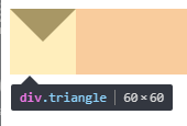
1、css实现正方形
思路:width为0;height为0;使用boder-width为正方形的边长的一半,不占任何字节;border-style为固体;border-color为正方形的填充色。
<!DOCTYPE html>

<html>

    <head>

        <meta charset="UTF-8">

        <title></title>

        <style type="text/css">

            .triangle{

                width: 0;

                height: 0;

                border-width: 30px;

                border-style: solid;

                border-color:#e66161;

            }

        </style>

    </head>

    <body>

        <div class="triangle"></div>

    </body>

</html>
图形


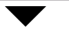
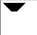
2、css实现三角形
思路:宽度width为0;height为0;border-width为直角三角形斜边的一半;border-color里有四个颜色属性,第一个为上--直角三角形内充填充色,第二个为右--直角三角形内填充色,第三个为下--直角三角形内填充色,第四个为左--直角三角形内填充色。
代码:
<!DOCTYPE html>

<html>

    <head>

        <meta charset="UTF-8">

        <title></title>

        <style type="text/css">

            .triangle{

                width: 0;

                height: 0;

                border-width: 30px;

                border-style: solid;

                border-color: #000000 transparent transparent transparent;

            }

        </style>

    </head>

    <body>

        <div class="triangle"></div>

    </body>

</html>
图形
代码:
.triangle{

                width: 0;

                height: 0;

                border-width: 30px;

                border-style: solid;

                border-color: #000000 #000000 transparent transparent;

            }
图形

代码:
.triangle{

                width: 0;

                height: 0;

                border-width: 30px;

                border-style: solid;

                border-color: #000000 #f50303 transparent transparent;

            }
图形

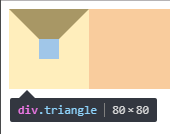
3、css实现正方形外梯形
思路:还是之前的思路,width为20;高度为20;梯形的短底边为div的width;梯形的长边=width+border-width*2;
代码:
<!DOCTYPE html>

<html>

    <head>

        <meta charset="UTF-8">

        <title></title>

        <style type="text/css">

            .triangle{

                width: 20px;

                height: 20px;

                border-width:30px;

                border-style: solid;

                border-color: #000000 transparent transparent transparent;

            }

        </style>

    </head>

    <body>

        <div class="triangle"></div>

    </body>

</html>
图形:
代码:
.triangle{
width: 0;
height: 0;
border-width: 30px;
border-style: solid;
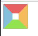
border-color:#e66161 #f3bb5b #94e24f #85bfda;
}
图形:
4、css实现pop弹层
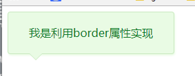
思路:利用两个三角形进行拼接,一个是背景色,一个是边框色,然后利用定位重叠在一起,定位要相差一个像素。
代码:
<!DOCTYPE html>

<html>

    <head>

        <meta charset="UTF-8">

        <title></title>

        <style type="text/css">

            .box{

                position: relative;

                width: 240px;

                height: 60px;

                line-height: 60px;

                background: #e9fbe4;

                box-shadow: 1px 2px 3px #e9fbe4;

                border: 1px solid #c9e9c0;

                border-radius: 4px;

                text-align: center;

                color: #0c7823;

            }

            .triangle-border{

                width: 0;

                height: 0;

                border-width: 10px;

                border-style: solid;

                position: absolute;

                left: 30px;

                overflow: hidden;

            }

            .border{

                bottom:-20px;

                border-color: #C9E9C0 transparent transparent transparent;

            }

            .background{

                bottom: -19px;

                border-color: #E9FBE4 transparent transparent transparent;

            }

        </style>

    </head>

    <body>

        <div class="box">

            <span>我是利用border属性实现</span>

            <div class="triangle-border border"></div>

            <div class="triangle-border background"></div>

        </div>

    </body>

</html>
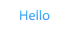
5、css实现字体渐变色
5.1使用gradient属性
存在的不足:IE浏览器都不支持。
<!DOCTYPE html>

<html>

    <head>

        <meta charset="utf-8" />

        <title></title>

        <style type="text/css">

            .promotion-floor-title {

                text-align: center;

                margin: 60px auto 40px;

            }

            .promotion-floor-title .title p {

                display: inline-block;

                text-align: center;

                font-size: 42px;

                background-image: -webkit-gradient(linear, 0 0, 0 bottom, from(#2ED4FB), to(#236BEC));

                -webkit-background-clip: text;

                -webkit-text-fill-color: transparent;

            }

        </style>

    </head>

    <body>

        <div class="promotion-floor-title">

            <div class="title">

                <p>Hello</p>

            </div>

        </div>

    </body>

</html>
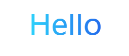
5.2使用svg,支持IE9以及以上
<!DOCTYPE html>

<html>

    <head>

        <meta charset="utf-8" />

        <title></title>

        <style type="text/css">

            .promotion-floor-title {

                text-align: center;

                margin: 60px auto 40px;

            }

            .promotion-floor-title .title {

                min-width: 590px;

                height: 41px;

                display: inline-block;

                position: relative;

            }

            .promotion-floor-title .title svg {

                margin: 0 223px;

                height: 41px;

            }

        </style>

    </head>

    <body>

        <div class="promotion-floor-title">

            <div class="title">

                <svg xmlns="http://www.w3.org/2000/svg" version="1.1">

                    <linearGradient id="grad1" x1="0%" y1="0%" x2="100%" y2="0%">

                        <stop offset="0%" style="stop-color:#2ED4FB;stop-opacity:1" />

                        <stop offset="100%" style="stop-color:#236BEC;stop-opacity:1" />

                    </linearGradient>

                    <text text-anchor="middle" x="50%" y="50%" dy=".36em" class="text" font-size="3.6rem" fill="url(#grad1)">Hello</text>

                </svg>

            </div>

        </div>

    </body>

</html>
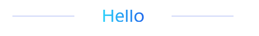
6、css实现一条线
思路:使用span标签,不占文档流,使用背景色background是线条颜色,定位使用position=absolute也是脱离原先的文档流,最主要的是设置高度height为1px,设置使用top来定位,以及宽度来限制线的长度。
<!DOCTYPE html>

<html>

    <head>

        <meta charset="utf-8" />

        <title></title>

        <style type="text/css">

            .promotion-floor-title {

                text-align: center;

                margin: 60px auto 40px;

            }

            .promotion-floor-title .title {

                min-width: 590px;

                height: 41px;

                display: inline-block;

                position: relative;

            }

            .promotion-floor-title .title svg {

                margin: 0 223px;

                height: 41px;

            }

            .promotion-floor-title .title span {

                background: #5672EB;

                position: absolute;

                height: 1px;

                width: 28%;

                top: 50%;

            }

            .promotion-floor-title .title .left-line {

                left: 0;

            }

            .promotion-floor-title .title .right-line {

                right: 0;

            }

        </style>

    </head>

    <body>

        <div class="promotion-floor-title">

            <div class="title">

                <svg xmlns="http://www.w3.org/2000/svg" version="1.1">

                    <linearGradient id="grad1" x1="0%" y1="0%" x2="100%" y2="0%">

                        <stop offset="0%" style="stop-color:#2ED4FB;stop-opacity:1" />

                        <stop offset="100%" style="stop-color:#236BEC;stop-opacity:1" />

                    </linearGradient>

                    <text text-anchor="middle" x="50%" y="50%" dy=".36em" class="text" font-size="3.6rem" fill="url(#grad1)">Hello</text>

                </svg>

                <span class="left-line"></span>

                <span class="right-line"></span>

            </div>

        </div>

    </body>

</html>
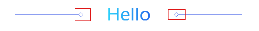
7、css使用伪类after实现旋转正方形
思路:在span使用伪类after,第一步设置content为"";第二步增加一个width和height相同的值;第三步使用border边框设定正方形颜色;第四步以及旋转transform等于rotateZ(45deg),设置兼容到webkit,moz,ms浏览器内核;使用position的absolute脱离原先的文档流;使用top来进行定位。
代码:
<!DOCTYPE html>

<html>

    <head>

        <meta charset="utf-8" />

        <title></title>

        <style type="text/css">

            .promotion-floor-title {

                text-align: center;

                margin: 60px auto 40px;

            }

            .promotion-floor-title .title {

                min-width: 590px;

                height: 41px;

                display: inline-block;

                position: relative;

            }

            .promotion-floor-title .title svg {

                margin: 0 223px;

                height: 41px;

            }

            .promotion-floor-title .title span {

                background: #5672EB;

                position: absolute;

                height: 1px;

                width: 28%;

                top: 50%;

            }

            .promotion-floor-title .title span:after {

                content: "";

                position: absolute;

                top: -5px;

                height: 9px;

                width: 9px;

                border: 1px solid #5672EB;

                border-radius: 1px;

                transform: rotateZ(45deg);

                -webkit-transform: rotateZ(45deg);

                -moz-transform: rotateZ(45deg);

                -ms-transform: rotateZ(45deg);

            }

            .promotion-floor-title .title .left-line {

                left: 0;

            }

            .promotion-floor-title .title .left-line:after {

                right: -13px;

            }

            .promotion-floor-title .title .right-line {

                right: 0;

            }

            .promotion-floor-title .title .right-line:after {

                left: -13px;

            }

        </style>

    </head>

    <body>

        <div class="promotion-floor-title">

            <div class="title">

                <svg xmlns="http://www.w3.org/2000/svg" version="1.1">

                    <linearGradient id="grad1" x1="0%" y1="0%" x2="100%" y2="0%">

                        <stop offset="0%" style="stop-color:#2ED4FB;stop-opacity:1" />

                        <stop offset="100%" style="stop-color:#236BEC;stop-opacity:1" />

                    </linearGradient>

                    <text text-anchor="middle" x="50%" y="50%" dy=".36em" class="text" font-size="3.6rem" fill="url(#grad1)">Hello</text>

                </svg>

                <span class="left-line"></span>

                <span class="right-line"></span>

            </div>

        </div>

    </body>

</html>
各种demo:css实现三角形,css大小梯形,svg使用的更多相关文章
- 前端(各种demo)一:css实现三角形,css实现梯形,pop弹层,css伪类before,after使用,svg使用(持续更新中)
各种demo: 1.css实现正方形 思路:width为0:height为0:使用boder-width为正方形的边长的一半,不占任何字节:border-style为固体:border-color为正 ...
- CSS实现三角形、梯形、平行四边形、圆形、椭圆形、对话框、自适应正方形
本文篇幅较长,希望能坚持看完,转载请注明出处,如果觉得好文请给个赞吧 CSS实现梯形 CSS实现三角形和梯形主要是依靠border是梯形的特性来做的,有点像相框的那种感觉. 首先我们先给一个正方形设置 ...
- 三种纯CSS实现三角形的方法
看到像上图这样的 tip 的小三角,你会怎么办? 切个图上去?恩,不错,简单,兼容性也一级棒,不但好控制,那点小东西也增加不了多少图片的大小.但有没有更好更讲究技巧的办法呢?哈哈,那必须有啊,而且还不 ...
- CSS画三角形引发的一些思考
今天刷知乎时看到了一个问题,有谁能详细讲一下css如何画出一个三角形?怎么想都想不懂? - 知乎.很巧,刚入前端坑的我前不久也遇到过这个问题,今天再来谈一谈这个问题则是因为知乎的一些答案引发了我的 ...
- 【面试技巧】老生常谈之 n 种使用 CSS 实现三角形的技巧
在一些面经中,经常能看到有关 CSS 的题目都会有一道如何使用 CSS 绘制三角形,而常见的回答通常也只有使用 border 进行绘制一种方法. 而 CSS 发展到今天,其实有很多有意思的仅仅使用 C ...
- 利用CSS制作三角形
在我们看到类似于这样的图片时: 我们一般都会想,哎,这还不简单,用一张图片就可以了. 的确,用图片可以很轻松地做到.不过我们接下来要讨论的是: 如何用css也作出这样的效果. 首先,我们来定义一个 ...
- 纯 CSS 实现三角形尖角箭头的实例
上次无意中发现了个使用纯 CSS 实现三角形尖角箭头的方法 http://blog.csdn.net/zhouzme/article/details/18901943 ,但没有怎么用上,也没有详细完整 ...
- css图形——三角形
1.css图形简介 在浏览网页的时候,我们经常看见各种图形的效果,而但凡涉及到图形效果,我们第一个想到的就是用图片来实现.但是在前端开发中,为了网站的性能速度,我们都是秉承着少用图片的原生质. 因为图 ...
- CSS绘制三角形和箭头,不用再用图片了
前言 还在用图片制作箭头,三角形,那就太lou了.css可以轻松搞定这一切,而且颜色大小想怎么变就怎么变,还不用担心失真等问题. 先来看看这段代码: /**css*/.d1{ width: 0; he ...
随机推荐
- HTML标签类型及特点
关键词:块级元素 行级元素 行内块元素 一. 概述 HTML(Hyper Text Markup Language )作为一种标记语言,网页所有的内容均书写在标签内部,标签是 ...
- BOM API
原文链接http://www.jb51.net/article/55851.htm 我们都知道, javascript 有三部分构成,ECMAScript,DOM和BOM,根据宿主(浏览器)的不同,具 ...
- R自带数据包
datasets(R自带数据包) 作者:王彦博 作品来源:百度百科 precip #长度为70的命名向量 euro #欧元汇率,长度为11,每个元素都有命名 landmasses #48个陆地的面积, ...
- validateform正则表达式 datatype验证数字
正则表达式验证正数负数 浮点数/^\-?[0-9]+(.[0-9]+)?$/ datatype="/^\-?[0-9]+(.[0-9]+)?$/"
- 【翻译】旧技术成就新勒索软件,Petya添加蠕虫特性
原文链接:https://blogs.technet.microsoft.com/mmpc/2017/06/27/new-ransomware-old-techniques-petya-adds-wo ...
- stringsteam使用之整型转字符串
最近需要用到整型转字符串的操作,学习了stringstream一些皮毛. 首先需要包含头文件. #include<sstream> 然后用流操作的方式将值传递给stringstream对象 ...
- 6.javaweb之respose对象
1.respose的生成的outer对象要优先于内置的out对象输出 response.setContentType("text/html;charaset=utf-8");//设 ...
- Mac用ssh登录Ubuntu14.04
在Ubuntu上配置ssh-server sudo apt-get install openssh-server 然后确认ssh-server是否启动 ps -e | grep ssh 如果存在s ...
- pdf文件之itextpdf操作实例
需求分析 1.需要创建一个pdf文件,包含文件的基本属性 2.文件需要包含附件,通过点击链接直接打开 3.生成的pdf文件不能直接修改(需要输入密码) 4.pdf文件需要有文字或图片水印 准备jar包 ...
- ASP搜索查询
html code: <form name="frm_Search" method="get" action="Search.asp" ...