
使用Bootstrap 3开发响应式网站实践01,前期准备、导航区域等
“使用Bootstrap 3开发响应式网站实践”系列,将使用Bootstrap 3.2制作一个自适应网站,无论是在电脑、平板,还是手机上,都呈现比较好的效果。在电脑浏览器上的最终效果如下:

在手机上的呈现效果如下:

本篇主要包括:
□ 前期准备
□ 引入Bootstrap,jQuey文件等
□ 搭建页面主体结构
□ 导航区域
□ 前期准备
→使用Visual Studio 2012创建一个空的ASP.NET网站
→把下载下来的Bootstrap 3中的css,fonts,js文件夹拷贝到网站根目录下
→在网站根目录下创建images文件夹,用来存放所有的图片
→使用NuGet安装最新版的jQuery
→在网站根目录下创建index.html文件
□ 引入Bootstrap,jQuey文件等
→在css文件夹下创建site.css
→在js文件夹下创建site.js
→把Bootstrap、jQuery等引入index.html文件中
<!DOCTYPE html><html xmlns="http://www.w3.org/1999/xhtml"><head><meta http-equiv="Content-Type" content="text/html; charset=utf-8"/><title></title><meta name="viewport" content="width=device-width, initial-scale=1, maximum-scale=1,user-scalable=no"><link href="css/bootstrap.min.css" rel="stylesheet" /><link href="css/site.css" rel="stylesheet" /></head><body><script src="Scripts/jquery-2.1.1.min.js"></script><script src="js/bootstrap.min.js"></script><script src="js/site.js"></script></body></html>
<meta name="viewport" content="width=device-width, initial-scale=1, maximum-scale=1,user-scalable=no">
这时响应式布局的一个标签,以上表示浏览器的宽度和屏幕宽度保持一致。比如,屏幕宽度为320px,那么浏览器的宽度自适应为320px。如果网站不是针对响应式开发的,就没有必要使用这个标签。其它属性包括:
○ width: 视觉宽度
○ device-width: 屏幕宽度
○ heigh: 视觉高度
○ device-height: 屏幕高度
○ initial-scale: 初始放大比例,设置为1.0时不放大
○ minimum-scale: 最小的放大比例,设置为1.0时不放大
○ maximum-scale: 最大的放大比例,设置为1.0时不放大
○ user-scalable: 是否允许放大,设置为no时不允许放大
另外,需要在site.css设置如下:
@-ms-viewport{width: device-width;}
□ 搭建页面主体结构
<!DOCTYPE html><html xmlns="http://www.w3.org/1999/xhtml"><head><meta http-equiv="Content-Type" content="text/html; charset=utf-8"/><title></title><meta name="viewport" content="width=device-width, initial-scale=1, maximum-scale=1,user-scalable=no"><link href="css/bootstrap.min.css" rel="stylesheet" /><link href="css/site.css" rel="stylesheet" /></head><body><div class="container" id="main"><div class="navbar navbar-fixed-top"></div><!--导航区域结束--><div class="carousel" id="myCarousel"></div><!--图片展示区域结束--><div class="row" id="bigCallout"></div><!--标注区域结束--><div class="row" id="featureHeading"></div><!--主要功能标题区域结束--><div class="row" id="features"></div><!--主要功能区域结束--><div class="row" id="moreInfo"></div><!--更多信息区域结束--><div class="row" id="moreProducts"></div><!--更多产品区域结束--></div><!--container结束--><footer></footer><!--页脚结束--><script src="Scripts/jquery-2.1.1.min.js"></script><script src="js/bootstrap.min.js"></script><script src="js/site.js"></script></body></html>
○ row属性值:代表单独一行,是Grid的父级元素。
□ 导航区域
→到http://bootswatch.com/下载Theme,并保存到网站根目录下的css文件夹
→下载某个主题,命名为simplex.bootstrap.min.css,并放到如下位置:
<link href="css/bootstrap.min.css" rel="stylesheet" /><link href="css/simplex.bootstrap.min.css" rel="stylesheet" /><link href="css/site.css" rel="stylesheet" />
→导航区域html如下:
<div class="navbar navbar-fixed-top"><div class="container"><a class="navbar-brand" href="/"><img src="data:images/logo.gif" alt="logo"/></a><div class="navbar-collapse collapse"><ul class="nav navbar-nav"><li class="active"><a href="#">主页</a></li><li><a href="#">服务</a></li></ul><form class="navbar-form pull-left"><input type="text" id="searchInput" class="form-control" placeholder="搜索"/><button type="submit" class="btn btn-default"><span class="glyphicon glyphicon-search"></span></button></form><ul class="nav navbar-nav pull-right"><li><a href="#"><span class="glyphicon glyphicon-user"></span>设置</a></li></ul></div><!--nav-collapse结束--></div><!--container结束--></div><!--导航区域结束-->
○ navbar属性值:导航区域、导航条
○ navbar-fixed-top属性值:把导航区域固定在页面顶部
○ 把导航区域的所有元素放在一个<div class="container">中
○ navbar-brand属性值:一般应用在网站logo上
○ navbar-collapse和collapse属性值:是为响应式设计的,当希望一块区域在页面宽度缩小到一定程度时自己适应,就把该块区域包裹在<div class="navbar-collapse collapse">中
○ nav和navbar-nav属性值:用在ul上,可以把a标签加入到导航区域
○ navbar-form属性值:用在form上,可以把form标签加入到导航区域
○ pull-left属性值:漂浮到左边
○ form-control属性值:用在表单元素上
○ glyphicon和glyphicon-search属性值:用在span上,显示Icon
当页面足够宽的时候,显示<div class="navbar-collapse collapse">包裹区域。

当页面宽度缩小到一定程度,<div class="navbar-collapse collapse">包裹区域被隐藏。

把以上ul中<li><a href="#">服务</a></li>改成下拉菜单。
<ul class="nav navbar-nav"><li class="active"><a href="#">主页</a></li><li class="dropdown"><a href="#" class="dropdown-toggle" data-toggle="dropdown">服务<strong class="caret"></strong></a><ul class="dropdown-menu"><li><a href="#">足球</a></li><li><a href="#">篮球</a></li><li><a href="#">乒乓球</a></li><li class="divider"></li><li class="dropdown-header">更多服务...</li><li><a href="#">创建水球</a></li><li><a href="#">创建冰球</a></li></ul></li></ul>

○ dropdown属性值:这里被应用到li上,这样li变成下拉菜单
○ data-toggle属性:这里属性值为dropdown,表示使用dropdown插件
○ dropdown-toggle属性值:这里了被应用到a上,点击a显示,再点击消失
○ caret属性值:这里被应用到strong,表示向下箭头
○ dropdown的选项是一个ul
○ dropdown-menu属性值:这里被应用到ul上,表示dropdown的选项
○ divider属性值:这里被应用到li上,表示分隔线
○ dropdown-header属性值:这里被应用到li上,该项无法被选中
再把以上"我的账户"有关ul中的li改成下拉菜单。
<ul class="nav navbar-nav pull-right"><li class="dropdown"><a href="#" class="dropdown-toggle" data-toggle="dropdown"><span class="glyphicon glyphicon-user"></span>我的账户<strong class="caret"></strong></a><ul class="dropdown-menu"><li><a href="#"><span class="glyphicon glyphicon-wrench"></span>设置</a></li><li><a href="#"><span class="glyphicon glyphicon-refresh"></span>个人信息</a></li><li><a href="#"><span class="glyphicon glyphicon-briefcase"></span>账单</a></li><li class="divider"></li><li><a href="#"><span class="glyphicon glyphicon-off"></span>退出</a></li></ul></li></ul>

但,现在还有一个问题:当页面宽度缩小到一定程度,<div class="navbar-collapse collapse">包裹区域被隐藏。我们希望在隐藏的时候,出现一个图片,点击它再次出现被隐藏部分。
在导航部分添加一个按钮:
<button type="button" class="navbar-toggle" data-target="#c" data-toggle="collapse" style="background-color: #e3e3e3;color: black">显示/隐藏</button>
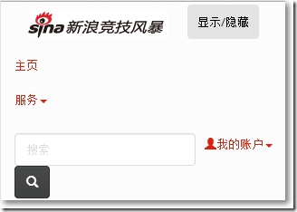
○ navbar-toggle属性值:这里被应用到button,当点击button出现隐藏部分
○ data-target属性:这里指向隐藏/显示的div
○ data-toggle属性:引用collapse插件
最后,导航部分的完整代码为:
<div class="navbar navbar-fixed-top"><div class="container"><button type="button" class="navbar-toggle" data-target="#c" data-toggle="collapse" style="background-color: #e3e3e3;color: black">显示/隐藏</button><a class="navbar-brand" href="/"><img src="data:images/logo.gif" alt="logo"/></a><div class="navbar-collapse collapse" id="c"><ul class="nav navbar-nav"><li class="active"><a href="#">主页</a></li><li class="dropdown"><a href="#" class="dropdown-toggle" data-toggle="dropdown">服务<strong class="caret"></strong></a><ul class="dropdown-menu"><li><a href="#">足球</a></li><li><a href="#">篮球</a></li><li><a href="#">乒乓球</a></li><li class="divider"></li><li class="dropdown-header">更多服务...</li><li><a href="#">创建水球</a></li><li><a href="#">创建冰球</a></li></ul></li></ul><form class="navbar-form pull-left"><input type="text" id="searchInput" class="form-control" placeholder="搜索"/><button type="submit" class="btn btn-default"><span class="glyphicon glyphicon-search"></span></button></form><ul class="nav navbar-nav pull-right"><li class="dropdown"><a href="#" class="dropdown-toggle" data-toggle="dropdown"><span class="glyphicon glyphicon-user"></span>我的账户<strong class="caret"></strong></a><ul class="dropdown-menu"><li><a href="#"><span class="glyphicon glyphicon-wrench"></span>设置</a></li><li><a href="#"><span class="glyphicon glyphicon-refresh"></span>个人信息</a></li><li><a href="#"><span class="glyphicon glyphicon-briefcase"></span>账单</a></li><li class="divider"></li><li><a href="#"><span class="glyphicon glyphicon-off"></span>退出</a></li></ul></li></ul></div><!--nav-collapse结束--></div><!--container结束--></div><!--导航区域结束-->
参考资料:
Code a Responsive Website with Bootstrap 3 --by Brad Hussey
http://getbootstrap.com/
http://bootswatch.com/
http://www.tutorialspoint.com/
“使用Bootstrap 3开发响应式网站实践”系列包括:
使用Bootstrap 3开发响应式网站实践01,前期准备、导航区域等
使用Bootstrap 3开发响应式网站实践02,轮播
使用Bootstrap 3开发响应式网站实践03,轮播下方的内容排版
使用Bootstrap 3开发响应式网站实践04,使用Panels展示内容
使用Bootstrap 3开发响应式网站实践05,使用Tab、Modal、Form展示内容,使用Popover、Tooltip展示提示信息
使用Bootstrap 3开发响应式网站实践06,使用ListGroup、Thumbnails展示内容
使用Bootstrap 3开发响应式网站实践07,页脚
使用Bootstrap 3开发响应式网站实践01,前期准备、导航区域等的更多相关文章
- 使用Bootstrap 3开发响应式网站实践07,页脚
页脚部分比较简单,把一个12列的Grid切分. <footer> <div class="container"> <div class="r ...
- 使用Bootstrap 3开发响应式网站实践06,使用ListGroup、Thumbnails展示内容
□ ListGroup展示内容 当希望把同类型的内容以列表.区块展示的时候,ListGroup是不错的选择. <div class="col-sm-6"> <h3 ...
- 使用Bootstrap 3开发响应式网站实践05,使用Tab、Modal、Form展示内容,使用Popover、Tooltip展示提示信息
本篇体验用Tab插件显示内容.Html部分为: <div class="row" id="moreInfo"> <div class=&quo ...
- 使用Bootstrap 3开发响应式网站实践04,使用Panels展示内容
在Bootstrap页面中,通常用Panels来展示主要功能的内容.该部分Html为: <div class="row" id="featureHeading&qu ...
- 使用Bootstrap 3开发响应式网站实践03,轮播下方的内容排版
通常把一些重要信息.需要重点标注的信息放在轮播的下方显示,这部分区域用到了大字体的标题.副标题以及段落文字等. <div class="row" id="bigCa ...
- 使用Bootstrap 3开发响应式网站实践02,轮播
本篇体验图片轮播.html部分为: <div class="carousel slide" id="myCarousel" > <!--Ind ...
- 了解Bootstrap和开发响应式网站
什么是Bootstrap? Bootstrap是Twitter推出的一个开源的用于web前端开发的工具包.它由Twitter的设计师Mark Otto和Jacob Thornton合作开发,是一个CS ...
- 7 个 Bootstrap 在线编辑器用于快速开发响应式网站
Bootstrap 已经使响应式网站开发变得简单很多. 但是如果你不必手动写全部代码,事情会如何呢? 如果你可以自由地选择你想要使用的Bootstrap 组件.并可以把它们拖拽到画布中,事情会如何呢? ...
- Bootstrap 简介: 创建响应式、移动项目的工具
原文链接: Introduction to Bootstrap: A Tool for Building Responsive, Mobile-First Projects 下载: 示例代码Boots ...
随机推荐
- [扩展推荐] Laravel 中利用 GeoIP 获取用户地理位置信息
我最近需要一个用户地域检测来设置用户的默认区域和货币.由 Daniel Stainback 创建的 torann/geoip 很好地满足为Laravel 5 项目提供 GeoIP 服务的要求. 这个 ...
- Elasticsearch doc_value认识
一.doc_value是什么 绝大多数的fields在默认情况下是indexed,因此字段数据是可被搜索的.倒排索引中按照一定顺序存放着terms供搜索,当命中搜索时,返回包含term的documen ...
- 用戶登陸。防SQL注入,驗證碼不區分大小寫。。
if (string.Compare(TBCheckCode.Text, Session["CheckCodeI"].ToString(), true) == 0) ...
- .NetCore读取配置Json文件到类中并在程序使用
ConfigurationBuilder 这个类提供了配置绑定,在dnc中 Program中WebHost提供了默认的绑定(appsettings文件) 如果我们需要加载我们自己的json配置文件怎么 ...
- RabbitMQ系列之RabbitMQ集群
本文的集群是RabbitMq 自身的Cluster搭建 . #hosts准备: vim /etc/hosts #172.16.3.79 s1 #172.16.3.105 s2 172.16.2.10 ...
- Hive(八)Hive的Shell操作与压缩存储
一.Hive的命令行 1.Hive支持的一些命令 Command Description quit Use quit or exit to leave the interactive shell. s ...
- CentOS 升级Python3.X和pip3
目的:实现python3 and python2 共存,pip2 and pip3共存 一.安装依赖 yum install openssl-devel -y yum install zlib-dev ...
- python爬虫+词云图,爬取网易云音乐评论
又到了清明时节,用python爬取了网易云音乐<清明雨上>的评论,统计词频和绘制词云图,记录过程中遇到一些问题 爬取网易云音乐的评论 一开始是按照常规思路,分析网页ajax的传参情况.看到 ...
- 深度学习基础系列(五)| 深入理解交叉熵函数及其在tensorflow和keras中的实现
在统计学中,损失函数是一种衡量损失和错误(这种损失与“错误地”估计有关,如费用或者设备的损失)程度的函数.假设某样本的实际输出为a,而预计的输出为y,则y与a之间存在偏差,深度学习的目的即是通过不断地 ...
- Django小知识点整理
一.Django中Choices字段显示中文的两种方式 1.get_xxxx_display():这种方式只能针对对象来使用 {% for row in server_list %} <li&g ...