CSS 常见问题笔记
CSS 常见问题
布局
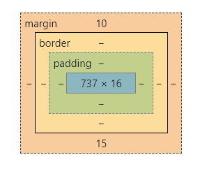
一、盒模型宽度计算
问题:div1 的 offsetWidth 是多少?
<style>

    #div1 {

        width: 100px;

        padding: 10px;

        border: 1px solid #ccc;

        margin: 10px;

    }

</style>

<div id="div1">

</div>
div1 的盒模型:
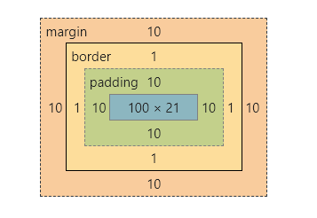
offsetWidth = (内容宽度 + 内边距 + 边框),无外边框。
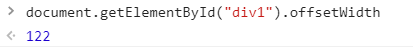
offsetWidth = 100 + 10 + 1 * 2 = 122
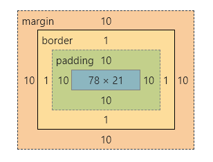
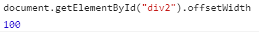
如果让 offsetWidth = 100,可以给 div 加一个样式 box-sizing: border-box;
<style>

    #div2 {

        width: 100px;

        padding: 10px;

        border: 1px solid #ccc;

        margin: 10px;

        box-sizing: border-box;

    }

</style>

<div id="div2">

</div>
div2 的盒模型:
二、margin 纵向重叠的问题
问题:AAA 和 BBB 之间的距离是多少?
<style>

    p {

        font-size: 16px;

        /*

        	line-height 为数字的话

        	行高为 字体 * 该数字

        	当前行高为 16px

        */

        line-height: 1;

        margin-top: 10px;

        margin-bottom: 15px;

    }

</style>

<p>AAA</p>

<p></p>

<p></p>

<p>BBB</p>
- 相邻元素的 margin-top 和 margin-bottom 是会重叠的。
- 空白内容也会被重叠。
AAA 和 BBB 之间的距离是 15px
AAA 和 BBB 的盒模型是一样的:
三、margin 负值的问题
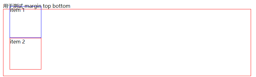
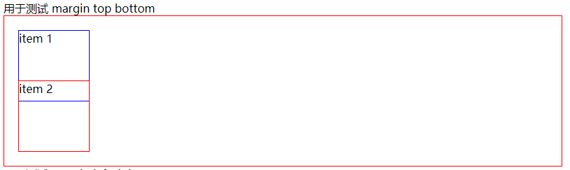
问题:对 margin 的 top left right bottom 设置负值,是什么效果?
- margin-top:该元素向上移动
- margin-bottom:该元素不受影响,该元素下面的元素上移
- margin-left:该元素向左移动
- margin-right:该元素不受影响,该元素右侧的元素左移
代码演示:
<style>
body {
margin: 20px;
}
.box {
border: 1px solid red;
padding: 20px;
}
.box-blue {
width: 100px;
height: 100px;
border: 1px solid blue;
}
.box-red {
width: 100px;
height: 100px;
border: 1px solid red;
}
.clearfix::after {
content: '';
display: table;
clear: both;
}
.float-left {
float: left;
}
.top {
margin-top: -30px;
}
.bottom {
margin-bottom: -30px;
}
.left {
margin-left: -30px;
}
.right {
margin-right: -30px;
}
</style>
<div>用于测试 margin top bottom</div>
<div class="box">
<div class="box-blue">item 1</div>
<div class="box-red">item 2</div>
</div>
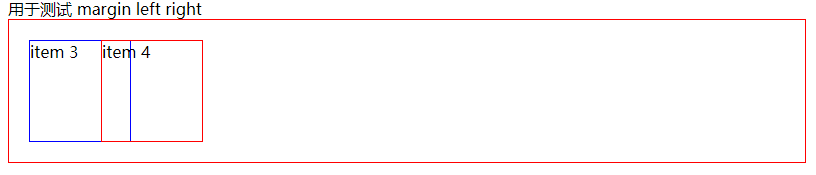
<div>用于测试 margin left right</div>
<div class="box clearfix">
<div class="float-left box-blue">item 3</div>
<div class="float-left box-red">item 4</div>
</div>
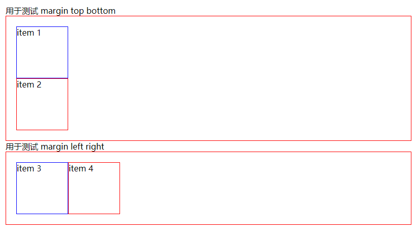
- 测试 margin-top:给 item1 添加 margin-top
- 测试 margin-bottom:给 item1 添加 margin-bottom
- 测试 margin-left:给 item3 添加 margin-left
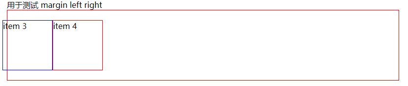
- 测试 margin-right:给 item3 添加 margin-right
四、BFC 的理解与应用
问题:什么是 BFC? 如何应用?
BFC:Block format context,块级格式化上下文
一块独立渲染区域,内部元素的渲染不会影响边界以外的元素
形成 BFC 的常见条件:
- float 不是 none
- position 是 absolute 或 fixed
- overflow 不是 visible
- display 是 flex、inline-block 等
<style>

    .box {

        background-color: #ccc;

    }

    .left {

        float: left;

    }

    .bfc {

        /* 触发 bfc */

        overflow: hidden;

    }

</style>

<div class="box">

    <img src="https://raw.githubusercontent.com/codeEgret/picBed/master/%E4%BB%99%E5%A5%B3%E6%A3%92.png" alt=""

         class="left" style="width: 100px">

    <p>这是一段文字......</p>

</div>
因为给 img 设置了 float ,图片完全跑出了容器,并没有撑开容器
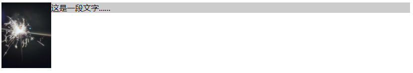
给 div 添加一个 class="bfc",用于触发 bfc,这样图片就不会脱离文档流。

五、float 布局
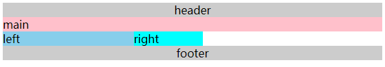
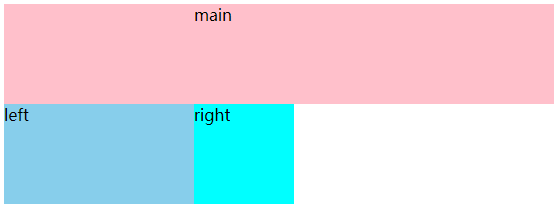
问题:如何实现圣杯布局和双飞翼布局?
圣杯布局和双飞翼布局的目的:
- 三栏布局,中间一栏最先加载和渲染(内容最重要)
- 两侧内容固定,中间内容随着宽度自适应
- 一般用于 PC 网页
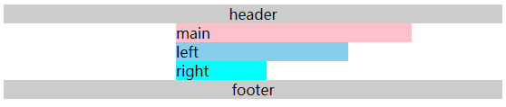
圣杯布局的实现:
- 先创建好大概的内容
<style>

    body {

        min-width: 550px;

    }

    header {

        text-align: center;

        background-color: #ccc;

    }

    .col {

        float: left;

    }

    .main {

        width: 100%;

        background-color: pink;

    }

    .left {

        width: 190px;

        background-color: skyblue;

    }

    .right {

        width: 100px;

        background-color: cyan;

    }

    footer {

        text-align: center;

        background-color: #ccc;

        clear: both;

    }

</style>

</head>

<body>

    <header>header</header>

    <div class="content">

        <div class="main col">main</div>

        <div class="left col">left</div>

        <div class="right col">right</div>

    </div>

    <footer>footer</footer>

</body>
- 给外层容器添加左右内边距,padding-left、padding-right
<style>

    .content {

        padding-left: 190px;

        padding-right: 100px;

    }

</style>
- 将 left 移动到左侧,给 left 添加 margin 负值,left 需要使用定位才能实现。
<style>

    .left {

        width: 190px;

        backgroud-color: skyblue;

        display: relative;

        left: -190px;

        margin: -100%;

    }

</style>
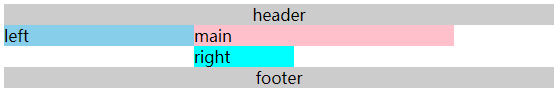
- 将 right 移动到右侧,给 right 设置 margin-right 负值,这个负值为 right 的宽度,这样right 的内容就被覆盖了,就移动上去了。
<style>

    .right {

        width: 100px;

        background-color: cyan;

        margin-right: -100px;

    }

</style>
双飞翼布局的实现:
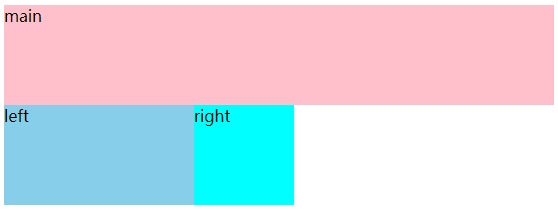
- 先创建好大概的内容
<style>

    body {

        min-width: 550px;

    }

    .col {

        float: left;

    }

    .main {

        width: 100%;

        height: 100px;

        background-color: pink;

    }

    .left {

        width: 190px;

        height: 100px;

        background-color: skyblue;

    }

    .right {

        width: 100px;

        height: 100px;

        background-color: cyan;

    }

</style>

<body>

    <div class="main col">

        <div class="main-wrapper">main</div>

    </div>

    <div class="left col">left</div>

    <div class="right col">right</div>

</body>
- 设置 main-wrapper 的左右外边距
<style>

    .main-wrapper {

        margin-left: 190px;

        margin-right: 100px;

    }

</style>
- 使用 margin-left 负值的方法,将 left 移上去,100% 代表的是 mian 的宽度。
<style>

    .left {

        width: 190px;

        height: 100px;

        background-color: skyblue;

        margin-left: -100%;

    }

</style>
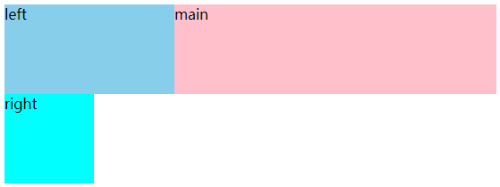
- 使用 margin-left 负值的方法,将 right 移上去,100px 代表 right 的宽度。
<style>

    .right {

        width: 100px;

        height: 100px;

        background-color: cyan;

        margin-left: -100px;

    }

</style>

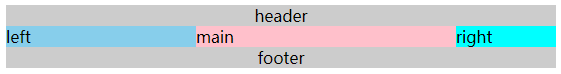
圣杯布局和双飞翼布局的技术总结:
- 使用 float 布局
- 两侧使用 margin 负值,以便和中间内容横向重叠
- 防止中间内容被两次覆盖,一个用 padding,一个用 margin
问题:手写 clearfix
在圣杯布局中的 footer 使用了 clear: both; 来清除浮动,我们可以手写一个 clearfix 来实现清除浮动。
.clearfix::after {

    content: '';

    display: table;

    clear: both;

}

/* 兼容 IE */

.clearfix {

    *zoom: 1;

}
六、flex 布局
常用语法:
- flex-direction:属性决定主轴的方向(项目的排列方向)
- row(默认值): 主轴为水平方向,起点在左端。
- row-reverse: 主轴为水平方向,起点在右端。
- column: 主轴为垂直方向,起点在上沿。
- column-reverse: 主轴为垂直方向,起点在下沿。
- justify-content:主轴上的对齐方式
- flex-start(默认值):左对齐
- flex-end:右对齐
- center:居中对齐
- space-between:两端对齐,间隔相等
- space-around: 每个项目两侧的间隔相等。所以,项目之间的间隔比项目与边框的间隔大一倍。
- align-items: 交叉轴上如何对齐
- flex-start: 交叉轴的起点对齐。
- flex-end: 交叉轴的终点对齐。
- center: 交叉轴的中点对齐。
- baseline: 第一行文字的基线对齐
- stretch (默认值):如果项目未设置高度或设为auto,将占满整个容器的高度。
- flex-wrap:是否换行
- nowrap(默认):不换行
- wrap:换行,第一行在上方
- wrap-reverse:换行,第一行在下方
- align-self:允许单个元素有不一样的对齐方式,比 align-items 多一个 auto 元素。
- auto(默认值):表示继承父元素的属性,如果没有符元素,等同于 stretch。
问题:flex 实现骰子的六个面
<style>

    .box1,

    .box2,

    .box3,

    .box4,

    .box5,

    .box6 {

        display: flex;

        float: left;

        margin: 10px;

        width: 300px;

        height: 300px;

        border: 1px solid #000;

        border-radius: 10px;

    }

    .item {

        width: 40px;

        height: 40px;

        border-radius: 50%;

        background: #ccc;

    }

    .box1 {

        justify-content: center;

        align-items: center;

    }

    .box2 {

        flex-direction: column;

        justify-content: space-around;

        align-items: center;

    }

    .box3 {

        justify-content: space-around;

        align-items: center;

    }

    .box3 .item:nth-child(1) {

        align-self: flex-start;

        transform: translateY(30px);

    }

    .box3 .item:nth-child(3) {

        align-self: flex-end;

        transform: translateY(-30px);

    }

    .box4 {

        flex-direction: column;

    }

    .box4-wrap {

        display: flex;

        justify-content: space-around;

        align-items: center;

        height: 150px;

    }

    .box5 {

        flex-direction: column;

    }

    .box5-wrap {

        display: flex;

        justify-content: space-around;

        align-items: center;

        height: 100px;

    }

    .box6 {

        flex-direction: column;

    }

    .box6-wrap {

        display: flex;

        justify-content: space-around;

        align-items: center;

        height: 100px;

    }

</style>

<body>

    <div class="box1">

        <div class="item"></div>

    </div>

    <div class="box2">

        <div class="item"></div>

        <div class="item"></div>

    </div>

    <div class="box3">

        <div class="item"></div>

        <div class="item"></div>

        <div class="item"></div>

    </div>

    <div class="box4">

        <div class="box4-wrap">

            <div class="item"></div>

            <div class="item"></div>

        </div>

        <div class="box4-wrap">

            <div class="item"></div>

            <div class="item"></div>

        </div>

    </div>

    <div class="box5">

        <div class="box5-wrap">

            <div class="item"></div>

            <div class="item"></div>

        </div>

        <div class="box5-wrap">

            <div class="item"></div>

        </div>

        <div class="box5-wrap">

            <div class="item"></div>

            <div class="item"></div>

        </div>

    </div>

    <div class="box6">

        <div class="box6-wrap">

            <div class="item"></div>

            <div class="item"></div>

        </div>

        <div class="box6-wrap">

            <div class="item"></div>

            <div class="item"></div>

        </div>

        <div class="box6-wrap">

            <div class="item"></div>

            <div class="item"></div>

        </div>

    </div>

</body>
定位
一、absolute 和 relative 分别依据什么定位?
- relative:他是依据自身定位的
- absolute:他是依据第一个定位父元素定位
二、居中对齐有哪些实现方式?
问题:水平居中
- inline 元素:text-centent: center;
- block 元素:margin: 0 auto;
- absolute 元素:left: 50% + margin-left: 负值
问题:垂直居中
- inline 元素:line-height 的值等于 height 的值
- absolute 元素:top: 50% + margin-top: 负值
- absolute 元素:transform(-50%, -50%)
- absolute 元素:top,left,right,bottom = 0 + margin: auto
第一种和第二种需要知道盒子的大小,不知道盒子大小的时候,可以使用第三种和第四种
图文样式
问题:line-height 如何继承
- 写具体数值,如 100px,则直接继承该值
- 写比例,如 2,则继承该比例
- 写百分比,如 200%,则继承计算出来的值
<style>

    .box1 {

        font-size: 20px;

        line-height: 30px;

        background-color: pink;

    }

    .box2 {

        font-size: 20px;

        line-height: 2;

        background-color: skyblue;

    }

    .box3 {

        font-size: 20px;

        line-height: 200%;

        background-color: cyan;

    }

    p {

        font-size: 25px;

    }

</style>

<div class="box1">

    <p>高度为30px</p>

</div>

<div class="box2">

    <p>高度为50px</p>

</div>

<div class="box3">

    <p>高度为40px</p>

</div>
CSS 常见问题笔记的更多相关文章
- CSS学习笔记
CSS学习笔记 2016年12月15日整理 CSS基础 Chapter1 在console输入escape("宋体") ENTER 就会出现unicode编码 显示"%u ...
- HTML+CSS学习笔记 (7) - CSS样式基本知识
HTML+CSS学习笔记 (7) - CSS样式基本知识 内联式css样式,直接写在现有的HTML标签中 CSS样式可以写在哪些地方呢?从CSS 样式代码插入的形式来看基本可以分为以下3种:内联式.嵌 ...
- HTML+CSS学习笔记 (6) - 开始学习CSS
HTML+CSS学习笔记 (6) - 开始学习CSS 认识CSS样式 CSS全称为"层叠样式表 (Cascading Style Sheets)",它主要是用于定义HTML内容在浏 ...
- HTML+CSS学习笔记(5)- 与浏览者交互,表单标签
HTML+CSS学习笔记(5)- 与浏览者交互,表单标签 1.使用表单标签,与用户交互 网站怎样与用户进行交互?答案是使用HTML表单(form).表单是可以把浏览者输入的数据传送到服务器端,这样服务 ...
- HTML+CSS学习笔记(4) - 认识标签(3)
HTML+CSS学习笔记(4) - 认识标签(3) 1.使用<a>标签,链接到另一个页面 使用<a>标签可实现超链接,它在网页制作中可以说是无处不在,只要有链接的地方,就会有这 ...
- HTML+CSS学习笔记(3)- 认识标签(2)
HTML+CSS学习笔记(3)- 认识标签(2) 1.使用ul,添加新闻信息列表 在浏览网页时,你会发现网页上有很多信息的列表,如新闻列表.图片列表, 这些列表就可以使用ul-li标签来完成.ul-l ...
- HTML+CSS学习笔记(2) - 认识标签(1)
HTML+CSS学习笔记(2) - 认识标签(1) 1.语义化,让你的网页更好的被搜索引擎理解 标签的用途: 我们学习网页制作时,常常会听到一个词,语义化.那么什么叫做语义化呢,说的通俗点就是:明白每 ...
- HTML+CSS学习笔记(1) - Html介绍
HTML+CSS学习笔记(1) - Html介绍 1.代码初体验,制作我的第一个网页 <!DOCTYPE HTML> <html> <head> <meta ...
- CSS常见问题及兼容性
CSS常见问题 1 (IE6,7)H5标签兼容 解决方法1:(只显示核心代码) 1<script> ; ; ; ;;;};;;;;;;; ...
随机推荐
- Yii2表头强制不换行
在Yii2中使用GridView生成的表格有一个小问题,那就是表头的列宽是根据列的值自适应的,但有时值的长度比较小,表头就会出现下面这种情况(表头不在同一行,非常的不利于数据的查看) 设置强制不换行可 ...
- Java并发编程(二)如何保证线程同时/交替执行
第一篇文章中,我用如何保证线程顺序执行的例子作为Java并发系列的开胃菜.本篇我们依然不会有源码分析,而是用另外两个多线程的例子来引出Java.util.concurrent中的几个并发工具的用法. ...
- utf8字符集下的比较规则
前言: 在MySQL中,比较常用的字符集是utf8和utf8mb4.这两个字符集是类似的,utf8是utf8mb3的别名,所以之后在MySQL中提到utf8就意味着使用1~3个字节来表示一个字符,如果 ...
- [bug] HDFS:DataXceiver error processing WRITE_BLOCK operation
文件格式有误,导致读取错误,我的是把制表符敲成了空格
- 【转载】Pycharm调试高效,还是pdb调试高效? (在服务端)
https://segmentfault.com/q/1010000005067119 Pycharm调试高效,还是pdb调试高效? (在服务端) python 3.9k 次浏览 问题对人有帮助, ...
- 攻防世界(五)Web_php_include
攻防世界系列:Web_php_include 方法一:大小写绕过 strstr()函数对php我协议进行了过滤,但我们可以尝试大小写绕过 抓包POST传值让其执行我们输入的命令 ?page=Php:/ ...
- 无法开机 如果您的手机黑屏无法开机,可以按照以下方式操作尝试: 如果是,使用原装充电器或使用弱电流方式充电(例如使用电脑USB接口充电)充电15-30分钟后尝试重新开机;注意:电量过低引起的无法开机,刚插入充电器时可能不亮屏但呼吸灯闪烁状态。
https://www.mi.com/service/support/startup 无法开机 如果您的手机黑屏无法开机,可以按照以下方式操作尝试: 技术支持 如何刷机 无法开机 手机自动关机.重启 ...
- dmidecode -t1 | egrep "Manufacturer|Product Name"
# dmidecode -t1 | egrep "Manufacturer|Product Name" Manufacturer: Loongson Product Name: L ...
- 云计算OpenStack---创建实例(11)
创建实例时,需要先创建网络及实例类型等其它配置: 一.创建虚拟网络(Self-service network) 网络概述图: 网络连接图: 1.创建self-service网络 (1)加载系统变量: ...
- 用PHP爬取知乎的100万用户
http://blog.jobbole.com/88788/ 突然发现 大数据 Python的爬虫能力很强 爬取到的数据 直接可以用于维修QQ营销 精准营销