CSS 常见问题笔记
CSS 常见问题
布局
一、盒模型宽度计算
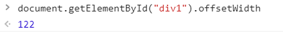
问题:div1 的 offsetWidth 是多少?
<style>

    #div1 {

        width: 100px;

        padding: 10px;

        border: 1px solid #ccc;

        margin: 10px;

    }

</style>

<div id="div1">

</div>
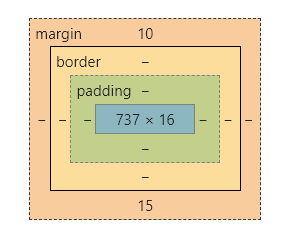
div1 的盒模型:
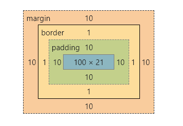
offsetWidth = (内容宽度 + 内边距 + 边框),无外边框。
offsetWidth = 100 + 10 + 1 * 2 = 122
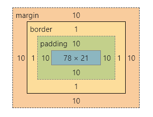
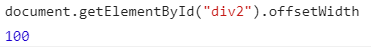
如果让 offsetWidth = 100,可以给 div 加一个样式 box-sizing: border-box;
<style>

    #div2 {

        width: 100px;

        padding: 10px;

        border: 1px solid #ccc;

        margin: 10px;

        box-sizing: border-box;

    }

</style>

<div id="div2">

</div>
div2 的盒模型:
二、margin 纵向重叠的问题
问题:AAA 和 BBB 之间的距离是多少?
<style>

    p {

        font-size: 16px;

        /*

        	line-height 为数字的话

        	行高为 字体 * 该数字

        	当前行高为 16px

        */

        line-height: 1;

        margin-top: 10px;

        margin-bottom: 15px;

    }

</style>

<p>AAA</p>

<p></p>

<p></p>

<p>BBB</p>
- 相邻元素的 margin-top 和 margin-bottom 是会重叠的。
- 空白内容也会被重叠。
AAA 和 BBB 之间的距离是 15px
AAA 和 BBB 的盒模型是一样的:
三、margin 负值的问题
问题:对 margin 的 top left right bottom 设置负值,是什么效果?
- margin-top:该元素向上移动
- margin-bottom:该元素不受影响,该元素下面的元素上移
- margin-left:该元素向左移动
- margin-right:该元素不受影响,该元素右侧的元素左移
代码演示:
<style>
body {
margin: 20px;
}
.box {
border: 1px solid red;
padding: 20px;
}
.box-blue {
width: 100px;
height: 100px;
border: 1px solid blue;
}
.box-red {
width: 100px;
height: 100px;
border: 1px solid red;
}
.clearfix::after {
content: '';
display: table;
clear: both;
}
.float-left {
float: left;
}
.top {
margin-top: -30px;
}
.bottom {
margin-bottom: -30px;
}
.left {
margin-left: -30px;
}
.right {
margin-right: -30px;
}
</style>
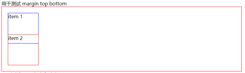
<div>用于测试 margin top bottom</div>
<div class="box">
<div class="box-blue">item 1</div>
<div class="box-red">item 2</div>
</div>
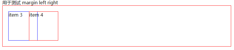
<div>用于测试 margin left right</div>
<div class="box clearfix">
<div class="float-left box-blue">item 3</div>
<div class="float-left box-red">item 4</div>
</div>
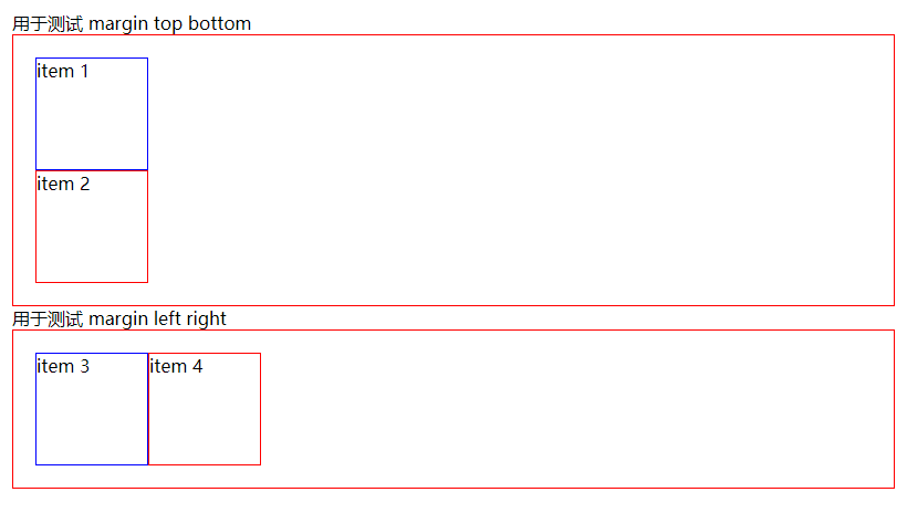
- 测试 margin-top:给 item1 添加 margin-top
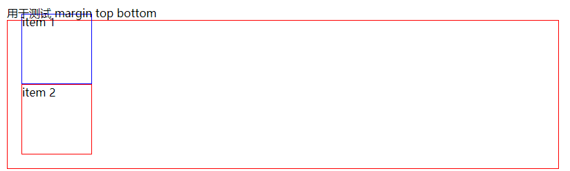
- 测试 margin-bottom:给 item1 添加 margin-bottom
- 测试 margin-left:给 item3 添加 margin-left
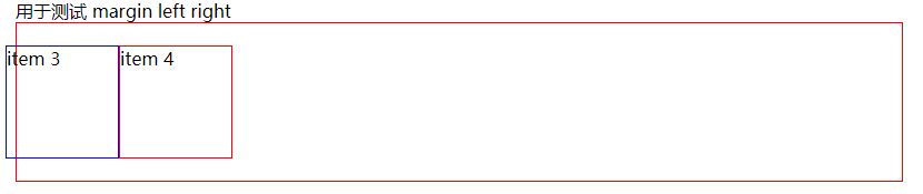
- 测试 margin-right:给 item3 添加 margin-right
四、BFC 的理解与应用
问题:什么是 BFC? 如何应用?
BFC:Block format context,块级格式化上下文
一块独立渲染区域,内部元素的渲染不会影响边界以外的元素
形成 BFC 的常见条件:
- float 不是 none
- position 是 absolute 或 fixed
- overflow 不是 visible
- display 是 flex、inline-block 等
<style>

    .box {

        background-color: #ccc;

    }

    .left {

        float: left;

    }

    .bfc {

        /* 触发 bfc */

        overflow: hidden;

    }

</style>

<div class="box">

    <img src="https://raw.githubusercontent.com/codeEgret/picBed/master/%E4%BB%99%E5%A5%B3%E6%A3%92.png" alt=""

         class="left" style="width: 100px">

    <p>这是一段文字......</p>

</div>
因为给 img 设置了 float ,图片完全跑出了容器,并没有撑开容器
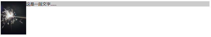
给 div 添加一个 class="bfc",用于触发 bfc,这样图片就不会脱离文档流。

五、float 布局
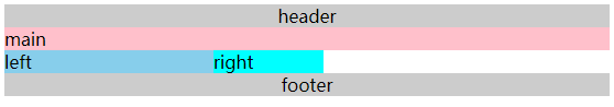
问题:如何实现圣杯布局和双飞翼布局?
圣杯布局和双飞翼布局的目的:
- 三栏布局,中间一栏最先加载和渲染(内容最重要)
- 两侧内容固定,中间内容随着宽度自适应
- 一般用于 PC 网页
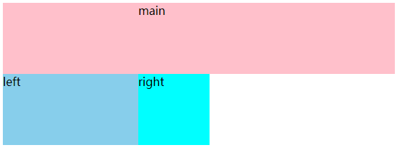
圣杯布局的实现:
- 先创建好大概的内容
<style>
body {
min-width: 550px;
}
header {
text-align: center;
background-color: #ccc;
}
.col {
float: left;
}
.main {
width: 100%;
background-color: pink;
}
.left {
width: 190px;
background-color: skyblue;
}
.right {
width: 100px;
background-color: cyan;
}
footer {
text-align: center;
background-color: #ccc;
clear: both;
}
</style>
</head>
<body>
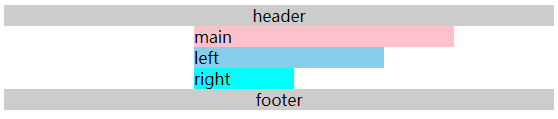
<header>header</header>
<div class="content">
<div class="main col">main</div>
<div class="left col">left</div>
<div class="right col">right</div>
</div>
<footer>footer</footer>
</body>
- 给外层容器添加左右内边距,padding-left、padding-right
<style>

    .content {

        padding-left: 190px;

        padding-right: 100px;

    }

</style>
- 将 left 移动到左侧,给 left 添加 margin 负值,left 需要使用定位才能实现。
<style>

    .left {

        width: 190px;

        backgroud-color: skyblue;

        display: relative;

        left: -190px;

        margin: -100%;

    }

</style>
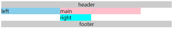
- 将 right 移动到右侧,给 right 设置 margin-right 负值,这个负值为 right 的宽度,这样right 的内容就被覆盖了,就移动上去了。
<style>

    .right {

        width: 100px;

        background-color: cyan;

        margin-right: -100px;

    }

</style>
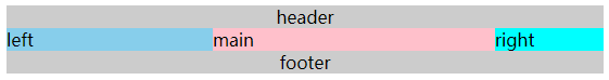
双飞翼布局的实现:
- 先创建好大概的内容
<style>

    body {

        min-width: 550px;

    }

    .col {

        float: left;

    }

    .main {

        width: 100%;

        height: 100px;

        background-color: pink;

    }

    .left {

        width: 190px;

        height: 100px;

        background-color: skyblue;

    }

    .right {

        width: 100px;

        height: 100px;

        background-color: cyan;

    }

</style>

<body>

    <div class="main col">

        <div class="main-wrapper">main</div>

    </div>

    <div class="left col">left</div>

    <div class="right col">right</div>

</body>
- 设置 main-wrapper 的左右外边距
<style>

    .main-wrapper {

        margin-left: 190px;

        margin-right: 100px;

    }

</style>
- 使用 margin-left 负值的方法,将 left 移上去,100% 代表的是 mian 的宽度。
<style>

    .left {

        width: 190px;

        height: 100px;

        background-color: skyblue;

        margin-left: -100%;

    }

</style>
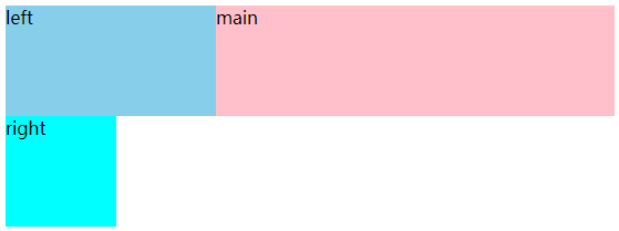
- 使用 margin-left 负值的方法,将 right 移上去,100px 代表 right 的宽度。
<style>

    .right {

        width: 100px;

        height: 100px;

        background-color: cyan;

        margin-left: -100px;

    }

</style>

圣杯布局和双飞翼布局的技术总结:
- 使用 float 布局
- 两侧使用 margin 负值,以便和中间内容横向重叠
- 防止中间内容被两次覆盖,一个用 padding,一个用 margin
问题:手写 clearfix
在圣杯布局中的 footer 使用了 clear: both; 来清除浮动,我们可以手写一个 clearfix 来实现清除浮动。
.clearfix::after {

    content: '';

    display: table;

    clear: both;

}

/* 兼容 IE */

.clearfix {

    *zoom: 1;

}
六、flex 布局
常用语法:
- flex-direction:属性决定主轴的方向(项目的排列方向)
- row(默认值): 主轴为水平方向,起点在左端。
- row-reverse: 主轴为水平方向,起点在右端。
- column: 主轴为垂直方向,起点在上沿。
- column-reverse: 主轴为垂直方向,起点在下沿。
- justify-content:主轴上的对齐方式
- flex-start(默认值):左对齐
- flex-end:右对齐
- center:居中对齐
- space-between:两端对齐,间隔相等
- space-around: 每个项目两侧的间隔相等。所以,项目之间的间隔比项目与边框的间隔大一倍。
- align-items: 交叉轴上如何对齐
- flex-start: 交叉轴的起点对齐。
- flex-end: 交叉轴的终点对齐。
- center: 交叉轴的中点对齐。
- baseline: 第一行文字的基线对齐
- stretch (默认值):如果项目未设置高度或设为auto,将占满整个容器的高度。
- flex-wrap:是否换行
- nowrap(默认):不换行
- wrap:换行,第一行在上方
- wrap-reverse:换行,第一行在下方
- align-self:允许单个元素有不一样的对齐方式,比 align-items 多一个 auto 元素。
- auto(默认值):表示继承父元素的属性,如果没有符元素,等同于 stretch。
问题:flex 实现骰子的六个面
<style>

    .box1,

    .box2,

    .box3,

    .box4,

    .box5,

    .box6 {

        display: flex;

        float: left;

        margin: 10px;

        width: 300px;

        height: 300px;

        border: 1px solid #000;

        border-radius: 10px;

    }

    .item {

        width: 40px;

        height: 40px;

        border-radius: 50%;

        background: #ccc;

    }

    .box1 {

        justify-content: center;

        align-items: center;

    }

    .box2 {

        flex-direction: column;

        justify-content: space-around;

        align-items: center;

    }

    .box3 {

        justify-content: space-around;

        align-items: center;

    }

    .box3 .item:nth-child(1) {

        align-self: flex-start;

        transform: translateY(30px);

    }

    .box3 .item:nth-child(3) {

        align-self: flex-end;

        transform: translateY(-30px);

    }

    .box4 {

        flex-direction: column;

    }

    .box4-wrap {

        display: flex;

        justify-content: space-around;

        align-items: center;

        height: 150px;

    }

    .box5 {

        flex-direction: column;

    }

    .box5-wrap {

        display: flex;

        justify-content: space-around;

        align-items: center;

        height: 100px;

    }

    .box6 {

        flex-direction: column;

    }

    .box6-wrap {

        display: flex;

        justify-content: space-around;

        align-items: center;

        height: 100px;

    }

</style>

<body>

    <div class="box1">

        <div class="item"></div>

    </div>

    <div class="box2">

        <div class="item"></div>

        <div class="item"></div>

    </div>

    <div class="box3">

        <div class="item"></div>

        <div class="item"></div>

        <div class="item"></div>

    </div>

    <div class="box4">

        <div class="box4-wrap">

            <div class="item"></div>

            <div class="item"></div>

        </div>

        <div class="box4-wrap">

            <div class="item"></div>

            <div class="item"></div>

        </div>

    </div>

    <div class="box5">

        <div class="box5-wrap">

            <div class="item"></div>

            <div class="item"></div>

        </div>

        <div class="box5-wrap">

            <div class="item"></div>

        </div>

        <div class="box5-wrap">

            <div class="item"></div>

            <div class="item"></div>

        </div>

    </div>

    <div class="box6">

        <div class="box6-wrap">

            <div class="item"></div>

            <div class="item"></div>

        </div>

        <div class="box6-wrap">

            <div class="item"></div>

            <div class="item"></div>

        </div>

        <div class="box6-wrap">

            <div class="item"></div>

            <div class="item"></div>

        </div>

    </div>

</body>
定位
一、absolute 和 relative 分别依据什么定位?
- relative:他是依据自身定位的
- absolute:他是依据第一个定位父元素定位
二、居中对齐有哪些实现方式?
问题:水平居中
- inline 元素:text-centent: center;
- block 元素:margin: 0 auto;
- absolute 元素:left: 50% + margin-left: 负值
问题:垂直居中
- inline 元素:line-height 的值等于 height 的值
- absolute 元素:top: 50% + margin-top: 负值
- absolute 元素:transform(-50%, -50%)
- absolute 元素:top,left,right,bottom = 0 + margin: auto
第一种和第二种需要知道盒子的大小,不知道盒子大小的时候,可以使用第三种和第四种
图文样式
问题:line-height 如何继承
- 写具体数值,如 100px,则直接继承该值
- 写比例,如 2,则继承该比例
- 写百分比,如 200%,则继承计算出来的值
<style>

    .box1 {

        font-size: 20px;

        line-height: 30px;

        background-color: pink;

    }

    .box2 {

        font-size: 20px;

        line-height: 2;

        background-color: skyblue;

    }

    .box3 {

        font-size: 20px;

        line-height: 200%;

        background-color: cyan;

    }

    p {

        font-size: 25px;

    }

</style>

<div class="box1">

    <p>高度为30px</p>

</div>

<div class="box2">

    <p>高度为50px</p>

</div>

<div class="box3">

    <p>高度为40px</p>

</div>
CSS 常见问题笔记的更多相关文章
- CSS学习笔记
CSS学习笔记 2016年12月15日整理 CSS基础 Chapter1 在console输入escape("宋体") ENTER 就会出现unicode编码 显示"%u ...
- HTML+CSS学习笔记 (7) - CSS样式基本知识
HTML+CSS学习笔记 (7) - CSS样式基本知识 内联式css样式,直接写在现有的HTML标签中 CSS样式可以写在哪些地方呢?从CSS 样式代码插入的形式来看基本可以分为以下3种:内联式.嵌 ...
- HTML+CSS学习笔记 (6) - 开始学习CSS
HTML+CSS学习笔记 (6) - 开始学习CSS 认识CSS样式 CSS全称为"层叠样式表 (Cascading Style Sheets)",它主要是用于定义HTML内容在浏 ...
- HTML+CSS学习笔记(5)- 与浏览者交互,表单标签
HTML+CSS学习笔记(5)- 与浏览者交互,表单标签 1.使用表单标签,与用户交互 网站怎样与用户进行交互?答案是使用HTML表单(form).表单是可以把浏览者输入的数据传送到服务器端,这样服务 ...
- HTML+CSS学习笔记(4) - 认识标签(3)
HTML+CSS学习笔记(4) - 认识标签(3) 1.使用<a>标签,链接到另一个页面 使用<a>标签可实现超链接,它在网页制作中可以说是无处不在,只要有链接的地方,就会有这 ...
- HTML+CSS学习笔记(3)- 认识标签(2)
HTML+CSS学习笔记(3)- 认识标签(2) 1.使用ul,添加新闻信息列表 在浏览网页时,你会发现网页上有很多信息的列表,如新闻列表.图片列表, 这些列表就可以使用ul-li标签来完成.ul-l ...
- HTML+CSS学习笔记(2) - 认识标签(1)
HTML+CSS学习笔记(2) - 认识标签(1) 1.语义化,让你的网页更好的被搜索引擎理解 标签的用途: 我们学习网页制作时,常常会听到一个词,语义化.那么什么叫做语义化呢,说的通俗点就是:明白每 ...
- HTML+CSS学习笔记(1) - Html介绍
HTML+CSS学习笔记(1) - Html介绍 1.代码初体验,制作我的第一个网页 <!DOCTYPE HTML> <html> <head> <meta ...
- CSS常见问题及兼容性
CSS常见问题 1 (IE6,7)H5标签兼容 解决方法1:(只显示核心代码) 1<script> ; ; ; ;;;};;;;;;;; ...
随机推荐
- 从苏宁电器到卡巴斯基第25篇:难忘的三年硕士时光 III
阴差阳错,走上了讲师的道路 时间已经来到了2015年的1月,我的找工作之路也是屡败屡战,屡战屡败.金山.百度以及腾讯不约而同地不要我,使得我对于自己的未来充满了迷茫.尽管才研二而已,可是对于我这种没有 ...
- PAT 乙级 -- 1011 -- A+B和C
问题简述 给定区间[-231, 231]内的3个整数A.B和C,请判断A+B是否大于C. 输入格式: 输入第1行给出正整数T(<=10),是测试用例的个数.随后给出T组测试用例,每组占一行,顺序 ...
- Win64 驱动内核编程-12.回调监控进线程创建和退出
回调监控进线程创建和退出 两个注册回调的函数:PsSetCreateProcessNotifyRoutine 进程回调PsSetCreateThreadNotifyRoutine 线程回调分 ...
- Mongodb安装配置以及在thinkphp中的使用
1.Mongodb安装 Mongodb安装参照此文档: https://www.runoob.com/mongodb/mongodb-window-install.html php的mongodb扩展 ...
- python-文件操作练习-配置文件读取、修改、删除
文件操作练习:http://www.cnblogs.com/wupeiqi/articles/4950799.html global log 127.0.0.1 local2 daemon maxco ...
- [BUAA2021软工助教]结对项目-第二阶段小结
一.作业链接 结对项目-第二阶段 二.优秀作业推荐 本次博客作业虽然是简单总结,但是以下作业中都不乏有思考.有亮点的精彩内容,推荐给同学们阅读学习. 磨练,结对编程!(中) zzx 和 zzy 同学实 ...
- [敏杰开发]Beta阶段测试报告
[敏杰开发]Beta阶段测试报告 这是一篇软工课程博客 项目 内容 课程:北航-2020-春-软件工程 博客园班级博客 作业要求 Beta阶段测试报告 我们在这个课程的目标是 测试项目 这个作业在哪个 ...
- [刷题] 447 Number of Boomerangs
要求 给出平面上n个点,寻找存在多少点构成的三元组(i j k),使得 i j 两点的距离等于 i k 两点的距离 n 最多为500,所有点坐标范围在[-10000, 10000]之间 示例 [[0, ...
- 【Git】git clone报错 git fatal: Unable to find remote helper for 'https'
[参考资料] https://stackoverflow.com/questions/8329485/unable-to-find-remote-helper-for-https-during-git ...
- 《SystemVerilog验证-测试平台编写指南》学习 - 第1章 验证导论
<SystemVerilog验证-测试平台编写指南>学习 - 第1章 验证导论 测试平台(testbench)的功能 方法学基础 1. 受约束的随机激励 2. 功能覆盖率 3. 分层的测试 ...