css3弹性盒子模型——回顾。
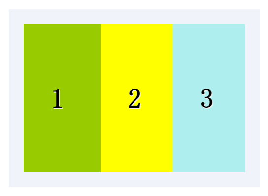
1.box-flex属性规定框的子元素是否可伸缩其尺寸。
父元素必须要声明display:box;子元素才可以用box-flex。
语法:box-flex:value;
示例:
<style>
.test_box {display: -moz-box;display: -webkit-box;display:box;width: 800px;margin: 40px auto;padding: 20px;
background: #f0f3f9;}
.list {padding: 0 1em; font: bold 36px/200px monaco;text-shadow: 1px 1px #eee;}
.list_one { -moz-box-flex: 1;-webkit-box-flex: 1;box-flex: 1;background-color: yellow;}
.list_two{-moz-box-flex: 2;-webkit-box-flex: 2;box-flex: 2;background-color: #99CC00;}
.list_three {-moz-box-flex: 1;-webkit-box-flex: 1;box-flex: 1;background-color: paleturquoise;}
</style>
<div class="test_box">
<div class="list list_two">1</div>
<div class="list list_one">2</div>
<div class="list list_three">3</div>
</div>
结果: 图片
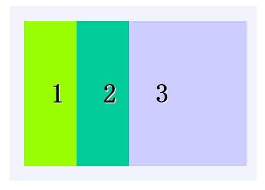
可以指定某个子元素的宽度,剩下的部分平分。
示例:
<style>
.test_box {display: -moz-box;display: -webkit-box;display: box;width: 800px;margin: 40px auto;padding: 20px;
background: #f0f3f9;}
.list {padding: 0 1em;font: bold 36px/200px monaco;
text-shadow: 1px 1px #eee;}
.list_one {-moz-box-flex: 1;-webkit-box-flex: 1;box-flex: 1;background: #00CC99;}
.list_two {-moz-box-flex: 2;-webkit-box-flex: 2;box-flex: 2;background: #99FF00;}
.list_w300 { width: 300px; background: #CCCCFF}
</style>
<div class="test_box">
<div class="list list_two">1</div>
<div class="list list_one">2</div>
<div class="list list_w300">3</div>
</div>
结果: 图片
2.box-orient
用来确定子元素的方向,是横着还是竖着。
可选值:horizontal | vertical | inline-axis | box-axis | inherit inline-axis是默认的 horizonta inline-axis 是一样的让元素横着 vertical
box-axis 是一样的让元素纵列。
示例:
<style>
.test_box {width: 300px; margin: 0 auto;display: -moz-box;
display: -webkit-box;display: box;box-orient:horizontal;padding: 20px;background: #f0f3f9;}
.list{padding: 0 1em;font: bold 36px/120px monaco; text-shadow: 1px 1px #eee;-webkit-box-flex: 1;}
.one{background: #99FF00;}
.two{background: #00CC99}
.three{background:#CCCC00}
</style>
<div class="test_box">
<div class="list one">1</div>
<div class="list two">2</div>
<div class="list three">3</div>
</div>
结果:如图

3.box-direction
用来确定子元素的排列顺序。可选值:
onrmal | revers | inherit onrmal是默认值按着正常顺序排列,从左到右
从前到后,revers表示反转。
示例:
<style>
.test_box {display: -moz-box;display: -webkit-box;display: box;-moz-box-direction:reverse;-webkit-box-direction:reverse;
box-direction:reverse;width: 300px;margin: 20px auto;padding: 10px;background: #f0f3f9;}
.list {padding: 0 1em;font: bold 36px/150px monaco;text-shadow: 1px 1px #eee;}
.list_one {-moz-box-flex: 1;-webkit-box-flex: 1;box-flex: 1;background: yellow;}
.list_two{-moz-box-flex: 2;-webkit-box-flex: 2;box-flex: 2;background: #99CC00;}
.three{background: #CCCCFF}
</style>
<div class="test_box">
<div class="list list_two">1</div>
<div class="list list_one">2</div>
<div class="list list_one three">3</div>
</div>
结果: 如图

4.box-align与box-pack
决定盒子内部剩余空间怎么使用,行为效果为对齐方式。
box-align 为垂直方向上的空间利用,box-pack 为水平方向上的空间利用。
box-align 可选参数: start | end | center | baseline | stretch
stretch为默认父标签的高度有多高,子元素就有多高。start表示底边对齐
end 为底部对齐,center居中对齐,baseline 基线对齐。
示例:
<style>
.test_box {margin: 0 auto;display: -moz-box;display: -webkit-box;
display: -o-box;display: box;-moz-box-align:end;
-webkit-box-align:end; -o-box-align:end; box-align:end;
width: 300px;height: 200px;padding: 20px;background: #f0f3f9;}
.list {padding: 0 1em;font: bold 36px/120px monaco;text-shadow: 1px 1px #eee;}
.one{background: #99FF00;}
.two{background: #00CC99}
.three{background:#CCCC00}
</style>
<div class="test_box">
<div class="list one">1</div>
<div class="list two" style="line-height:200px;">2</div>
<div class="list three">3</div>
</div>
结果:如图

box-pack可选值: start | end | center | justify
start为默认值, justify表示两端对齐。
示例:
<style>
.test_box {margin: 0 auto;display: -moz-box;display: -webkit-box;
display: -o-box;display: box;-moz-box-pack:justify;
-webkit-box-pack:justify; -o-box-pack:justify; box-pack:justify;
width: 300px;height: 200px;padding: 20px;background: #f0f3f9;}
.list {padding: 0 1em;font: bold 36px/120px monaco;
text-shadow: 1px 1px #eee;}
.one{background: #99FF00;}
.two{background: #00CC99}
.three{background:#CCCC00}
</style>
<div class="test_box">
<div class="list one">1</div>
<div class="list two" style="line-height:200px;">2</div>
<div class="list three">3</div>
</div>
结果:如图

5.box-lines
用来决定子元素是否可以换行显示,有两个可以选的值:single | mutiple
single 默认值,不换行。mutiple 换行多行显示。
示例:
<style>
.test_box {margin: 0 auto;display: -moz-box;display: -webkit-box;
display: -o-box;display: box;-moz-box-lines:multiple;
-webkit-box-lines:multiple;-o-box-lines:multiple;
box-lines:multiple; width: 300px;
height: 200px;padding: 20px;background: #f0f3f9;}
.list {padding: 0 1em;font: bold 36px/120px monaco;text-shadow: 1px 1px #eee;}
.one{background: #99FF00;}
.two{background: #00CC99}
.three{background:#CCCC00}
</style>
<div class="test_box">
<div class="list one">1</div>
<div class="list two" style="line-height:200px;">2</div>
<div class="list three">3</div>
</div>
结果:如图

6.box-ordinal-group
改变子元素的顺序,值为数字,数字越小越排在前面。
示例:
<style>
.test_box {display: -moz-box;display: -webkit-box;display: box;
width: 300px;margin: 40px auto;padding: 20px;background: #f0f3f9;}
.list {padding: 0 1em;font: bold 36px/200px monaco;text-shadow: 1px 1px #eee;}
.list_one {-moz-box-flex: 1;-webkit-box-flex: 1; box-flex: 1;
-moz-box-ordinal-group: 1;-webkit-box-ordinal-group: 1;box-ordinal-group: 1;background: #99CC00;}
.list_two{-moz-box-flex: 2;-webkit-box-flex: 2;box-flex: 2;-moz-box-ordinal-group: 2;-webkit-box-ordinal-group: 2;
box-ordinal-group: 2;background: #CC33CC;}
.three{ background: #CCCC00}
</style>
<div class="test_box">
<div class="list list_two">1</div>
<div class="list list_one">2</div>
<div class="list list_one three">3</div>
</div>
结果:如图

demo下载https://github.com/ningmengxs/css3.git
css3弹性盒子模型——回顾。的更多相关文章
- css3弹性盒子模型之box-flex
css3弹性盒子模型之box-flex 浏览器支持 目前没有浏览器支持 box-flex 属性. Firefox 支持替代的 -moz-box-flex 属性. Safari.Opera 以及 Chr ...
- css3弹性盒子模型
当下各种手机,平板尺寸不一,如果盒模型只能固定尺寸,不能随意压缩,将不能很好的迎合这个时代.所以css3推出了新的盒模型——弹性盒子模型(Flexible Box Model). 弹性盒模型可以水平布 ...
- CSS3中的弹性盒子模型
介绍 在css2当中,存在标准模式下的盒子模型和IE下的怪异盒子模型.这两种方案表示的是一种盒子模型的渲染模式.而在css3当中,新增加了弹性盒子模型,弹性盒子模型是一种新增加的强大的.灵活的布局方案 ...
- CSS3弹性盒模型flexbox布局基础版
原文链接:http://caibaojian.com/using-flexbox.html 最近看了社区上的一些关于flexbox的很多文章,感觉都没有我这篇文章实在,最重要的兼容性问题好多人都没有提 ...
- css3基础教程:CSS3弹性盒模型
今天给大家分享一篇关于CSS3基础教程 文章,主要是讲CSS3弹性盒模型.弹性布局的主要思想是让容器有能力来改变项目的宽度和高度,以填满可用空间(主要是为了容纳所有类型的显示设备和屏幕尺寸)的能力. ...
- CSS3弹性盒模型布局模块介绍
来源:Robert’s talk原文:http://robertnyman.com/2010/12/02/css3-flexible-box-layout-module-aka-flex-box-in ...
- flexbox弹性盒子模型
这几天在做移动端的web开发,遇到了一些问题,之前没有折腾过这方面的东西,这次好好吸收下 css3的flexbox--弹性盒子模型,这个盒模型决定了一个盒子在其他盒子中的分布方式及如何处理可用的空间. ...
- CSS box-flex属性,然后弹性盒子模型简介
今天做项目的时候发现一个css3的新属性flex 一.什么是flex 它的作用是能够按照设置好的规则来排列容器内的项目,而不必去计算每一个项目的宽度和边距.甚至是在容器的大小发生改变的时候,都可以重新 ...
- CSS box-flex属性,然后弹性盒子模型简介(转)
一.淡淡的开头语 昨天趁着不想工作的时间间隙闲逛24ways,在My CSS Wish List一文中,见到了个新鲜的CSS属性,就是题目中的box-flex,以前没有见过,顿生疑惑,不知是骡子还是马 ...
随机推荐
- iOS WebView的用法
一.UIWebView 可以加载和显示某个URL的网页,也可以显示基于HTML的本地网页或部分网页: a. 加载 URL WebView = [[UIWebView alloc] initWithFr ...
- iOS查错机制
转自: http://mp.weixin.qq.com/s?__biz=MjM5OTM0MzIwMQ==&mid=404478233&idx=2&sn=ae55d4f70fce ...
- openstack名称发音收集
MariaDB: maria['mɛərɪr] Corosync: coro[kə'roʊ] sync[sɪŋk] pacemaker: [ˈpesˌmekɚ] galera: ...
- (简单) POJ 2406 Power Strings,扩展KMP。
Description Given two strings a and b we define a*b to be their concatenation. For example, if a = & ...
- MAP--复杂map结构的构造
我的关键结构比如 struct{ int a; int b; int c; }s: 因为这三个数据是基本信息,可以唯一区别一个设备.拿这样一个数据结构作为索引就能找到每个设备. ...
- 【python】matplotlib在windows下安装
昨晚装了好久的这玩意,终于在凌晨成功搞定,然后跑起了一个人人网抓取好友关系的脚本~开心. 以下是我参考的最给力的文档,全部安装一遍,就可以啦~ 但是!在安装前一定要先确认自己的python版本!本人自 ...
- mysql 隔离级别与锁
1.什么是事务 事务是一条或多条数据库操作语句的组合,具备ACID,4个特点. 原子性:要不全部成功,要不全部撤销 隔离性:事务之间相互独立,互不干扰 一致性:数据库正确地改变状态后,数据库的一致性约 ...
- Laravel邮件发送问题小解
在Laravel中已经有内置了发送邮件的功能,通过 Mail::send 可发送邮件,但要使用这个函数必须先进行相关配置. 在 /app/config/mail.php 中设置你的邮件参数,如下: 1 ...
- Android源码编译jar包BUILD_JAVA_LIBRARY 与BUILD_STATIC_JAVA_LIBRARY的区别(二)
上文简单介绍了BUILD_JAVA_LIBRARY 与BUILD_STATIC_JAVA_LIBRARY编译出来jar包的区别, 那么你如果拿到了一个内容是dex格式的jar包,而你又偏偏需要这个ja ...
- mysql查看sql语句执行时间
原文地址: http://www.cnblogs.com/happySmily/p/5943311.html