SVG渐变
前面的话
给SVG元素应用填充和描边,除了使用纯色外,还可以使用渐变。本文将详细介绍SVG渐变
线性渐变
有两种类型的渐变:线性渐变和径向渐变。必须给渐变内容指定一个id属性,否则文档内的其他元素不能引用它。为了让渐变能被重复使用,渐变内容需要定义在<defs>标签内部,而不是定义在形状上面
线性渐变沿着直线改变颜色,要插入一个线性渐变,需要在SVG文件的defs元素内部,创建一个<linearGradient> 节点
<svg height="70" version="1.1" xmlns="http://www.w3.org/2000/svg">

  <defs>

      <linearGradient id="Gradient1">

        <stop offset="0%" stop-color="#05a"/>

        <stop offset="100%" stop-color="#0a5"/>

      </linearGradient>

  </defs>

  <rect id="rect1" x="10" y="10" rx="15" ry="15" width="50" height="50" fill="url(#Gradient1)"/>

</svg>
结果如下所示,默认情况下实现的是水平方向的渐变
<stop>元素一共有3个属性,包括offset,stop-color,stop-opacity
offset用来设置色标位置

stop-color用来设置色标颜色

stop-opacity用来设置色标的透明度
下面是一个例子
<svg height="70" version="1.1" xmlns="http://www.w3.org/2000/svg">

  <defs>

      <linearGradient id="Gradient1">

        <stop offset="0%" stop-color="#05a"/>

        <stop offset="50%" stop-color="#50a" stop-opacity="0.5"/>

        <stop offset="100%" stop-color="#0a5"/>

      </linearGradient>

  </defs>

  <rect id="rect1" x="10" y="10" rx="15" ry="15" width="50" height="50" fill="url(#Gradient1)"/>

</svg>
【x1、x2、y1、y2】
线性渐变包括x1、x2、y1、y2这四个属性,用来控制渐变的大小和方向。取值为0-100%,或者0-1的小数。默认地,x1=y1=y2=0、x2=1
如果变成垂直方向的渐变,则需要设置为x1=x2=y1=0、y2=1
<svg height="70" version="1.1" xmlns="http://www.w3.org/2000/svg">

  <defs>

      <linearGradient id="Gradient1" x1=0 x2=0 y1=0 y2=1>

        <stop offset="0%" stop-color="#05a"/>

        <stop offset="100%" stop-color="#0a5"/>

      </linearGradient>

  </defs>

  <rect id="rect1" x="10" y="10" rx="15" ry="15" width="50" height="50" fill="url(#Gradient1)"/>

</svg>
如果将y2或x2设置为50%,则50%-100%这一部分区域填充为最后一个色标的纯色
<svg height="70" version="1.1" xmlns="http://www.w3.org/2000/svg">

  <defs>

      <linearGradient id="Gradient1" x1=0 x2=50% y1=0 y2=50%>

        <stop offset="0%" stop-color="#05a"/>

        <stop offset="100%" stop-color="#0a5"/>

      </linearGradient>

  </defs>

  <rect id="rect1" x="10" y="10" rx="15" ry="15" width="50" height="50" fill="url(#Gradient1)"/>

</svg>
当然了,可以有多个色标
<svg height="70" version="1.1" xmlns="http://www.w3.org/2000/svg">

  <defs>

      <linearGradient id="Gradient1" x1=0 x2=1 y1=0 y2=1>

        <stop offset="0%" stop-color="#05a"/>

        <stop offset="20%" stop-color="#50a"/>

        <stop offset="40%" stop-color="#5a0"/>

        <stop offset="60%" stop-color="#a05"/>

        <stop offset="80%" stop-color="#a50"/>

        <stop offset="100%" stop-color="#0a5"/>

      </linearGradient>

  </defs>

  <rect id="rect1" x="10" y="10" rx="15" ry="15" width="50" height="50" fill="url(#Gradient1)"/>

</svg>
渐变除了可以作为填充,也可以作为描边
<svg height="70" version="1.1" xmlns="http://www.w3.org/2000/svg">

  <defs>

      <linearGradient id="Gradient1" x1=0 x2=1 y1=0 y2=1>

        <stop offset="0%" stop-color="#05a"/>

        <stop offset="20%" stop-color="#50a"/>

        <stop offset="40%" stop-color="#5a0"/>

        <stop offset="60%" stop-color="#a05"/>

        <stop offset="80%" stop-color="#a50"/>

        <stop offset="100%" stop-color="#0a5"/>

      </linearGradient>

  </defs>

  <rect id="rect1" x="10" y="10" rx="15" ry="15" width="50" height="50" fill="transparent" stroke-width="10" stroke="url(#Gradient1)"/>

</svg>
【xlink:href】
xlink:href属性用于在一个渐变中引用另一个渐变,被引用的渐变的属性是可继承的,也可以被重写
下面的例子中,Gradient2引用了Gradient1的渐变,并重写了渐变的方向
<svg height="70" version="1.1" xmlns="http://www.w3.org/2000/svg">

  <defs>

      <linearGradient id="Gradient1" x1=0 x2=1 y1=0 y2=1>

        <stop offset="0%" stop-color="#05a"/>

        <stop offset="50%" stop-color="#50a"/>

        <stop offset="100%" stop-color="#0a5"/>

      </linearGradient>

      <linearGradient id="Gradient2" xlink:href="#Gradient1" x1=0 x2=0 y1=0 y2=1>

      </linearGradient>

  </defs>

  <rect id="rect1" x="10" y="10" rx="15" ry="15" width="50" height="50" fill="url(#Gradient2)"/>

</svg>
【gradientUnits】
gradientUnits有两个的值,userSpaceOnUse和objectBoundingBox,这用于决定渐变是否随着引用它的元素进行缩放。也就是说它决定了x1、y1、x2、y2的缩放
userSpaceOnUse: x1、y1、x2、y2表示当前用户坐标系统的坐标。也就是说渐变中的值都是绝对值
objectBoundingBox: x1, y1, x2, y2表示应用渐变的元素创建的边界坐标系统。也就是说渐变随着应用的元素进行了缩放
如果不设置,默认取值是objectBoundingBox
<svg height="70" version="1.1" xmlns="http://www.w3.org/2000/svg">

  <defs>

      <linearGradient id="Gradient1" gradientUnits="objectBoundingBox">

        <stop offset="0%" stop-color="#05a"/>

        <stop offset="50%" stop-color="#50a"/>

        <stop offset="100%" stop-color="#0a5"/>

      </linearGradient>

  </defs>

  <rect id="rect1" x="10" y="10" rx="15" ry="15" width="50" height="50" fill="url(#Gradient1)"/>

</svg>
如果设置为userSpaceOnUse,则x1、x2、y1、y2需要设置为用户坐标系的坐标绝对值
<svg height="70" version="1.1" xmlns="http://www.w3.org/2000/svg">

  <defs>

      <linearGradient id="Gradient1" gradientUnits="userSpaceOnUse" x1="10" x2="60" y1="0" y2="0">

        <stop offset="0%" stop-color="#05a"/>

        <stop offset="50%" stop-color="#50a"/>

        <stop offset="100%" stop-color="#0a5"/>

      </linearGradient>

  </defs>

  <rect id="rect1" x="10" y="10" rx="15" ry="15" width="50" height="50" fill="url(#Gradient1)"/>

</svg>
【spreadMethod】
spreadMethod可以接受三个值,pad,reflect,repeat,它定义了渐变如何开始和结束,当cx和cy的值是在0%到100%里面的时候
pad:(默认值)使用开始和结束位置的颜色结点来填充剩余的部分

reflect: 反射渐变图案,从开始->结束,再从结束->开始,然后开始->结束,往复直到空间都填满

repeat: 从start-to-end重复渐变图案,直到空间填满
pad为默认值
<svg height="70" version="1.1" xmlns="http://www.w3.org/2000/svg" >

  <defs>

      <linearGradient id="Gradient1" spreadMethod=pad x1=0.4 x2=0.6>

        <stop offset="0%" stop-color="#05a"/>

        <stop offset="100%" stop-color="#0a5"/>

      </linearGradient>

  </defs>

  <rect id="rect1" x="10" y="10" rx="15" ry="15" width="50" height="50" fill="url(#Gradient1)"/>

</svg>
下面是reflect的效果
<svg height="70" version="1.1" xmlns="http://www.w3.org/2000/svg" >

  <defs>

      <linearGradient id="Gradient1" spreadMethod=reflect x1=0.4 x2=0.6>

        <stop offset="0%" stop-color="#05a"/>

        <stop offset="100%" stop-color="#0a5"/>

      </linearGradient>

  </defs>

  <rect id="rect1" x="10" y="10" rx="15" ry="15" width="50" height="50" fill="url(#Gradient1)"/>

</svg>
下面是repeat的效果
<svg height="70" version="1.1" xmlns="http://www.w3.org/2000/svg" >

  <defs>

      <linearGradient id="Gradient1" spreadMethod=repeat x1=0.4 x2=0.6>

        <stop offset="0%" stop-color="#05a"/>

        <stop offset="100%" stop-color="#0a5"/>

      </linearGradient>

  </defs>

  <rect id="rect1" x="10" y="10" rx="15" ry="15" width="50" height="50" fill="url(#Gradient1)"/>

</svg>
径向渐变
径向渐变与线性渐变相似,只是它是从一个点开始发散绘制渐变。创建径向渐变需要在文档的defs中添加一个<radialGradient>元素
<svg height="70" version="1.1" xmlns="http://www.w3.org/2000/svg">

  <defs>

      <radialGradient id="Gradient1">

        <stop offset="0%" stop-color="#05a"/>

        <stop offset="50%" stop-color="#50a" stop-opacity="0.5"/>

        <stop offset="100%" stop-color="#0a5"/>

      </radialGradient>

  </defs>

  <rect id="rect1" x="10" y="10" rx="15" ry="15" width="50" height="50" fill="url(#Gradient1)"/>

</svg>
【cx、cy、r、fx、fy】
与线性渐变的x1、y1、x2、y2属性不同,径向渐变使用cx、cy、r、fx、fy这五个属性来设置渐变
r 设置圆的半径

cx、cy 定义渐变的中心点坐标

fx、fy  定义渐变的焦点坐标
如果不设置,r默认0.5,即元素宽度或高度的一半;cx、cy默认为0.5;fx、fy默认为0.5
<svg height="70" version="1.1" xmlns="http://www.w3.org/2000/svg">

  <defs>

      <radialGradient id="Gradient1"  r=0.5 cx=0.5 cy=0.5 fx=0.5 fy=0.5>

        <stop offset="0%" stop-color="#05a"/>

        <stop offset="50%" stop-color="#50a" stop-opacity="0.5"/>

        <stop offset="100%" stop-color="#0a5"/>

      </radialGradient>

  </defs>

  <rect id="rect1" x="10" y="10" rx="15" ry="15" width="50" height="50" fill="url(#Gradient1)"/>

</svg>
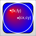
巧妙地设置焦点坐标,可以实现聚光灯的效果
<svg height="70" version="1.1" xmlns="http://www.w3.org/2000/svg">

  <defs>

      <radialGradient id="Gradient1"  r=0.5 cx=0.5 cy=0.5 fx=0.8 fy=0.8>

        <stop offset="0%" stop-color="#05a"/>

        <stop offset="50%" stop-color="#50a" stop-opacity="0.5"/>

        <stop offset="100%" stop-color="#0a5"/>

      </radialGradient>

  </defs>

  <rect id="rect1" x="10" y="10" rx="15" ry="15" width="50" height="50" fill="url(#Gradient1)"/>

</svg>
【xlink:href】
xlink:href属性用于在一个渐变中引用另一个渐变,被引用的渐变的属性是可继承的,也可以被重写
下面的例子中,Gradient2引用了Gradient1的渐变,并重写了渐变的方向
<svg height="70" version="1.1" xmlns="http://www.w3.org/2000/svg">

  <defs>

      <radialGradient id="Gradient1">

        <stop offset="0%" stop-color="#05a"/>

        <stop offset="50%" stop-color="#50a" stop-opacity="0.5"/>

        <stop offset="100%" stop-color="#0a5"/>

      </radialGradient>

      <radialGradient id="Gradient2" xlink:href="#Gradient1" fx=0.6>

  </defs>

  <rect id="rect1" x="10" y="10" rx="15" ry="15" width="50" height="50" fill="url(#Gradient2)"/>

</svg>
【gradientUnits】
gradientUnits有两个的值,userSpaceOnUse和objectBoundingBox,这用于决定渐变是否随着引用它的元素进行缩放。也就是说它决定了cx、cy、fx、fy、r的缩放
userSpaceOnUse: cx、cy、fx、fy、r表示当前用户坐标系统的坐标。也就是说渐变中的值都是绝对值
objectBoundingBox: cx、cy、fx、fy、r表示应用渐变的元素创建的边界坐标系统。也就是说渐变随着应用的元素进行了缩放
如果不设置,默认取值是objectBoundingBox
<svg height="70" version="1.1" xmlns="http://www.w3.org/2000/svg">

  <defs>

      <radialGradient id="Gradient1" gradientUnits="objectBoundingBox">

        <stop offset="0%" stop-color="#05a"/>

        <stop offset="50%" stop-color="#50a" stop-opacity="0.5"/>

        <stop offset="100%" stop-color="#0a5"/>

      </radialGradient>

  </defs>

  <rect id="rect1" x="10" y="10" rx="15" ry="15" width="50" height="50" fill="url(#Gradient1)"/>

</svg>
如果设置为userSpaceOnUse,则cx、cy、fx、fy、r需要设置为用户坐标系的坐标绝对值
<svg height="70" version="1.1" xmlns="http://www.w3.org/2000/svg">

  <defs>

      <radialGradient id="Gradient1" gradientUnits="userSpaceOnUse" cx=35 cy=35 fx=35 fy=35 r=25>

        <stop offset="0%" stop-color="#05a"/>

        <stop offset="50%" stop-color="#50a" stop-opacity="0.5"/>

        <stop offset="100%" stop-color="#0a5"/>

      </radialGradient>

  </defs>

  <rect id="rect1" x="10" y="10" rx="15" ry="15" width="50" height="50" fill="url(#Gradient1)"/>

</svg>
【spreadMethod】
和线性渐变一样。它可以接受三个值,pad,reflect,repeat,它定义了渐变如何开始和结束,当cx和cy的值是在0%到100%里面的时候
pad:(默认值)使用开始和结束位置的颜色结点来填充剩余的部分

reflect: 反射渐变图案,从开始->结束,再从结束->开始,然后开始->结束,往复直到空间都填满

repeat: 从start-to-end重复渐变图案,直到空间填满
pad为默认值
<svg height="70" version="1.1" xmlns="http://www.w3.org/2000/svg">

  <defs>

      <radialGradient id="Gradient1" r=0.2 spreadMethod=pad>

        <stop offset="0%" stop-color="#05a"/>

        <stop offset="50%" stop-color="#50a" stop-opacity="0.5"/>

        <stop offset="100%" stop-color="#0a5"/>

      </radialGradient>

  </defs>

  <rect id="rect1" x="10" y="10" rx="15" ry="15" width="50" height="50" fill="url(#Gradient1)"/>

</svg>
下面是reflect的效果
<svg height="70" version="1.1" xmlns="http://www.w3.org/2000/svg">

  <defs>

      <radialGradient id="Gradient1" r=0.2 spreadMethod=reflect>

        <stop offset="0%" stop-color="#05a"/>

        <stop offset="50%" stop-color="#50a" stop-opacity="0.5"/>

        <stop offset="100%" stop-color="#0a5"/>

      </radialGradient>

  </defs>

  <rect id="rect1" x="10" y="10" rx="15" ry="15" width="50" height="50" fill="url(#Gradient1)"/>

</svg>
下面是repeat的效果
<svg height="70" version="1.1" xmlns="http://www.w3.org/2000/svg">

  <defs>

      <radialGradient id="Gradient1" r=0.2 spreadMethod=repeat>

        <stop offset="0%" stop-color="#05a"/>

        <stop offset="50%" stop-color="#50a" stop-opacity="0.5"/>

        <stop offset="100%" stop-color="#0a5"/>

      </radialGradient>

  </defs>

  <rect id="rect1" x="10" y="10" rx="15" ry="15" width="50" height="50" fill="url(#Gradient1)"/>

</svg>
SVG渐变的更多相关文章
- 学习SVG系列(5):SVG渐变
SVG渐变 渐变是一种从一种颜色到另一种颜色的平滑过渡,可以把多个颜色的过渡应用到同一个元素. 渐变有两种: Linear Redial 线性渐变-<linearGradient> lin ...
- 走进SVG
什么是SVG?也许现在很多人都听说过SVG的人比较多,但不一定了解什么是SVG:SVG(Scalable Vector Graphics 一大串看不懂的英文)可伸缩矢量图形,它是用XML格式来定义用于 ...
- svg矢量图
svg简介 Scalable Vector Graphics 可缩放矢量图形 SVG 图像在放大或改变尺寸的情况下其图形质量不会有所损失 svg知识点 svg如何绘图 svg和cnavas区别 svg ...
- SVG介绍
SVG介绍 SVG是指可缩放矢量图(Scalable Vector Graphics).SVG使用XML格式来定义图形.SVG可以直接嵌入到HTML页面中. 位图和矢量图 位图(Bitmap)是由很多 ...
- svg基础知识体系建立
一.简介:SVG 是使用 XML 来描述二维图形和绘图程序的语言. SVG 指可伸缩矢量图形 (Scalable Vector Graphics) SVG 用来定义用于网络的基于矢量的图形 SVG 使 ...
- SVG和canvas画图,js求数组最大最小值
windows命令行的内容怎么复制,右键选择标记,选中内容后再点击鼠标右键就复制了. 安装Node.js后再用npm install命令会出现如下warn:saveError ENOENT: no s ...
- HTML5 可缩放矢量图形(1)—SVG基础
参考文档1 SVG基础 SVG介绍 概念:SVG 是使用 XML 来描述二维图形和绘图程序的语言.(理解就是一个在网页上使用笔画图的过程) 什么是SVG SVG 指可伸缩矢量图形 (Scalable ...
- 关于 CSS 反射倒影的研究思考
原文地址:https://css-tricks.com/state-css-reflections 译者:nzbin 友情提示:由于演示 demo 的兼容性,推荐火狐浏览.该文章篇幅较长,内容庞杂,有 ...
- CSS遮罩——如何在CSS中使用遮罩
Css遮罩是2008年4月由苹果公司添加到webkit引擎中的.遮罩提供一种基于像素级别的,可以控制元素透明度的能力,类似于png24位或png32位中的alpha透明通道的效果. 图像是由rgb三个 ...
随机推荐
- 定时器(setTimeout)的秘密
原文地址:→传送门 写在前面 setTimeout()是大家再熟悉不过的定时器,但平时对定时器的了解甚少,于是想看看setTimeout()的原理机制. setTimeout()基础 setTimeo ...
- 计时器C#
用于测某一方法执行所用的时间: Stopwatch sw = new Stopwatch(); sw.Start(); //功能代码块 sw.Stop(); long totalTime = sw.E ...
- vc++MFC开发上位机程序
用vc++MFC开发过不少跟单片机通讯的上位机程序了.搞懂了MFC架构,开发还是很快的,与底层单片机程序通讯,可以用串口.usb.网络.短信形式.串口现在用的越来越少了,一般电脑跟单片机在一块,使用串 ...
- 相对路径&绝对路径
粗浅理解: 1)绝对路径:带有访问协议的路径,就是带上http访问协议 2)相对路径: ①以带斜杠开头的相对路径: A)前台相对路径:以web服务器的根路径为参照路径,比如在jsp.HTML中写的路径 ...
- 16. leetcode 404. Sum of Left Leaves
Find the sum of all left leaves in a given binary tree. Example: 3 / \ 9 20 / \ 15 ...
- 10. leetcode 226 Invert Binary Tree
思路:递归.先将左子树反转,再将右子树反转,然后让root->left指向反转后的右子树,root->right指向反转后的左子树.
- 双向循环链表(C语言描述)(一)
双向循环链表是链表的一种,它的每个节点也包含数据域和指针域.为了方便程序维护,可以单独为数据域定义一种数据类型,这里以整型为例: typedef int LinkedListData; 双向循环链表( ...
- Hibernate 中Criteria Query查询详解【转】
当查询数据时,人们往往需要设置查询条件.在SQL或HQL语句中,查询条件常常放在where子句中.此外,Hibernate还支持Criteria查询(Criteria Query),这种查询方式把查询 ...
- MySql学习笔记(四)
MYSQL如何查看系统帮助: 1.查看官方API文档: http://dev.mysql.com/doc/ 2.通过Mysql中的help命令 比如:help create database MYSQ ...
- httpd页面用户访问认证控制
[root@liubin-pc ~]# yum install -y httpd 客户机地址限制 通过配置Order.Deny from.Allow from 来限制客户机 allow.deny :先 ...