关于matplotlib绘制直方图偏移的问题
在使用pyplot绘制直方图的时候我发现了一个问题,在给函数.hist()传参的时候,如果传入的组数不是刚刚好(就是说这个组数如果是使用(最大值-最小值)/组距计算出来,而这个数字不是整除得来而是取整得来的话),图像就会产生偏移现象。
看下面这段代码:绘制IMDB排行前1000电影的时长分布直方图
# coding=utf-8

from matplotlib import pyplot as plt

import pandas as pd

# 数据准备

file_path = "./IMDB-Movie-Data.csv"

df = pd.read_csv(file_path)

runtime_data = df["Runtime (Minutes)"]

# 计算组数

max_runtime = max(runtime_data)

min_runtime = min(runtime_data)

num_bin = int((max_runtime-min_runtime)//6)

# 配置图形参数

plt.figure(figsize=(20, 8), dpi=80)

plt.grid(alpha=0.5)

# 绘图

plt.hist(runtime_data, num_bin)

plt.xticks(range(min_runtime, max_runtime+6, 6))

plt.show()
结果如下:
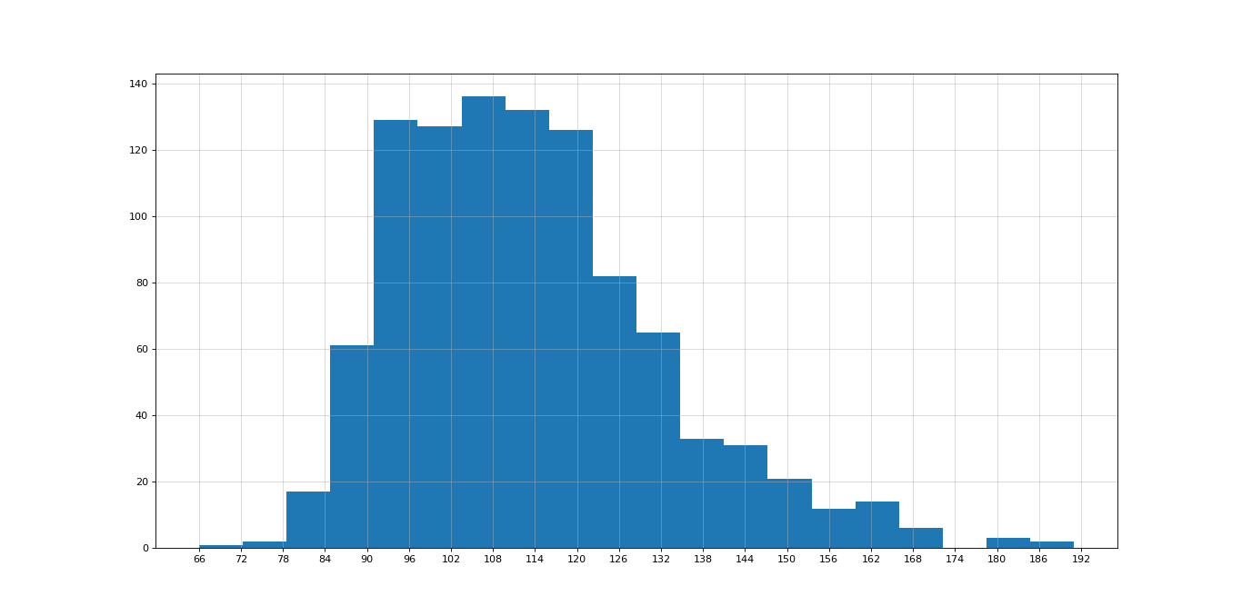
- 产生这个问题的原因就在于,在这个程序中
max_runtime-min_runtime的值是125,不能被6整除,所以产生了偏移。
如果我们将上述代码中的(max_runtime-min_runtime)//6和plt.xticks(range(min_runtime, max_runtime+6, 6))中的6更换为一个能被125整除的数,比如5,结果会是如何呢?
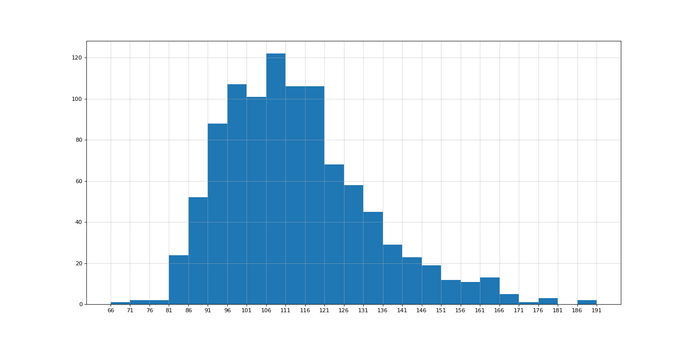
- 我们可以看到问题解决了,偏移消失了,但是这并不是解决问题的根本办法,如果我们就是要用6作为组距而不想偏移呢?
我们可以传入一个列表参数来解决这个问题
# coding=utf-8

from matplotlib import pyplot as plt

import pandas as pd

# 数据准备

file_path = "./IMDB-Movie-Data.csv"

df = pd.read_csv(file_path)

runtime_data = df["Runtime (Minutes)"]

# 将传参从组数改为传入列表

max_runtime = max(runtime_data)

min_runtime = min(runtime_data)

plt.figure(figsize=(20, 8), dpi=80)

plt.hist(runtime_data, range(min_runtime, max_runtime+6, 6))

plt.grid(alpha=0.5)

plt.xticks(range(min_runtime, max_runtime+6, 6))

plt.show()
结果如图:

关于matplotlib绘制直方图偏移的问题的更多相关文章
- NumPy使用 Matplotlib 绘制直方图
NumPy - 使用 Matplotlib 绘制直方图 NumPy 有一个numpy.histogram()函数,它是数据的频率分布的图形表示. 水平尺寸相等的矩形对应于类间隔,称为bin,变量hei ...
- matplotlib绘制直方图【柱状图】
代码: def drawBar(): xticks = ['A', 'B', 'C', 'D', 'E']#每个柱的下标说明 gradeGroup = {'A':200,'B':250,'C':330 ...
- Python:matplotlib绘制直方图
使用hist方法来绘制直方图: 绘制直方图,最主要的是一个数据集data和需要划分的区间数量bins,另外你也可以设置一些颜色.类型参数: plt.hist(np.random.randn(1 ...
- numpy和matplotlib绘制直方图
使用 Matplotlib Matplotlib 中有直方图绘制函数:matplotlib.pyplot.hist()它可以直接统计并绘制直方图.你应该使用函数 calcHist() 或 np.his ...
- 4.matplotlib绘制直方图
  # coding=utf-8 from matplotlib import pyplot as plt from matplotlib import font_manager a=[131, ...
- 利用pandas读取Excel表格,用matplotlib.pyplot绘制直方图、折线图、饼图
利用pandas读取Excel表格,用matplotlib.pyplot绘制直方图.折线图.饼图 数据: 折线图代码: import pandas as pdimport matplotlib. ...
- matplotlib如何绘制直方图、条形图和饼图
1 绘制直方图: import matplotlib.pyplot as plt import numpy as np import matplotlib def hist1(): # 设置matpl ...
- python包matplotlib绘制图像
使用matplotlib绘制图像 import matplotlib.pyplot as plt from matplotlib.pyplot import MultipleLocator impor ...
- matplotlib绘制动画
matplotlib从1.1.0版本以后就开始支持绘制动画,具体使用可以参考官方帮助文档.下面是一个很基本的例子: """ A simple example of an ...
随机推荐
- 从零开始搭建vue开发环境及构建vue项目
1.安装node.js 安装完成之后,打开dos(windows+R或者直接windows键打开,输入cmd,按回车键)窗口,输入命令node -v可以查看安装的 node.js版本 node.js自 ...
- LVS,Keepalived,HAproxy区别与联系
LVS,Keepalived,HAproxy区别与联系 LVS 全称Linux Virtual Server,也就是Linux虚拟服务器,由章文嵩(现就职于于淘宝,正因为如此才出现了后来的fullna ...
- Python 中文分词(结巴分词)
特点: 支持三种分词模式: 精确模式,试图将句子最精确地切开,适合文本分析: 全模式,把句子中所有的可以成词的词语都扫描出来, 速度非常快,但是不能解决歧义: 搜索引擎模式,在精确模式的基础上,对长词 ...
- 2018-2019-2 网络对抗技术 20165336 Exp1 PC平台逆向破解
2018-2019-2 网络对抗技术 20165336 Exp1 PC平台逆向破解 1. 逆向及Bof基础实践说明 1.1 实践目标 本次实践的对象是一个名为pwn1的linux可执行文件.该程序正常 ...
- redis常用的命令总结
redis常用的命令大全 1.基于内存的key-value数据库 2.基于c语言编写的,可以支持多种语言的api //set每秒11万次,取get 81000次 3.支持数据持久化 4.value可以 ...
- centos7的systemd命令对比
centos7的systemd命令对比 http://www.linuxidc.com/Linux/2014-09/106490p2.htmhttp://www.linuxidc.com/Linux/ ...
- Python3.0科学计算学习之绘图(二)
(1) np.mashgrid()函数:-----生成网络点坐标矩阵,可以是二维网络矩阵,也可以是三维网络矩阵.其中,每个交叉点就是网络点,描述这些网络点的矩阵就是坐标矩阵(横坐标矩阵X中的每个元素与 ...
- 解决postman环境切换,自动获取api签名时间及签名
postman调试api接口时,常遇到两个问题: 1.环境分为开发环境,测试环境,正式环境,如何只写一个接口,通过切换postman环境来实现不同环境的接口调用? 2. api接口请求时往往会添加,来 ...
- 安装rlwrap-0.37.tar.gz
1.解压下载好的rlwrap文件 [root@wangliping tool]# tar -zxvf rlwrap-0.37.tar.gz 2.进入解压好的文件[root@wangliping too ...
- Vue系列之 => html-webpack-plugin的两个基本作用
安装 npm i html-webpack-plugin -D webpack.config.js const path = require('path'); //启用热更新的第二步,导入webpac ...