利用perspective 和 transform 里面的几个参数来实现旋转照片墙
旋转照片墙
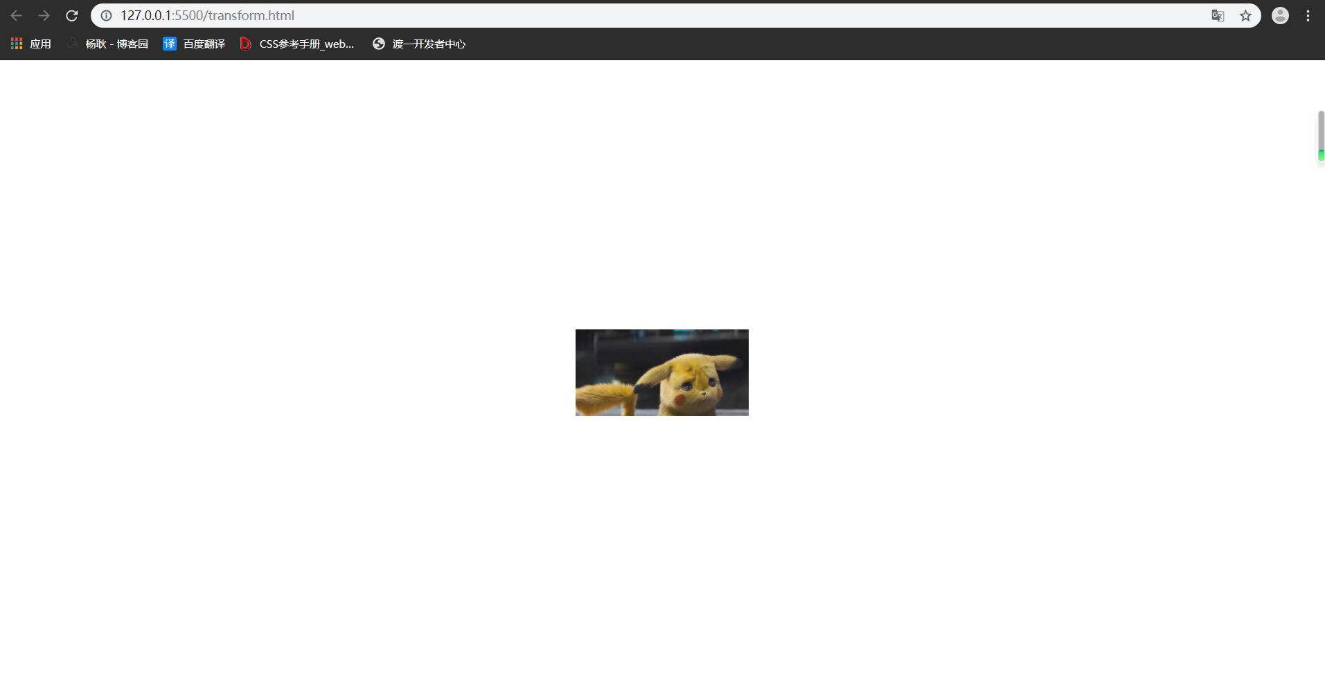
首先,来看下,是什么效果吧,上效果图 ↓

其实这个东西,很容易制作,先说下思路, 把照片都给叠在一起,然后 rotateY 旋转,给每张图片 旋转不一样的角度能构成一圈, 然后translateZ 出去就好了,最后一步,父级转起来。
搭建好基本的 html 和 css ↓ 已经写好注释啦。
<!DOCTYPE html>

<html lang="en">

<head>

    <meta charset="UTF-8">

    <meta name="viewport" content="width=device-width, initial-scale=1.0">

    <meta http-equiv="X-UA-Compatible" content="ie=edge">

    <title>Document</title>

    <style>

        *{

            padding: 0;

            margin: 0;

        }

        :root,body{    /* root在html也就是文档,文档是有高度的,而body 是没有高度的,所以继承下来,给 body的子元素使用*/

            height: 100%;

        }

        .wra{

            position: absolute;    /* 把父级作为容器,定位到屏幕的中间去 */

            width: 200px;

            height: 100px;

            left: calc(50% - 100px);

            top: calc(50% - 50px);

        }

        .img{

            position: absolute;   /*设置定位属性,然后所与的图片就会 叠在一起。*/

            width: 200px;

            height: 100px;

        }

        .img:nth-of-type(1){

            background-image: url('./img/rotatePic/u=1036157886,1414018506&fm=26&gp=0.jpg');

            background-size: cover; /*这个参数,是为了更好的显示完整的图片,既是他有可能显示不全。*/

        }

        .img:nth-of-type(2){

            background-image: url('./img/rotatePic/u=1252635897,4048351284&fm=26&gp=0.jpg');

            background-size: cover;

        }

        .img:nth-of-type(3){

            background-image: url('./img/rotatePic/u=1369094069,1969348532&fm=26&gp=0.jpg');

            background-size: cover;

        }

        .img:nth-of-type(4){

            background-image: url('./img/rotatePic/u=1891680577,1135327170&fm=26&gp=0.jpg');

            background-size: cover;

        }

        .img:nth-of-type(5){

            background-image: url('./img/rotatePic/u=215760299,4224999617&fm=26&gp=0.jpg');

            background-size: cover;

        }

        .img:nth-of-type(6){

            background-image: url('./img/rotatePic/u=4188003421,389717180&fm=26&gp=0.jpg');

            background-size: cover;

        }

        .img:nth-of-type(7){

            background-image: url('./img/rotatePic/下载 (1).jfif');

            background-size: cover;

        }

        .img:nth-of-type(8){

            background-image: url('./img/rotatePic/下载 (2).jfif');

            background-size: cover;

        }

    </style>

</head>

<body>

    <div class="wra">

        <div class="img"></div>

        <div class="img"></div>

        <div class="img"></div>

        <div class="img"></div>

        <div class="img"></div>

        <div class="img"></div>

        <div class="img"></div>

        <div class="img"></div>

    </div>

</body>

</html>
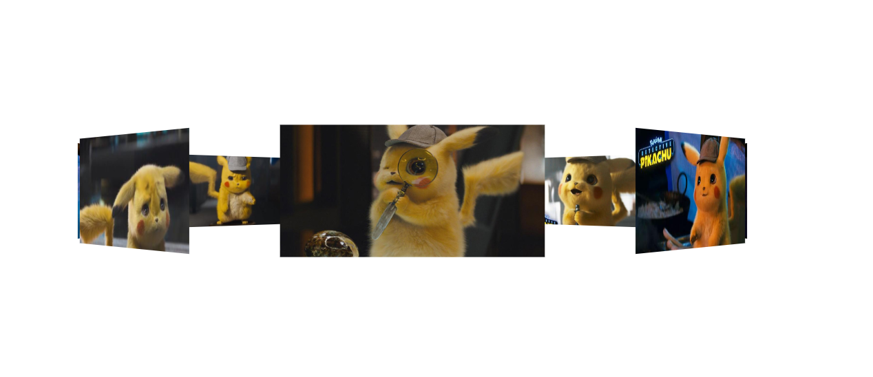
效果如下:
基本架子搭建好后,给每张图片,旋转不同的位置。
<!DOCTYPE html>

<html lang="en">

<head>

    <meta charset="UTF-8">

    <meta name="viewport" content="width=device-width, initial-scale=1.0">

    <meta http-equiv="X-UA-Compatible" content="ie=edge">

    <title>Document</title>

    <style>

        *{

            padding: 0;

            margin: 0;

        }

        :root,body{

            height: 100%;

        }

        .wra{

            position: absolute;

            width: 200px;

            height: 100px;

            left: calc(50% - 100px);

            top: calc(50% - 50px);

        }

        .img{

            position: absolute;

            width: 200px;

            height: 100px;

        }

        .img:nth-of-type(1){

            background-image: url('./img/rotatePic/u=1036157886,1414018506&fm=26&gp=0.jpg');

            background-size: cover;

            /*第一张图片,就不用旋转了,让他在原位置就好。*/

        }

        .img:nth-of-type(2){

            background-image: url('./img/rotatePic/u=1252635897,4048351284&fm=26&gp=0.jpg');

            background-size: cover;

            transform: rotateY(45deg);

        }

        .img:nth-of-type(3){

            background-image: url('./img/rotatePic/u=1369094069,1969348532&fm=26&gp=0.jpg');

            background-size: cover;

            transform: rotateY(90deg);

        }

        .img:nth-of-type(4){

            background-image: url('./img/rotatePic/u=1891680577,1135327170&fm=26&gp=0.jpg');

            background-size: cover;

            transform: rotateY(135deg);

        }

        .img:nth-of-type(5){

            background-image: url('./img/rotatePic/u=215760299,4224999617&fm=26&gp=0.jpg');

            background-size: cover;

            transform: rotateY(180deg);

        }

        .img:nth-of-type(6){

            background-image: url('./img/rotatePic/u=4188003421,389717180&fm=26&gp=0.jpg');

            background-size: cover;

            transform: rotateY(225deg);

        }

        .img:nth-of-type(7){

            background-image: url('./img/rotatePic/下载 (1).jfif');

            background-size: cover;

            transform: rotateY(270deg);

        }

        .img:nth-of-type(8){

            background-image: url('./img/rotatePic/下载 (2).jfif');

            background-size: cover;

            transform: rotateY(315deg);

        }

    </style>

</head>

<body>

    <div class="wra">

        <div class="img"></div>

        <div class="img"></div>

        <div class="img"></div>

        <div class="img"></div>

        <div class="img"></div>

        <div class="img"></div>

        <div class="img"></div>

        <div class="img"></div>

    </div>

</body>

</html>
旋转好位置后,添加 translateZ() 参数,分开图片。因为,translateZ 也是 transform 的参数之一,所以要添加在rotate后面接上。最后,记得在15行添加上 perspective 属性。不懂什么是 perspective 属性的话,请点击→ css3系列之详解perspective
 1 <!DOCTYPE html>

 2 <html lang="en">

 3 <head>

 4     <meta charset="UTF-8">

 5     <meta name="viewport" content="width=device-width, initial-scale=1.0">

 6     <meta http-equiv="X-UA-Compatible" content="ie=edge">

 7     <title>Document</title>

 8     <style>

 9         *{

10             padding: 0;

11             margin: 0;

12         }

13         :root,body{

14             height: 100%;

15             perspective: 1000px;

16         }

17         .wra{

18             position: absolute;

19             width: 200px;

20             height: 100px;

21             left: calc(50% - 100px);

22             top: calc(50% - 50px);

23             transform-style: preserve-3d; /*这个属性的作用呢,是为了让浏览器,以3d的方式来渲染,

24                                             这个属性要添在父级身上,那么他的子元素,就能以3d的方式展示。

25                                             浏览器默认的渲染方式是2d的,我们这种3d结构,他显示不出来。 */

26         }

27         .img{

28             position: absolute;

29             width: 200px;

30             height: 100px;

31         }

32         .img:nth-of-type(1){

33             background-image: url('./img/rotatePic/u=1036157886,1414018506&fm=26&gp=0.jpg');

34             background-size: cover;

35             transform: translateZ(350px);

36         }

37         .img:nth-of-type(2){

38             background-image: url('./img/rotatePic/u=1252635897,4048351284&fm=26&gp=0.jpg');

39             background-size: cover;

40             transform: rotateY(45deg) translateZ(350px);

41         }

42         .img:nth-of-type(3){

43             background-image: url('./img/rotatePic/u=1369094069,1969348532&fm=26&gp=0.jpg');

44             background-size: cover;

45             transform: rotateY(90deg) translateZ(350px);

46         }

47         .img:nth-of-type(4){

48             background-image: url('./img/rotatePic/u=1891680577,1135327170&fm=26&gp=0.jpg');

49             background-size: cover;

50             transform: rotateY(135deg) translateZ(350px);

51         }

52         .img:nth-of-type(5){

53             background-image: url('./img/rotatePic/u=215760299,4224999617&fm=26&gp=0.jpg');

54             background-size: cover;

55             transform: rotateY(180deg) translateZ(350px);

56         }

57         .img:nth-of-type(6){

58             background-image: url('./img/rotatePic/u=4188003421,389717180&fm=26&gp=0.jpg');

59             background-size: cover;

60             transform: rotateY(225deg) translateZ(350px);

61         }

62         .img:nth-of-type(7){

63             background-image: url('./img/rotatePic/下载 (1).jfif');

64             background-size: cover;

65             transform: rotateY(270deg) translateZ(350px);

66         }

67         .img:nth-of-type(8){

68             background-image: url('./img/rotatePic/下载 (2).jfif');

69             background-size: cover;

70             transform: rotateY(315deg) translateZ(350px);

71         }

72     </style>

73 </head>

74 <body>

75     <div class="wra">

76         <div class="img"></div>

77         <div class="img"></div>

78         <div class="img"></div>

79         <div class="img"></div>

80         <div class="img"></div>

81         <div class="img"></div>

82         <div class="img"></div>

83         <div class="img"></div>

84     </div>

85 </body>

86 </html>
然后你就能看见这种效果啦。
然后,我们给父级 加上旋转的功能就OK了。
<!DOCTYPE html>

<html lang="en">

<head>

    <meta charset="UTF-8">

    <meta name="viewport" content="width=device-width, initial-scale=1.0">

    <meta http-equiv="X-UA-Compatible" content="ie=edge">

    <title>Document</title>

    <style>

        *{

            padding: 0;

            margin: 0;

        }

        :root,body{

            height: 100%;

            perspective: 1000px;

        }

        @keyframes run{   /*这里我们要他旋转360度,那么就不用那么麻烦写关键帧了。开始0  结束360,然后循环即可*/

            0%{

                transform: rotateY(0deg);

            }

            100%{

                transform: rotateY(360deg);

            }

        }

        .wra{

            position: absolute;

            width: 200px;

            height: 100px;

            left: calc(50% - 100px);

            top: calc(50% - 50px);

            transform-style: preserve-3d;

            animation: run 20s linear infinite; /*animation linear是匀速运动,infinite是无限循环*/

        }

        .img{

            position: absolute;

            width: 200px;

            height: 100px;

        }

        .img:nth-of-type(1){

            background-image: url('./img/rotatePic/u=1036157886,1414018506&fm=26&gp=0.jpg');

            background-size: cover;

            transform: translateZ(350px);

        }

        .img:nth-of-type(2){

            background-image: url('./img/rotatePic/u=1252635897,4048351284&fm=26&gp=0.jpg');

            background-size: cover;

            transform: rotateY(45deg) translateZ(350px);

        }

        .img:nth-of-type(3){

            background-image: url('./img/rotatePic/u=1369094069,1969348532&fm=26&gp=0.jpg');

            background-size: cover;

            transform: rotateY(90deg) translateZ(350px);

        }

        .img:nth-of-type(4){

            background-image: url('./img/rotatePic/u=1891680577,1135327170&fm=26&gp=0.jpg');

            background-size: cover;

            transform: rotateY(135deg) translateZ(350px);

        }

        .img:nth-of-type(5){

            background-image: url('./img/rotatePic/u=215760299,4224999617&fm=26&gp=0.jpg');

            background-size: cover;

            transform: rotateY(180deg) translateZ(350px);

        }

        .img:nth-of-type(6){

            background-image: url('./img/rotatePic/u=4188003421,389717180&fm=26&gp=0.jpg');

            background-size: cover;

            transform: rotateY(225deg) translateZ(350px);

        }

        .img:nth-of-type(7){

            background-image: url('./img/rotatePic/下载 (1).jfif');

            background-size: cover;

            transform: rotateY(270deg) translateZ(350px);

        }

        .img:nth-of-type(8){

            background-image: url('./img/rotatePic/下载 (2).jfif');

            background-size: cover;

            transform: rotateY(315deg) translateZ(350px);

        }

    </style>

</head>

<body>

    <div class="wra">

        <div class="img"></div>

        <div class="img"></div>

        <div class="img"></div>

        <div class="img"></div>

        <div class="img"></div>

        <div class="img"></div>

        <div class="img"></div>

        <div class="img"></div>

    </div>

</body>

</html>
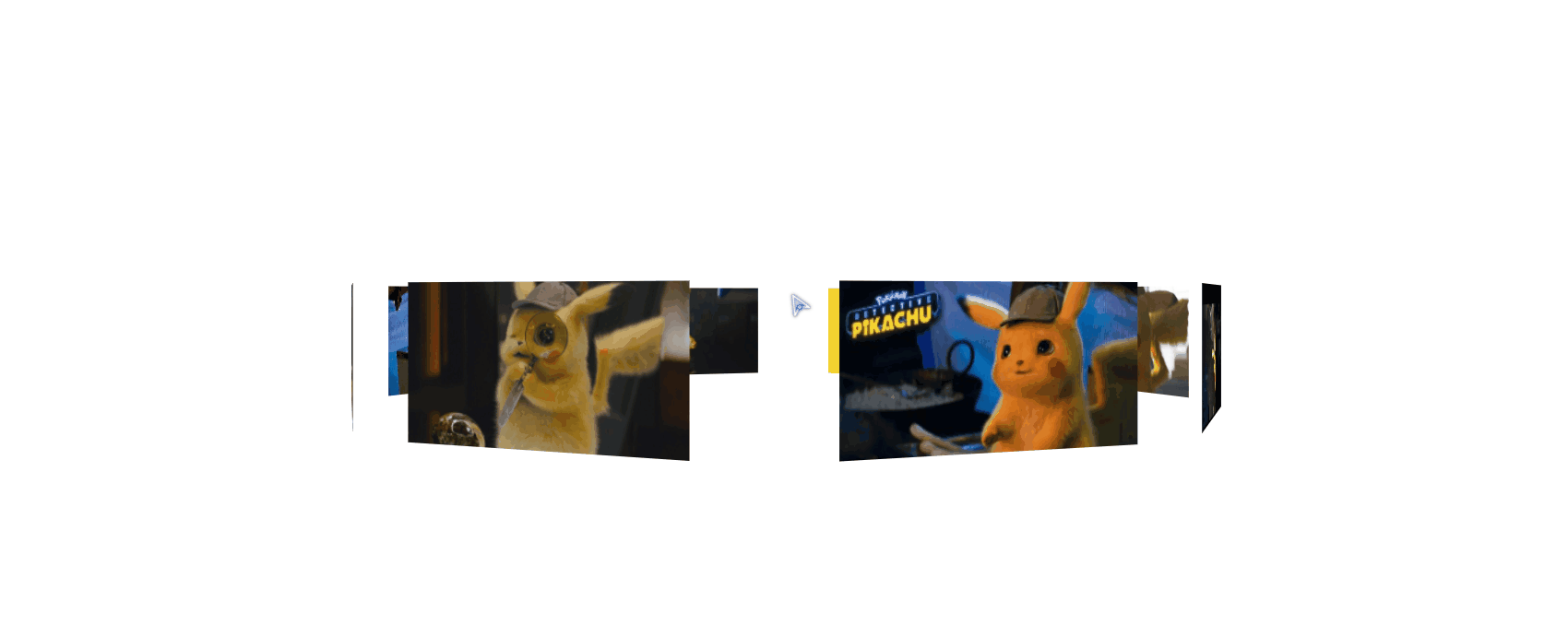
最后,再加上一个小功能。像你想看哪里,鼠标就移动到 那里 即可,代码在93行开始。
 1 <!DOCTYPE html>

 2 <html lang="en">

 3 <head>

 4     <meta charset="UTF-8">

 5     <meta name="viewport" content="width=device-width, initial-scale=1.0">

 6     <meta http-equiv="X-UA-Compatible" content="ie=edge">

 7     <title>Document</title>

 8     <style>

 9         *{

10             padding: 0;

11             margin: 0;

12         }

13         :root,body{

14             height: 100%;

15             perspective: 1000px;

16         }

17         @keyframes run{

18             0%{

19                 transform: rotateY(0deg);

20             }

21             100%{

22                 transform: rotateY(360deg);

23             }

24         }

25         .wra{

26             position: absolute;

27             width: 200px;

28             height: 100px;

29             left: calc(50% - 100px);

30             top: calc(50% - 50px);

31             transform-style: preserve-3d;

32             animation: run 20s linear infinite;

33         }

34         .img{

35             position: absolute;

36             width: 200px;

37             height: 100px;

38         }

39         .img:nth-of-type(1){

40             background-image: url('./img/rotatePic/u=1036157886,1414018506&fm=26&gp=0.jpg');

41             background-size: cover;

42             transform: translateZ(350px);

43         }

44         .img:nth-of-type(2){

45             background-image: url('./img/rotatePic/u=1252635897,4048351284&fm=26&gp=0.jpg');

46             background-size: cover;

47             transform: rotateY(45deg) translateZ(350px);

48         }

49         .img:nth-of-type(3){

50             background-image: url('./img/rotatePic/u=1369094069,1969348532&fm=26&gp=0.jpg');

51             background-size: cover;

52             transform: rotateY(90deg) translateZ(350px);

53         }

54         .img:nth-of-type(4){

55             background-image: url('./img/rotatePic/u=1891680577,1135327170&fm=26&gp=0.jpg');

56             background-size: cover;

57             transform: rotateY(135deg) translateZ(350px);

58         }

59         .img:nth-of-type(5){

60             background-image: url('./img/rotatePic/u=215760299,4224999617&fm=26&gp=0.jpg');

61             background-size: cover;

62             transform: rotateY(180deg) translateZ(350px);

63         }

64         .img:nth-of-type(6){

65             background-image: url('./img/rotatePic/u=4188003421,389717180&fm=26&gp=0.jpg');

66             background-size: cover;

67             transform: rotateY(225deg) translateZ(350px);

68         }

69         .img:nth-of-type(7){

70             background-image: url('./img/rotatePic/下载 (1).jfif');

71             background-size: cover;

72             transform: rotateY(270deg) translateZ(350px);

73         }

74         .img:nth-of-type(8){

75             background-image: url('./img/rotatePic/下载 (2).jfif');

76             background-size: cover;

77             transform: rotateY(315deg) translateZ(350px);

78         }

79     </style>

80 </head>

81 <body>

82     <div class="wra">

83         <div class="img"></div>

84         <div class="img"></div>

85         <div class="img"></div>

86         <div class="img"></div>

87         <div class="img"></div>

88         <div class="img"></div>

89         <div class="img"></div>

90         <div class="img"></div>

91     </div>

92     <script>

93         document.body.onmousemove = function(e){

94             this.style.perspectiveOrigin = e.pageX + 'px ' + e.pageY +'px';

95         }

96     </script>

97 </body>

98 </html>
看一下效果好吧。
利用perspective 和 transform 里面的几个参数来实现旋转照片墙的更多相关文章
- 吃透css3之3d属性--perspective和transform
本文为原创,转载请注明出处: cnzt 写在前面:最近写了个3d轮播效果图,在此将思路和过程中遇到的问题都记录下来. 首先,我们下来了解一下perspective和transform都是做什么的. t ...
- 利用CSS3的transform 3D制作的立方体旋转效果
<!doctype html> <html> <head> <meta charset="utf-8"> <title> ...
- perspective结合transform的3D效果
http://css-tricks.com/almanac/properties/p/perspective/ 链接中讲了 perspective的两种用法及比较: 1.perspective:100 ...
- css3 利用perspective实现翻页效果和正方体 以及翻转效果
要点: 1 实现3D效果就需要使用perspective属性 1 页面旋转使用css3的rorate 2 使用backface-visibility 实现正面元素翻转之后背面不可见,显示出反面的元素 ...
- 在CSS3中,可以利用transform功能来实现文字或图像的旋转、缩放、倾斜、移动这四种类型的变形处理
CSS3中的变形处理(transform)属 transform的功能分类 1.旋转 transform:rotate(45deg); 该语句使div元素顺时针旋转45度.deg是CSS 3的“Val ...
- transform:rotate()将元素进行不同角度的旋转
通过设置transform:rotate()可以将元素进行不同角度的旋转: 下面是一些测试代码: <!DOCTYPE html> <html> <head> < ...
- 教你如何利用分布式的思想处理集群的参数配置信息——spring的configurer妙用
引言 最近LZ的技术博文数量直线下降,实在是非常抱歉,之前LZ曾信誓旦旦的说一定要把<深入理解计算机系统>写完,现在看来,LZ似乎是在打自己脸了.尽管LZ内心一直没放弃,但从现状来看,需要 ...
- 【C++】利用指针实现通过函数改变多个参数的值
写惯了python,对于C++的语法越来越生疏,不同于python中函数可以return多个变量,C++的函数要想返回多个参数可以利用指针实现. 因为在函数内部的变量都是局部变量,所以当参数传入函数中 ...
- C++利用不完全实例化来获得函数模板参数的返回值和参数
有一些模板会以函数为模板参数,有时候这些模板要获得函数的返回值和参数.如在boost中的signal和slot机制,就存在这样情况. 那么,我们如何得到这些信息呢? 我们使用C++不完全实例化来实现. ...
随机推荐
- Java 中的 3 个双引号是什么语法?Java 15 刷新你的认知!
Java 中的 3 个双引号 """ 是什么语法? 这是 Java 15 新出的,刷新你的认知! 一.前言 在 Java 15 的推出的时候,Text Blocks 正式 ...
- E. Tree Reconstruction 解析(思維)
Codeforce 1041 E. Tree Reconstruction 解析(思維) 今天我們來看看CF1041E 題目連結 題目 略,請直接看原題 前言 一開始完全搞錯題目意思,還以為每次會刪除 ...
- C语言之 判断语句基础与if语句反汇编
0x01.判断语句介绍以及用法 判断语句有哪些? 1.If 用法1: if (条件) { //代码块 } 当条件成立,也就是为True时,执行{}中的代码 用法2: if(条件) { //代码块 } ...
- Linux下如何使用X86 CPU的GPIO
目录 1.前言 2.linux pinctrl子系统 3. pin controller driver 4.手动构造device 1.前言 在arm嵌入式开发中,各个外设具有固定的物理地址,我们可以直 ...
- 阿里P6晋升到P7是一个坎吗? P7 晋升总结
作者:程序之心丁仪 来源:https://chengxuzhixin.com/blog/post/P6_jin_sheng_dao_P7_zong_jie.html 公众号停更了挺长一段时间,首先说声 ...
- Linux 网络编程的5种IO模型:异步IO模型
Linux 网络编程的5种IO模型:异步IO模型 资料已经整理好,但是还有未竟之业:复习多路复用epoll 阅读例程, 异步IO 函数实现 背景 上一讲< Linux 网络编程的5种IO模型:信 ...
- day81:luffy:课程分类页面&课程信息页面&指定分类显示课程信息&分页显示课程信息
目录 1.构建课程前端初始页面 2.course后端的准备工作 3.后端实现课程分类列表接口 4.前端发送请求-获取课程分类信息 5.后端实现课程列表信息的接口 6.前端显示列表课程信息 7.按照指定 ...
- NOIP 2018 D1 解题报告(Day_1)
总分 205分 T1 100分 T2 95分 T3 10分 T1: 题目描述 春春是一名道路工程师,负责铺设一条长度为 nn 的道路. 铺设道路的主要工作是填平下陷的地表.整段道路可以看作是 ...
- Git clone 克隆Github上的仓库,速度慢?
一. 终端输入: git config --global http.postBuffer 524288000 二. git替换https 三. windows 安装 https://motrix.ap ...
- Mybatis日记
SqlSession build: ExecutorType :SIMPLE ,REUSE, BATCH, SIMPLE 为默认执行器: REUSE 为可重用执行器,重用Statement,执行器会缓 ...