Highcharts 测量图;Highcharts 圆形进度条式测量图;Highcharts 时钟;Highcharts 双轴车速表;Highcharts 音量表(VU Meter)
Highcharts 测量图
配置
chart.type 配置
配置 chart 的 type 为 'gauge' 。chart.type 描述了图表类型。默认值为 "line"。
var chart = {

   type: 'guage'

};
pane 配置
pane 只适用在极坐标图和角度测量仪。此可配置对象持有组合x轴和y周的常规选项。每个x轴和y轴都可以通过索引关联到窗格中。
var pane = {

  startAngle: -150,  // x轴或测量轴的开始度数,以度数的方式给出。0是北

  endAngle: 150      //x轴极坐标或角度轴的最终度数,以度数的方式给出。0是北

};
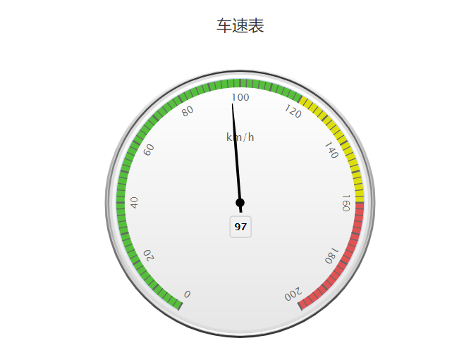
实例
文件名:highcharts_guage_angular.htm
<html>

<head>

<meta charset="UTF-8" />

<title>Highcharts 教程 | 菜鸟教程(runoob.com)</title>

<script src="http://apps.bdimg.com/libs/jquery/2.1.4/jquery.min.js"></script>

<script src="http://code.highcharts.com/highcharts.js"></script>

<script src="http://code.highcharts.com/highcharts-more.js"></script>

</head>

<body>

<div id="container" style="width: 550px; height: 400px; margin: 0 auto"></div>

<script language="JavaScript">

$(document).ready(function() {

   var chart = {

      type: 'gauge',

      plotBackgroundColor: null,

      plotBackgroundImage: null,

      plotBorderWidth: 0,

      plotShadow: false

   };

   var title = {

      text: '车速表'

   };

   var pane = {

      startAngle: -150,

      endAngle: 150,

      background: [{

         backgroundColor: {

            linearGradient: { x1: 0, y1: 0, x2: 0, y2: 1 },

            stops: [

               [0, '#FFF'],

               [1, '#333']

            ]

         },

         borderWidth: 0,

         outerRadius: '109%'

      }, {

         backgroundColor: {

            linearGradient: { x1: 0, y1: 0, x2: 0, y2: 1 },

            stops: [

               [0, '#333'],

               [1, '#FFF']

            ]

         },

         borderWidth: 1,

         outerRadius: '107%'

     }, {

         // default background

     }, {

         backgroundColor: '#DDD',

         borderWidth: 0,

         outerRadius: '105%',

         innerRadius: '103%'

     }]

   };

   // the value axis

   var yAxis = {

      min: 0,

      max: 200,

      minorTickInterval: 'auto',

      minorTickWidth: 1,

      minorTickLength: 10,

      minorTickPosition: 'inside',

      minorTickColor: '#666',

      tickPixelInterval: 30,

      tickWidth: 2,

      tickPosition: 'inside',

      tickLength: 10,

      tickColor: '#666',

      labels: {

         step: 2,

         rotation: 'auto'

      },

      title: {

         text: 'km/h'

      },

      plotBands: [{

         from: 0,

         to: 120,

         color: '#55BF3B' // green

      }, {

         from: 120,

         to: 160,

         color: '#DDDF0D' // yellow

      }, {

         from: 160,

         to: 200,

         color: '#DF5353' // red

      }]

   };

   var series= [{

        name: 'Speed',

        data: [80],

        tooltip: {

           valueSuffix: ' km/h'

        }

   }];

   var json = {};

   json.chart = chart;

   json.title = title;

   json.pane = pane;

   json.yAxis = yAxis;

   json.series = series;

   // Add some life

   var chartFunction = function (chart) {

      if (!chart.renderer.forExport) {

         setInterval(function () {

         var point = chart.series[0].points[0], newVal, inc = Math.round((Math.random() - 0.5) * 20);

         newVal = point.y + inc;

         if (newVal < 0 || newVal > 200) {

            newVal = point.y - inc;

         }

         point.update(newVal);

         }, 3000);

      }

   };

   $('#container').highcharts(json,chartFunction);

});

</script>

</body>

</html>
以上实例输出结果为:
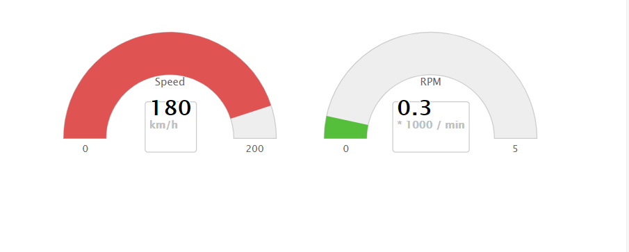
Highcharts 圆形进度条式测量图
配置
chart.type 配置
配置 chart 的 type 为 'solidguage' 。chart.type 描述了图表类型。默认值为 "line"。
var chart = {

   type: 'solidguage'

};
pane 配置
pane 只适用在极坐标图和角度测量仪。此可配置对象持有组合x轴和y周的常规选项。每个x轴和y轴都可以通过索引关联到窗格中。
var pane = {

  startAngle: -150,  // x轴或测量轴的开始度数,以度数的方式给出。0是北

  endAngle: 150      //x轴极坐标或角度轴的最终度数,以度数的方式给出。0是北

};
实例
文件名:highcharts_guage_solid.htm
<html>

<head>

<meta charset="UTF-8" />

<title>Highcharts 教程 | 菜鸟教程(runoob.com)</title>

<script src="http://apps.bdimg.com/libs/jquery/2.1.4/jquery.min.js"></script>

<script src="http://code.highcharts.com/highcharts.js"></script>

<script src="http://code.highcharts.com/highcharts-more.js"></script>

<script src="http://code.highcharts.com/modules/solid-gauge.js"></script>

</head>

<body>

<div style="width: 600px; height: 400px; margin: 0 auto">

    <div id="container-speed" style="width: 300px; height: 200px; float: left"></div>

    <div id="container-rpm" style="width: 300px; height: 200px; float: left"></div>

</div>

<script language="JavaScript">

$(document).ready(function() {

   var chart = {

      type: 'solidgauge'

   };

   var title = null;

   var pane = {

      center: ['50%', '85%'],

      size: '140%',

      startAngle: -90,

      endAngle: 90,

      background: {

         backgroundColor: (Highcharts.theme && Highcharts.theme.background2) || '#EEE',

         innerRadius: '60%',

         outerRadius: '100%',

         shape: 'arc'

      }

   };

   var tooltip = {

      enabled: false

   };

   // the value axis

   var yAxis = {

      stops: [

         [0.1, '#55BF3B'], // green

         [0.5, '#DDDF0D'], // yellow

         [0.9, '#DF5353'] // red

      ],

      lineWidth: 0,

      minorTickInterval: null,

      tickPixelInterval: 400,

      tickWidth: 0,

      title: {

         y: -70

      },

      labels: {

         y: 16

      },

      min: 0,

      max: 200,

      title: {

         text: 'Speed'

      }

   };

   var plotOptions = {

      solidgauge: {

         dataLabels: {

            y: 5,

            borderWidth: 0,

            useHTML: true

         }

      }

   };

   var credits = {

      enabled: false

   };

   var series = [{

      name: 'Speed',

      data: [80],

      dataLabels: {

         format: '<div style="text-align:center"><span style="font-size:25px;color:' +

         ((Highcharts.theme && Highcharts.theme.contrastTextColor) || 'black') + '">{y}</span><br/>' +

         '<span style="font-size:12px;color:silver">km/h</span></div>'

      },

      tooltip: {

         valueSuffix: ' km/h'

      }

   }];


   var json = {};

   json.chart = chart;

   json.title = title;

   json.pane = pane;

   json.tooltip = tooltip;

   json.yAxis = yAxis;

   json.credits = credits;

   json.series = series;

   $('#container-speed').highcharts(json);

   // the value axis

   yAxis = {

      stops: [

         [0.1, '#55BF3B'], // green

         [0.5, '#DDDF0D'], // yellow

         [0.9, '#DF5353'] // red

      ],

      lineWidth: 0,

      minorTickInterval: null,

      tickPixelInterval: 400,

      tickWidth: 0,

      title: {

         y: -70

      },

      labels: {

         y: 16

      },

      min: 0,

      max: 5,

      title: {

         text: 'RPM'

      }

   };

   series = [{

      name: 'RPM',

      data: [1],

      dataLabels: {

         format: '<div style="text-align:center"><span style="font-size:25px;color:' +

         ((Highcharts.theme && Highcharts.theme.contrastTextColor) || 'black') + '">{y:.1f}</span><br/>' +

         '<span style="font-size:12px;color:silver">* 1000 / min</span></div>'

      },

      tooltip: {

         valueSuffix: ' revolutions/min'

      }

   }];

   json.yAxis = yAxis;

   json.series = series;

   $('#container-rpm').highcharts(json);

   var chartFunction = function() {

      // Speed

      var chart = $('#container-speed').highcharts();

      var point;

      var newVal;

      var inc;

      if (chart) {

         point = chart.series[0].points[0];

         inc = Math.round((Math.random() - 0.5) * 100);

         newVal = point.y + inc;

         if (newVal < 0 || newVal > 200) {

            newVal = point.y - inc;

         }

         point.update(newVal);

      }

      // RPM

      chart = $('#container-rpm').highcharts();

      if (chart) {

         point = chart.series[0].points[0];

         inc = Math.random() - 0.5;

         newVal = point.y + inc;

         if (newVal < 0 || newVal > 5) {

            newVal = point.y - inc;

         }

         point.update(newVal);

      }

   };

   // Bring life to the dials

   setInterval(chartFunction, 2000);

});

</script>

</body>

</html>
以上实例输出结果为:
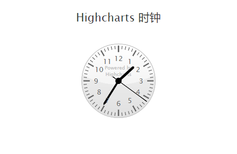
Highcharts 时钟
配置
chart.type 配置
配置 chart 的 type 为 'gauge' 。chart.type 描述了图表类型。默认值为 "line"。
var chart = {

   type: 'gauge'

};
pane 配置
pane 只适用在极坐标图和角度测量仪。此可配置对象持有组合x轴和y周的常规选项。每个x轴和y轴都可以通过索引关联到窗格中。
var pane = {

  startAngle: -150,  // x轴或测量轴的开始度数,以度数的方式给出。0是北

  endAngle: 150      //x轴极坐标或角度轴的最终度数,以度数的方式给出。0是北

};
实例
文件名:highcharts_guage_clock.htm
<html>

<head>

<meta charset="UTF-8" />

<title>Highcharts 教程 | 菜鸟教程(runoob.com)</title>

<script src="http://apps.bdimg.com/libs/jquery/2.1.4/jquery.min.js"></script>

<script src="http://code.highcharts.com/highcharts.js"></script>

<script src="http://code.highcharts.com/highcharts-more.js"></script>

</head>

<body>

<div id="container" style="width: 550px; height: 400px; margin: 0 auto"></div>

<script language="JavaScript">

$(document).ready(function() {

   /**

   * 获取当前时间

   */

   function getNow() {

      var now = new Date();

      return {

         hours: now.getHours() + now.getMinutes() / 60,

         minutes: now.getMinutes() * 12 / 60 + now.getSeconds() * 12 / 3600,

         seconds: now.getSeconds() * 12 / 60

      };

   }

   /**

   * Pad numbers

   */

   function pad(number, length) {

      // Create an array of the remaining length + 1 and join it with 0's

      return new Array((length || 2) + 1 - String(number).length).join(0) + number;

   }

   var now = getNow();

   var chart = {

      type: 'gauge',

      plotBackgroundColor: null,

      plotBackgroundImage: null,

      plotBorderWidth: 0,

      plotShadow: false,

      height: 200

   };

   var credits = {

      enabled: false

   };

   var title = {

      text: 'Highcharts 时钟'

   };

   var pane = {

      background: [{

         // default background

      }, {

         // reflex for supported browsers

         backgroundColor: Highcharts.svg ? {

            radialGradient: {

               cx: 0.5,

               cy: -0.4,

               r: 1.9

            },

            stops: [

               [0.5, 'rgba(255, 255, 255, 0.2)'],

               [0.5, 'rgba(200, 200, 200, 0.2)']

            ]

         } : null

      }]

   };

   // the value axis

   var yAxis = {

      labels: {

         distance: -20

      },

      min: 0,

      max: 12,

      lineWidth: 0,

      showFirstLabel: false,

      minorTickInterval: 'auto',

      minorTickWidth: 1,

      minorTickLength: 5,

      minorTickPosition: 'inside',

      minorGridLineWidth: 0,

      minorTickColor: '#666',

      tickInterval: 1,

      tickWidth: 2,

      tickPosition: 'inside',

      tickLength: 10,

      tickColor: '#666',

      title: {

         text: 'Powered by<br/>Highcharts',

         style: {

            color: '#BBB',

            fontWeight: 'normal',

            fontSize: '8px',

            lineHeight: '10px'

         },

         y: 10

      }};var tooltip ={

      formatter:function(){returnthis.series.chart.tooltipText;}};var series=[{

      data:[{

         id:'hour',

         y: now.hours,

         dial:{

            radius:'60%',

            baseWidth:4,

            baseLength:'95%',

            rearLength:0}},{

         id:'minute',

         y: now.minutes,

         dial:{

            baseLength:'95%',

            rearLength:0}},{

         id:'second',

         y: now.seconds,

         dial:{

            radius:'100%',

            baseWidth:1,

            rearLength:'20%'}}],

      animation:false,

      dataLabels:{

         enabled:false}}];var json ={};

   json.chart = chart;

   json.credits = credits;

   json.title = title;

   json.pane = pane;

   json.yAxis = yAxis;

   json.tooltip = tooltip;

   json.series = series;

   $('#container').highcharts(json, chartFunction);// Add some lifevar chartFunction =function(chart){

      setInterval(function(){

         now = getNow();var hour = chart.get('hour'),

         minute = chart.get('minute'),

         second = chart.get('second'),// run animation unless we're wrapping around from 59 to 0

         animation = now.seconds ===0?false:{ easing:'easeOutElastic'};// Cache the tooltip text

         chart.tooltipText = pad(Math.floor(now.hours),2)+':'+

         pad(Math.floor(now.minutes *5),2)+':'+

         pad(now.seconds *5,2);

         hour.update(now.hours,true, animation);

         minute.update(now.minutes,true, animation);

         second.update(now.seconds,true, animation);},1000);};});// Extend jQuery with some easing (copied from jQuery UI)

$.extend($.easing,{

   easeOutElastic:function(x, t, b, c, d){var s=1.70158;var p=0;var a=c;if(t==0)return b;

      if((t/=d)==1)return b+c;

      if(!p) p=d*.3;if(a <Math.abs(c)){ a=c;var s=p/4;}else

         var s = p/(2*Math.PI)*Math.asin (c/a);return a*Math.pow(2,-10*t)*Math.sin((t*d-s)*(2*Math.PI)/p )+ c + b;}});</script></body></html>
以上实例输出结果为:
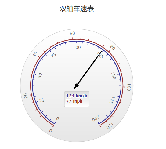
Highcharts 双轴车速表
配置
chart.type 配置
配置 chart 的 type 为 'gauge' 。chart.type 描述了图表类型。默认值为 "line"。
var chart = {

   type: 'gauge'

};
pane 配置
pane 只适用在极坐标图和角度测量仪。此可配置对象持有组合x轴和y周的常规选项。每个x轴和y轴都可以通过索引关联到窗格中。
var pane = {

  startAngle: -150,  // x轴或测量轴的开始度数,以度数的方式给出。0是北

  endAngle: 150      //x轴极坐标或角度轴的最终度数,以度数的方式给出。0是北

};
实例
文件名:highcharts_guage_dualaxes.htm
<html>

<head>

<meta charset="UTF-8" />

<title>Highcharts 教程 | 菜鸟教程(runoob.com)</title>

<script src="http://apps.bdimg.com/libs/jquery/2.1.4/jquery.min.js"></script>

<script src="http://code.highcharts.com/highcharts.js"></script>

<script src="http://code.highcharts.com/highcharts-more.js"></script>

</head>

<body>

<div id="container" style="width: 550px; height: 400px; margin: 0 auto"></div>

<script language="JavaScript">

$(document).ready(function() {

   var chart = {

      type: 'gauge',

      plotBackgroundColor: null,

      plotBackgroundImage: null,

      plotBorderWidth: 0,

      plotShadow: false

   };

   var credits = {

      enabled: false

   };

   var title = {

      text: '双轴车速表'

   };

   var pane = {

      startAngle: -150,

      endAngle: 150

   };

   // the value axis

   var yAxis = [{

      min: 0,

      max: 200,

      lineColor: '#339',

      tickColor: '#339',

      minorTickColor: '#339',

      offset: -25,

      lineWidth: 2,

      labels: {

         distance: -20,

         rotation: 'auto'

      },

      tickLength: 5,

      minorTickLength: 5,

      endOnTick: false

   }, {

      min: 0,

      max: 124,

      tickPosition: 'outside',

      lineColor: '#933',

      lineWidth: 2,

      minorTickPosition: 'outside',

      tickColor: '#933',

      minorTickColor: '#933',

      tickLength: 5,

      minorTickLength: 5,

      labels: {

         distance: 12,

         rotation: 'auto'

      },

      offset: -20,

      endOnTick: false

   }];

   var series= [{

      name: 'Speed',

      data: [80],

      dataLabels: {

         formatter: function () {

            var kmh = this.y,

            mph = Math.round(kmh * 0.621);

            return '<span style="color:#339">' + kmh + ' km/h</span><br/>' +

               '<span style="color:#933">' + mph + ' mph</span>';

         },

         backgroundColor: {

            linearGradient: {

               x1: 0,

               y1: 0,

               x2: 0,

               y2: 1

            },

            stops: [

               [0, '#DDD'],

               [1, '#FFF']

            ]

         }

      },

      tooltip: {

         valueSuffix: ' km/h'

      }

   }];

   var json = {};

   json.chart = chart;

   json.credits = credits;

   json.title = title;

   json.pane = pane;

   json.yAxis = yAxis;

   json.series = series;

   // Add some life

   var chartFunction = function (chart) {

      setInterval(function () {

         var point = chart.series[0].points[0],

         newVal,

         inc = Math.round((Math.random() - 0.5) * 20);

         newVal = point.y + inc;

         if (newVal < 0 || newVal > 200) {

            newVal = point.y - inc;

         }

         point.update(newVal);

      }, 3000);

   };

   $('#container').highcharts(json, chartFunction);

});

</script>

</body>

</html>
以上实例输出结果为:
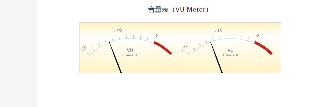
Highcharts 音量表(VU Meter)
配置
chart.type 配置
配置 chart 的 type 为 'gauge' 。chart.type 描述了图表类型。默认值为 "line"。
var chart = {

   type: 'gauge'

};
pane 配置
pane 只适用在极坐标图和角度测量仪。此可配置对象持有组合x轴和y周的常规选项。每个x轴和y轴都可以通过索引关联到窗格中。
var pane = {

  startAngle: -150,  // x轴或测量轴的开始度数,以度数的方式给出。0是北

  endAngle: 150      //x轴极坐标或角度轴的最终度数,以度数的方式给出。0是北

};
实例
文件名:highcharts_vumeter.htm
<html>

<head>

<meta charset="UTF-8" />

<title>Highcharts 教程 | 菜鸟教程(runoob.com)</title>

<script src="http://apps.bdimg.com/libs/jquery/2.1.4/jquery.min.js"></script>

<script src="http://code.highcharts.com/highcharts.js"></script>

<script src="http://code.highcharts.com/highcharts-more.js"></script>

</head>

<body>

<div id="container" style="width: 550px; height: 400px; margin: 0 auto"></div>

<script language="JavaScript">

$(document).ready(function() {

   var chart = {

      type: 'gauge',

      plotBorderWidth: 1,

      plotBackgroundColor: {

         linearGradient: { x1: 0, y1: 0, x2: 0, y2: 1 },

         stops: [

            [0, '#FFF4C6'],

            [0.3, '#FFFFFF'],

            [1, '#FFF4C6']

         ]

      },

      plotBackgroundImage: null,

      height: 200

   };

   var credits = {

      enabled: false

   };

   var title = {

      text: '音量表(VU Meter)'

   };

   var pane = [{

         startAngle: -45,

         endAngle: 45,

         background: null,

         center: ['25%', '145%'],

         size: 300

      }, {

         startAngle: -45,

         endAngle: 45,

         background: null,

         center: ['75%', '145%'],

         size: 300

   }];

   var yAxis = [{

         min: -20,

         max: 6,

         minorTickPosition: 'outside',

         tickPosition: 'outside',

         labels: {

            rotation: 'auto',

            distance: 20

         },

         plotBands: [{

            from: 0,

            to: 6,

            color: '#C02316',

            innerRadius: '100%',

            outerRadius: '105%'

         }],

         pane: 0,

         title: {

            text: 'VU<br/><span style="font-size:8px">Channel A</span>',

            y: -40

         }

      }, {

         min: -20,

         max: 6,

         minorTickPosition: 'outside',

         tickPosition: 'outside',

         labels: {

            rotation: 'auto',

            distance: 20

         },

         plotBands: [{

            from: 0,

            to: 6,

            color: '#C02316',

            innerRadius: '100%',

            outerRadius: '105%'

         }],

         pane: 1,

         title: {

            text: 'VU<br/><span style="font-size:8px">Channel B</span>',

            y: -40

         }

   }];

   var plotOptions = {

      gauge: {

            dataLabels: {

            enabled: false

         },

         dial: {

            radius: '100%'

         }

      }

   };

   var series= [{

        data: [-20],

        yAxis: 0

     },{

        data:[-20],

        yAxis:1}];var json ={};

   json.chart = chart;

   json.credits = credits;

   json.title = title;

   json.pane = pane;

   json.yAxis = yAxis;

   json.plotOptions = plotOptions;

   json.series = series;// Add some lifevar chartFunction =function(chart){

      setInterval(function(){if(chart.series){// the chart may be destroyedvar left = chart.series[0].points[0],

            right = chart.series[1].points[0],

            leftVal,

            rightVal,

            inc =(Math.random()-0.5)*3;

            leftVal =  left.y + inc;

            rightVal = leftVal + inc /3;if(leftVal <-20|| leftVal >6){

               leftVal = left.y - inc;}if(rightVal <-20|| rightVal >6){

               rightVal = leftVal;}

            left.update(leftVal,false);

            right.update(rightVal,false);

            chart.redraw();}},500);};

   $('#container').highcharts(json, chartFunction);});</script></body></html>
以上实例输出结果为:
Highcharts 测量图;Highcharts 圆形进度条式测量图;Highcharts 时钟;Highcharts 双轴车速表;Highcharts 音量表(VU Meter)的更多相关文章
- Android 自定义 View 圆形进度条总结
Android 自定义圆形进度条总结 版权声明:本文为博主原创文章,未经博主允许不得转载. 微博:厉圣杰 微信公众号:牙锅子 源码:CircleProgress 文中如有纰漏,欢迎大家留言指出. 最近 ...
- Android 高手进阶之自定义View,自定义属性(带进度的圆形进度条)
Android 高手进阶(21) 版权声明:本文为博主原创文章,未经博主允许不得转载. 转载请注明地址:http://blog.csdn.net/xiaanming/article/detail ...
- Android 带进度的圆形进度条
最近项目有个需求,做带进度从下到上的圆形进度条. 网上查了一下资料,发现这篇博客写得不错http://blog.csdn.net/xiaanming/article/details/10298163 ...
- 自定义VIew——漂亮的圆形进度条
package com.example.firstapp; import java.text.DecimalFormat; import android.annotation.SuppressLint ...
- Android自定义控件系列之应用篇——圆形进度条
一.概述 在上一篇博文中,我们给大家介绍了Android自定义控件系列的基础篇.链接:http://www.cnblogs.com/jerehedu/p/4360066.html 这一篇博文中,我们将 ...
- 【Android 应用开发】 自定义 圆形进度条 组件
转载著名出处 : http://blog.csdn.net/shulianghan/article/details/40351487 代码下载 : -- CSDN 下载地址 : http://down ...
- [iOS]圆形进度条及计时功能
平时用战网安全令的时候很喜欢圆形倒计时的效果,然后简单看了一下Android的圆形进度条,后来又写了一个IOS的.整体界面参照IOS系统的倒计时功能,顺便熟悉了UIPickerView的一些特性的实现 ...
- 移动端纯CSS3制作圆形进度条所遇到的问题
近日在开发的页面中,需要制作一个动态的圆形进度条,首先想到的是利用两个矩形,宽等于直径的一半,高等于直径,两个矩形利用浮动贴在一起,设置overflow:hidden属性,作为盒子,内部有一个与其宽高 ...
- CAShapeLayer实现圆形进度条效果
一.CAShapeLayer简单介绍: .CAShapeLayer继承至CALayer,能够使用CALayer的全部属性值 2.CAShapeLayer须要与贝塞尔曲线配合使用才有意义 3.使用CAS ...
随机推荐
- 转:centos彻底删除文件夹、文件命令
转自:http://www.cnblogs.com/kluan/p/4458296.html centos彻底删除文件夹.文件命令(centos 新建.删除.移动.复制等命令: 1.新建文件夹 mkd ...
- 阿里云搭建go开发环境
开通了一个阿里云来玩,记录一下环境搭建的过程 运行环境 ECS Ubuntu 16.04 64位 过程 #切换到安装文件夹 cd /usr/local #下载go #由于墙的原因,直接下载官方的可能会 ...
- cocos2d-x项目中如何避免增加一个cpp就必须在工程android.mk文件去添加引用
LOCAL_SRC_FILES := hellocpp/main.cpp \ ../../Classes/AppDelegate.cpp \ ../../Classes/HelloWorl ...
- C++之旅(第一天)
基础知识 完全支持C语言 可以在C++引入C的头文件 #include <stdio.h> #include <iostream> int main() { } 输入和输出 C ...
- 详解Java中的clone方法 -- 原型模式
转自: http://blog.csdn.net/zhangjg_blog/article/details/18369201 Java中对象的创建 clone顾名思义就是复制, 在Java语言中, ...
- web.py url传参及获取
第一种:直接获取: import web urls = ( '/(.*)','index' #URL后面必须加(.*) ) class index: def GET(self,name): print ...
- 20145216史婧瑶《Java程序设计》第3周学习总结
20145216 <Java程序设计>第3周学习总结 教材学习内容总结 第四章 认识对象 4.1 类与对象 •对象(Object):存在的具体实体,具有明确的状态和行为 •类(Class) ...
- unsigned short A = 10; printf("~A = %u\n", ~A); char c=128; printf("c=%d\n",c); 输出多少?
这是题目给出的答案:第一题,-A =0xfffffff5,int值 为-11,但输出的是uint.所以输出4294967285 第二题,c=0x10,输出的是int,最高位为1,是负数,所以它的值就是 ...
- Jquery4 过滤选择器
学习要点: 1.基本过滤器 2.内容过滤器 3.可见性过滤器 4.子元素过滤器 5.其他方法 过滤选择器简称:过滤器.它其实也是一种选择器,而这种选择器类似 CSS3里的伪类,可以让不支持 CSS3 ...
- linux top 各个标识的含义 详解
top之前一直都是一知半解,今天周末加班,我的工作已经完成,在等同事吃饭,就把这个写下来. 第一行: top - 20:42:47 up 57 days, 1:25, 4 users, ...