
css3基础-文本与字体+转换+过渡+动画+案例
Css3文本与字体
文本阴影
h1 {

    text-shadow: 5px 5px 5px red;

}
word-break换行:
h1:nth-child(1) { word-break: normal; } /*英文:一行放不下时整个单词换行*/

h1:nth-child(2) { word-break: break-all; } /*英文:一行放不下时把单词拆开换行*/

h1:nth-child(3) { word-break: keep-all; } /*英文:与normal类似*/

h1:nth-child(4) { word-break: normal; } /*中文:正常*/

h1:nth-child(5) { word-break: break-all; } /*中文:正常*/

h1:nth-child(6) { word-break: keep-all; } /*中文:标点符号之后换行*/
word-wrap换行(中文无效):
h1:nth-child(1) { word-wrap: normal; } /*英文:不换行*/

h1:nth-child(2) { word-wrap: break-word; } /*英文:换行*/
文本溢出时处理:
h1:nth-child(1) { text-overflow: clip; } /*隐藏*/

h1:nth-child(2) { text-overflow: ellipsis; }  /*省略号显示*/

h1:nth-child(3) { text-overflow: '>>'; } /*显示指定字符:只火狐有效*/
自定义字体
.ttf最常见字体,RAW格式,不做优化
.otf格式
.woff格式,web最佳格式,压缩版本
.eot格式,IE专用格式
.svg
@font-face {

    font-family: 'myfont';

    src: url('font/myFont.eot');

    src: url('font/myFont.eot?#iefix') format('embedded-opentype'),

         url('font/myFont.ttf') format('truetype'),

         url('font/myFont.woff') format('woff'),

         url('font/myFont.svg#myFont') format('svg');

}

h1 {

    font-family: 'myfont';

}
获取特殊字体格式文件的网址:
https://www.fontsquirrel.com/tools/webfont-generator
css3转换
2d旋转transform:rotate(deg)
.pic1 {

    -webkit-transform: rotate(7deg);

       -moz-transform: rotate(7deg);

        -ms-transform: rotate(7deg);

         -o-transform: rotate(7deg);

            transform: rotate(7deg);

}
2d平移transform: translate()
div > img {

    transform: translateX(200px);

}

div > img {

    transform: translateY(200px);

}

div > img {

    transform: translate(200px, 100px);

}
2d缩放transform: scale()
div > img {

    transform: scaleX(.5);

}

div > img {

    transform: scaleY(.5);

}

div > img {

    transform: scale(.5, .5);

}
2d斜切Skew()
div > img {

    transform: skew(15deg, 15deg); /*当只有一个参数的时候,第二个参数默认为0deg*/

}

div > img {

    transform: skewX(15deg); /*逆时针正,顺时针负*/

}

div > img {

    transform: skewY(15deg);

}
3D旋转
div > img {

    transform: rotateZ(45deg);

}

div > img {

    transform: rotate3d(1, 1, 1, 45deg); /*正:顺时针;负:逆时针*/

}
3D平移
div > img {

    transform: translateZ(200px);

}

div > img {

    transform: translate3d(200px, 200px, 200px);

}
3D缩放
div > img {

    transform: scaleZ(.5);

}

div > img {

    transform: scale3d(.5, .5, .5);

}
更改原点位置
div > img {

    transform: rotate3d(1, 1, 1, 45deg);

    transform-origin: left top 0;

}
Matrix_translate
transform: matrix(1, 0, 0, 1, x, y)等同于transform: translate(x, y)
div:nth-child(1) > img {

    transform: matrix(1, 0, 0, 1, 30, 30);

}

div:nth-child(2) > img {

    transform: translate(30px, 30px);

}
Matrix_ scale
transform: matrix(sx, 0, 0, sy, 0, 0)等同于transform: scale(sx, sy)
div:nth-child(1) > img {

    transform: matrix(.5, 0, 0, .5, 0, 0);

}

div:nth-child(2) > img {

    transform: scale(.5, .5);

}
Matrix_ skew
transform: matrix(1, tanθy, tanθx, 1, 0, 0)等同于transform: skew(θxdeg, θydeg)
div:nth-child(1) > img {

    transform: matrix(1, .5774, .5774, 1, 0, 0);

}

div:nth-child(2) > img {

    transform: skew(30deg, 30deg);

}
Matrix_ rotate
transform: matrix(cosθ, sinθ, -sinθ, cosθ, 0, 0)等同于transform: rotate(θdeg)
div:nth-child(1) > img {

    transform: matrix(.7071, .7071, -0.7071, .7071, 0, 0);

}

div:nth-child(2) > img {

    transform: rotate(45deg);

}
Matrix镜像对称:
matrix((1-k*k) / (1+k*k), 2k / (1 + k*k), 2k / (1 + k*k), (k*k - 1) / (1+k*k), 0, 0)
如果对称轴y=-x,即斜率k=-1,代入公式计算:
matrix((1- -1*-1) / (1+ -1*-1), 2*-1 / (1 + -1*-1),2*-1 / (1 + -1*-1),(-1*-1 - 1) / (1+-1*-1), 0, 0)即得到matrix((1- 1) / (1+ 1), -2 / (1 +1),-2 / (1 + 1),(1 - 1) / (1+1), 0, 0)=matrix(0,-1,-1,0, 0, 0)
有个可爱的小伙伴做的计算网址:
https://www.zhangxinxu.com/study/201206/css3-transform-matrix-mirror.html
div:nth-child(1) > img {

    transform: matrix3d(.5, 0, 0, 0, 0, .5, 0, 0, 0, 0, .5, 0, 0, 0, 0, 1);

}

div:nth-child(2) > img {

    transform: scale3d(.5, .5, .5);

}
transform-style: preserve-3d;
实现父元素对子元素的3D遮罩效果
Demo:
<!DOCTYPE html>

<html lang="en">

<head>

<meta charset="UTF-8">

<title>transform style</title>

<style type="text/css">

body { background: #abcdef; }

div { position: relative; width: 760px; height: 760px; margin: auto;

    -webkit-transform-style: preserve-3d;

       -moz-transform-style: preserve-3d;

        -ms-transform-style: preserve-3d;

         -o-transform-style: preserve-3d;

            transform-style: preserve-3d;

}

div > .inner { position: absolute; top: 0; right: 0; bottom: 0; left: 0; width: 100%; height: 100%; margin: auto; transform: rotateY(-45deg); background: url(images/circle_inner.png) no-repeat center center; }

div > .middle { position: absolute; top: 0; right: 0; bottom: 0; left: 0; width: 100%; height: 100%; margin: auto; transform: rotateX(-45deg); background: url(images/circle_middle.png) no-repeat center center; }

div > .outer { position: absolute; top: 0; right: 0; bottom: 0; left: 0; width: 100%; height: 100%; margin: auto; transform: rotateZ(-45deg); background: url(images/circle_outer.png) no-repeat center center; }

div > .imooc { position: absolute; top: 0; right: 0; bottom: 0; left: 0; width: 100%; height: 100%; margin: auto; background: url(images/imooc.png) no-repeat center center; }

</style>

</head>

<body>

<div>

    <div class="inner"></div>

    <div class="middle"></div>

    <div class="outer"></div>

    <div class="imooc"></div>

</div>

</body>

</html>

perspective: 500px;透视距离,perspective属性指定了观察者与z=0平面的距离,使具有三维位置变换的元素产生透视效果。z>0的三维元素比正常大,而z<0时则比正常小,大小程度由该属性的值决定
perspective-origin: bottom;透视点的位置,默认情况下,消失点位于元素的中心,但是可以通过设置perspective-origin属性来改变其位置
div { position: relative; width: 760px; height: 760px; margin: auto;

    -webkit-transform-style: preserve-3d;

       -moz-transform-style: preserve-3d;

        -ms-transform-style: preserve-3d;

         -o-transform-style: preserve-3d;

            transform-style: preserve-3d;

    -webkit-perspective: 500px;

       -moz-perspective: 500px;

        -ms-perspective: 500px;

         -o-perspective: 500px;

            perspective: 500px;

    -webkit-perspective-origin: bottom;

       -moz-perspective-origin: bottom;

        -ms-perspective-origin: bottom;

         -o-perspective-origin: bottom;

            perspective-origin: bottom;

}
元素背面是否可见
backface-visibility: hidden;

backface-visibility: visible;
css3过渡
transition: transform,如果不指定默认是all
div { width: 800px; height: 800px; margin: auto; transform: rotate(0deg); background: url(images/imooc.png) no-repeat center center, url(images/circle_outer.png) no-repeat center center;

    -webkit-transition: transform 2s ease-in-out 1s;

       -moz-transition: transform 2s ease-in-out 1s;

        -ms-transition: transform 2s ease-in-out 1s;

         -o-transition: transform 2s ease-in-out 1s;

            transition: transform 2s ease-in-out 1s;

}

div:hover { cursor: pointer; transform: rotate(180deg);

    -webkit-transition: transform 2s ease-in-out 1s;

       -moz-transition: transform 2s ease-in-out 1s;

        -ms-transition: transform 2s ease-in-out 1s;

         -o-transition: transform 2s ease-in-out 1s;

            transition: transform 2s ease-in-out 1s;

}
transition-timing-function:
#div1 {transition-timing-function: linear;} /*线性*/

#div2 {transition-timing-function: ease;} /*平滑*/

#div3 {transition-timing-function: ease-in;} /*慢入*/

#div4 {transition-timing-function: ease-out;} /*慢出*/

#div5 {transition-timing-function: ease-in-out;} /*慢入慢出*/
简写:属性+动画时间+运动函数+延迟时间
transition: transform 2s ease-in-out 1s;
当鼠标经过一个元素的时候,该元素翻转360°并且放大一倍显示
<!DOCTYPE html>

<html lang="en">

<head>

    <meta charset="UTF-8">

    <title>demo</title>

    <style>

        div {

            font-size: 14px;

            font-weight: bold;

            line-height: 50px;

            position: fixed;

            top: 0;

            right: 0;

            bottom: 0;

            left: 0;

            width: 200px;

            height: 50px;

            margin: auto;

            cursor: pointer;

            text-align: center;

            background: #abcdef;

            /*此处写代码*/

            -webkit-transform:rotate(0deg) scale(1);

            -webkit-transition:transform 1s;

        }

        /*此处写代码*/

       div:hover{

           -webkit-transform:rotate(360deg) scale(2);

           -webkit-transition:transform 1s;

       }

    </style>

</head>

<body>

    <div>www.test.com</div>

</html>

Css3动画
animation-delay 属性定义动画什么时候开始,单位可以是秒(s)或毫秒(ms),允许负值,-2s使动画马上开始,但会跳过2s进入动画
animation-iteration-count: infinite;无限循环/具体的数值
旋转太极:
<!DOCTYPE html>

<html lang="en">

<head>

    <meta charset="UTF-8">

    <title>demo</title>

    <style type="text/css">

        div {

            position: absolute;

            top: 0;

            right: 0;

            bottom: 0;

            left: 0;

            box-sizing: border-box;

            width: 400px;

            height: 400px;

            margin: auto;

            border: 1px solid red;

            border-bottom: 200px solid red;

            border-radius: 50%;

            transform-origin: 50% 50%;

            animation-name: rotate;

            animation-duration: 5s;

            animation-timing-function: linear;

            animation:rotate 5s linear infinite;

        }

        div::before{

            content:" ";

            width:60px;

            height:60px;

            border-radius:50%;

            position: absolute;

            top:100px;

            left:0;

            background-color: red;

            border: 70px solid white;

        }

        div::after{

            content:" ";

            width:60px;

            height:60px;

            border-radius:50%;

            position: absolute;

            top:100px;

            right:0;

            background-color: white;

            border: 70px solid red;

        }

        @keyframes rotate{

            from{transform:rotate(0deg);}

            to{transform:rotate(360deg);}

        }

    </style>

</head>

<body>

    <div></div>

</body>

</html>
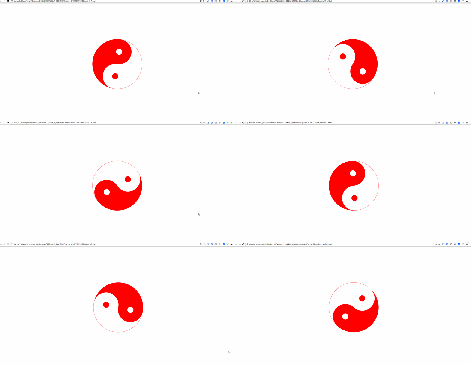
animation-direction与循环搭配,如果动画被设置为只播放一次,该属性将不起作用:
animation-direction: normal; /*正常*/

animation-direction: reverse; /*反向*/

animation-direction: alternate; /*先正向再反向*/

animation-direction: alternate-reverse; /*先反向再正向*/
动画暂停或未播放时的样式
animation-fill-mode: none; /*默认*/

animation-fill-mode: forwards; /*动画结束时的状态*/

animation-fill-mode: backwords; /*动画开始时的状态*/

animation-fill-mode: both; /*动画开始或结束的状态*/
animation-play-state: paused; /*动画暂停*/

animation-play-state: running; /*动画正在运行*/
鼠标悬停时暂停:
div {

    cursor: pointer;

    -webkit-animation-play-state: running;

            animation-play-state: running;

}

div:hover {

    cursor: pointer;

    -webkit-animation-play-state: paused;

            animation-play-state: paused;

}
Animation简写:
Animation:name duration timing-function delay iteration-count direction fill-mode play-state;
滚屏网页都有一个提示滚屏箭头动画效果
<!DOCTYPE html>
<html lang="en">
<head>
<meta charset="UTF-8">
<title>2-9</title>
<style type="text/css">
div {
font-family: Arial;
font-size: 72px;
font-weight: bold;
position: fixed;
right: 0;
left: 0;
width: 30px;
height: 30px;
margin: auto;
transform: rotate(90deg);
cursor:pointer;
animation:my_move .5s ease-in-out .5s infinite alternate ;
}
@keyframes my_move{
from{bottom:200px;}
to{bottom:100px;}
}
</style>
</head>
<body>
<div>></div>
</body>
</html>
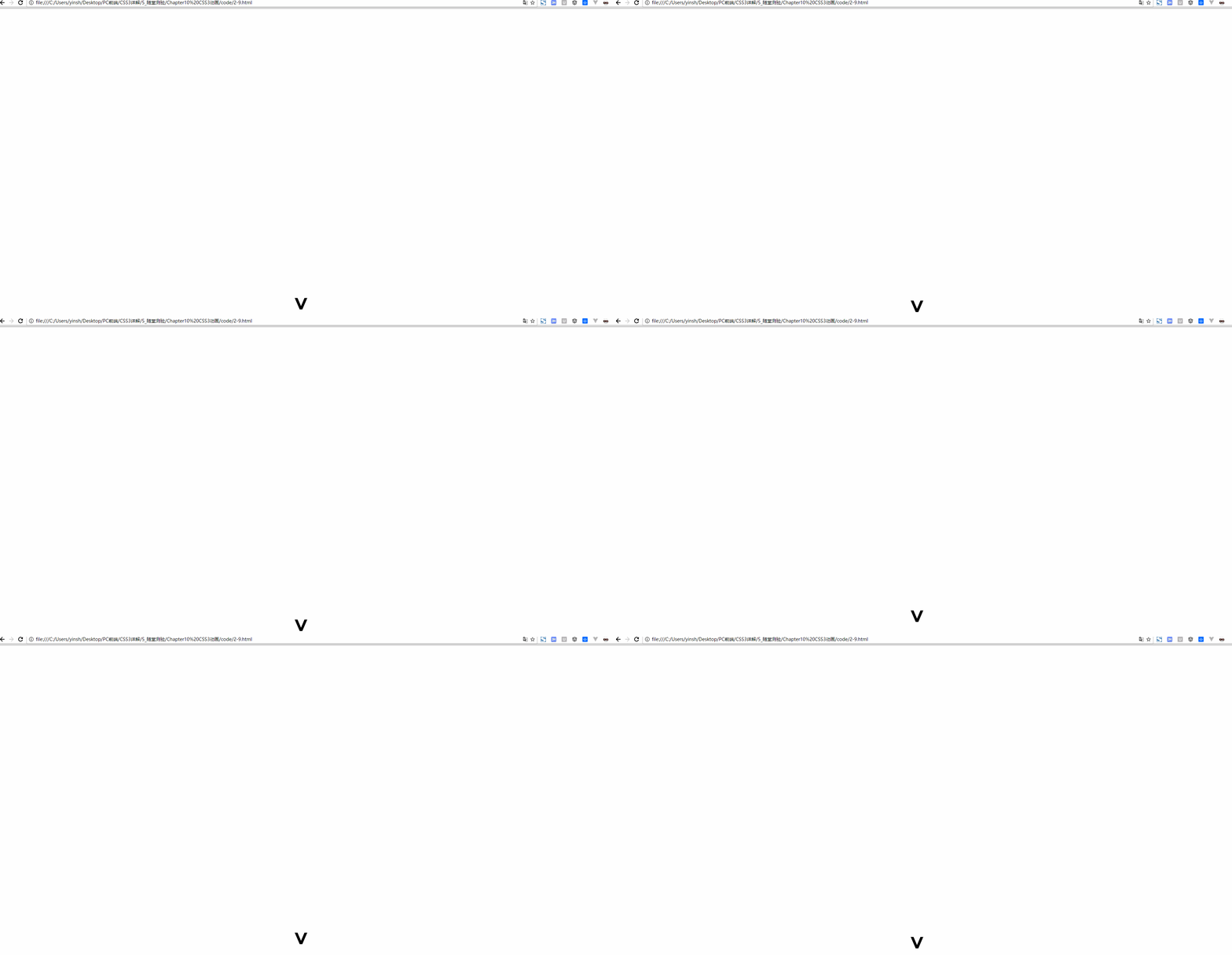
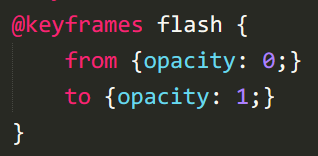
定义元素忽明忽暗的闪烁效果
css3基础-文本与字体+转换+过渡+动画+案例的更多相关文章
- css3基础教程十六变形与动画animation
前面我们讲过的变形与动画一般都是通过鼠标的单击.获得焦点,被点击或对元素进行一定改变后以后触发效果的,那么有没有像Flash一样自动播放的动画效果呢?答案当然是肯定的,这就是我们今天要讲到的anima ...
- CSS基础篇之背景、过渡动画
background-origin(背景原点) 设置元素背景图片的原始起始位置.必须保证背景是background-repeat为no-repeat属性才能生效. background-origin: ...
- CSS3—— 2D转换 3D转换 过渡 动画
2D转换 对元素进行移动.缩放.转动.拉长或拉伸 ————> ————> 移动 顺时针旋转 扩大/缩小 倾斜 2D变换合并 3D转换 绕x轴 绕y轴 过渡 从一种样式逐渐改变为另一 ...
- css3 转换 过渡 及动画
转换transform: 通过 CSS3 转换,我们能够对元素进行移动.缩放.转动.拉长或拉伸.您可以使用 2D 或 3D 转换来转换您的元素 2D转换属性: transform 向元素应用 2D 或 ...
- CSS3 基本属性 浅析(含选择器、背景阴影、3D转换、动画等)
1渐进增强原则 2私有前缀 不同浏览器在发布不同版本(一般测试版)时会加前缀,新增属性加上前缀进行支持测试: Chrome浏览器:-webkit-border-radius: 5px; ...
- CSS3文本与字体
一.CSS3 换行 1.word-break(规定自动换行的处理方法) word-break: normal / break-all / keep-all; /* normal:使用浏览器默认的换行规 ...
- CSS简介,基础选择器,字体属性,文本属性
欢迎大家去博客冰山一树Sankey,浏览效果更好.直接右上角搜索该标题即可 博客园主页:博客园主页-冰山一树Sankey CSDN主页:CSDN主页-冰山一树Sankey 前端学习:学习地址:黑马程序 ...
- CSS 基础:文本和字体(4)<思维导图>
这段时间利用一下间隙时间学习了CSS的基础知识,主要目的是加深对CSS的理解,虽然个人主要工作基本都是后台开发,但是个人觉得系统学习一下CSS的基础还是很有必要的.下面我学习CSS时做的思维导图(全屏 ...
- css3贝塞尔曲线过渡动画速率——transition-timing-function:cubic-bezier(n,n,n,n)
css3过渡动画速率用到的是三阶贝塞尔曲线,曲线有四个点,p0,p1,p2,p3 有几个属性: linear 规定以相同速度开始至结束的过渡效果(等于 cubic-bezier(0,0,1,1)). ...
随机推荐
- screen配置窗口显示
screen的下方不显示,可以复制如下的代码 cd /root && vim .screenrc 贴上如下内容 hardstatus on hardstatus alwayslastl ...
- gulp的简单打包示例(一)
引言 前端开发,打包工具是必不可少的,虽然有很多别人帮你封装好的打包工具,但自己配置一个,自身的实力也会大增呀.这篇博文主要讲的是使用gulp对html.js.less.css.图片的压缩合并等配置. ...
- 一个支持高网络吞吐量、基于机器性能评分的TCP负载均衡器gobalan
一个支持高网络吞吐量.基于机器性能评分的TCP负载均衡器gobalan 作者最近用golang实现了一个TCP负载均衡器,灵感来自grpc.几个主要的特性就是: 支持高网络吞吐量 实现了基于机器性能评 ...
- f(n)=1-1/2+1/3-1/4...+1/n
#include <stdio.h>//f(n)=1+1/1+1/2+1/3+...+1/n int main(){ int n,i; double sum=0.0; scanf(&quo ...
- 《Android Studio实战 快速、高效地构建Android应用》--四、Git入门
Git版本控制系统(VCS)是分布式的,仓库的每一个副本均包含项目的完整历史 安装Git 下载 下载地址:http://git-scm.com/downloads 选择适合自己操作系统的来下载 如果下 ...
- Magicodes.IE在Docker中使用
Magicodes.IE在Docker中使用 更新日志 2019.02.13 [Nuget]版本更新到2.0.2 [导入]修复单列导入的Bug,单元测试"OneColumnImporter_ ...
- Ubuntu下python使用pyenv+virtualenv进行版本和包隔离
安装pyenv 参考:https://github.com/pyenv/pyenv git clone https://github.com/pyenv/pyenv.git ~/.pyenv echo ...
- 《Python学习手册 第五版》 -第5章 数值类型
本章是承接第四章整体说明之后,将对”数值类型“展开详细的说明 数值类型这一章主要通过一下几个内容来讲解: 1.数值类型有哪些? 2.表达式运算符:有哪些?有什么规范? 3.数值的显示格式 接下来,从第 ...
- learn about sqlserver partitition and partition table --- add or remove table partitions addition more
Yes . In the previous. chapter , we see how to generate "partition function" "parttit ...
- one-hot编码(pytorch实现)
n = 5 #类别数 indices = torch.randint(0, n, size=(15,15)) #生成数组元素0~5的二维数组(15*15) one_hot = torch.nn.fun ...