css3条纹进度条
新建div,取名progress,如下
<div class="progress"></div>
在里面插入条纹进度条,以及进度显示文本进度:
<div class="progress-bar progress-bar-info progress-bar-striped active" style="width: 75%;">

        <div class="progress-value">75%</div>

 </div>
添加样式
.progress{

            height: 25px;

            background: #262626;

            padding: 5px;

            overflow: visible;

            border-radius: 20px;

            border-top: 1px solid #000;

            border-bottom: 1px solid #7992a8;

            margin-top: 50px;

}

.progress-bar {

            float: left;

            width: 0;

            height: 100%;

            font-size: 12px;

            line-height: 20px;

            color: #fff;

            text-align: center;

            background-color: #337ab7;

            -webkit-box-shadow: inset 0 -1px 0 rgba(0,0,0,.15);

            box-shadow: inset 0 -1px 0 rgba(0,0,0,.15);

            -webkit-transition: width .6s ease;

            -o-transition: width .6s ease;

            transition: width .6s ease;

 }

.progress .progress-bar{

          border-radius: 20px;

          position: relative;

          animation: animate-positive 2s;

 }

.progress .progress-value{

                      display: block;

                      padding: 3px 7px;

                      font-size: 13px;

                      color: #fff;

                      border-radius: 4px;

                      background: #191919;

                      border: 1px solid #000;

                      position: absolute;

                      top: -40px;

                      right: -10px;

}

.progress-bar-info {

            background-color: #5bc0de;

}

.progress .progress-value:after{

                      content: "";

                      border-top: 10px solid #191919;

                      border-left: 10px solid transparent;

                      border-right: 10px solid transparent;

                      position: absolute;

                      bottom: -6px;

                      left: 26%;

}

.progress-bar-striped {

            background-image: -webkit-linear-gradient(45deg,rgba(255,255,255,.15) 25%,transparent 25%,transparent 50%,rgba(255,255,255,.15) 50%,rgba(255,255,255,.15) 75%,transparent 75%,transparent);

            background-image: -o-linear-gradient(45deg,rgba(255,255,255,.15) 25%,transparent 25%,transparent 50%,rgba(255,255,255,.15) 50%,rgba(255,255,255,.15) 75%,transparent 75%,transparent);

            background-image: linear-gradient(45deg,rgba(255,255,255,.15) 25%,transparent 25%,transparent 50%,rgba(255,255,255,.15) 50%,rgba(255,255,255,.15) 75%,transparent 75%,transparent);

            -webkit-background-size: 20px 20px;

            background-size: 20px 20px;

}

@-webkit-keyframes animate-positive{

              0% { width: 0; }

}

@keyframes animate-positive{

              0% { width: 0; }

 }
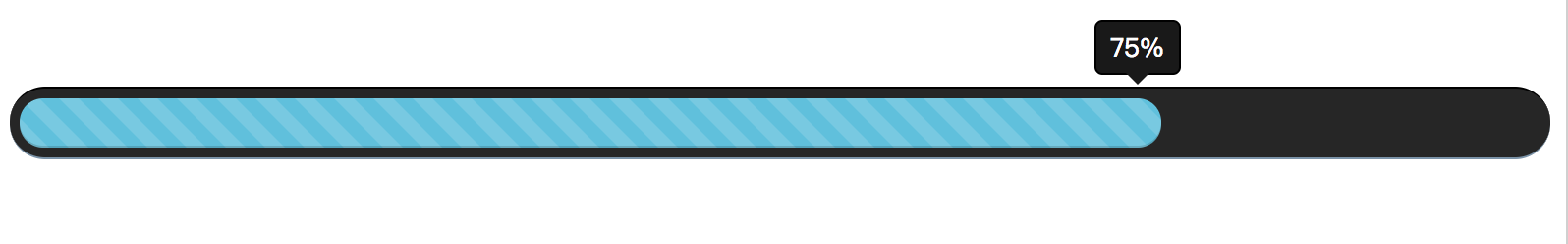
最后效果如下:
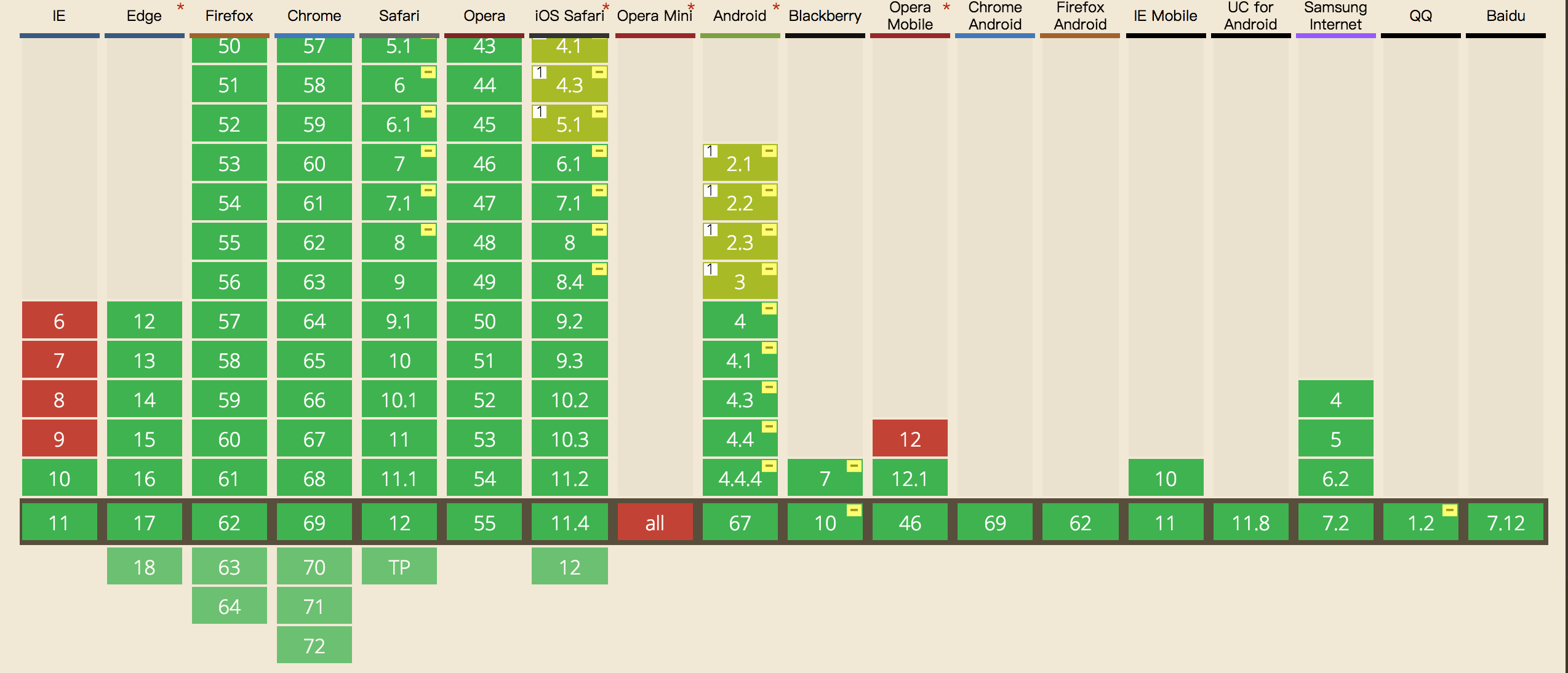
这里需要注意的是css3,keyframes的兼容性如下,ie9及以下就别用了:
css3条纹进度条的更多相关文章
- CSS3动画进度条
CSS3动画进度条 CSS CODE: @-webkit-keyframes move{ 0%{ background-position: 0 0; } 100%{ background-posi ...
- 纯CSS3制作进度条源代码
<!DOCTYPE html><html lang="en"><head> <meta charset="UTF-8&qu ...
- Javascript 及 CSS3 实现进度条效果
Javascript 及 CSS3 实现进度条效果 一:css2 属性clip实现网页进度条: 在实现之前,我们先来介绍一下clip属性,因为这个属性在css2.1中很少使用到,所以我们有必要来了解 ...
- 两种CSS3圆环进度条详解
晚上睡觉之前,我抽了1个多小时,研究了一下圆环进度条,结合从网上查阅的资料,我终于掌握了两种圆环的生成方法. 这次的效果就是单纯的CSS3效果,也没有写具体的JS,等以后有时间在好好整理一下吧~. 第 ...
- css3实现进度条的模拟
两种进度条动画的实现: 1.css3,但IE9-不支持. 2.js动画,兼容性好,但没有css3实现的顺畅 Demo: <html> <head> < ...
- 学习 | css3实现进度条加载
进度条加载是页面加载时的一种交互效果,这样做的目的是提高用户体验. 进度条的的实现分为3大部分:1.页面布局,2.进度条动效,3.何时进度条增加. 文件目录 加载文件顺序 <link rel=& ...
- css3彩色进度条
<html> <head> <title>progress</title> <script type=" ...
- css3圈圈进度条
<!DOCTYPE html> <html> <head> <meta charset="utf-8"> <meta http ...
- css3实现进度条
HTML 结构很简单,但不是 Single Element: <div class="spinner"><i></i></div> ...
随机推荐
- CF585F Digits of Number Pi
题目 把\(s\)串所有长度为\(\lfloor \frac{d}{2}\rfloor\)的子串插入一个ACAM中,之后数位dp就好了,状态是\(dp_{i,j,0/1}\)第\(i\)位,在ACAM ...
- Spark on YARN--WordCount、TopK
原文地址:http://blog.csdn.net/cklsoft/article/details/25568621 1.首先利用http://dongxicheng.org/framework-on ...
- Java技术专区-虚拟机系列-类加载机制(类的初始化)
类加载的生命周期: 加载 -> 验证 -> 准备 -> 解析 -> 初始化 -> 使用 -> 卸载 加载 -> 验证 -> 准备 -& ...
- 微服务-熔断器 Hystrix 的原理与使用
前言 分布式系统中经常会出现某个基础服务不可用造成整个系统不可用的情况, 这种现象被称为服务雪崩效应. 为了应对服务雪崩, 一种常见的做法是手动服务降级. 而Hystrix的出现,给我们提供了另一种选 ...
- Oracle分区表之分区范围扫描(PARTITION RANGE ITERATOR)与位图范围扫描(BITMAP INDEX RANGE SCAN)
一.前言: 一开始分区表和位图索引怎么会挂钩呢?可能现实就是这么的不期而遇:比如说一张表的字段是年月日—‘yyyy-mm-dd’,重复率高吧,适合建位图索引吧,而且这张表数据量也不小,也适合转换成分区 ...
- ssh-keyscan - 收集 ssh 公钥
总览 (SYNOPSIS) ssh-keyscan -words [-v46 ] [-p port ] [-T timeout ] [-t type ] [-f file ] [host | addr ...
- Android编程之Listener侦听的N种写法及实现原理
写下这个题目时突然想起鲁迅笔下的孔乙已,茴香豆的几种写法,颇有些咬文嚼字的味道.虽然从事手机编程多年,但一直使用的是C和C++编程,由于安卓早期只支持JAVA开发,所以对于时下如火如荼的安卓系统,我一 ...
- Codeforces 1175F 尺取法 性质分析
题意:给你一个数组,问有多少个区间,满足区间中的数构成一个排列. 思路(大佬代码):我们发现,一个排列一定含有1,所以我们不妨从1开始入手计算构成排列的区间个数.对于每个扫描到的1(假设处于位置i), ...
- 通过lua进行nginx的权限控制
nginx_lua的安装 nginx使用luajit进行编译安装 使用openresty进行yum安装 openresty中将lua和nginx进行封装,详情可查看openresty官网 openre ...
- 【专业的 Markdown 编辑写作软件】MWeb for Mac基本使用教程
MWeb for Mac是一款专业的 Markdown 编辑写作软件,可以生成MarkDown编辑器和静态博客,在记日记的时候,你可以使用插入图片的功能,使用MWeb软件你可以拖拽或直接粘贴即可插入图 ...