【Flutter学习】基本组件之进度条(LinearProgressIndicator, CircularProgressIndicator)
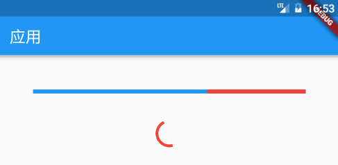
一,概述
基本有两种类型:
- 条形进度条(LinearProgressIndicator)
new LinearProgressIndicator(

backgroundColor: Colors.blue,

// value: 0.2,

valueColor: new AlwaysStoppedAnimation<Color>(Colors.red),

),

new Container(padding: const EdgeInsets.all(20.0)), - 圆形进度条(CircularProgressIndicator)
new CircularProgressIndicator(

strokeWidth: 4.0,

backgroundColor: Colors.blue,

// value: 0.2,

valueColor: new AlwaysStoppedAnimation<Color>(Colors.red),

),
注意:如果 value 为 null 或空,则显示一个动画,否则显示一个定值。Progress 的值只能设置 0 ~ 1.0,如果大于 1,则表示已经结束。
二,构造函数
- LinearProgressIndicator
/**
 * 条形进度条

 * LinearProgressIndicator本身不能设置高度,可以包一层父容器设置高度来间接设置LinearProgressIndicator的高度,

 * 如Container,SizedBox等

 *

 * const LinearProgressIndicator({

    Key key,

    double value,//0~1的浮点数,用来表示进度多少;如果 value 为 null 或空,则显示一个动画,否则显示一个定值

    Color backgroundColor,//背景颜色

    Animation<Color> valueColor,//animation类型的参数,用来设定进度值的颜色,默认为主题色

    String semanticsLabel,

    String semanticsValue,

    })

*/ - CircularProgressIndicator
/**

 * 圆形进度条

 * 可以在外面包一层SizedBox,间接改变进度条的大小

 *const CircularProgressIndicator({

    Key key,

    double value,//0~1的浮点数,用来表示进度多少;如果 value 为 null 或空,则显示一个动画,否则显示一个定值

    Color backgroundColor,//背景颜色

    Animation<Color> valueColor,//animation类型的参数,用来设定进度值的颜色,默认为主题色

    this.strokeWidth = 4.0,//进度条宽度

    String semanticsLabel,

    String semanticsValue,

    })

 */
三,demo
- LinearProgressIndicator
body: ListView(

          children: <Widget>[

            Container(

              padding: EdgeInsets.only(left: 50.0, right: 50.0, top: 50.0),

              child: LinearProgressIndicator(

                value: 0.3,

                backgroundColor: Color(0xff00ff00),

              ),

            ),

            Container(

              padding: EdgeInsets.only(left: 50.0, right: 50.0, top: 50.0),

              child: LinearProgressIndicator(

//                    value: 0.3,

                backgroundColor: Color(0xffff0000),

              ),

            ),

            Container(

              padding: EdgeInsets.only(left: 50.0, right: 50.0, top: 50.0),

              child: LinearProgressIndicator(

                value: 0.3,

                valueColor: new AlwaysStoppedAnimation<Color>(Colors.red),

                backgroundColor: Color(0xff00ff00),

              ),

            ),

            Container(

              padding: EdgeInsets.only(left: 50.0, right: 50.0, top: 50.0),

              child: Container(

                height: 10.0,

                child: LinearProgressIndicator(

                  value: 0.3,

                  valueColor: new AlwaysStoppedAnimation<Color>(Colors.red),

                  backgroundColor: Color(0xff00ff00),

                ),

              ),

            ),

          ],

), - CircularProgressIndicator
body: Stack(

            children: <Widget>[

              Positioned(

                  left: 150.0,

                  top: 20.0,

                  child: CircularProgressIndicator(

//                    value: 0.3,

                    backgroundColor: Color(0xffff0000),

                  )

              ),

              Positioned(

                  left: 150.0,

                  top: 70.0,

                  child: CircularProgressIndicator(

                    value: 0.3,

                    backgroundColor: Color(0xffff0000),

                  )

              ),

              Positioned(

                  left: 150.0,

                  top: 120.0,

                  child: CircularProgressIndicator(

//                    value: 0.3,

                    strokeWidth: 4.0,

                    backgroundColor: Color(0xffff0000),

                    valueColor: new AlwaysStoppedAnimation<Color>(Colors.red),

                  )

              ),

              Positioned(

                  left: 150.0,

                  top: 170.0,

                  child: CircularProgressIndicator(

//                    value: 0.3,

                    strokeWidth: 8.0,

                    backgroundColor: Color(0xffff0000),

                    valueColor: new AlwaysStoppedAnimation<Color>(Colors.red),

                  )

              ),

              Positioned(

                  left: 150.0,

                  top: 220.0,

                  child: SizedBox(

                    width: 50.0,

                    height: 50.0,

                    child: CircularProgressIndicator(

//                    value: 0.3,

                      backgroundColor: Color(0xffff0000),

                      valueColor: new AlwaysStoppedAnimation<Color>(Colors.red),

                    ),

                  )

              ),

            ],

          )
【Flutter学习】基本组件之进度条(LinearProgressIndicator, CircularProgressIndicator)的更多相关文章
- 使用tqdm组件构造程序进度条
使用tqdm组件构造程序进度条 觉得有用的话,欢迎一起讨论相互学习~Follow Me 主要代码 import tqdm # 引用tqdm组件 TRAIN_STEPS = N for i in tqd ...
- 第33讲 UI组件_进度条ProcessBar和消息队列处理器handler
第33讲UI组件_进度条ProcessBar和消息队列处理器handler 1. 进度条ProcessBar 一个可视化的进度指示器,代表正在执行的耗时任务.可以为用户展示一个进度条,表示正在执行的任 ...
- progress组件(进度条)
progress组件:进度条 progress组件的属性: percent:类型:number 设置百分比 (0~100) show-info:类型:布尔 在进度条右侧显示百分比 border-rad ...
- jqueryui组件progressbar进度条和日期组件datepickers的简单使用
<!DOCTYPE html> <html lang="en"> <head> <meta charset="UTF-8&quo ...
- 自己定义View学习之12/7(进度条之混合模式)
今天重点内容是我们学习自己定义view里面的混合模式.事实上我们的画布就跟photoshop一样.是个图层关系,一层盖着一层.这样就导致有非常多种覆盖模式,这就是我们今天的主题."混合模式& ...
- 【Flutter学习】组件学习之目录
01. Flutter组件-Layout-Container-容器 02. Flutter组件-Text-Text-文本 03. Flutter组件-Text-RichText-富文本 04. ...
- android学习笔记20——ProgressDialog进度条对话框
ProgressDialog==>进度条对话框 ProgressDialog本身就代表一个进度条对话框,程序只需要创建ProgressDialog实例,并将其显示出来就是一个进度条对话框:开发者 ...
- ftk学习记录(一个进度条文章)
[ 声明:版权全部,欢迎转载,请勿用于商业用途. 联系信箱:feixiaoxing @163.com] 首先.在開始今天的文章之前.我们还是给朋友们展示一下前面一段代码的执行效果.效果例如以下, w ...
- Android学习笔记_76_Android ProgressBar 进度条
android 进度条的样式 例1:(默认样式(中等圆形))Xml代码 <ProgressBar android:id="@+id/progressBar1" ...
随机推荐
- mysql 8.0版本下载安装以及默认密码修改
1. 下载 去mysql官网下载地址进行下载,选择需要的安装包 可以直接跳过登录进行下载 ps:我是先注册账号下载的,注册时遇到一个坑,就是在chrome75版本无法选择省市,不选择又不让注册. 可以 ...
- StatefulWidget 有状态组件
在 Flutter 中自定义组件其实就是一个类,这个类需要继承 StatelessWidget/StatefulWidget: StatelessWidget 是无状态组件,状态不可变的 widget ...
- Oracle or Question Solve(二)
数据库常用语句和函数 ----update update()函数主要注意的是后面的where限制条件--例子:update tab_a a set a.v1 = (select b.v1 from t ...
- 51nod 1518 稳定多米诺覆盖(容斥+二项式反演+状压dp)
[传送门[(http://www.51nod.com/Challenge/Problem.html#!#problemId=1518) 解题思路 直接算不好算,考虑容斥,但并不能把行和列一起加进去容斥 ...
- 4 November in ss
Contest A. 输油管道问题 某石油公司计划建造一条由东向西的主输油管道.该管道要穿过一个有 \(n\) 口油井的油田.从每口油井都要有一条输油管道沿最短路经 (或南或北) 与主管道相连.如果给 ...
- [CSP-S模拟测试]:kill(二分答案+贪心)
题目传送门(内部题50) 输入格式 第一行包含四个整数$n,m,s$,表示人数.怪物数及任务交付点的位置.第二行包含$n$个整数$p_1,p_2,...,p_n$.第三行包含$n$个整数$q_1,q_ ...
- Windwos 08R2_DNS全面图文详解
目录 目录 前言 软件环境 DNS域名服务器 DNS服务器原理 DNS域名空间 DNS区域 DNS服务器的类别 DNS查询模式 缓存文件 配置DNS服务器 DNS服务的应用 创建DNS正向解析区域 在 ...
- 显示等待WebDriverWait+lambda
代码,关键代码标红 参考文章:https://www.cnblogs.com/yoyoketang/p/6517477.html #coding:utf-8 ''' 这里写了一个百度搜索页的pageo ...
- 大数据给IT企业带来攫金市场新机遇
大数据给IT企业带来攫金市场新机遇 大数据,一个时髦的名词,也是当下热门的业务领域.大数据诱人的利益诉求点之一,即通过大数据能更好地提高效率,更好地有的放矢.一方面,大数据让公司内部更有效地运作:另一 ...
- 《单词的减法》state1~state17(第二遍学习记录)
单词的减法(二) 2016.05.18.2016.05.21 state 1 advisory 顾问的,劝告的 anticipate/participate 期望/参加 state 2 applian ...