
HTML5 动画用 animation transform transition 做的两个例子
1,左右移动,自我翻转的圆
<!DOCTYPE html>

<html>

<head>

    <meta charset="UTF-8">

    <title>移动的圆</title>

    <style type="text/css">

        html, body {

            margin: 0;

            padding: 0;

            background: #ffffff;

            outline: none;

            letter-spacing: 0

        }

        .box {

            margin: 120px auto 0 auto;

            padding: 100px 0 0 0;

            width: 680px;

            height: 400px;

            background: #000000;

        }

        /* 指定偏移过程中的 */

        @keyframes myAnimation {

            0%     { transform: rotate3d(0, 1, 0,   0deg); margin-left: 0 }

            16.67% { transform: rotate3d(0, 1, 0,  60deg); margin-left: 200px }

            33.34% { transform: rotate3d(0, 1, 0, 120deg); margin-left: 400px }

            50.01% { transform: rotate3d(0, 1, 0, 180deg); margin-left: 600px }

            66.68% { transform: rotate3d(0, 1, 0, 240deg); margin-left: 400px }

            83.35% { transform: rotate3d(0, 1, 0, 300deg); margin-left: 200px }

            100%   { transform: rotate3d(0, 1, 0, 360deg); margin-left: 0 }

        }

        .test {

            width: 80px;

            height: 80px;

            font-size: 16px;

            font-weight: bold;

            line-height: 80px;

            text-align: center;

            background: red;

            border-radius: 50%;

            color: #ffffff;

            animation-name: myAnimation;         /* 使用的动画名称 */

            animation-duration: 2s;              /* 一次动画持续时间 */

            animation-timing-function: linear;   /* 动画变化快慢方式 */

            animation-iteration-count: infinite; /* 动画循环的次数,infinite 无限循环 */

        }

    </style>

</head>

<body>

<div class="box">

    <div class="test">文字</div>

</div>

</body>

</html>
效果如下

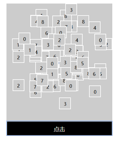
2,洗牌
<!DOCTYPE html>

<html>

<head>

    <meta charset="UTF-8">

    <title>洗牌</title>

    <script src="https://cdn.bootcss.com/jquery/3.3.0/jquery.min.js"></script>

    <script src="https://cdn.bootcss.com/vue/2.6.8/vue.min.js"></script>

</head>

<style type="text/css">

    #box {

        position: relative;

        width: 360px;

        background: #CCCCCC;

        margin: 200px auto 0 auto;

    }

    .content {

        position: absolute;

        width: 40px;

        height: 40px;

        line-height: 40px;

        text-align: center;

        font-size: 16px;

        border: 2px solid white;

        box-sizing: border-box;

        background: #CCCCCC;

        transition-property: top, left;  /* 这里指动画会接管 top 和 left 属性,一般需要能计量的属性 */

        transition-duration: 2s, 2s;     /* 这里指当被接管的属性发生变化时,动画过度的完成时间 */

    }

    .button {

        width: 360px;

        height: 50px;

        line-height: 50px;

        text-align: center;

        font-size: 19px;

        color: white;

        background: black;

        margin: 400px 0 0 0;

    }

</style>

<body>

    <div id="box">

        <div v-for="(num, index) in numArr"

             class="content"

             :style="{'top': num.top, 'left': num.left}"

        >

            {{num.content}}

        </div>

        <input type="button" value="点击" class="button" @click="shuffle()" />

    </div>

</body>

<script type="text/javascript">

    // 组装初始化数组

    var numArr = [];

    for (var i = 0; i < 9; i++) {

        for(var j = 0; j < 9; j++){

            var num = {};

            num.top = i * 40 + 'px';

            num.left = j * 40 + 'px';

            num.content = (numArr.length + 1) % 9;

            numArr.push(num);

        }

    }

    // 数组验重

    function havaObjArr(obj, arr){

        for(var i = 0; i < arr.length; i++){

            if(obj.left == arr[i].left && obj.top == arr[i].top){

                return true;

            }

        }

        return false;

    }

    // 用 VUE 绑定数据

    var vm = new Vue({

        data: {

            numArr: numArr

        },

        methods: {

            // 重组数组

            shuffle() {

                var numArr = [];

                while (numArr.length < 81) {

                    var num = {};

                    num.left = parseInt(Math.random() * 9) * 40 + 'px';

                    num.top = parseInt(Math.random() * 9) * 40 + 'px';

                    if (!havaObjArr(num, numArr)) {

                        num.content = (numArr.length + 1) % 9;

                        numArr.push(num);

                    }

                }

                this.numArr = numArr;

            }

        }

    }).$mount('#box');

</script>

</html>
效果如下
HTML5 动画用 animation transform transition 做的两个例子的更多相关文章
- CSS动画:animation、transition、transform、translate
https://blog.csdn.net/px01ih8/article/details/80780470 一.区分容易混淆的几个属性和值 先区分一下css中的几个属性:animation(动画). ...
- animation和transition做动画的区别
animation做动画,是不需要去触发的,可以定义一开始就执行 transition做动画,是需要人为触发,才能执行的
- CSS3 动画实现 animation 和 transition 比较
在 CSS3 中有两种方式实现动画, 分别是 animation 和 transition, 他们都有以下功能 根据特定 CSS 属性进行动画 设定属性变化的 timing function 设定动画 ...
- css 动画 transform transition animation
1.transform transform 是通过在浏览器里面让网页元素 移动 旋转 透明 模糊 等方法来实现改变其外观的技术 -webkit-transform : translate(3em,0 ...
- CSS3与动画有关的属性transition、animation、transform对比
最近应公司需求,需要用css3做动画,终于把以前一直傻傻分不清楚的三个属性理解了. 索性在这里进行一个简单的对比,加深自己的记忆. 浏览器兼容性 CSS3 transform 属性 Internet ...
- css010 css的transform transition和animation
css010 css的transform transition和animation 看着没有一个能想起他们是干什么的.. 1. Transform Transform(变形) r ...
- css 动画(二) transition 过渡 & animation 动画
前言:这是笔者学习之后自己的理解与整理.如果有错误或者疑问的地方,请大家指正,我会持续更新! translate:平移:是transform的一个属性: transform:变形:是一个静态属性,可以 ...
- CSS 中 transform、animation、transition、translate的区别
在前端页面的开发过程中,经常会碰到这么几个 CSS 属性容易搞混:transform.translate.animation还有transition.下面就针对这几个 CSS 属性做一个对比,辨别这几 ...
- css笔记——区分css3中的transform transition animation
出处:http://blog.csdn.net/dyllove98/article/details/8957232 CSS3中和动画有关的属性有三个 transform. transition ...
随机推荐
- Spark:DataFrame批量导入Hbase的两种方式(HFile、Hive)
Spark处理后的结果数据resultDataFrame可以有多种存储介质,比较常见是存储为文件.关系型数据库,非关系行数据库. 各种方式有各自的特点,对于海量数据而言,如果想要达到实时查询的目的,使 ...
- 树的子结构(JAVA)
树的子结构 题目描述 输入两棵二叉树A,B,判断B是不是A的子结构.(ps:我们约定空树不是任意一个树的子结构) public boolean HasSubtree(TreeNode root1, T ...
- 旋转数组的最小数字(JAVA)
旋转数组的最小数字 题目描述 把一个数组最开始的若干个元素搬到数组的末尾,我们称之为数组的旋转. 输入一个非递减排序的数组的一个旋转,输出旋转数组的最小元素. 例如数组{3,4,5,1,2}为{1,2 ...
- [Java] 基本資料包裝類別 Wrapper Classes
基本型別包裝 (Wrapper Classes) 將基本型別生成物件,要將基本型別先包裝成物件,才能執行生成, Boxing: Integer a = new Integer(1) Unboxing: ...
- C++ 属性类
又一次向目标迈进了... 这次是实现一个物体所拥有的属性类.没什么好说的,非常简单. 因为我是C++新手,不知道对这次的实现有没有什么更好的实现方式.因为这个类对以后的进展很重要,而且,要充分考虑易用 ...
- Yii2.0 RESTful API 基础配置教程
创建api应用 通过拷贝原有的应用,重命名得到新的应用 安装完 Composer,运行下面的命令来安装 Composer Asset 插件: php composer.phar global req ...
- linux下目录简介——/SElinux
一.前言 安全增强型 Linux(Security-Enhanced Linux)简称 SELinux,它是一个 Linux 内核模块,也是 Linux 的一个安全子系统. SELinux 主要由美国 ...
- 1.2.8 Excel做个滚动抽奖
1.首先要准备好数据库: 2.用RAND函数来生成随机数字,做一个辅助列: 3.制作抽奖界面: 4.输入公式: 在F3中输入下列公式并填充至F5: =INDEX(A:A,MATCH(SMALL(B:B ...
- VS快捷键大全(总结了一些记忆的口诀)(转载)
相信.Net开发人员都想能够熟记各种VS快捷键以提高平时开发的效率,但苦于记忆能力太差而快捷键又特别多,特别烦,所以作罢! 下面我将简单介绍一下我记忆VS快捷键的一些方法,希望对大家有所帮助. 1.窗 ...
- Visual Studio Code Java输出中文乱码的问题
Visual Studio Code 推出了java插件,最近适用了一把,非常不错,但是有个很明显的bug.就是中文乱码,具体现象有如下: 1.System.out.println 控制台输出乱码. ...